Someone please tell us where’s the warming
By Frank Bosse and Fritz Vahrenholt
(Translated/edited by P Gosselin)
The Goddard Institute for Space Studies (GISS) has released the global mean temperature figure for 2012. The anomaly is +0.56° Celsius. A look at the last 30 years (a climate-relevant time-period) shows a global temperature stagnation:
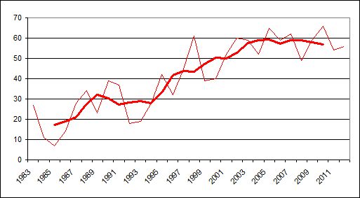
Temperature anomaly (in hundredths of a degree) from 1983 to 2012.
This has created a commotion in the media. Spiegel has taken notice and reported of “puzzled scientists”. Perhaps we can lend them a hand in finding the missing heat. The 5-year moving average has been flat since 2002 – a full decade. There really hasn’t been any significant increase since 1997; that’s 16 years. James Hansen (see our blog report: “Who is James Hansen?“), released the temperature data while publishing an enlightening paper (Hansen et al. 2013, pdf). In it he acknowledges the temperature rise stop and attributes it mainly to the effects of natural variability. Global ocean heat content (OHC) of the upper 700 meters has also flattened, especially since 2004:

Therefore it is argued that since the beginning of the millenium the heat must have been transported to the ocean depths, down to 2000 meters. However, from those depths, little data is available. As a whole, everything appears vague and imprecise. Yet, there is something we wish to take a closer look at. Question: Where could this have possibly taken place? Here’s a look at the heat content (down to 700 m depth) of the Southern Hemisphere:
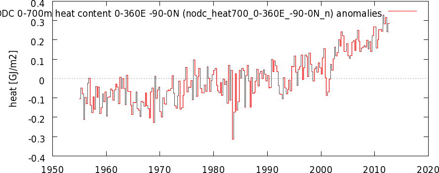
Here the trend is uninterrupted. There’s been no change in trend since 1990. Now let’s take a look at the Northern Hemisphere:
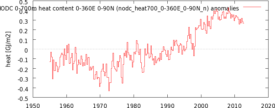
Here nothing has warmed in the last 10 years (see our blog article “A look at the global mean temperature in 2013. Is cooling ahead!“). In the meantime, this is what we have found, also published at climate website climate4you:
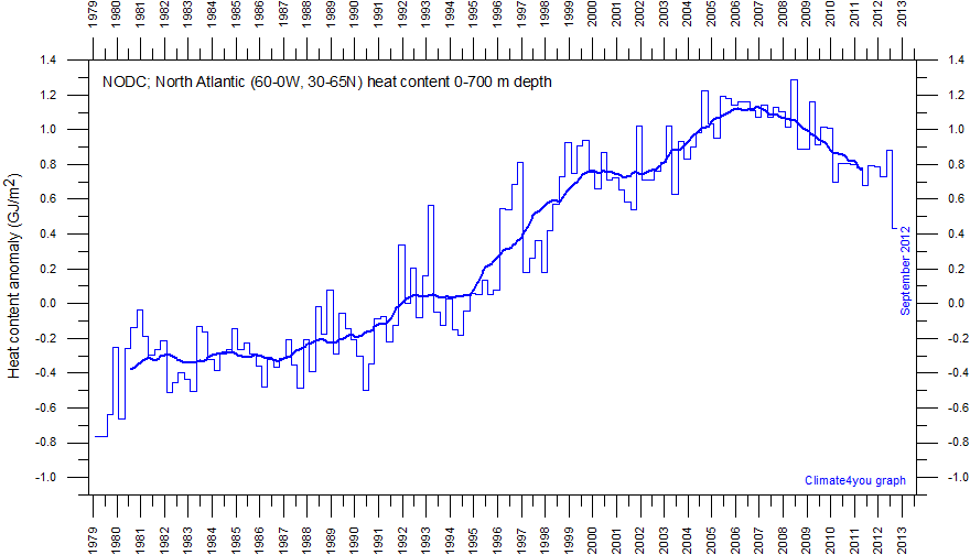
The above is the Ocean Heat Content (OHC) of the North Atlantic above 30° north, which is also known as the AMO region, which is where the Atlantic Multidecadal Oscillation takes place. The dataset shows the anomaly from the detrended sea surface temperatures (SST). A look at the region of impact shows that a huge area of the Northern Hemisphere is impacted:

Depicted above is the correlation of the AMO region with the global temperatures (positive correlation in orange, red violet). In the Northern hemisphere large regions are effected: USA, Central America and all of Europe, up to the Urals and also the Far East. In the Southern Hemisphere there’s practically no correlation! There the AMO does not play a role. What’s the relationship to ocean heat content (OHC)?
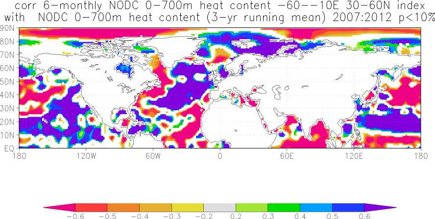
The above chart shows how the course of the OHC, whose magnitude in the North Atlantic has been dropping since 2004, correlates with the entire OHC of the Northern Hemisphere since 2004. The “cold colors” show the areas of water that behave like or similarly to the North Atlantic, i.e. in decline. In regions where warm colours rule, OHC is rising and thus counters the North Atlantic. In the ocean regions where the AMO has an effect (see the preceding chart ), OHC behaves like the North Atlantic. Only the Northeast Pacific is out of sync. Here a negative phase of the Pacific Decadal Oscillation has been in play for quite some time now. OHC in the North Pacific also has not been doing much since the year 2000:
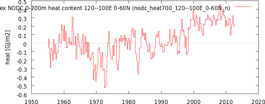
The decline in OHC in the Northern Hemisphere could be well connected to the effect of the AMO. The flattening out of the OHC is very likely an AMO signal, which began to decline in 2005. Or is the North Atlantic being massively impacted by the anthropogenic aerosols (which are often used as an explanation) to explain the AMO? This is likely not the case because the chart showing the distribution of tropospheric aerosols indicates that the North Atlantic is one of the regions of the Northern Hemisphere that is impacted the least.
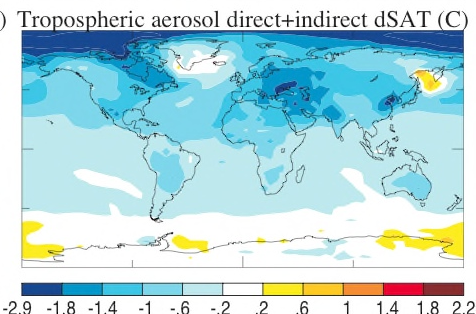
Figure from Shindell 2007.
So here it’s likely that the thermohaline circulation is offsetting the temperature driving greenhouse gas effects. If the early phase of the falling AMO has been able to offset the effect of anthropogneic greenhouse gases for years, then the rising AMO’s impact on temperatures during the period of 1975 to 1997 had to have been half of the entire observed warming during the period. This would have profound consequences for the prognoses: The effect of the greenhouse gas was only 50% responsible for the warming since the intensive industrialization since 1960.
Implicitly, maybe late – but not too late – the British MetOffice recognized this as it recently corrected its prognosis for the coming years (see blog article “The avalanche gathers speed: British Weather Service drastically reduces its warming prognoses until 2020“). It concedes the effect when it explains: “In this case, changes in ocean surface temperatures in some parts of the world over the past year are understood to have made a key contribution to the difference between the 2011 and 2012 forecasts…”.
Therefore we should prepare for a long phase of stagnation if the AMO continues falling for decades. This is even simulated in a little known paper (Wouters et al. 2012). The authors are able to reporoduce the variability without the anthropogenic influence.
Summary
Temperatures have been flat for more than 10 years and the OHC of the North Atlantic reached its peak 7 years ago. We have shown that global temperatures follow the OHC there (see: “A preview of global mean temperature in 2013: Cooling ahead!“). We now see that the temperature course over the years followed the OHC, in harmony with the AMO. Cycles, particularly the oceans, were always suspected in the IPCC reports. Such cycles, however, are obvious and lead to the conclusion that manmade greenhouse gases are only 50% responsble for the warming. The impact of the thermohaline circulation on the climate is a key to understanding climate change and to what we can expect in the years ahead.
Another key is the sun. If a Maunder-type of minimum occurs, then we will certainly not see any temperature increase of the type vehemently postulated in the IPCC reports. These are exciting times – stay curious!




Incredible post! Global temperatures follow the OHC of the North Atlantic? We appear to be in for a period of serious cooling in that case. Is there a translation available of the paper, “A preview of global mean temperature in 2013: Cooling ahead!“?
You’re in luck: https://notrickszone.com/2013/01/09/ocean-heat-content-based-model-by-german-scientists-shows-continued-global-cooling/
I missed it Pierre – thank you so much!
Prof. Fritz Vahrenholt: OHC Tells Us To “Prepare For A Long Phase Of Temperature Stagnation”
I think I safely say that this would be unprecedented.
Hmm… and the impact on Arctic sea ice formation?
Northrhine Westphalia (red green govt) looks for solutions for climate change adaptation.
Interesting: “Increasing heat in the cities, floods and the disappearance of native pant and animal species” are purported to be effects of climate change. So in a wonderful warmist twist of logic they now claim that UHI is caused by CO2AGW!
Floods? The Rhine had floods forever, it’s an effing stream! But now? Caused by climate change.
http://www.co2-handel.de/article186_19609.html
The eternal question: Stupid or evil?
Hmmmmmmm. Where IS the warming? Good question….
http://climatechangepsychology.blogspot.com/2013/01/jeff-masters-michael-mann-katharine.html
You’re looking for psychologocal readons for why people don’t believe you? Well try this:
The models are junk and it’s effin cold.
[…] https://notrickszone.com/2013/01/24/prof-fritz-vahrenholt-ohc-tells-us-to-prepare-for-a-long-period-o… […]
In fact, the 0-700 m layer has warmed more in the last 16 years than in the 16 years before:
http://davidappell.blogspot.com/2013/01/where-heat-went.html
David, you’re all over the Internet with this.
How many times do people have to tell you that the sea warms because of solar variability?
And that, by the way, probably has the most to do with prior Arctic sea ice loss, due to reduced North Atlantic current and subsequent summer warming of the Arctic ocean due to reduced flow.
BY THE WAY the aerosol chart is purely modeled, there is no direct observation of it at all