By Ed Caryl
Several researchers have noted that the 11-year solar cycle does not show up in temperature or precipitation data. Most recently, Dr. David Evans has introduced his “notch filter” answer to the problem. I think the answer is much simpler.
The solar influence on earth has several components. The Total Solar Insolation (TSI), varies over the 11-year solar cycle by about 0.1%. Solar UV varies by much more, up to 10%, but those wavelengths carry much less energy than TSI, and affect only the top of the atmosphere. The solar wind has little energy, but influences the cosmic ray influx. Other influx, such as Forbush Events, from Coronal Mass Ejections (CME’s), have short term effects. These last two, the solar wind and Forbush Events, do not follow the solar cycle very closely, so tend not to show up in a time power spectrum of climate, or even of cosmic rays.
So why does the TSI cycle not show up in climate data? Because annual and daily changes completely drown out the signal. First, the earth’s orbit around the sun is not circular, but elliptical. We are closer to the sun during the northern hemisphere winter by 3.4% compared to the distance in the summer. Because the TSI varies by the square of the distance change, the change in TSI is 6.8% from summer to winter. This alone would make the 11-year 1% signal difficult to detect, but there are other, much large variations.
The earth is tilted on it’s axis by 23.5°. This causes a further variation in insolation even at the equator. At the equator, the annual variation is almost 12%, with the maximum occurring at the spring and fall equinoxes, and the minimum occurring on June 21st.
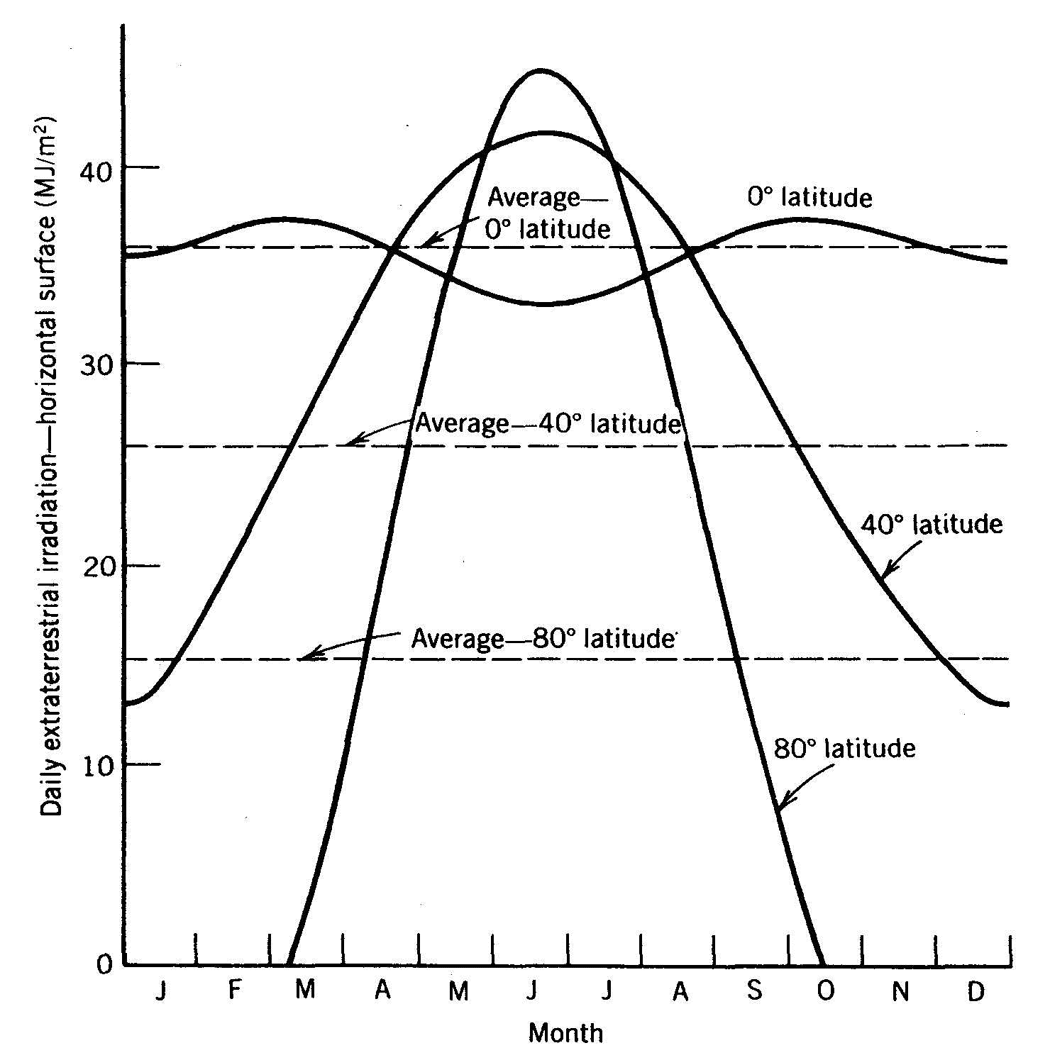
Figure 1: is the insolation seen at three different latitudes. Source here
At 40° latitude, this variation grows to over 100% around the average, and at 80° degrees, to over 200% around the average, including days of 24 hours of sunlight and more days of 24 hours of darkness.
Besides the large annual variations in insolation, there is the diurnal variation, night and day, with another signal that is nearly a square wave. But this isn’t all. The variation in clouds causes albedo changes that are nearly random, and imposed on the above insolation curves. I say nearly random, because of solar effects on clouds due to changes in cosmic rays. But these effects have only small correlation with solar cycles.
So, a 0.1% TSI change on an 11-year cycle, is buried in the much larger annual orbital and axial tilt cycle, the diurnal cycle, as well as random albedo changes due to clouds. An analogy would be hearing the 50/60 Hertz power supply hum on your HiFi, while playing Tchaikovsky’s 1812 Overture, complete with cannons, at full volume.


… plus add PDO, AMO, el Niño and la Niña cycles, etc., etc…
I wouldn’t dismiss Solar UV just on the basis of low energy, though.
Ed, you write: ” Solar UV varies by much more, up to 10%, but those wavelengths carry much less energy than TSI, and affect only the top of the atmosphere.”
Not sure that changes in the upper atmosphere have little impact on the lower atmosphere. European winters, for example, are much harsher in times of lower solar sunspot activity, see Lockwood et al 2010: “Are cold winters in Europe associated with low solar activity?” http://iopscience.iop.org/1748-9326/5/2/024001
Also Lüning/Vahrenholt’s book The Negelected Sun, p. 264, also show that upper atmosphere can impact lower atmosphere via a UV amplification mechanism.
This was put up as a damper on some of the claims.
http://daedalearth.wordpress.com/2014/06/27/an-11-year-solar-signal-in-the-atmosphere/
There is a solar signal at low level in a number of datasets where I have specifically looked closely but I completely agree with you it is lost in other things.
My own view is that the magnetic cycle is more important but how changes in magnetic polarity alter the sun/earth coupling if it does is an open question. Evans was aware of this one from a post I did at the Talkshop early last year.
An 11 year is possibly played down in certain circles because of claim to positive feedback, an unstable system. Seeing nothing avoids having to explain why an external change has little effect instead of being magnified.
“Solar UV varies by much more, up to 10%, but those wavelengths carry much less energy than TSI, and affect only the top of the atmosphere.”
EUV varies a lot more, and has effects on upper atmospheric chemistry which propagate downwards.
http://tallbloke.wordpress.com/2011/12/12/n-f-arnold-solar-modulation-of-transport-processes-in-the-winter-middle-atmosphere/
The blue end of the solar spectrum penetrates the deepest into the ocean >100m, and deposits a lot of energy there; up to 35% of the insolation arriving at the ocean surface.
The 11 year cycle is one magnetic reversal, so the full cycle (one N-S, one S-N) is around 22 years. A case can be made for longer climate cycles correlating with multiples of 22 years, e.g 66 years:
http://motls.blogspot.co.uk/2011/03/is-there-66-year-cycle-in-temperatures.html
I have tried to find a relationship between the ocean cycles and the TSI, based on that 66-year theory. So far, nothing found. I suspect again, the signal is buried in all the other things that are going on.
I knew that statement would trigger arguments… it was meant to. We definitely need to know more about what wavelengths above the visible do to the atmosphere, and how they do it. We know that an active sun inflates the atmosphere to satellite altitudes, causing increased drag. That inflation must have effects lower down. Thank you for all the links. May we all learn more.
I have already shown on many occasion that temperature correlates very well with solar activity, and not as a bullshit global anomaly either.. honestly it is painful watching people catch up.
I agree with Tim and Rog..
Sure looks like it does to me:
HadCRUT and AMO vs SSN
That is just the data – the actual data only very lightly processed as you can see.
The effect looks strongest on the AMO, which is northern Atlantic detrended SST’s. That seems logical since the Arctic is most affected by variations in the Sun (see Soon 2005).
There is an interesting lead-lag variability, but many peaks line up. The magnitude seems to be around 0.1 C across a solar cycle, which is a lot. Puts paid the climateers CO2-does-everything hypothesis and supports Svensmark quite neatly.
Bruce,
That pattern has tantalized me also. But when you plot that stuff as an XY scatter chart you get bumpkiss…. Nothing. Only the long term trends line up. Solar wind and Forbush events seem to drive something, until the last two cycles, then that correlation breaks down. I think we have hit a limit during the “pause” and the usual actors can’t drive temperature any higher. The climate is saturated. Probably because tropical sea surface temperature can’t rise any higher.
Buried in data .. true. The data has a lot of errors, let me mention as an example a 5 W/m2 “imbalance” – read “mysterious error” – in CERES data. I don’t believe that we are anywhere near the required 0.1% accuracy. Once we achieve it, it will take several decades of data gathering to detect this signal.
Ed, one of the things I fail to understand is why anyone would use the Final Temperature Product from any of the main sources.
It is patently obvious from the work that Steve Goddard and many others have done that the temp history has not just been “cooled” it has also been straightened out to better represent the Hockey Stick and make it easier for the Models to fit to.
Just have a look at the 7th Graph on this thread
http://wattsupwiththat.com/2014/06/26/on-denying-hockey-sticks-ushcn-data-and-all-that-part-2/#more-112008
It was presented by Zeke Hausfather and shows a plot of Raw Global Actual Temperature data, now compare that to any other global graph including the one presented by Zeke as Graph 8 which just uses Gridding & Anomalies of the same data.
Which one represents the Truth as far as temperatures are concerned, just look at the Step Functions taking place in the Raw actual temperatures?
Just look at the downward trend between the late 50s and early 90s, doesn’t that look familiar?
I have done the restricted analysis. See here:
https://notrickszone.com/2011/12/20/a-recent-temperature-history-part-1-of-2/
The whole global warming meme is based on:
1. Using the natural climate cycles in such a way as to “prove” a warming by picking start points at the beginning of cycle 1 and end point of cycle 3.
2. Adding cooling at the beginning and warming at the end with various “adjustments”.
3. Using UHI to advantage where ever possible.
Is this purposeful cheating? I don’t know. I suspect that among the many people involved, it is a combination of confirmation bias, semi-honest mistakes, and purposeful slanting. Keep in mind that the people doing the hiring in these organizations hire only the like-minded.
Sorry I can’t attach that graph from WUWT as I don’t know how.
I think it is one of THE most important graphs to be presented by a warmist.
“Egads! It appears that the world’s land has warmed 2C over the past century! Its worse than we thought!” (Zeke Hausfather)
So what if the world’s land mass has warmed 2 deg C; 3/4 of the surface of the planet are oceans so assuming that’s pretty inert we would end up with 0.5 deg C average, which sounds perfectly reasonable.
Isn’t it funny how Zeke Hausfather doesn’t mention that. You notice you have a warmist propagandist when they twist words like that.
The whole point is they don’t want to show that graph because it shows 2 major jumps in Temperature, instead of the steady response to CO2 that they need, hence the straightening out of the old data to make it fit the hockey stick shape.
This is probably one of those cases where a simple thermodynamic model of the Earth could be used to get a rough idea of the expected 11-year signal level from the direct heating of the sun. Key is the heat capacity of the system.
When searching for 11-year signals in measurements using Fourier transforms it would probably help to first resample the data by interpolation (simple linear interpolation should be sufficient) such that all solar cycles occupy the same number of samples.
Great idea!
“We are closer to the sun during the northern hemisphere winter by 3.4% compared to the distance in the summer.”
True, but we spend less time there. IIRC, due to Kepler’s 2nd Law, the energy accumulated is the same for a given time interval anywhere in the orbit.
Small SNR could be a reason the 11 year cycle is not observed. A notch in the transfer function is another possibility. However, I suspect it is because the 11 year cycle is being modulated by the 9.3 year motion of the pole due to lunar effects, which provides mixing of the heated surface waters.
This would produce roughly 5 year and 60 year effects, though there would be some splitting of the lines due to the solar cycle spectrum, which is actually split at about 10.8 and 11.8 years, and not actually a single cycle at 11 years precisely.
The 5 year cycle would be further attenuated by long term smoothing due to thermal mass of the oceans. This all appears more or less consistent with the spectrum of the global temperature mean, as you see clearly the 60-ish year cycle dominating, and small split peaks around the 5 year (0.2 years^-1) mark.
I suspect all this could be nailed down fairly well by an enterprising researcher. I, unfortunately, do not have the time to give it more than the cursory look I have shown here, patched together from several disparate analyses I performed over the last several years.
I know that the volcanic signal is drowned out by weather variations from year to year on a local level, so that one might be led to believe that the global temperature signal is a fictitious one. This is clearly not the case. The further you ‘zoom out’, the more the combined local variations are smoothed out into an average and the more apparent the relatively small, but consistent and insistent volcanic signal becomes.
I don’t think the same can be said about the solar cycle signal. Solar input primarily feeds the mighty (tropical) ocean processes (prominently, ENSO), which then in turn distributes the energy globally (through ocean currents and atmospheric circulation) to control/create our climate. The Sun thus impacts climate in a pretty indirect way. I wouldn’t expect to observe a separate solar signal on top of the ENSO/AMO signal. It’s rather ‘baked into’ it.
You said in the original post:
“We are closer to the sun during the northern hemisphere winter by 3.4% compared to the distance in the summer. Because the TSI varies by the square of the distance change, the change in TSI is 6.8% from summer to winter.
I sort of thought while it was true that the earth was closer, it was also moving faster, so spending less time in the warmer zone. In fact, I thought this exactly compensated for the increase. Such are the orbital mechanics. Gravity is of course inverse square too. Is this right?
You are correct.