If your “Globe” Is Only 10 Meters From Your Door – It’s Warming!
By guest writer Ed Caryl
In A Recent Temperature History – Part 1, 22 stations in the midwest U. S. were examined. On an average, these stations were cooling slightly over one AMO cycle, from 1934 to 2000, but there was much variability. The greatest cooling was –0.76°C, and the greatest warming was 0.59°C. As these sites are all within a few hundred kilometers of each other, why the large variation? Was it population density? Or is it something else?
The towns in this group are all small, according to GISS under 10,000 population. The actual population was found to be from about 500 to just less than 7000, with one outlier at 24,900. The station distance from the center of that city is more than 7 kilometers, so GISS can be forgiven for that classification.
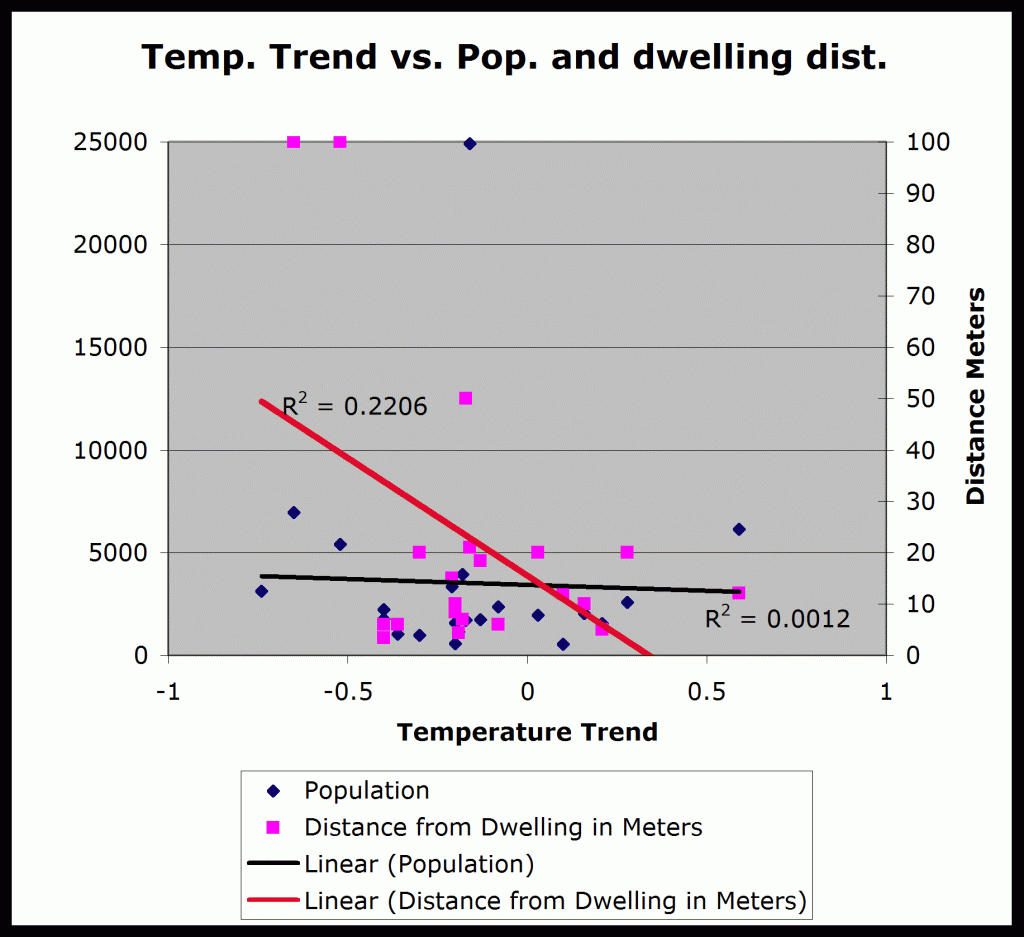
But perhaps it isn’t the surrounding population that counts, but simply the closest heated dwelling. To test that hypothesis, this author researched each station at the SurfaceStations.org website, and found the distance from each measurement sensor (MMS) to the nearest heated building. For some it was necessary to go to Google maps using the latitude and longitude along with other clues, to find the information. For others it was necessary to estimate the distance from photographs. This information was then plotted in Figure 1.
Figure 1. This is a plot of the temperature trends for 22 mid-western U. S. stations versus town population (black) , and distance from the measuring instrument to the nearest heated building (pink and red), usually a residence.
As can be seen on the plot, town population made almost no difference to the trend. The dots are nearly completely random with respect to population. On the other hand, the distance from a heated dwelling made a much larger difference. The two coolest sites were more than 100 meters from the nearest building. Within the population limits of this study, the Urban Warming Influence is simply the distance to the nearest heated building, not the size of the city.
This phenomenon is the reason for much of the Arctic warming. Urban Warming in the Arctic, and indeed in the Antarctic, is an occupied-building-to-temperature-sensor distance problem. In the polar regions, the temperature differential between occupied buildings and the outdoor temperature sensors is much greater than in the temperate mid-west U. S., so the distance must be greater to avoid the UWI problem. But man doesn’t like digging long cable trenches in ice or permafrost (it’s like concrete!), or walking long distances in –40° weather, so the measurements are not done properly.
It is clear to this author that measured “Global Warming” is simply due to increasing nearby energy use and the temperature sensor proximity to the resulting heat. Of course if we all reduce our “carbon footprint”, this reduced energy use will surely slow “Global Warming”; but it will not be because CO2 emission is reduced, and it will result in all of us freezing.





Dear Ed,
The range you give from 0.76°C to 0.59°C applies at slopes over 66-years time series with auto-correlation. I do not know what the error distribution is and therefore cannot say whether it is large. Do you know of any study in which stations got a quality measure? If I had them for the 13486 stations in the GHCN base, I could compute global time series for three quality types, say. That is also done in meta-analysis, in which general results are compared for studies with different quality measures. It would be interesting to find that global warming only occurs in the low-quality set. You have good arguments that it must be the case, but your idea can be tested.
There is no siting quality study done for GHCN stations, and it is difficult to do because metadata for GHCN stations is nearly non-existent. The lat-lon values for stations in the GHCN database is coarse (1/100th’s of a degree) and thus is nearly useless for locating the stations visually via Google Earth and other mapping tools.
What Ed has demonstrated, albeit with a small sample, is something I’ve theorized about for quite some time, that Arctic stations, being warm pockets of humanity, unduly influence temperature readings due to waste heat. I believe this is why the GISS maps of global temperature show a perennial hot spot in the Arctic latitudes.
Here is a study, but it doesn’t have a complete list.
http://wattsupwiththat.files.wordpress.com/2009/05/surfacestationsreport_spring09.pdf
But you can clearly see the state of the problem.
Ed I’ll be contacting you when I get home – some other ideas to bandy about.
Why do I get the feeling my best guest-writer is about to get poached? 🙂
No chance. Anthony can re-post if he wants. With your permission, of course.
It’s great when you contribute here, but don’t let me keep you from reaching bigger things. Some of the most read stories here were written by you (A Light In Siberia, One of Our Hemispheres is Missing, etc). As far as reposting, he’s (other bloggers need permission) more than welcome.
Thank you Ed, this is very interesting work. I look forward to reading further posts on this.
I am glad to see reference to Anthony’s earlier work is being followed up.
Best wishes for the New Year
Thanks, gentlemen. As I have the lat-lon values of all stations, socio-economic indices may also be used for a crude classification. I’m thinking about it. Via this link the indices can be found
http://www.uoguelph.ca/~rmckitri/research/jgr07/jgr07.html
A couple of things strike me about this.
One is that the data contains a couple of serious outliers. The remaining points don’t seem to lie on the same straight line at all. So maybe the significant result is just an artifact of a couple of odd results.
The second is, what is the mechanism that explains warming by proximity to dwellings? It can’t be imagined that over time they move the the thermometer closer to the house. Or do the householders get more prosperous and turn the thermostat up?
Or is it, as is quite likely, that I’ve missed something?
Actually, Rich, it’s both of those things. We are talking of a time span of 66 years. During that interval, the instrumentation changed from Stevenson Screens with Min-Max thermometers to electronic MMS sensors cabled to the nearest house. Most were moved closer at that time. The energy use also increased. People no longer wear long-johns in the winter, and the use of air conditioning in the summer has greatly increased.
The outliers are just egregious examples of the above.
Well that makes sense. Thanks.
Journal, pencil and multiple walks during a day to the instruments housed within the screen located in the middle of the field seems to have gone out of style. Automated weather stations linked to computers are all very fashionable and quite logical but the darn cables between computer and instruments are too short!
The Unified Theory of Climate
http://wattsupwiththat.com/2011/12/29/unified-theory-of-climate/#comment-846549
Now this scientific report will shove the UN IPCC Climate Change doctrine out of the window for good.
How do you determine that the buildings in your sample are heated and how do you determine that those buildings are emitting heat ? How does your study of the 22 mid-west stations support your claim about the polar regions ?
The buildings are mostly private homes. People like to be warm in winter and cool in summer. If they heat their homes, the homes emit heat. If they cool them in the summer, the air conditioning condensers emit heat. The same things happen in the arctic, amplified by the difference between inside and outside temperatures. One example: at Alert in northern Canada, there is a steam heated sewer outfall line 50 feet from the thermometers.