NoTricksZone reader Indomitable Snowman, a scientist who wishes to remain anonymous, has submitted an analysis of June temperature in Germany measured by the DWD German Weather Service.
==========================================
German June Temperature Data – Statistical Analysis
By: The Indomitable Snowman
Recently, Pierre posted an article that included temperature data for the month of June in Germany. By inspection the sequential plot of the data appeared to show no long-term trend of any sort. However, more insight can be gained via quantitative statistical analysis.
Statistical Results
Using the tabulated data (graciously provided by Josef Kowatsch) for the sequential years 1930 – 2015 (86 data points in total), it is readily found that the mean value of the data set is 15.7, while the standard deviation is 1.20.
Trend Chart
Using the data points and the above information, it is a simple task to construct a “trend chart” – in which the data points are plotted, but with the inclusion of horizontal lines for the mean value, +/- one standard deviation, and +/- three standard deviations:
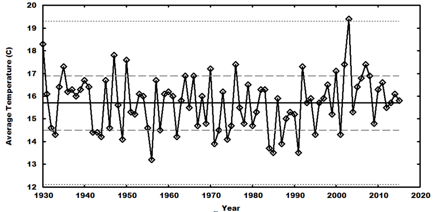
The trend chart clearly shows that the “system” is statistically well-behaved, with the points clustering close to the +/- one-standard-deviation band – indicating that there is no secular change in the underlying system over the time span, and that the variability about the mean can be solely attributed to statistical fluctuations. (It is also a well-known problem that when such a stable system is sequentially sampled, apparent-but-phantom “trends” will seem to appear; these can be seen in the plot, but they are not meaningful – they are artifacts of the sequential sampling.)
Histogram
The proper way to group the data in such a system is grouping by standard deviations – something that is best-presented in a simple histogram:
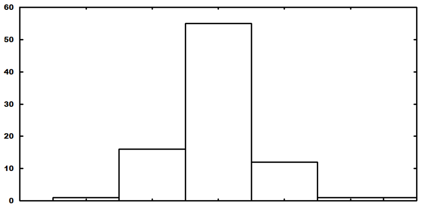
The center bar is the number of occurrences within one standard deviation of the mean, while the other bars (moving outward) show the number of occurrences from one to two standard deviations (plus and minus), etc. Even though the number of data points is relatively small for the emergence of complete statistical behavior (i.e., the system is undersampled), a Gaussian profile (expected of a system that has a stable mean and statistical fluctuations about that mean) is clearly discernable.
Further, simple Gaussian statistics would predict the following number of occurrences for a Gaussian system with 86 data points – 54 within one standard deviation of the mean, 30 between one and two standard deviations, and 2 beyond two standard deviations. The actual numbers from the data are 55, 28, and 3 – remarkably close to the simple Gaussian expectations, even though the system has been undersampled.
Conclusion
Statistical analysis of the data indicates that the system in question has been stable over the entirety of the sampling period (1930 – 2015) and is not changing. In particular, the system, even though undersampled, produces results that are in almost exact agreement with expected results for a system that is stable around a central mean – with the variability between individual samples being entirely attributable to simple statistical variability.


Again: this is a statistical artefact produced by the choice of starting year:
http://www.dwd.de/DWD/klima/national/gebietsmittel/brdras_ttt_06_de.jpg
Why not add an indicator of the correlation value?
Still does not change fact everything has been stable over past 85 years.
“sod” thinks the horizontal line through the middle of the data is a time-trend line, which can be affected by the choice of starting year. But it is not a trend line, it is just a horizontal line at the mean value of all the points, 15.7. One can express “Indomitable Snowman’s” point by saying, “look, the mean value (an unchanging value for the data set, since it has nothing to do with time) looks like a proper time-trend line for the data; and further, the distribution of values above and below that line follow the Gaussian, or ‘normal’, distribution produced by random variation (of the temperature, in this case) about a stable mean value.”
What “Indomitable Snowman” has in fact done is what I do as a matter of course for a graph like the above, and I do it basically by eyeballing first, without even calculating the precise mean. An experienced data analyst knows 68% of the points in a “normal” distribution lie within one standard deviation, 95% within two standard deviations (and of course, 50% lie above the mean and 50% below). With such an easy graph as the above, one can eyeball both the mean and the one s.d. region (for the latter, 1/6th of the 86 points–14.33, say 14 or 15–should be above the 1 s.d. level, 1/6th below, so it’s not hard to estimate the 1 s.d. lines, first by counting the 14 or 15 highest points and imagining a line separating them from all the other points, then do the same with the same number of lowest points; it’s just a matter of making sure the + and – 1 s.d. lines estimated in this way are equidistant from the mean). That is just the way a data analyst knows right away, just by “eyeballing”, if the data is showing random variation around a stable mean. Then for fun, you can confirm your estimation by doing what “Indomitable Snowman” did–calculating the mean and standard deviation, and comparing with your eyeball estimates. And then, for fun or for doubters like “sod”, you can do an OLS regression of temps vs. time, and confirm that the time-trend line is indeed basically unchanging, at the mean value of the points.
I have in fact tried to commend this simple technique to those debating on the climate blogs, in order to cure them of their reverence for more arcane “statistical analysis”, of the kind done for example by Steven McIntyre at ClimateAudit, in what I consider over-reaction to the climate scientists who make up their own analysis methods to “tease out the signal of human-caused climate change” (as Michale Mann recently advised the Democratic Party Platform Drafting Committee). I try to advise everyone to keep it simple, and that, I have found, is best with regard to climate science, because ALL of it is bad and easily disproved, without need for intimidating those uneducated in basic statistics, much less high-flown “statistical methods” (ooh, scary! As Bob the glob would say**, I think I just scared myself).
**in the movie “Monsters Vs. Aliens”
Agree, Harry. You can see with the naked eye that the temperatures do not increase. What you say about Steve, is also true but he has done important work. I do not understand why he did not (as far as I know) a survival analysis of the surface station record. It is rather simple: is the dropout of stations random? I have found differences between stayers and dropouts at twenty sigma. Over eighty percent of the stations dropped finally out, not randomly but on the basis of the correlation between their time series and regional series. If you would do this with subjects in medical research, your result would not be published in a third-rank journal. That is the reason why Snowman does not find a trend in sound data, and why the satellite record deviates from the surface record. And the bitter fun is that Mann decided to do his Nature trick, after finding that his proxies deviated too much from the surface record. Therefore, he took the most rotten part of it and glued it to his proxy data. The creator of Piltdown Man was more clever when he merged two skulls of related primates. Here we are as homo sapiens.
sod has problems with simple arithmetic let alone statistics.
“Still does not change fact everything has been stable over past 85 years.”
Sorry, but that is a false interpretation of data.
If i cherrypick a time period to get a certain result, i get no information about what is really happening.
For example a 10 year period can easily produce a cooling trend in RSS data:
http://www.woodfortrees.org/plot/rss/from:1998/to:2008/plot/rss/from:1998/to:2008/trend
the long term trend in temperature in certain german states is obviously upwards:
http://www.dwd.de/DWD/klima/national/gebietsmittel/brdras_ttt_06_bw.jpg
if you start in the 20s (100 years) or in the 80s (30 years), so both time periods would make a lot of sense, you will get a much more extreme result.
so this is an attempt to ignore the facts.
No, the one who is “ignoring the facts” here is you – because you are clearly illiterate, are unwilling (or unable) to understand what was written, and again lack even the ability to grasp that your pre-programmed talking points are not even applicable in this case.
And you still are unable to grasp that the horizontal line in the first plot is simply the computed mean, and not a trend line!
This is all really simple. There was no cherry-picking – that is a fact. A dataset was provided, and all of the points were included in the analysis. The statistical analysis (via known methods for addressing problems like this one) clearly shows that the system is stable over the time interval in question. The required cross-check – regarding the meaningfulness of the statistical results – was performed, and it was demonstrated that the number of datapoints in the set is sufficient to provide statistical behavior and justify the statistical nature of the analytical results.
As usual, you offer no specific critique of the material presented. You just spew (irrelevant) talking points, complain that the results don’t agree with the junk science that you want to believe (for ideological rather than scientific reasons), and cite the junk science results via link dumps.
Real scientists and real engineers find the green cultists loathsome because the cultists are trying to take two of the most successful enterprises in human history (science for understanding, engineering for making things that actually work) and turn them – Stark-Lysenko style – into streetwalkers for their perverse and dangerous ideological cult(s). The only reason that this sort of nonsense is able to persist is because the margin for error that has been available (and which continues to be maintained by the diligent and the competent) has been so large that the system has been able to function-and-provide in spite of the vandalism being done to it by the cultists. But if the cultists keep at it, at some point the lights will go out, water won’t come out of the taps, and there won’t be food on the shelves. At that point, don’t expect any sympathy or kindness from those of us who produce more than we consume.
” The statistical analysis (via known methods for addressing problems like this one) clearly shows that the system is stable over the time interval in question.”
can you explain to me, how your analysis here supports this conclusion?
How would an “unstable” dataset look in your analysis? can you give an example of an “unstable” dataset?
Go read some books on basic statistics. Your never-ending insistence on being an invincible ignoramus is your problem, not mine.
“Go read some books on basic statistics. ”
I would love to do that.
Which textbook will explain to me, how your analysis supports the headline of this post: “Statistical Analysis Shows Germany’s June Mean Temperatures Completely Stable”
Go to a library and find your own books – there are plenty of them on the shelves.
If you actually understood statistics, you would understand that the analysis in the article provides the conclusion. If you don’t understand that, you need to go elevate your game.
“a statistical artefact produced by the choice of starting year:” – sod in denial
LOL – like the bozos at DMI calling data for 19 years a “climate mean?”
Get back to your military training, son.
P.S. – What “starting year” would you recommend, seeing as how the choice of it will ALWAYS affect whether you have a warming or cooling trend.
Is it warming, or cooling? “IT DEPENDS”
https://youtu.be/FOLkze-9GcI?t=157
“P.S. – What “starting year” would you recommend, seeing as how the choice of it will ALWAYS affect whether you have a warming or cooling trend.”
I would suggest to start a trend in EVERY year. and then look at a trend among trends.
on a global scale, you see this being done here:
https://moyhu.blogspot.de/p/temperature-trend-viewer.html
I would also avoid the technique of ” let us look at the longest period with no (or a negative) trend. This methodology is utter garbage, the result is predetermined by the method!
“I would suggest to start a trend in EVERY year. and then look at a trend among trends.” – sod the ignoramus
Let’s not stop there? How about EVERY month? or EVERY day? or EVERY hour?
Averaging the averages? What a brilliant idea, NOT!!!
“let’s not stop there? How about EVERY month? or EVERY day? or EVERY hour?”
this would not change the result by much, as the additional data points also add variability. The annual trend would rarely be changed by dropping single months. If that happens, it would pretty clearly show, that the trend was an artefact. ((for example a trend starting in January of a year being negative, while the trend starting in February is positive. such a trend would be pure garbage)
“Averaging the averages? What a brilliant idea, NOT!!!”
I am sorry, but this is how statistical analysis is being done. You will want to check, whether the trend you get is mostly based on your choice of starting year. And a very simple check is to look at the trends for a couple of different starting years. (and the average of those trend numbers would give you some information about the real trend).
You really hate science, don t you?
PS: Graphs like this one are a much better solution, but most people will struggle to read them:
https://moyhu.blogspot.de/p/temperature-trend-viewer.html
“‘Averaging the averages? What a brilliant idea, NOT!!!’
I am sorry, but this is how statistical analysis is being done.” – sod the incorrigible
You never cease to amuse.
Employees of the Salvation Army are usually called soldiers, Yonason. I have posted an answer to your question below, but it still may reside in Pierre’s waiting room.
@ Mindert Eiting
I’ll keep an eye out for your other post, Mindert. Thanks.
Did you wish to go back further, sod? Maybe all the way back to the 1850s when the Earth was lifting out of the Little Ice Age (which your side denies existed a la the hockey stick)? I suppose that Could look like a trend if one IGNORES the LIA….
What starting year do you prefer to use, sod? And why have you chosen that particular year?
Good grief, you never cease to amaze. You lack the candlepower to even know when the canned talking-points that you get from the support-group sites are not even APPLICABLE.
Go ponder this. It’s good advice for you.
http://quotes.lifehack.org/media/quotes/quote-Mark-Twain-it-is-better-to-keep-your-mouth-100592.png
As Pierre already pointed out, the results can’t be “an artifact” since they are just numbers. The only question is if 86 data points are enough for underlying statistical behavior to appear. The only surprise on that count is how statistical the behavior actually is, given only 86 data points. For the period 1930 – 2015, the system is stable – and (get this) adding more points from the past would not change that conclusion – even if 1880 – 1930 showed a trend, that trend would disappear after 1930… which is the opposite of what the cult narrative keeps trying to claim.
And if the data from 1880 – 1930 were to be included, it’s very likely (judging by the plot) that the results would remain the same.
But since you provided the plot, let’s discuss one more artifact – the 30-year running mean. In a completely-definable Gaussian system, a 30-unit-running mean of the sampling will regularly wend its way back and forth between +/- one standard deviation. As the standard deviation in this system is 1.2, it’s obvious that the blue line for the 30-year running mean remains well within that constraint – indicating that 30-year running mean is responding to statistical noise, not a systematic shift in the nature of the underlying system.
” For the period 1930 – 2015, the system is stable – and (get this) adding more points from the past would not change that conclusion – even if 1880 – 1930 showed a trend, that trend would disappear after 1930…”
sorry, but this interpretation is simply wrong. In most datasets, you will get different trend directions, if you change the starting year.
For example the last 4 data points should give an obvious positive trend, while a start in the midst of the 2000s should be negative and one in the mid 80s would be positive again.
https://notrickszone.com/wp-content/uploads/2016/07/Snowman_1-768×375.png
That is, why you would do multiple trends for different starting dates, why you should chose standard starting years (for example over the whole data set, or the best known period of 30 years) and why you should add correlation numbers (these should indicate, when you produce an artefact caused by choice of starting year)
As I said above, you are an invincible ignoramus who knows nothing, fails to even properly comprehend what is written, and in this case still fails to grasp that the horizontal line in the plot is A SINGLE COMPUTED NUMBER and not a trend line.
“For example the last 4 data points should give an obvious positive trend, while a start in the midst of the 2000s should be negative and one in the mid 80s would be positive again.”
This is just flat-out wrong, and if you actually understood anything about basic statistics (and were not chemically-resistant to learning something about the topic) you would know that. When a stable, statistical system is sampled sequentially, the sequentially-collected data will throw up phantom “trends” that are not real. As I’ve tried to explain to you multiple times, this is a well-known behavior and a well-known meaningless artifact in such situations. If you think you are finding trends, you are in the same class as those loonies who were sure that they could detect “messages” in the snow of empty TV channels.
“This is just flat-out wrong, and if you actually understood anything about basic statistics (and were not chemically-resistant to learning something about the topic) you would know that. When a stable, statistical system is sampled sequentially, the sequentially-collected data will throw up phantom “trends” that are not real.”
What is a “stable statistical system”?
You cannot find trends, without looking at trends. your statistical analysis does not tell us anything about trends. But trends are the only relevant thing here.
I am well aware of fake short term trends. I keep linking the graph that shows how this works:
https://moyhu.blogspot.de/p/temperature-trend-viewer.html?Xxdat=%5B0,3,0,12,1353%5D
But the trends on the right side of the graph (those ending in 2016) are pretty stable (this is the global level though).
So you need to look at the same type of analysis for Germany, if you want to know anything about trends.
Your box plot will not tell you anything that is relevant.
You flat-out admitted that you don’t understand statistics. Then you complain that you don’t understand the article.
Everything you assert here is factually incorrect. You admit that you do not understand statistics yet insist that the analysis is wrong. This makes no sense. Period.
You keep baying at the moon. The variability in the data is entirely due to statistical noise. Trying to fool yourself into believing otherwise is delusion.
Grasping at straws again?
Reply to SOD’s first comment
Thanks for the effort but your analysis is not relevant for the question. Do the following: take the June means and order them as to size, the lowest at the beginning and the highest at the end. You make now a mess of the time order but you will see an impressive trend. Nothing changed with respect to the numbers and you will get the same mean, standard deviation, and histogram. For the evaluation of the trend with a proper time ordering you have to use the temporal information as is done in regression analysis. By the way, temperature data are usually not normally distributed but have a long left tail.
“…temperature data are usually not normally distributed but have a long left tail.” – Mindert Eithing
Isn’t that hinted at with the bar to the left of center being slightly higher than the one to the right?
BTW, not doubting you at all when I ask if you have any refs for how it’s normally done. I would like to see something on that, so I could have a better understanding of it.
Thanks.
I have analyzed some years ago GHCN data from thousands of stations since the eighteenth century. Both in space and time temperatures are not normally distributed. Low outliers are more common than high outliers, e.g. minus seventy on Antarctica but never plus hundred somewhere (both 85 from a mean of 15). The issue is obvious. Distributions resemble a bit the binomial with a mean below the median. So you get a long left tail with many low bars and a few high bars at the right. I do not know whether these basic statistics are reported somewhere. There is an interesting problem connected with this phenomenon, that in skewed distributions mean and variance are dependent (binomial: np and np(1-p)). The WMO has reduced the variance by dropping many deviating stations and it would be a miracle if this did not influence the mean, which is the basis of all alarmism.
Good get – it can actually be very strongly argued that the distribution in this sort of system should be binomial rather than Gaussian.
But given the ease of use, we can use the simple Gaussian system as a template – and get a lot of insight from it. As per this little hack analysis, the results are surprisingly Gaussian. And as it is quite easy to postulate a simple Gaussian system and generate the sorts of results it would produce, this provides a suitable “null hypothesis” against which measured data can be compared.
If you make a plot of measured temperature data and a simulation of that data based on a purely Gaussian system… you can’t tell which is which by inspection!
“…and it would be a miracle if this did not influence the mean, which is the basis of all alarmism.” – Mindert Eiting
Yes. And I can’t believe that they don’t know that. It’s almost as if it’s deliberate. 🙂
Mindert, thanks for your comment since I know that you’re not just some talking-points-blabbering cultist like someone else I could mention.
I disagree though – this analysis is very useful for box-bounding the problem and its underlying nature. These are very-well-defined statistical techniques and they provide a great deal of insight. Without going into detail, it is what it is.
The main message is that you can’t come to grips at all with a system of this sort unless you include analysis that involves the standard deviations inherent in the system. Trying to pin down “behavior” that amounts to claiming the ability to find things that are much smaller in magnitude than one standard deviation is basically untenable. If you’re so inclined, you can easily set up completely random systems and compare the “data” they produce with measured data from real systems – even two independent random numbers are sufficient to make a good start, and in signal processing the methodologies involve twelve independent random numbers.
The cultists don’t realize how silly their attempts to pin down such small things are – they can’t find signals of the tiny magnitudes that they claim (relative to the standard deviation) when the amount of statistical noise is much larger. Back in the days of analog over-the-air television signals and hand-turned mechanical tuners, when you turned to a channel that was empty in your area, you’d get a screen full of snow and a hissing noise in the sound – basically, white noise (both visual and auditory). But there were always a few loonie-tunes around who claimed that if you sat there late at night and stared at a snowy screen long enough, you could actually find the “messages” that were in there. The cultists are basically in the same position now with the quantitative claims that they make.
“you can’t come to grips at all with a system of this sort unless you include analysis that involves the standard deviations inherent in the system.” – The Indomitable Snowman, Ph.D.
What’s the stdev of this?
https://enthusiasmscepticismscience.files.wordpress.com/2010/05/slgrotchafterlindzen.jpg?w=517&h=250
Lindzen uses that data from Grotch to show what the data look like before as well as after it’s reduced to what the warmists want. When all the data are before us, what’s really scary is what they’ve done to the raw data, because, as you say “…the amount of statistical noise is much larger” (than the signal).
Mindert, thanks for your comment since I know that you’re not just some talking-points-blabbering cultist like someone else I could mention.
I disagree though – this analysis is very useful for box-bounding the problem and its underlying nature. These are very-well-defined statistical techniques and they provide a great deal of insight. Without going into detail, it is what it is.
The main message is that you can’t come to grips at all with a system of this sort unless you include analysis that involves the standard deviations inherent in the system. Trying to pin down “behavior” that amounts to claiming the ability to find things that are much smaller in magnitude than one standard deviation is basically untenable. If you’re so inclined, you can easily set up completely random systems and compare the “data” they produce with measured data from real systems – even two independent random numbers are sufficient to make a good start, and in signal processing the methodologies involve twelve independent random numbers.
The cultists don’t realize how silly their attempts to pin down such small things are – they can’t find signals of the tiny magnitudes that they claim (relative to the standard deviation) when the amount of statistical noise is much larger. Back in the days of analog over-the-air television signals and hand-turned mechanical tuners, when you turned to a channel that was empty in your area, you’d get a screen full of snow and a hissing noise in the sound – basically, white noise (both visual and auditory). But there were always a few loonie-tunes around who claimed that if you sat there late at night and stared at a snowy screen long enough, you could actually find the “messages” that were in there. The cultists are basically in the same position now with the quantitative claims that they make.
I make your point (about “teasing the data…” to find a non-existent signal) with specific reference to Michael Mann, in my comment above and in my own blog post 2 days ago, “What Incompetent Climate Science Has Wrought…”.
[…] http://Statistical Analysis Shows Germany’s June Mean Temperatures Completely Stable – See m… […]
What I find most interesting about this whole discussion is that the Indomitable Snowman is unwilling to reveal his name. One suspects he is in a position where straying from the Global Warming manta is forbidden by political correctness. What a shame, I post under my own name. I am immune to political correctness. And proud of it.
The Navahoe Code Talkers had to be kept secret, and probably for the exact same reasons.
I wouldn’t want him to “out” himself and lose his job, or whatever they may be able to do to him. They don’t play fair, so I see no reason that those of us who can be hurt by them should, either.