Stefan Rahmstorf caught redhanded manipulating temperature charts
By Michael Krueger
(Text translated/edited by P. Gosselin)

Three days ago, climate researcher Stefan Rahmstorf published an article at his KlimaLounge blog on the hearing of Jewish climate scientist Nir Shaviv in the German Bundestag concerning the Climate Change Conference in Katowice.
Accuses Shaviv of presenting “outlandish theories”
There he describes Shaviv as a “climate skeptic” with outlandish theories and who is courted by the fossil lobby and AfD Party. During the hearing, the German Left party even accused Shaviv of obviously being paid to publish climate-denialism. Stefan Rahmstorf went even further, claiming, “This is a targeted misleading of the layperson audience”.
Just who is misleading whom, I would like to pursue here.
The conflict between Jewish climate scientist Nir Shaviv and Stefan Rahmstorf dates back to 2003, when Stefan Rahmstorf wrote the following e-mail to his colleagues:
I feel another recent paper may require a similar scientific response, the one by Shaviv & Veizer (attached). …This paper got big media coverage here in Germany and I guess it is set to become a climate skeptics classic: …”
Since then, Shaviv has fallen out of favor with Stefan Rahmstorf.
Dissenters get labelled as right wingers
In the comment area of Mr. Rahmstorf’s article, some commentators — who were immediately labelled by other commenters as right wing spectrum — criticized that NASA’s temperature curve in Figure 5 was truncated in 2016, exactly when the last El-Nino pushed up the global temperature. Mr. Rahmstorf vehemently rejected the criticism.
In the article Mr. Rahmstorf refers to a link on how to create your own widget according to Figure 5, here the link. There the year 2017 is included and the curve is not cut off at 2016. Between 2016 and 2017 the global temperature dropped by 0.1°C, and in 2018 by a further 0.1°C.
Hide the decline
In the year 2016 we were at +1°C temperature anomaly according to NASA (a new record!), but today in the year 2018 only at 0.8°C. Mr. Rahmstorf obviously wanted to hide this by cleverly truncating at 2016, probably with the hope his lay public would not notice it?
Mr. Rahmstorf first showed the following Figure 5 in the article, which was truncated at 2016:
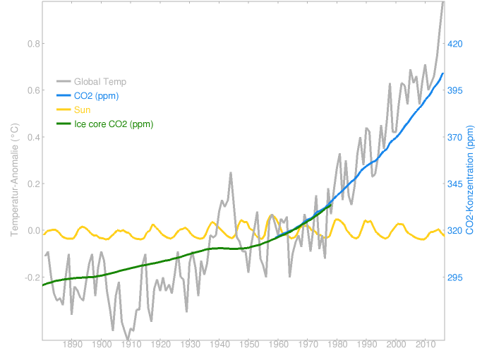
When the “deception” was discovered, he quickly changed Figure 5, without comment, and recorded the year 2017. Now the chart looks like this:
The year 2018 is still missing, which is currently only 0.8°C above the mean just before the end of the year, i.e. 0.1°C lower than 2017.
Poor correlation
With the chart he also tries to give the impression that there is a close relationship between CO2 rise and temperature rise. If one looks at the correlation coefficients, i.e. whether there is a linear relationship between CO2 and temperature rise, one can immediately see that between 1880-1970/80 there is only a moderate correlation between CO2 and temperature. It is around 0.6. A value of zero means no correlation, 1 means a perfect correlation. Only between 1980 and today does the correlation increase to around 0.9.
Thus one can say that actually only since 1980 does a good correlation exist.
To be correct, it has to be taken into account that other climatic factors also contribute to the rise in temperature and not just CO2 alone. In addition, in the recent geological past (around the last 1 million years), as evidenced by ice cores in the Antarctic and Arctic, it is always the temperature that has risen and then followed by CO2.
So it may well be that even today the temperature increase precedes the CO2 increase and the CO2 increase is partly due to temperature, e.g. because less CO2 can be stored in warm seas. (Half of the CO2 remains in the air, the other half goes into the ocean).
Natural factors kept hidden
Of course, Mr. Rahmstorf does not mention this in his article, in the belief nobody would notice. Or in other words, it’s about “deliberately misleading the lay audience”, and here not by Mr. Shaviv.
Mr. Rahmstorf’s supporters in the comments section obviously do not care whether Mr. Rahmstorf uses the methods which he accuses others of using. It is about deliberately discrediting others who have a different opinion and not of having a debate at factual level. The climate activists consider themselves scientifically and politically legitimized to force their policy on the opponents of opinion, and to do so by using smearing and violence if necessary. Sometimes a Jewish scientist gets placed in the “right-wing corner” and persons with a different opinion placed with the right wing AfD. The ends justify the means.
More misleading claims by Rahmstorf
In the following I would like to briefly go into further “deceptions” in Mr. Rahmstorf’s article. He writes:
30 years ago, in 1988, the American climate researcher James Hansen famously declared in the US Senate that the long predicted warming was now there and recognizable in the data.”
But Hansen was completely wrong with his 1988 scenarios, as we know today. See the following figure:

Furthermore ,Stefan Rahmstorf defends the hockey stick curve of his friend Michael Mann from 1998/99.
Busted hockey stick chart
Recent reconstructions would still show the same result. It should be noted that Mann’s 1998/99 hockey stick was truncated in 1980 because the proxy data showed no increase at the end of the time series. His colleague Briffa even truncated the chart in 1960. Used in place of the proxy data were weather data/temperatures from weather stations showing much larger rises than the proxy data averaged.
What follows is the the Briffa version where the proxy data are cut off at 1960 and replaced by data from weather stations and with the proxy data (green) up until the present.

The same was done with the more recent “reconstructions” mentioned by Mr. Rahmstorf.
When Mr. Rahmstorf was asked, he replied, claiming “these are well-known ‘talking points’ of the ‘climate sceptics’, and almost everything is wrong or misleading.”
Original article in German at Science Skeptical here.


A more properly graphed relationship of CO2 and temperature shows nothing of the sort.
CO2’s Impact On Global Temperature Trends: Minimal To Non-Existent, Per IPCC’s Gold-Standard
https://www.c3headlines.com/2014/10/co2-impact-global-temperature-trends-minimal-to-non-existent-ipcc-gold-standard-those-stubborn-facts.html
Here’s another analysis that doesn’t help their case, showing temperature change “acceleration” decreasing with increasing CO2!
https://www.c3headlines.com/2015/04/uk-metoffice-dangerius-accelerated-global-warming-co2-those-stubborn-facts.html
Their own data show that they are wrong, yet they not only refuse to see it, but deliberately present tampered data as best they can in order to obscure that fact.
Would that Nir Shaviv in the German Bundestag concerning the Climate Change Conference in Katowice https://www.youtube.com/watch?v=Re3lzLlTOyQ
??
Here’s Shaviv’s statement on it.
https://www.bundestag.de/blob/580504/2b96f368c0a785e5e4a09bb1d9797449/19-16-143_fachgespraech_cop24_prof_nir_shaviv-data.pdf
I meant to add this to my last comment to you.
https://www.youtube.com/watch?v=G4wov0kc3yg
Now I realize why Temps correlate so well with TSI, even though TSI is too weak to be the cause. It’s because TSI is just a very good proxy for how the sun is really affecting temps. Puzzled by that no longer, I am. D’Oh!
Yonason,
Excellent video, should be seen by more people.
However as Professor William Briggs says here — https://youtu.be/yAW7EgVHrDk — that it’s a very hard task going against the very belief system people have become comfortable with. It rubs against what they ‘believe’, what they have (irrationally) allowed to become part of their psychological make-up.
Yonason,
I see the non-skeptical true believer offers you yet more empty sophistry and bunkum.
For some ridiculous reason we all have to believe in some spurious correlation of atmospheric CO2 levels being the main driver of climate change when most physical evidence (of the climate changing) shows no such thing. Then wonders why people are skeptical of the IPCC’s irrational arguments.
What’s the correlation between Arctic amplification and human CO2 emissions?
https://notrickszone.com/wp-content/uploads/2018/04/CO2-Emissions-and-Greenland-Ice-Sheet.jpg
–
https://notrickszone.com/wp-content/uploads/2018/04/CO2-Emissions-and-Arctic-Air.jpg
Since the relation is not a linear one, how can any such graph ever give that impression?
So it’s not a known talking point of skeptics? You guys seem to be personally offended when misleading data gets truncated. Do you really believe that the temperatures actually decreased like it’s visible in reconstructions? Does the deep concern that you are being lied to by the elite make you feel this way?
The reporting of the “correlation” is almost always (>97%) of the type: Pearson product moment correlation coefficient.
There are characteristics of the data that ought to be met to use this, and often they are not met, and no one checks.
However, assuming it is the Person ‘r’ that is used, the other interesting thing is the square of ‘r’, called the coefficient of determination.
R² gives the proportion of the variance (fluctuation) of one variable that is predictable from the other variable. It is a measure that allows us to determine how certain one can be in making predictions from a certain model/graph. [From MathBits dot com]
In the current post, an r of 0.6 is quoted.
So r-squared is 0.36. Saying this another way, 36% of the variance is how well the hypothesis works.
John F. Hultquist,
On the reporting of the “correlation” — a parody …
From https://papers.ssrn.com/sol3/papers.cfm?abstract_id=3144908
EXTRATERRESTRIAL FORCING OF SURFACE TEMPERATURE:
It is proposed that visitation by extraterrestrial spacecraft (UFO) alters the electromagnetic properties of the earth, its atmosphere, and its oceans and that these changes can cause global warming leading to climate change and thence to the catastrophic consequences of floods, droughts, severe storms, and sea level rise. An empirical test of this theory is presented with data for UFO sightings and surface temperature reconstructions for the study period 1910-2015. The results show strong evidence of proportionality between surface temperature and cumulative UFO sightings. We conclude that the observed warming since the Industrial Revolution are due to an electromagnetic perturbation of the climate system by UFO extraterrestrial spacecraft.
10 years earlier, Michael Crichton published this.
http://climaterealists.com/index.php?id=2097
I’m disappointed that Crichton didn’t appear in Munshi’s references in the PDF linked to by your source.
UPDATED
10 years15 earlier, Michael Crichton published this.https://www.heartland.org/_template-assets/documents/publications/16253.pdf
(SUPERSEDES THIS)
http://climaterealists.com/index.php?id=2097
I’m (STILL) disappointed that Crichton didn’t appear in Munshi’s references in the PDF linked to by your source.
(I couldn’t find audio of the talk, but will post it if I find it)
A lecture by Michael Crichton
“In past centuries, the greatest killer of women was fever following childbirth . One woman in six died of this fever. In 1795, Alexander Gordon of Aberdeen suggested that the fevers were infectious processes, and he was able to cure them. The consensus said no. In 1843, Oliver Wendell Holmes claimed puerperal fever was contagious, and presented compellng evidence. The consensus said no. In 1849, Semmelweiss demonstrated that sanitary techniques virtually eliminated puerperal fever in hospitals under his management. The consensus said he was a Jew, ignored him, and dismissed him from his post. There was in fact no agreement on puerperal fever until the start of the twentieth century. Thus the consensus took one hundred and twenty five years to arrive at the right conclusion despite the efforts of the prominent “skeptics” around the world, skeptics who were demeaned and ignored. And despite the constant ongoing deaths of women.”
“Probably every schoolchild notices that South America and Africa seem to fit together rather snugly, and Alfred Wegener proposed, in 1912, that the continents had in fact drifted apart. The consensus sneered at continental drift for fifty years. The theory was most vigorously denied by the great names of geology-until 1961, when it began to seem as if the sea floors were spreading. The result: it took the consensus fifty years to acknowledge what any schoolchild sees. And shall we go on? The examples can be multiplied endlessly.”
“Jenner and smallpox, Pasteur and germ theory. Saccharine, margarine, repressed memory, fiber and colon cancer, hormone replacement therapy……the list of consensus errors goes on and on.”
He left us with so many valuable observations into human nature, and the havoc that can be wreaked by small minded fools masquerading as leaders.
Most of us will be well aware that correlation does not necessarily imply causation. For example, the heights of my younger grandchildren show an excellent correlation with atmospheric carbon dioxide concentration. Any two variables that show a pronounced trend over time will always show some sort of correlation. There are various ways in which we can deal with this problem.
For example, we can see whether the “ticks”, i.e. the change from one year to the next still show a correlation. However, this will only work when the “ticks” are both upward and downward. Another way is to divide the time series into chunks and determine whether the rates of rise, (or fall), still correlate.
See, for example, my comment of 2 December 2018, which argued that CO2 only accounts for less than half of the warming that we have actually experienced :-
https://notrickszone.com/2018/12/01/new-university-of-exeter-study-finds-climate-models-skewed-overhype-co2-uncertainties-rigorously-concealed/#comment-1279954
Why is it your belief that CO2 even accounts for close to half of the warming we have experienced in the last few decades — considering there has never been a real-world physics accounting (i.e., measurements) for how much, if at all, increasing CO2 concentrations in volumes of parts per million affect water temperatures? Do you have real-world evidence that shows how influential CO2 is at heating or cooling water bodies when increased or decreased relative to, say, cloud cover variations?
Why do you believe there are no alternative-to-CO2 explanations for the temperature changes?
Cloud cover changes alone can explain the radiation budget changes — and the Greenland ice sheet melt and Arctic sea ice decline — since the late 1970s. Simply put, during 1979-2011 per satellite observation, there was a positive imbalance in the radiation budget of +2.7 W m-2 (+2.3 W m-2 absorbed) due to the reduction in low cloud cover. This allowed more solar radiation to be absorbed by the oceans, and this extra heat was transmitted to the atmosphere. Here are just a small sampling of the papers demonstrating this.
Herman et al., 2013
https://www.atmos-chem-phys.net/13/8505/2013/acp-13-8505-2013.html
“[T]here has been a global net decrease in 340 nm cloud plus aerosol reflectivity [1979-2011]. … Applying a 3.6% cloud reflectivity perturbation to the shortwave energy balance partitioning given by Trenberth et al. (2009) corresponds to an increase of 2.7 W m−2 of solar energy reaching the Earth’s surface and an increase of 1.4% or 2.3 W m−2 absorbed by the surface.”
—
Goode and Palle´, 2007
ftp://bbsoweb.bbso.njit.edu/pub/staff/pgoode/website/publications/Goode_Palle_2007_JASTP.pdf
“The decrease in the Earth’s reflectance [cloud cover] from 1984 to 2000 suggested by Fig. 4, translates into … an additional global shortwave forcing of 6.8 Wm2. To put that in perspective, the latest IPCC report (IPCC, 2001) argues for a 2.4 Wm2 increase in CO2 longwave forcing since 1850. The temporal variations in the albedo are closely associated with changes in the cloud cover.”
—
McLean, 2014
http://file.scirp.org/Html/22-4700327_50837.htm
“The reduction in total cloud cover of 6.8% [between 1984 – 2009] means that 5.4 Wm−2 (6.8% of 79) is no longer being reflected but acts instead as an extra forcing into the atmosphere … To put this [5.4 Wm-2 of solar radiative forcing via cloud cover reduction between 1984-2009] into context, the IPCC Fifth Assessment Report…states that the total anthropogenic radiative forcing for 2011 relative to 1750 is 2.29 Wm−2 for all greenhouse gases and for carbon dioxide alone is 1.68 Wm−2. The increase in radiative forcing caused by the reduction in total cloud cover over 10 years is therefore more than double the IPCC’s estimated radiative forcing for all greenhouse gases and more than three times greater than the forcing by carbon dioxide alone [from 1750 to present]. … According to the energy balance described by Trenberth et al. (2009), the reduction in total cloud cover accounts for the increase in temperature since 1987, leaving little, if any, of the temperature change to be attributed to other forcings.”
—
Kay et al., 2008
https://agupubs.onlinelibrary.wiley.com/doi/10.1029/2008GL033451
“Reduced cloudiness and enhanced downwelling radiation are associated with the unprecedented 2007 Arctic sea ice loss. Over the Western Arctic Ocean, total summertime cloud cover estimated from spaceborne radar and lidar data decreased by 16% from 2006 to 2007. The clearer skies led to downwelling shortwave (longwave) radiative fluxes increases of +32 Wm−2 (−4 Wm−2) from 2006 to 2007. Over three months, simple calculations show that these radiation differences alone could enhance surface ice melt by 0.3 m, or warm the surface ocean by 2.4 K, which enhances basal ice melt. Increased air temperatures and decreased relative humidity associated with an anti‐cyclonic atmospheric circulation pattern explain the reduced cloudiness. Longer‐term observations show that the 2007 cloudiness is anomalous in the recent past, but is not unprecedented. Thus, in a warmer world with thinner ice, natural summertime circulation and cloud variability is an increasingly important control on sea ice extent minima.”
—
Hofer et al., 2017
http://advances.sciencemag.org/content/3/6/e1700584
https://eartharxiv.org/wrqb9/
Decreasing cloud cover drives the recent mass loss on the Greenland Ice Sheet … We show, using satellite data and climate model output, that the abrupt reduction in surface mass balance since about 1995 can be attributed largely to a coincident trend of decreasing summer cloud cover enhancing the melt-albedo feedback. Satellite observations show that, from 1995 to 2009, summer cloud cover decreased by 0.9 ± 0.3% per year. Model output indicates that the GrIS summer melt increases by 27 ± 13 gigatons (Gt) per percent reduction in summer cloud cover, principally because of the impact of increased shortwave radiation over the low albedo ablation zone.
As Tyler Vigan has shown correlations are a good starting point to find out what is happening in the world. However it is up to humans to separate spurious correlation from real evidence led correlations, something computer models can not do that — computers just number-crunch.
See https://youtu.be/g-g0ovHjQxs
It is just like the supposed link of CO2 levels rise causing increased global temperature rise is a spurious correlation. There is just about no observed evidence, (there’s no correlation over an extended time period, say the last 1000 years) that it is real. There is a much better (observed evidence led) correlation to show that the temperature of the planet drives CO2 levels.
To the real skeptic this lack of observed evidence led correlation(s) is the what kills the supposition that a rise in atmospheric CO2 levels causes global temperature rise. There is NO evidence!
Stefan Rahmstorf went even further, claiming, “This is a targeted misleading of the layperson audience”. “
This shows yet again, that those with the belief in the cAGW model are incapable of rational thought.
Rahmstorf just dismisses another Professor Nir Shaviv’s work without offering reasons why it is wrong, he ‘believes’ in the cAGW supposition and therefore is dismissed without proper research or analysis.
Stefan Rahmstorf is not acting as a scientist but as an emotional believer in the cult of cAGW, a cultist who attempts at every turn to further the cult’s message and the public’s indoctrination. He is the very embodiment of climate Lysenkoism ( see https://en.wikipedia.org/wiki/Lysenkoism ).
A conference lecture from Professor Nir Shaviv outlining the basics of how the sun modulates this planet’s weather and climate through it’s effects on clouds …
https://www.youtube.com/watch?v=p9gjU1T4XL4
Certainly is so much more convincing theory than the CO2 supposition as there is so much observed evidence.
Ex-NOAA Climate Scientist: ‘No Role Of CO2 In Any Significant Change Of The Earth’s Climate’ echoes about the same thing.
https://notrickszone.com/2018/04/05/ex-noaa-climate-scientist-no-role-of-co2-in-any-signi%EF%AC%81cant-change-of-the-earths-climate/
[…] https://notrickszone.com/2019/01/18/pik-scientist-rahmstorf-goes-after-hebrew-universitys-nir-shaviv-… […]
[…] https://notrickszone.com/2019/01/18/pik-scientist-rahmstorf-goes-after-hebrew-universitys-nir-shaviv-… […]
[…] PIK Scientist Rahmstorf Goes After Hebrew University’s Nir Shaviv …But Gets Caught Fudgi… […]
Michael, Pierre, excellent posting, thank you.
Rahmstorf’s chart (above), claiming to show that Earth’s average surface temperature is controlled by rising CO2 rather than by solar variations, is even more disingenuous than you’ve indicated.
Look at the tiny vertical scale (representing magnitude) of the sinuous yellow “Sun” curve. While this scale clearly shows the sun’s 11-year solar-magnetic-activity cycle, it obscures longer-term (multi-decadal) variations, notably the modern solar Grand Maximum (c.1937-2003). Moreover, the limited horizontal (time) scale, 1880-2018, necessarily fails to indicate that this is the ONLY Grand Maximum since the first millennium (the previous one occurred about 500AD according to fig. 2 of Usoskin et al. 2014 Astronomy & Astrophysics vol L10).
The modern Grand Maximum peaked in 1958 in terms of maximum group-sunspot-number (Hoyt & Schatten 1998 Solar Physics vol 181 fig. 3); or in 1980 in terms of solar magnetic output (e.g. Owens & Lockwood 2012 Journal of Geophysical Research vol 117 fig. 5 green, red and black curves); or in 1991 in terms of fewest cosmic rays reaching Earth (i.e. strongest ‘shielding’ by solar wind), e.g. see Oulu cosmic ray station, bottom chart here …
https://cosmicrays.oulu.fi
If one adds a 25-year lag to account for our vast ocean’s thermal inertia (incredibly ignored in IPCC’s models), solar output appears to correlate with Earth’s average temperature quite well. In particular, the 2016 peak temperature (e.g. see Rahmstorf’s MODIFIED chart, extended to 2018, above) becomes coincident with 1991’s two-month extreme cosmic-ray minimum (same Oulu chart).
Much of the above is summarised here …
https://www.researchgate.net/publication/329880738
https://www.researchgate.net/publication/330508733
The inevitable conclusion is that CO2 is largely if not entirely irrelevant. Instead, Earth’s multi-decadal surface-temperature variations are fully explicable by the sun’s inconstancy, via Svensmark’s breathtakingly elegant solar-magnetic/cosmic-ray/cloud link.
Note that solar magnetic output increased by a factor of 2.3 from 1901 to 1995 (i.e. more than doubled), and by 1.4 from the 1964 start of direct measurements (Lockwood et al. 1999 Nature vol 399 fig. 3). This 1.4-fold rise corresponds to the overall fall in cosmic rays in the same time period (same Oulu chart) and, lagged by 25 years, to Earth’s overall warming for the 25 years preceding the 2016 peak (e.g. Rahmstorf chart).
Predictably, Earth is now cooling, from the 2016 peak. Judging by the overall increase in cosmic rays from 1991, still in progress today (January 2019; Oulu chart), one can predict continued overall cooling (with minor warmings not reaching the 2016 peak value) until at least 2044 (i.e. 2019 plus 25-year lag).
Please keep up your great work.
Best regards from Roger (geologist, UK)