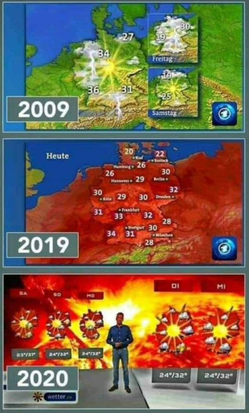
CORRECTION: The chart below is misleading. The ARD has not changed its color scheme. The chart for 2009 shows the 3-day forecast, whose color coding according to ARD in fact has not changed. The 2019 is the forecast chart for the day, and this 1-day chart uses a different color code for temperature. It too has not changed since 2009. The third chart, as already mentioned, is from another drama source: website: wetter.de. Hat-tip: reader Taylor Martin
=======================================
WARNING: Watching too much German public television will make you hysterical, and pretty stupid (if you’re already leaning in that direction)
Sometimes you really wonder: can people be fooled really so easily?
German ARD public television network apparently thinks so, and has since gone off the deep end with the hype, drama and disinformation they add to their reports. I guess they think it’s working.
At Facebook one person illustrated this very well by showing the evolution of weather charts used by ARD German television in 2009, 2019 and this year. If you were to rate numerically the level of redness and fiery imagery and plot it, you’d get a real hockey stick trend. Check out the forecast chart evolution below:
Hat-tip: Axel Robert Göhring at Facebook
In 2009, a nice hot summer day way forecast using pleasant color scheme of yellow and green. Even the “Samstag” (Saturday) forecast of highs from 19-25°C used the same green color scheme as it did for showing 34-36°C.
But as the years went by, Germans refused to panic enough about warming, and so by 2019 everything charts had to look hot and unbearable – even for forecasts of 20°C, see middle chart. Even temperatures in the 70sF look warm and toasty.
Then last year came doomsday prophet Greta with her inferno-visions and messages of hell. This year, weather forecast charts of highs in the 70s! to upper 80s are exploded in size, and made to look like explosion-like inferno images taken from beyond the gates of Hell. Just a note: I’m not sure if the 2020 chart is from ARD or another station, but you get the idea of what’s going on.
Also read here.

When banks go bust they are in “The Red” right?
So read the humor of the ECB right now, in the weather! What medieval witchcraft!
The fever must break through – reaching Intensive-Care-Unit pitch!
Only very urgently tell these feverish banksters, with such a fever you get no rescue package, no intensive care, rather split-up, dissection – in other word suck it up!
How does a Glass-Steagall vaccination sound?
Transpose these same 2020 weather chart colours onto areas in the USA currently being burned down by Antifa and BLM
Back years ago the USA view of the USSR was impacted by maps that exaggerated the higher latitudes and used the color red. Flat maps are always getting something wrong, and this intrinsic characteristic has been used to deceive.
Examination of this idea was done in book form by geographer Mark Monmonier.
You can find it on the web with the title: How to Lie with Maps
Thanks, John. I’ll read it later.
file:///C:/Users/yonaton/AppData/Local/Temp/monmonier001.pdf
Oops. Wrong link. Truncated. This might do it.
https://lecturasurbanas.files.wordpress.com/2011/08/monmonier_how-to-lie-with-maps.pdf
Thanks.
I did not come across that link.
Too many ‘sell’ things on the web.
“Too many ‘sell’ things on the web.”
Yes. The whole thing is going to the dogs. From an ocean of spit, to an ocean of …something a lot worse. Now they try to sell stuff that used to be free, blocking links to where it is free because enough people are foolish enough to pay, so why not. Too many parasites in positions of control, IMO.
The third frame is from wetter.de and has nothing to do with the ARD.
The first frame shows the weather forecast for the next 3 days, whereas the second frame shows the weather forecast for today’s weather. They didn’t “evolve”; they’re just from different segments of the same show.
You could spin the story backwards too, just compare https://youtu.be/ZCK4r33rzBs?t=863 (up to 32 C, green background) against https://youtu.be/bg2VUdKBQjI?t=729 (red background for 22 C).
“Then last year came doomsday prophet Greta with her inferno-visions and messages of hell.”
Then last year came doomsday prophet Greta with her inferno-visions and messages FROM hell.
Have to use the correct preposition. har
Last year the soybean crop was a failure, this year, the soybean crop is stellar. The same for the corn and the wheat.
A few fields here and there are short, but it still looks like a bumper crop for corn, soybeans and wheat out there in the great wide open.
You need temps in the 80’s and 90’s to have optimum growth.
Last year, some crops of soybeans and wheat were not harvested.
30 degrees Centigrade is ok, 76 degrees Fahrenheit, but warmer to hot, 84-92 will be ideal after an inch of rain.
Been wanting to share this link:
The Real Little Ice Age
It is at JSTOR and is a free read for 27 pages or so.
And then there are hurricanes, which are supposed to be “tropical” storms.
Kyle formed off the coast of South Carolina. Unpleasantly warm in the summer, but hardly “tropical.” I guess they’ll take whatever they can get to pad the numbers.
https://www.youtube.com/watch?v=G5wGlG1EHvE
The BBC have been doing this for quite a while now.
I used to live in New England (USA), and one September it would climb to about 90 F (32 C) during the day, every day for about a week. Beautiful weather. England is no more “tropical” than New England.
At night the temp would drop to the mid 30’s, a roughly 55 degree F swing. And they are paranoid by a few tenths of a degree warming, much of which is caused by data tampering.
Thanks, mwhite, for the video of the BBC brainwashed forecaster. I guess it’s a condition of employment?
Maybe it is not propaganda, but the state-funded television shows the reality you are hiding from.
The world is burning quite literally here in Germany:
https://www.ble.de/SharedDocs/Downloads/DE/BZL/Daten-Berichte/Waldbrandstatistik/Waldbrandstatistik-2018.pdf;jsessionid=1DCC8C5E17ED520AEB60087276FAB959.1_cid325?__blob=publicationFile&v=2
And obviously even worse in other parts of our planet.
What is your solution for all the people in this world losing their livelihood because of heat, floodings, rising sea levels and droughts?
How certain are you, that the sources you trust in are absolutely correct and the other sources – stating that climate change is a thing we do affect – are not, considering that this could determine the life or death of millions of people?
I stubbed my toe the other day. If not for you, I wouldn’t have know that gullible warming was the cause. //s//