Climate alarmism is looking increasingly like organized fraud and deception.
A German YouTube video reveals a number of charts prepared by Tony Heller illustrating how climate alarmists hide data in order to produce an alarming impression of the globe’s climate.
Today we present 4 pairs of charts to show how climate alarmists carefully cherrypick their start points and ignore all the available data in order to create totally phony climate scenarios.
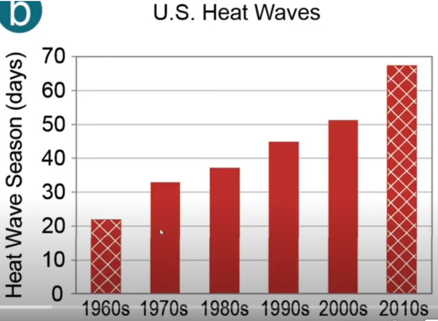
US HEAT WAVES
The first pair looks at US heat waves. The alarmist chart starts at 1960, and so shows what appears to be an alarming trend:
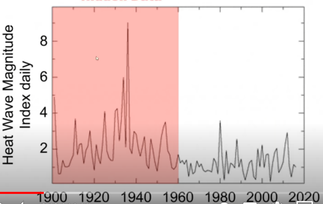
But the data go back much further, and so the heat wave story loses all its alarm:
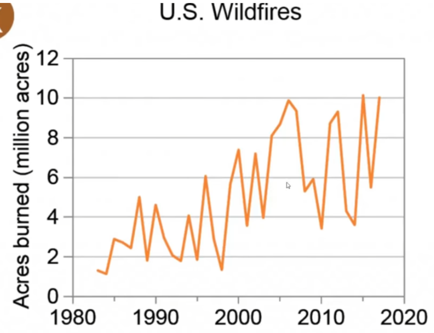
US WILD FIRES
Alarmist deceitful chart:
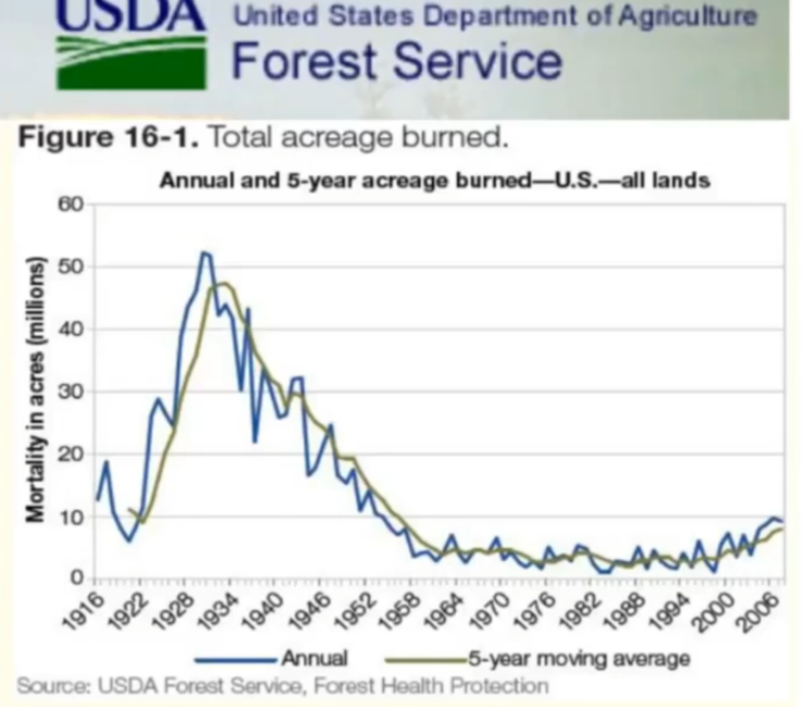
Reality, data go back to 1916:
ARCTIC SEA ICE
Alarmist deception chart:
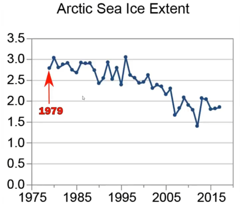
Arctic ice reality:

SEA LEVEL RISE
Alarmist chart:
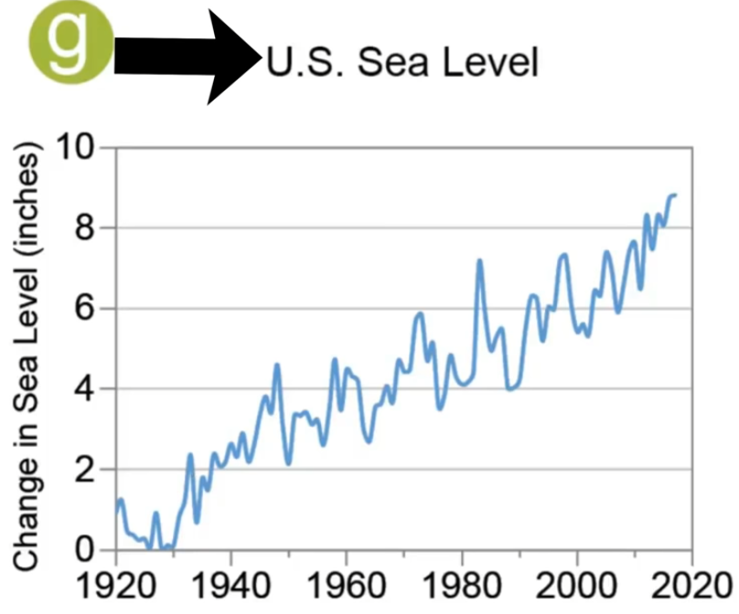
Reality – no sea level rise acceleration:


The wildfire acres burned chart includes a lot of prescribed fires set by the CCC in the 1930s when they were not planting trees.
They were in the southeastern fire district — not in the drier western states where prescribed fires could be very dangerous.
It should be possible to get data from that fire district and subtract it from the total acres burned, if anyone is interested in accuracy.
The chart shown is not accurate in the 1930s/
But … acres burned has no strong correlation with climate trends.
NUMBER OF WILDFIRES:
Only 10% of fires are believed to be natural.
The 90% that are man made are not going to vary simply because
it’s a degree warmer than in the past.
ACRES BURNED:
The amount of fuel in the forest is very important, along with better modern fire fighting equipment, such as airplanes and helicopters dropping fire retardant chemicals.
Concerning the other data in the article:
Truncating data is just one of the deceptions.
How about claiming an accurate global average temperature with poor Southern Hemisphere coverage before 1950, and very little S.H. coverage before 1900.
How about gradually eliminating the inconvenient global cooling from 1940 to 1975, originally reported as -0.5 to -0.6 degree C. in 1975, and now “adjusted away” to -0.1 degrees C., or no cooling at all !
And then there is the biggest deception of all:
— Always wrong predictions of a coming climate crisis, since 1957
(starting with oceanographer Roger Revelle and associates),
stated calmly, and with uncertainty, back in 1957, as you would expect from honest scientists … but now stated with waving arms, hysteria, and no uncertainty at all, in 2021.
It’s nice to have all of this info in one place.
Here a an informative read about wildfires in the USA:
https://earthobservatory.nasa.gov/images/89757/people-cause-most-us-wildfires
study was of 1.6M fires from 1992 to 2012
Here is up-to-date info on wildfire in western states.
The 10 year chart is interesting, showing involved acres is down 400,000 from the average, and no where near 2015’s 5.7M acres, or 2011’s 6M.
https://www.nifc.gov/fire-information/nfn#Idaho
NASA has a global active fire index that has been in a downtrend since satellite data collection began in 2000.
I had previously stated there is no correlation of acres burned and global warming.
I have an active fires index chart from 2000 to 2020 that shows a long term downtrend, but don’t know how to post it here.
Data are from the NASA Earth Observatory, who have made it very difficult to locate the data in 2021.
Most likely because the data do not support the “wildfires are getting worse” FALSE narrative. No need to publish good news.
I found a NASA page with a chart that goes to 2015 (scroll about two thirds of the way down the page to see the gif chart):
https://earthobservatory.nasa.gov/images/145421/building-a-long-term-record-of-fire