Global Sea Ice Area
Data analyst Zoe Phin just posted some interesting, surprising results on global sea ice area.
Data sources like the National Snow and Ice Data Center show global sea ice has been” drastically decreasing for a long time” and so we need to panic and overhaul the entire carbon economy. We hear this daily in the media.
Surprising global sea ice area findings
But Zoe has analyzed what she characterizes as a “very legitimate source” of data from NASA, (here, or here). And according to her findings, the data from these sources suggest global sea ice loss is not as dramatic as some institutes would like us to believe it is. In fact there ‘s been a gain!
Zoe plotted the data going back 40 years, from 1982 to 2021, the “Global Sea Ice Area Fraction”, which “is a proportion of the entire Earth’s surface that is ice over water.”

Global sea ice area linear regression trend: From 0.03625 to 0.03631, which is +0.171%. Chart: Zoe’s Insights
“As you can see, about 3.6% (on average) of our planet’s area is covered in ice over water,” reports Zoe. “In the last 40 years, ice over water has INCREASED, and not decreased, as popularly claimed.”
According to Zoe, the observed increase is equivalent to ~30,600 km², or “roughly the size of Belgium”.
Northern hemisphere sea ice area has declined
The northern hemisphere has decreased, and this has gotten lots of attention from alarmists and the media:
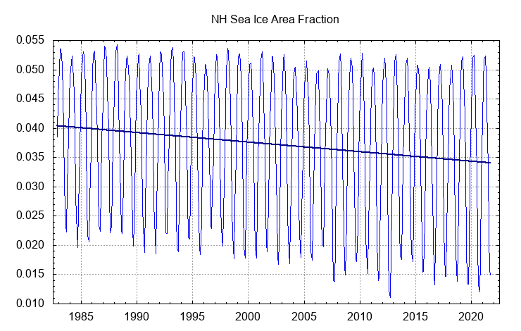
Northern hemisphere linear regression trend: -15.707%. Chart: Zoe’s Insights
More than offset by southern hemisphere gain
However, the loss over the northern hemisphere has been more than compensated by the gains in the southern hemisphere, which we never hear about.

Southern hemisphere linear regression trend: +19.947%! Chart: Zoe’s Insights
How many of you have read this in the mainstream media?
Read Zoe’s entire post here.


[…] NASA Data On Global Sea Ice Area Shows A Growth Equal To The Size Of Belgium Since 1982! […]
“How many of you have read this in the mainstream media?” Obviously a rhetorical question.
Tony Heller has been showing similar data for years. Like Zoe he pulled NOAA / NASA data and made similar charts.
I think the NH falling sea ice vs the SH rising sea ice was also discussed at WUWT.
However good work Zoe
The 2021 data charted above is incomplete (missing Oct, Nov, Dec 2021) because we haven’t finished & don’t have a crystal ball. The data from
https://nsidc.org/arcticseaicenews/charctic-interactive-sea-ice-graph/
shows a recent loss of SH sea ice coverage from before October & continuing till now.
This would still be a minor change & most likely a flat trend for the average of both NH+SH. It’s a moving target where ever you select the time frame (you can be selective to make it look better/worse) but the general idea is “don’t panic”.
We don’t have good >120yr records for this to understand what’s normal.
The data is from October 1982 to September 2021. Exactly 40 years.
Oh, Belgium!
Excellent analysis!
This reciprocal change in sea ice area in the two hemispheres is probably caused by the ocean circulation phenomena of heat piracy and the inter hemispheric bipolar seesaw. The AMOC in the North Atlantic pulls the warm water across the equator in the Atlantic (south of the Caribbean) from south to north. This balances the north to south flow of deep ocean floor cold water from north to south. The SH exports surface warm water and gets deep cold water in exchange.
Phil the mechanism is not changes in ocean currents. The warming which happened in the last 150 years is the same pattern of warming that happened before and is called a Dansgaard-Oeschger or Bond ‘Event’ warming.
The warming is caused by a reduction in cloud cover at high latitude regions. For Greenland this causes warming. The albedo of the Antarctic Ice Sheet plateau is greater than, the albedo of the top of clouds. So when there is a decrease in cloudy days over the Antarctic Plateau, that causes cooling/rather than warming. The cooling of the Antarctic Plateau causes/caused an increase in sea ice surrounding the Antarctic.
This phenomena, which is called a D-O/Bond warming cycle, where the Greenland Ice Sheet warms and Antarctic Ice sheet plateau cools is called the polar see-saw.
This is a paper by Svensmark that explains how high latitude cloud cover changes causes the polar see-saw. Key in Svensmark’s analysis is the determination from satellite measurement that the albedo of the Antarctic decreases when the Antarctic is cloudy, because the albedo of the Antarctic ice sheet, is greater than the albedo of the top of clouds. The high speed Antarctic winds, on the surface of the ice sheet, breaks up the snow crystals which causes there to be, an increase in the albedo of the snow surface.
http://arxiv.org/abs/physics/0612145v1
The Antarctic climate anomaly and galactic cosmic rays
“Borehole temperatures in the ice sheets spanning the past 6000 years show Antarctica repeatedly warming when Greenland cooled, and vice versa (Fig. 1) [13, 14]. North-south oscillations of greater amplitude associated with Dansgaard-Oeschger events are evident in oxygenisotope data from the Wurm-Wisconsin glaciation[15]. The phenomenon has been called the polar see-saw[15, 16], but that implies a north-south symmetry that is absent. Greenland is better coupled to global temperatures than Antarctica is, and the fulcrum of the temperature swings is near the Antarctic Circle. A more apt term for the effect is the Antarctic climate anomaly.”
https://en.wikipedia.org/wiki/File:Greenland_Gisp2_Temperature.svg
The following is a link to Bond’s paper “Persistent Solar influence on the North Atlantic Climate during the Holocene” Bond found that cosmogenic isotopes changes correlate with the past warming and cooling cycles. The D-O warming periods are always followed by cooling periods and every 6000 to 8000 years, abrupt Heinrich cooling events, like the Younger Dryas abrupt cooling period or the 8,200 year BP abrupt cooling period.
http://www.essc.psu.edu/essc_web/seminars/spring2006/Mar1/Bond%20et%20al%202001.pdf
Let’s see if NASA “correct” their data now that Zoe found that it doesn’t fit their alarmist narrative
Well, this is quite different from the NSIDC data, which shows a global decrease…
https://climate4you.com/images/NSIDC%20GlobalArcticAntarctic%20SeaIceArea.gif
Don’t know which graph is more reliable than the other though.
Yes, I got some pushback because I used a “reanalysis model”. Some people are convinced NSIDC is pure data not based on any models whatsoever, but that is simply false.
What is ice and what icey water? A decision must be made.
Not a single satellite over a long period. How to combine several satellites is also a decision. They also used different spectral bands.
NSIDC, as far as I can tell is only concerned with polar ice above 70 degrees (?). That’s not the only place ice appears.
So while NSIDC is the most popular source, I doubt NASA would waste time publishing something that wasn’t true or unuseful.
Believing that, I published what I found.