The poles, we are told, are supposed to be the tell-tale barometer of global warming. No place is supposed to warm up as quickly as the poles.
And because there are practically no thermometers to speak of at both the North and South poles, we need a better way of getting an idea of how temperature is behaving at these remote yet “sensitive” regions of our planet.
Because ice melts when it’s warmer and freezes when it’s colder, polar sea ice cover could act as a good measurement tool in place of the mercury thermometer. Not only does it indicate air temperatures, but also water temperatures beneath the ice. It can be argued that sea ice extent is indeed a better way of measuring overall temperature than mercury thermometers. Fortunately NASA has been taking satellite excellent photos of both poles since 1979 and thus we have an accurate record of sea ice spanning 35 years.
As CO2 rises, global warming is claimed to be enhanced, and thus the poles should be warming, disproportionately many scientists claim, compared to other regions like those located near the equator. We should see it in the global sea ice record.
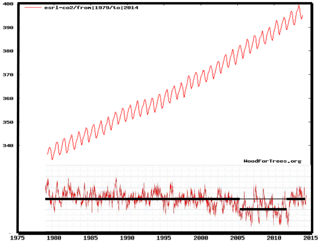
The following is a plot of CO2 vs global sea ice extent since 1979:
Graphic formed by combining WoodForTrees CO2 plot and the U. of Illinois sea ice anomaly plot.
The above chart shows that today’s global sea ice is basically at the same level as it was 35 years ago, back when CO2 was below 350 ppm. Moreover the overall trend is flat. There’s no correlation. CO2 has not caused sea ice to melt like it has been claimed to do. Not even close! The melting that did occur was very short in duration, less than 5 years, from 2005 to 2008.
The whole scare of a polar meltdown has been nothing but a huge load of bovine manure. The whole thing has been nothing but widespread hysteria in the collective paranoid mind of a society fanned by high tech, highly funded swindlers and a complicit media class.
The whole global warming scare arguably has been a power grab by an elitist cabal of lying bureaucrats who have deluded themselves into thinking they have all the answers and solutions.
It’s high time that the new generation of politicians start calling it out.


Plainly shown, indeed.
However, were facts ever a reason to change politics?
can you give a link which claims a strong effect of global warming on winter sea ice cover?
you do understand, that by adding you mostly count winter sea ice and basically remove the correlation, even if there is one?
Sod, you can use a search engine as well as I can. I found several articles blaming the so called “record winter low ice” in the arctic on global warming. Scientists with bias can never see anything but warming and will ignore winds and currents. Their logic sometimes gets so twisted up it becomes funny. For example: Some claim the open water causes warming while others claim the warming causes open water. Some claim the open water causes cold winters, while others claim the opposite for the future.
You say, “by adding you mostly count winter sea ice”. The plot is total sea ice, and it is an anomaly plot. It is obvious that winter sea ice is greater than summer sea ice, but how else would you count it? Ignore half the year? So CO2 warming only counts in the summer? That’s good to know. I have news. The chart looks the same if you only look at summer ice. Remember the “ship of fools”? That was summer ice in Antarctica.
” Ignore half the year? ”
Yes.
Let me give an example: i think that we can agree, that there is a correlation between temperature and the consumption of ice cream.
I check this, by looking at july temperature and ice cream consumption in July. I find a significant higher conspumption in julys with a temperature significantly higher than the average. The correlation is strong.
You take a different approach: you look at temperature anomaly of the whole year and ice cream consumption over the whole year and you find little to no correlation (no surprise, even “high” temperatures in January will not make people eat ice cream).
In general, you want to look at data and not at noise.
What would you do to measure the GLOBAL consumption of ice cream?
See how I earn my money? I’m the replacement guy for the warmunist dolts that populate German society.
Sod, correlation is a relation between variables.
i know how to check basic statistics. Do you?
here is a scatter plot example:
http://www.statcrunch.com/grabimageforreport.php?reportid=34965&groupid=1848&image_id=889782
http://www.tylervigen.com/
Ed Caryl 14. April 2015 at 15:04 | Permalink | Reply
“Sod, you can use a search engine as well as I can.”
That’s conjecture.
Thanks for the chuckle!
Its summer in the Southern Hemisphere.
Notice the word “global”
We used to have data for above the arctic circle but it was stopped being used to reflect true global conditions, I wonder why
Pierre,
Your WFT graph doesn’t show a scale.
Here are better links (NSIDC), showing the trend lines for both the Antarctic and the for the Arctic, in March and in September (the min/max and max/min, respectively). Scale is % area decline / rise, using the period 1981-2010 as a baseline.
http://tinyurl.com/k6dabjv
http://tinyurl.com/p5rtoez
It is clear that the minimum ice reading is noisiest (not surprising), while the maximum ice reading is the least noisy; it is also clear that the Arctic and Antarctic are not only 180 degrees out of phase with each other on a year-to-year basis, their TREND LINES for 30+ are going in opposite directions.
Summary:
For the past 35 years, Arctic Sea Ice Extent has been shrinking.
For the past 35 years, Antarctic Sea Ice Extent has been growing.
This phenomenon is clearly shown on this image from Ole Humlum’s site:
http://www.climate4you.com/images/NSIDC%20NHandSHiceExtension12monthRunningAverage.gif
Furthermore, the Antarctic Sea Ice Extent has undergone an impressive rebound over the past decade, even as the rapid decline through 2008 in Arctic Sea Ice Extent has begun to level off (apparently).
http://www.climate4you.com/images/NSIDC%20TOTAL-NHandSHiceExtension12monthRunningAverage.gif
If you look at the IPCC FAR (1990), Chapter 7.8.2 (p. 224), you will see that the Arctic Ice Extent expanded rapidly during the 1970s, during which the Antarctic Ice Extent was undergoing a period of decline. This undisputed observation was dropped from later IPCC reports, ostensibly because the satellite data started in 1979. (But perhaps also because the rise in Arctic Sea Ice during the 1970s was an inconvenient truth?)
If there is a trend in Global Sea Ice Extent today, it would appear to be rising slightly (though we’ll know by the end of this decade whether the upward trend is sustained).
There is still much we have to learn about the earth’s climate. Those who hung their hats on Arctic Minimum Sea Ice Extent (measured in September each year) as being the “smoking gun” of AGW are being mocked by the data real time.
And those who are using failed models to predict long-term scenarios should remove their blinders.
Kurt in Switzerland
Thanks Kurt for the links. It would be very entertaining to see Sod or David A try to explain away the most amazing one of them:
http://www.climate4you.com/images/NSIDC%20NHandSHiceExtension12monthRunningAverage.gif#sthash.hkQ4eNa7.dpuf
The focus is on the Arctic because sea ice there is below the post-1979 average. But there are many factors at work, especially water, wind and clouds. CO2, not so much. And in the longer record, nothing is out of natural bounds.
https://rclutz.wordpress.com/2015/03/29/arctic-sea-ice-factors/
Ron,
Given that 1979 was a noticeable “high point” in the satellite data (sea-ice extent was measured by satellites from 1973, apparently), selecting 1979 looks like a form of “cherry picking” — bound to backfire.
BTW, the IPCC SAR (1995) also showed this pre-1979 satellite data, too.
For the TAR (2001), which also brought out the (in)-famous “Hockey Stick Graph” of Global Temperature for the past millennium, a new chart was displayed for sea-ice. This was apparently the result of different re-analyses, which gave a markedly different arctic sea ice trend for the 1970s than displayed in the FAR and SAR. I don’t know if this change was ever challenged, or justified in the small print.
Subsequent reports have displayed the data in graphs from 1979 for some reason. I’m not sure if the data between 1973 and 1979 was judged erroneous at some point, or if there was some other reason. Perhaps there’s an ice expert who knows more.
Humlum has plenty of devidence from Scandinavian and Russian Arctic Seafarers, suggesting a far more varied Arctic Sea Ice Extent over the past 150 years than is generally assumed.
Kurt in Switzerland said, “Your WFT graph doesn’t show a scale… Here are better links (NSIDC)…”
Also, WoodForTrees (WFT) stopped updating CO2 in November of 2013. (I have no idea why. Broken link?) It would be better to go to the source (NOAA):
http://www.esrl.noaa.gov/gmd/ccgg/trends/
They even have downloadable annual mean data
(Mauna Loa CO2 annual mean data)
Excellent post! The extra year or so of data does not change the main point.
sod should try plotting the ice cover starting around 1810.
That was the end of the Little Ice Age so there would have been lots of arctic ice then, right?
Wrong, the ice cover was low, causing the British Admiralty to send out expeditions to find the NW Passage.
“It can be argued that sea ice extent is indeed a better way of measuring overall temperature than mercury thermometers.”
My bold. When I was in high school the chemistry class had wood-vials of mercury. We stood beside a flat topped wood table and each student, with bare hands, could pour the liquid on the table. We touched it, moved it around, made many small drops from the original, then reassembled those into a single unit. What else we did, I don’t remember. Maybe I sniffed too much of the vapor. Finally, the glob went back into its wooden container – waiting for the next student and its next outing on the table.
Mercury is a strange and interesting substance.
Thank goodness!
Since I reduced my CO2 footprint by 20% the Arctic stopped melting and the polar bears are saved. Al Gore was right.
oops!
/sarc
“The melting that did occur was very short in duration, less than 5 years, from 2005 to 2008.”
The supplied graph however shows a marked lower ice period between 2005 and 2012, which is 7 years. This is how the graph is marked by the author, not just my own estimation! But even the black line on the graph seems rather arbitrary. One could set the start of decline just as easily at around 2001, making the melting last for around a decade at the very least.
This shouldn’t affect the overall message of the article but it should be a bit more careful with its claimed numbers.
“It can be argued that sea ice extent is indeed a better way of measuring overall temperature than mercury thermometers.”
I once thought that might be the case but it isn’t. Sea ice extent, especially that in the Arctic, is greatly effected by wind and wave action.
When ice melts, it’s all because of rising temperature the warmists like to tell us. But when it grows it’s wind and waves?
Look at the GISS map for the time, in which the sea ice increased around the antarctic:
http://data.giss.nasa.gov/cgi-bin/gistemp/nmaps.cgi?sat=4&sst=3&type=anoms&mean_gen=0112&year1=2008&year2=2014&base1=1951&base2=1980&radius=250&pol=rob
The water around the polar continent seems to be showing a cold anomaly. so there is no contradiction.
” Fortunately NASA has been taking satellite excellent photos of both poles since 1979 and thus we have an accurate record of sea ice spanning 35 years.”
Slightly incorrect. NASA deserves credit for the ESMR sensor on the NImbus satellites. However, since 1987, most of the microwave imaging data came from the SSMI sensor on the DMSP military metsats, used by the US Navy for operations in the Arctic and by the USAF for tropical storm recon. The processing software was donated to NSIDC gratis by DoD. Sensor and software by Hughes Aircraft Co.
“No place is supposed to warm up as quickly as the poles.”
I seem to recall reading some years ago that, according to the physics underlying any anthropogenic global warming, a “hot spot” was supposed to develop in the troposphere in the tropical latitudes. As far as I know it was never found. Is that correct?
So now it’s the poles?
Both the “hot spot” and polar warming were predicted. So far, only the North Pole warmed, and that warming has some problems: lack of instrument locations, ice not cooperating, satellites don’t cross the pole directly, so have slant range difficulties, and so on. Time will tell.