In the IPCC’s 2001 third report (TAR), the total surface temperature increase for the 20th century was reported to be “about 0.6°C”.
“The global average surface temperature has increased over the 20th century by about 0.6°C.”
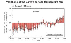
This Met Office graph of global temperatures for 1860-2000 was included in the IPCC’s 2001 report. It provided visual clarification of the 0.6°C temperature increase since 1900.
In taking a closer look, the graph does indeed show a warming of 0.6°C between 1900 and 2000:
At the time, this warming amplitude for the 20th century was widely accepted in the scientific literature. For example:
“Humans may be responsible for less than 0.01°C (of approximately 0.56°C (1°F) total average atmospheric heating during the last century).”
“The global average surface temperature has increased by about 0.6°C over the twentieth century.”
“An analysis of observational records shows that the global surface air temperature (SAT) has increased by 0.6°C since 1861.”
The IPCC Adds 0.3°C Of Phantom Warming To Global Temperatures Between 2001 and 2013 Reports
The IPCC authors acknowledged that there was a pause in global warming since the 21st century began in the 2013 report (AR5), regularly referring to the pause as a “hiatus.” They even acknowledged that 97% of climate model simulations (111 of 114) got it wrong, or didn’t simulate the lack of warming:
IPCC AR5 Chapter 9 (2013):
“For the period 1998–2012, 111 of the 114 climate-model simulations show a surface-warming trend larger than the observations.”
“Almost all CMIP5 historical simulations do not reproduce the observed recent warming hiatus.”
Even the UK’s Met Office — where the IPCC obtains temperature data (HadCRUT) — acknowledged there was a pause in global warming since the early 2000s in a paper published in July, 2013, entitled “The Recent Pause in Global Warming.”
“The start of the current pause is difficult to determine precisely. Although 1998 is often quoted as the start of the current pause, this was an exceptionally warm year because of the largest El Niño in the instrumental record. This was followed by a strong La Niña event and a fall in global surface temperature of around 0.2oC (Figure 1), equivalent in magnitude to the average decadal warming trend in recent decades. It is only really since 2000 that the rise in global surface temperatures has paused.”
Nonetheless, by the time the 5th report (AR5) was released later that year (2013), the IPCC (and the Met Office) had decided that a substantial warming of 0.25°C had occurred since the release of the 2001 report. Twelve years and a hiatus later, the 0.6°C of warming since the 19th century ended had been transformed into 0.85°C of warming.
“The globally averaged combined land and ocean surface temperature data as calculated by a linear trend show a warming of 0.85°C over the period 1880 to 2012.“
Apparently, 0.6°C since 1900 wasn’t substantial enough. So 0.25°C of additional warming was tacked on. After all, 0.85°C sounds a lot more dangerous than 0.6°C.
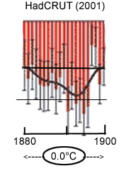
But notice there was a difference in starting points here: 1880 vs. 1900. Was it possible that 1880 was -0.25°C cooler than 1900, which would account for the discrepancy? Not according to the IPCC’s own 1860-2000 graph from the 2001 report. Both 1880 and 1900 temperature anomalies were identical, as seen here:
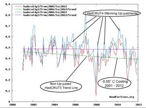
So was it possible the additional 0.25°C of warming occurred since the 21st century began, or since 2001? Not according to the HadCRUT temperature dataset. Version HadCRUT3 was in use through 2012, and according to the data made available for public use on WoodForTrees.org (green trend line), HadCRUT3 indicated there was a cooling of about -0.05°C between 2001 and 2012. The advent of HadCRUT4 in late 2012 allowed the Met Office to make substantial “up-justments” to the recent data, especially for the 2005 – 2012 period. This extra warming added to the data could potentially eliminate the pause, or better conform temperatures to climate model expectations. But even those “up-justments” didn’t work. There was still no warming trend for the 2001-2012 period (purple trend line) even with the “up-justed” temperatures for HadCRUT4 from HadCRUT3.
So with the elimination of the -0.05°C cooling between 2001 and 2012 as indicated by the HadCRUT3 data, and with the addition of 0.25°C of extra warming since 1880 or 1900 that didn’t exist in the 2001 report, the IPCC and the Met Office were able to subtly add 0.3°C to global temperatures between their 3rd and 5th reports.
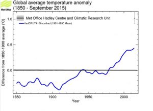
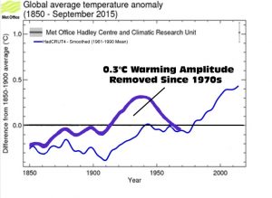
But perhaps a more recent graph (2015) might shed light on where this extra 0.3°C of warming could possibly be coming from. It doesn’t.
Adapted Met Office graph available here.
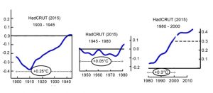
Other than more-of-the-same suppression of the 1880s to 1940s warming period (notice the 1940-’45 warming amplitude has recently been reduced by -0.05°C, making 1980 warmer), the warming trend for the 20th century (1900-2000) is still 0.6°C as shown on this 2015 Met Office graph. And between 1880 and 2012, the graph still shows 0.6°C of warming (actually, about 0.55°C, since 1880 has recently been heated up almost 0.1°C relative to 1900 for some reason). Neither starting point (1880 or 1900) indicates a warming amplitude of 0.85°C as claimed by the IPCC in 2013.
Met Office Has Removed 0.3°C Of Global Warming Amplitude From 1880s-1940s Period, And Transformed Strong 1940s-’70s Cooling Into A Pause
As just mentioned, the most recent depictions of the global warming trend for the 20th century have 1980 about 0.05°C warmer than 1940-’45. A few decades ago, or before a series of chronic “adjustments” to the data were made to artificially reduce the 1940s warming height, 1980 was still about -0.15°C cooler than 1940-’45, a net change of 0.2°C.
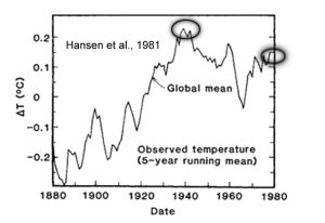
For example, this 1981 global temperature graph from NASA shows 1940 still 0.15°C warmer than 1980. James Hansen, lead author of the paper, even admitted that he thought it was “remarkable” that 1980 is almost as warm as 1940 was.
“A remarkable conclusion from Fig. 3 [below] is that the global mean temperature is almost as high today [1980] as it was in 1940.”
Reducing the 1920s to 1940s warming amplitude has apparently been a high priority agenda item for overseers of temperature datasets for quite some time. In exposed e-mail exchanges from 2009, for example, Phil Jones and Tom Wigley — both overseers of the HadCRUT datasets spanning decades and activists for the anthropogenic global warming cause — discuss reducing the “1940 blip” in their reconstructions of 20th century temperatures by simply cooling the 1940 temperature data down by -0.15°C.
“If you look at the attached plot you will see that the land also shows the 1940s blip (as I’m sure you know). So, if we could reduce the ocean blip by, say, 0.15 degC, then this would be significant for the global mean — but we’d still have to explain the land blip. I’ve chosen 0.15 here deliberately. This still leaves an ocean blip, and i think one needs to have some form of ocean blip to explain the land blip (via either some common forcing, or ocean forcing land, or vice versa, or all of these). When you look at other blips, the land blips are 1.5 to 2 times (roughly) the ocean blips — higher sensitivity plus thermal inertia effects. My 0.15 adjustment leaves things consistent with this, so you can see where I am coming from. Removing ENSO does not affect this. It would be good to remove at least part of the 1940s blip, but we are still left with “why the blip”.
— Tom Wigley, Phil Jones exchange, from uncovered Climate Research Unit e-mails
–
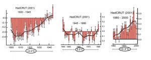
Not only has reducing the amplitude of the 1920s to 1940s warming been a priority among dataset procurers for the sake of advancing the cause, so too has eliminating the 1940s to 1970s global cooling period from the temperature record. As shown in the Met Office graphs above, the 1940 to 1970 global cooling period extensively referenced in the scientific literature has now been reduced to a mere fraction of what it was reported to be during the 1970s.
–
The warming amplitude for the 1880 to 1940 period has now been reduced to between 0.2° and 0.3°C in modern datasets (see the smoothed blue trend line from 2015 Met Office graph above). The cooling period between 1940 and 1970 has now been reduced to less than 0.1°C.
–
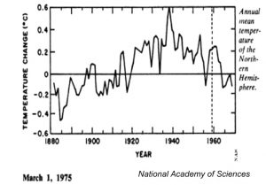
During the 1970s, it was commonly accepted by climatologists that the Earth had warmed by about +0.6°C between 1880 and 1940, and then cooled by -0.3°C between 1940 and 1970 (before temperatures began rising again in the late 1970s). The Southern Hemisphere experienced only modest warming and cooling, but in the Northern Hemisphere, the warming and cooling was especially pronounced: 1°C of warming from 1880 to 1940, and -0.5°C cooling from 1940 to 1970. Below are some examples of the widely accepted global and Northern Hemisphere temperature trends mentioned in the scientific literature during the 1970s.
–
“[B]etween 1880 and 1940 a net warming of about 0.6°C occurred, and from 1940 to the present our globe experienced a net cooling of 0.3°C.”
“In the period from 1880 to 1940, the mean temperature of the earth increased about 0.6°C; from 1940 to 1970, it decreased by 0.3-0.4°C.”
Introduction: “In the last century it is possible to document an increase of about 0.6°C in the mean global temperature between 1880 and 1940 and a subsequent fall of temperature by about 0.3°C since 1940. In the polar regions north of 70° latitude the decrease in temperature in the past decade alone has been about 1°C.”
“Instrumental surface temperature records have been compiled for large portions of the globe for about the past 100 years (Mitchell, 1961; Budyko, 1969). They show that the Northern Hemisphere annual mean temperature has risen about 1°C from 1880 to about 1940 and has fallen about 0.5 °C since then”
“[A]verage temperature data for the northern hemisphere shows the range of change between 1880 to 1940 to be approximately 1.1°C.”
“Since 1940, however, the temperature of the Northern Hemisphere has been steadily falling: Having risen about 1.1 degrees C. between 1885 and 1940, according to one estimation, the temperature has already fallen back some 0.6 degrees, and shows no signs of reversal.”
The net effect of substantially removing the warming from the 1880 to 1940 period (and concomitantly adding warming to the 1940s to 1970s cooling period) is to make the warming trend for the 20th and 21st centuries appear linear rather than oscillatory. A linear warming fits climate models better, as the CO2 emissions rates have been linearly rising, of course, especially after about 1950. Making the temperature record conform to modeling of CO2-induced climate changes is the main agenda.
Observations Found In Scientific Papers Reveal A 20th Century Temperature Oscillation, Not Linear Warming
If we were to return the 0.3°C of warming observed during the 1880s to 1940s period removed by the Met Office over decades of “adjustments” to the data, the graph of surface temperature changes might look like this:
Interestingly, when scientists reconstruct surface and ocean temperatures for the 20th century using physical evidence (such as ice cores), the steepness of the warming and cooling trends for the pre-1970s era looks eerily similar to the oscillatory trends depicted above. In other words, modern scientists who have been recently eliminating the warming amplitude of the 1880s to 1940s period to conform to CO2-centered climate modeling would appear to be making the datasets less accurate than they were in the 1970s … and all for the sake of an agenda.
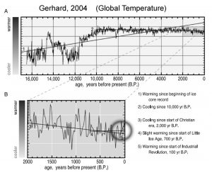
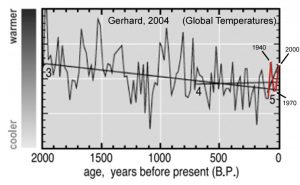
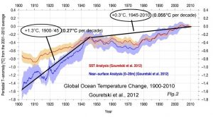
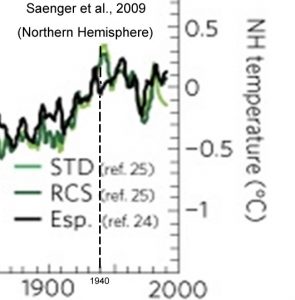
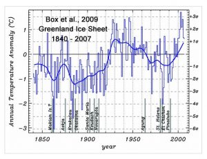
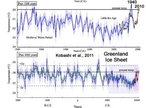
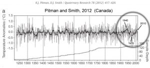
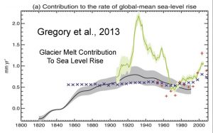
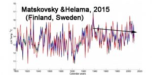
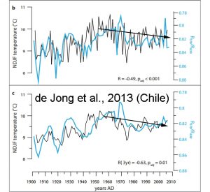
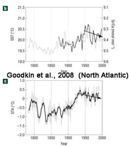
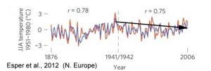
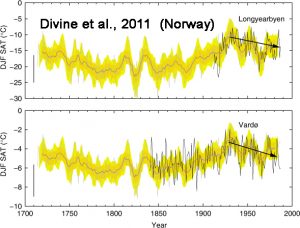
Below are several examples of an oscillatory rather than linear temperature record for the 20th century (i.e., pronounced cooling after the 1940s and a decelerated warming since the 1970s) found in the peer-reviewed scientific literature.
http://icdc.cen.uni-hamburg.de/uploads/pics/hc_fig2.jpeg
“The annual whole ice sheet 1919–32 warming trend is 33% greater in magnitude than the 1994–2007 warming.”
Goodkin et al., 2008 (North Atlantic)



Good write-up, Pierre. 🙂
url posted on SG and other sites
Climate data change is as bad as US politics!
Fine write-up Pierre, well done.
Oops to both of us. Its Kenneth Richard’s work. 🙂
I do wish Pierre would figure out why the graphs go all blurry. 😉
Open them in a new tab, they are fine.
A bit OT, but wind power RULES in the UK …..
N O T !
https://notalotofpeopleknowthat.wordpress.com/2016/10/31/wind-power-down-to-0-6-today/#comment-79166
The one thing that most people don’t realise, is that the presentation from CRU is that of anomalies compared to 1961-1990, featuring some of the coldest years of the 20th century, guranteed hits every time.
From the middle of the 70’s there was a phase change in temperature and a leap upwards in just 2 years, to then level again. 1963 is 3rd coldest in the entire CET record. 1976 is still the hottest summer in the CET.
The change in temperature doesn’t depend on the base period chosen for anomalies. Nor do trends.
NO, they depend mostly on how much past temperatures are adjusted from one year to the next, for absolutely NO REASON except there being a Tom Wigley type inconvenient peak!
You have looked at Iceland before, so here are their own statistics.
http://en.vedur.is/climatology/articles/nr/1213
And longer series of observations.
http://en.vedur.is/climatology/data/
I hope you can use it.
“So was it possible the additional 0.25°C of warming occurred since the 21st century began, or since 2001?”
Yes. NOAA global shows +0.27 C of warming since 1/2001.
(Learn to calculate.)
data page:
http://www.ncdc.noaa.gov/monitoring-references/faq/anomalies.php
David:
Can you provide the source for the HadCRUT +0.25 C warming trend between 2001-2012, which is the last year of record for 2013 report, and where the claim of +0.85 C comes from (“1880-2012”)?
Can you explain why 1940 was +0.15 C warmer than 1980 as of 1981 datasets (GIS), but now 1980 is at least +0.05 C (HadCRUT) or +0.2 C (GIS) warmer than 1940 in present datasets? What caused the net 0.2 (HadCRUT) to 0.35 C (GIS) change (warming) in the 1940 vs. 1980 temperature record between 1981 and today? Is there another explanation other than that the 1910s to 1940s warming period has been artificially suppressed by dataset overseers by about 0.3 C so as to eliminate the cool period and the inconvenient early 20th century warmth? How does data change over time like that … and always in one direction?
Kenneth: Download the HadCRUT4 data and calculate trends and changes. That’s all it takes.
They’ve modified HadCRUT4 data to better fit climate models. That’s what they do. See the printscreen above where they’ve added warming to the 2005-2012 period in HadCRUT4 vs. 3 to erase the cooling between 2001 and 2012. You’re not convincing anyone that there is not a biased agenda here that guides their actions.
+100
Well said.
There is no requirements for past observations to be tampered with.
Kenneth Richard says:
“They’ve modified HadCRUT4 data to better fit climate models.”
What proof do you have of that?
Here’s my suspicion:
I’m sure you think that the “adjustment” talk that Phil Jones and Tom Wigley (HadCRUT overseers) were engaging in (“it would be good to remove 0.15 C” from the “1940 blip”) was entirely due to the wish to honestly present temperature data. You probably also believe that removing the -0.3 C of 1940 to 1970s cooling period by suppressing the 1910s to 1940s warming amplitude was entirely legitimate too. And making 1940 -0.2 C colder than 1980 in today’s datasets when it was +0.15 C warmer as of the early ’80s? Those are legitimate adjustments too, right?
You probably also think that Michael Mann’s “Nature trick” to “hide the decline” was nothing but scientists talking about honest ways to present temperature data.
tom: “Thorough, not thoroughly fabricated: The truth about global temperature data: How thermometer and satellite data is adjusted and why it *must* be done,” Scott K Johnson, 1/21/16
http://arstechnica.com/science/2016/01/thorough-not-thoroughly-fabricated-the-truth-about-global-temperature-data/
That paper has been shown many times to be a LOAD OPF RUBBISH
You KNOW the surface station data is a monumental mess, and unfit for anything but propaganda.
That is why you like it so much.
Yet you STILL can’t shows us the pristine stations that feed into those 6 yellow circled points.
NOR can you show us where the data for all the grey area is FABRICATED.
All you ever do is RUN and HIDE like a cowardly little grub.
Kenneth wrote:
“How does data change over time like that … and always in one direction?”
Here is a very good article that explains it all very well:
“Thorough, not thoroughly fabricated: The truth about global temperature data: How thermometer and satellite data is adjusted and why it *must* be done,” Scott K Johnson, 1/21/16
http://arstechnica.com/science/2016/01/thorough-not-thoroughly-fabricated-the-truth-about-global-temperature-data/
No, your links don’t address the specific question I asked, as expected. I would like *you* to explain why it is that NASA had 1980 still -0.15 C colder than 1940 as of 1981, but then, 35 years later, 1980 is shown to be +0.2 C warmer than 1940. That’s a +0.35 C change in the *data* itself. The data changes are consistently biased towards reducing the amplitude of the 1910 to 1940 warming so as to eliminate the oscillatory shape of the 20th century temperature trend, as well as to eliminate the global cooling period that has still been widely accepted to have taken place in the Arctic between 1940 and 1995. They have artificially reduced the height of the 1940s warming trajectory by more than 0.3 C.
During the 1970s, it was commonly known, or accepted by climatologists (a consensus), that the globe cooled by -0.3 C between 1940 and 1970. Now, NASA shows effectively no change; they have tendentiously erased the global cooling that was so commonly discussed in the peer-reviewed scientific literature at the time:
https://notrickszone.com/2016/09/13/massive-cover-up-exposed-285-papers-from-1960s-80s-reveal-robust-global-cooling-scientific-consensus/#comments
Why did they eliminate the 1940s warming zenith and the 1940s to ’70s cooling? Because it’s not convenient to the cause, of course. If the observations don’t fit the models, change the observations to make them fit. That’s exactly what Wigley and Jones were talking about doing in the e-mails: changing the data to fit their models.
Well said Kenneth Richard, David Appell is as Stalin would have said a useful idiot. To me any graph not showing the cooling 1940-1970 is fraudulent, no matter who made it.
I would like *you* to explain why it is that NASA had 1980 still -0.15 C colder than 1940 as of 1981, but then, 35 years later, 1980 is shown to be +0.2 C warmer than 1940.
Simple parts first:
Firstly, you’re comparing different dataset scopes. The 1981 paper used land-stations only. The current main GISS dataset incorporates SST observations. Of course that will result in some discrepancy.
Secondly, you seem to be missing that the 1981 graph is showing 5-year running means. There is no “1980” datapoint on the 1981 graph – the final point is the 5-year mean centering on 1978.
On a technical point, the GHCN database used in the current version of GISS contains about three times as many stations as the database used in the 1981 paper, which likely means the sampling is more representative in the current version.
I’ve plotted here an overlay of the current global average GISS land-stations-only time series on the 1981 version. The differences are actually quite minor, aside from the very earliest period.
Note that I’ve used the Climate Explorer engine to produce this global average – the official GISS met-station global average time series is not quite the same. The fundamental dataset is the same for both, the discrepancy stems from use of different processes for arriving at a global average. Actually you can see that discrepancy is about the same size as the discrepancy with the 1981 time series. It’s therefore prima facie plausible that such a difference could result from a simple change in averaging method, rather than necessarily anything to do with the underlying data. That sensitivity to averaging process is unavoidable when trying to extrapolate a global average from a land-only dataset, though in no case does the big picture change.
There is a noticeable departure in the final 5-year mean of the time series. Tracking regionally this appears to be confined to the low-latitudes. Given the reasonable correlation with variability at other times I would suggest the most likely explanation is poor sampling in the final few years in this region. Given the lag to acquire or make data available, particularly in less developed parts of the world, it’s reasonable to assume there was a substantial station count drop in the late 70s for this 1981 paper.
That link of yours has been TRASHED many times rotten appell.
GET OVER IT !!
You have NOTHING
… and you just keep RUNNING and HIDING from producing anything real to back up any single one of you FANTASIES.
Appell, have you got those pictures of theose surface stations yet?
Are they still hiding?
And have you got those pictures of birds killed by coal fired power stations.
So far you have produced ABSOLUTELY NOTHING to back up anything you say.
Or will you run and hide, YET AGAIN. !!
“NOAA global shows +0.27 C of warming since 1/2001. ”
Any EVERY bit of it is FABRICATED. It is NOT REAL !!!
You KNOW that there is ZERO WARMING in the whole REAL data, apart from the El Nino transients(now) and steps (1998).
All those adjustments begin to look as scandalous as the climate gate.
2001 : 0.6/century
2013 : 0.85/century
Way too ‘scientific’ for the lamestream journalists to report or investigate.
Read this:
“Thorough, not thoroughly fabricated: The truth about global temperature data: How thermometer and satellite data is adjusted and why it *must* be done,” Scott K Johnson, 1/21/16
http://arstechnica.com/science/2016/01/thorough-not-thoroughly-fabricated-the-truth-about-global-temperature-data/
David, explain why NASA changed the data between 1981 and now such that 1980 was -0.15 C cooler than 1940 as of 1981 observational data, whereas 1980 is now +0.2 C warmer than 1940 with today’s “adjustments” to the original data. Why do you believe there *must* be an additional +0.35 C of warming added to 1980, or removed from 1940?
Kenneth: Have you read the collection of GISS papers over the years, which discuss the details of their dataset?
You KNOW the surface station data is a monumental mess, and unfit for anything but propaganda.
You KNOW it covers barely 50% of the world land surface, mostly from very low quality surface stations heavily affected by UHI and at airports.
You know it is at least 40% FABRICATION.. A SCIENCE FANTASY.
And you STILL can’t shows us the pristine stations that feed into those 6 yellow circled points.
NOR can you show us where the data for all the grey area is FABRICATED.
All you ever do is RUN and HIDE like a cowardly little grub.
roflmao…..That load of garbage again.
Its been ripped apart many times..
But its all you have isn’t it, rotten appell.
Have you found those picks of birds killed by coal fired power stations .. or are we all to conclude that IT JUST ISN’T HAPPENING.. ie YOU LIED, yet again. !!
And about those surface temperatures that cover BARELY 50% of the land surface, meaning the rest has to be FABRICATED…… Have you found pics of the weather stations in the 6 circles on this map yet?
Have you found any data that NOAA/GISS use in the grey areas?
Or are you going to do your RUN and HIDE trick, yet again.
https://s19.postimg.org/ek13ihsdv/201608_2.gif
David Appell has claimed that coal plants kill birds?
Yep.. he produced a paper that said that coal fired power station killed heaps more than chopping wind turbines and solar burners.
He has not been able to produce ONE SINGLE picture to back up those LIES !!!
As usual, he is EMPTY of anything except sci-fantasy. That is his specialty, afterall.
Kenneth: Number of bird deaths per unit of energy produced:
https://notrickszone.com/2011/03/24/nuclear-is-the-safest-form-of-energy-opposition-is-a-glaring-denial-of-reality/
coal: 161
oil: 36
nat gas: 4
wind: 0.15
YOU ARE A LIAR.
You have yet to produce one single picture of a bird killed by a coal fired power station.
RUN and HIDE is your only response, because you know its the only response you can give.
That is how PATHETIC you are.
Ken, I forgot, none of you care about human deaths. My bad.
Here you go:
“Avian Mortality by Energy Source,” US News, 8/22/14
http://www.usnews.com/news/blogs/data-mine/2014/08/22/pecking-order-energys-toll-on-birds
See also:
“Within the uncertainties of the data used, the estimate means that wind farms killed approximately 20,000 birds in the United States in 2009 but nuclear plants killed about 330,000 and fossil fueled power plants more than 14 million. The paper concludes that further study is needed, but also that fossil fueled power stations appear to pose a much greater threat to birds and avian wildlife than wind farms and nuclear power plants.”
“The avian benefits of wind energy: A 2009 update,” Benjamin K. Sovacool, Renewable Energy, Volume 49, January 2013, Pages 19–24. http://www.sciencedirect.com/science/article/pii/S0960148112000857
I see. So you were honestly trying to provide a link to a source on bird deaths, and just happened to mistakenly link to a NTZ source on people deaths. An honest mistake, I’m sure. You claim that “none of you care about human deaths.” Can you provide details of what exactly you mean here? Who doesn’t care about human deaths? I can assure you that I do. I don’t appreciate the attempts to insinuate otherwise.
Ah, Sovacool, 2013. It amazes how such a paper could have passed peer review. Well, since it’s activism on parade, I guess I shouldn’t be surprised.
First off, Sovacool estimates that wind turbines kill only 20,000 birds in the US per year. According to Smallwood (2013), it’s 573,000 for wind turbines (as of 2012), and about 80,000 per year for solar power utilities (Walston et al., 2016). (By the way, wind turbines are now the leading cause of multiple mortality events in bats (O’Shea et al., 2016), and US turbines kill about a million a year, and about 4 million worldwide.)
Walston et al., 2016
http://www.sciencedirect.com/science/article/pii/S0960148116301422
A preliminary assessment of avian mortality at utility-scale solar energy facilities in the United States
We estimated annual USSE [utility-scale solar energy] -related avian mortality to be between 16,200 and 59,400 birds in the southern California region, which was extrapolated to between 37,800 and 138,600 birds [killed per year] for all USSE [utility-scale solar energy] facilities across the United States that are either installed or under construction.
Based on turbine locations mapped by the USGS through July 2013, we calculated 4402 MW of total electric energy production of wind energy facilities in the study region. … Taking a capacity-weighted average mortality rate across projects in the region results in an estimate of 6.71 bird deaths/MW/year. In addition, based on Smallwood (2013) national mortality estimate of 573,093 birds across a total installed wind energy capacity of 51,630 MW in the United States (as of 2012), we estimated a national avian mortality rate of 11.10 birds/MW.
Sovacool’s estimated death rate due to coal plants — which has not been reproduced elsewhere — is largely derived by prognosticating the modeled effects of “climate change” on future bird populations — similar to how the polar bear was classified as an endangered species due to the future assumptions about climate change — even though the Arctic was just as warm as it is now in the 1920s and 1930s, and several degrees warmer than now just a few thousand years ago, when polar bears somehow managed to survive.
“In this case Dr. Sovacool relied primarily on a paper in Nature (Thomas et al., 2004 [which claims we’ll see a million species go extinct by 2050 due to “climate change”]) that presents hypothetical scenarios for bird extinction depending on a number of future climate change scenarios. Using the maximum hypothesized extinction rate for the worst-case scenario presented in that paper he derived (without further explanation) a rate of 4.98 deaths/GWh. Adding the 0.2 deaths/GWh from the other sources with the 4.98 deaths/GWh attributable to “climate change” he derived a rate of 5.18 fatalities per GWh which he then extrapolated to approximately 14.1 million birds a year.”
David, the 14.1 million bird deaths per year is a made-up number based upon worst-case-scenario modeled estimates from the Thomas et al. (2004) paper claiming 1 million extinctions by 2050 due to “climate change” that even the IPCC has backed away from as of AR4 (because it’s bunk). Even the 0.2 deaths/GWh ascribed to coal plants due to “non-climate change” effects is a concocted figure, as (a) it ignores the fact that coal is significantly extracted from underground sources (where birds don’t fly or live), and (b) Sovacool used one single above-ground US coal plant in Illinois to extrapolate deaths from collisions for all the coal power plants in the US (which, again, are often underground). And this paper passed peer-review.
Do you consider yourself to be skeptical, David? I ask because you don’t seem to be the least bit skeptical of what you read — as long as it agrees with your belief system. Perhaps you should look into the sources you cite a little more before posting. I’d be embarrassed to post links to an NTZ article on people deaths while claiming it’s bird deaths, or to a paper that claims there are 14.1 million birds per year killed by underground coal mines because the author of that figure decided to use a worst-case extinction model of hypothesized future deaths from a 2004 paper rather than use real-world observations, which show nothing close to 14.1 million bird deaths per year due to underground coal mines. I, for one, would like to see a little more evidence before accepting such outrageous claims. Apparently you don’t need evidence — as long as it confirms your biases and beliefs.
Still not ONE SINGLE PICTURE. !!
No wonder you are the laughing stock of the whole climate scam.
Um, David, that notrickszone link you provided does not show claimed *bird* deaths. Those are claimed *people* deaths. Or are birds the same as people?
Provide a link that shows *birds* are killed by coal plants. Do you have one, or are you just making this stuff up?
That would be probably the 50th time he has asked to back up this LIE.
NADA. Nothing. EMPTY as always. !!
LOL.
It’s obviously the canaries in the coalmines.
“Or are birds the same as people? ”
Remember, DA lives in a fantasy world.. he probably doesn’t even know that there is a difference. Afterall, he probably thinks he can fly once he puts on his leotards.
He’s used that one before. I pointed it out in a reply (months ago), but he is apparently a slow learner.
Please note that ‘premature deaths’ from any ’cause’ are not ‘deaths’ it means people ‘die earlier than they otherwise would’. So for the coal plant premature deaths is meant people breathing ‘something’ from the plant emissions (obviously not CO2) they died weeks or months or years early. It doesn’t mean anyone died because of the coal fired plant.
But bird deaths are from being clobbered. Those are real deaths. The ‘modeled deaths caused by power plants in future’ are nothing at all. First, climate change isn’t bad for birds and second, no one can prove there will be any. The ‘coal plant’ bird deaths are literally fictitious and the paper no more than bespoke science in service of an agenda.
Typical.
When the data has to be altered to fit the theory, then the theory isn’t creditable. Appell has no claim to be a scientist.
How would you prefer to handle biases in the raw data?
Certainly NOT by faking new biases in a vain attempt to match science-fantasy based models.
Yes, I.E., in an unbiased way.
[…] För de nördar som älskar att fördjupa sig i IPCCs klimatdata är det här blogginlägget av Kenneth Richard på NoTricksZone mycket läsvärt. Det handlar om hur IPCC ökat på den globala uppvärmningen med […]