
“[E]ven if there had been no industrial revolution and burning of fossil fuels, there would have still been warming through the twentieth century – to at least 1980, and of almost 1°C.” – Abbot and Marohasy, 2017
For those who ascribe to the position that humans are dangerously altering the Earth’s climate, it has become almost axiomatic to frame today’s climate changes as highly unusual, unprecedented, and falling well outside the range of natural variability. In this way, proponents of the dangerous anthropogenic global warming (DAGW) narrative can connect human activities (i.e., fossil fuel burning) to these “unnatural” climate changes.
The deepening problem for DAGW advocates, though, is there is nothing unusual, unprecedented, or remarkable about modern temperatures or rates of climatic change. Not only is there extensive scientific evidence available in the peer-reviewed scientific literature affirming today’s temperatures are no warmer than they have been for most of the last 10,000 years, but the paleoclimate evidence suggests centennial-scale fluctuations in the Earth’s surface (and subsurface ocean) temperatures can naturally reach rates and amplitudes that far exceed the modern values.
For example, Bova et al. (2016) found that ocean temperatures in the 0-1000 meter layer naturally (no human influence) rise and fall by more than 2°C in a span of 200 years, or 1°C per century. In contrast, the oceanographers found that the 0-1000 meter warming in the last 200 years of presumed anthropogenic influence has been so modest that it falls “below the detection limit“.
Rosenthal et al., (2013) indicated that Pacific Ocean temperatures in the 0-700 meter layer have risen by just 0.25°C from 1600-1800 C.E. to 2000-2010, which is a rate of about 0.1°C per century, or one-tenth of the rate of warming (cooling) that has occurred without human influence during the Holocene.
New Paper: Natural Variability Explains Most Of the Modern Warming
In a new paper published in GeoResJ, Abbot and Marohasy (2017) statistically document the extent to which regional or hemispheric temperatures have risen and fallen naturally over the past few thousand years. They then compare these documented natural amplitudes to the observed/measured record of centennial-scale temperature changes. They found that there is, at most, just a 0.2°C difference between the naturally-occurring temperature change amplitudes (no human influence) and the modern era’s temperature changes (with assumed human influence). So if there has been a 1°C increase in global temperature since the 1800s, at most 0.2°C could have possibly fallen outside the range of natural variation and thus ascribed to human activity. The rest (0.8°C and up) of the contribution would therefore be of natural origin. So, as the authors conclude, “the increase in temperature over the last 100 years can be largely attributed to natural phenomena.”
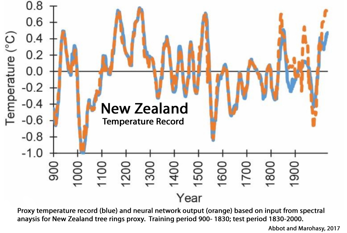
Abbot and Marohasy, 2017
The proxy measurements suggest New Zealand’s climate has fluctuated within a band of approximately 2°C since at least 900 AD, as shown in Figure 2. The warming of nearly 1°C since 1940 falls within this band. The discrepancy between the orange and blue lines in recent decades as shown in Figure 3, suggests that the anthropogenic contribution to this warming could be in the order of approximately 0.2°C. [80% of the warming since 1940 may be due natural factors].
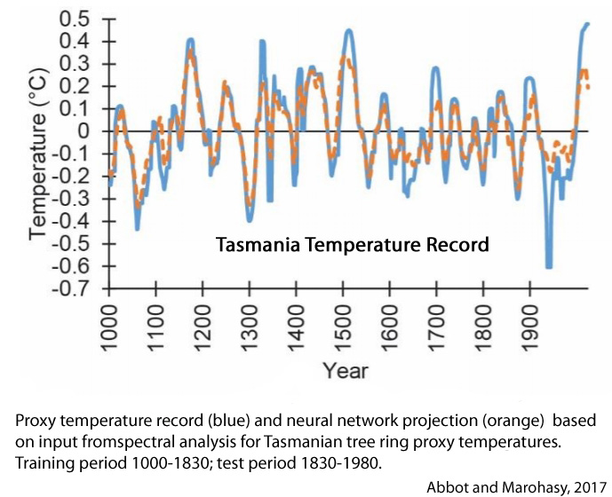
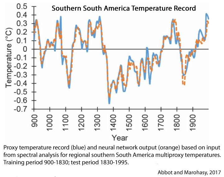
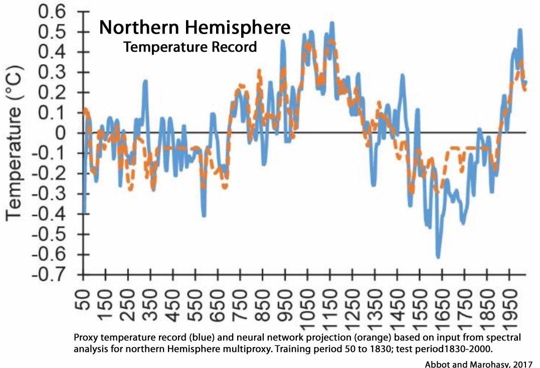
The largest deviation between the ANN [artificial neural network, which identifies amplitudes of natural variability in the paleoclimate record] Earth projections and measured temperatures for six geographically distinct regions was approximately 0.2 °C, and from this an Equilibrium Climate Sensitivity (ECS) of approximately 0.6 °C [for a doubling of CO2 from 280 ppm to 560 ppm plus feedbacks] was estimated. This is considerably less than estimates from the General Circulation Models (GCMs) used by the Intergovernmental Panel on Climate Change (IPCC), and similar to estimates from spectroscopic methods.
To summarize, Figures 3, 5, 7, 9, 11 and 13 [New Zealand, Southern South America, Tasmania, Canadian Rockies, Sweden and the Northern Hemisphere] indicate that the period from 1880 to the end of the proxy records shows general correspondence between the projections generated by ANN output (which is based on input using extrapolation of natural oscillations from the pre-industrial era), and the actual proxy temperature measurements. Importantly, an upward trend is generally apparent for both the proxy measurements and the ANN model projection for the 20th century. This would suggest that the increase in temperature over the last 100 years can be largely attributed to natural phenomena.
[A]fter applying the latest big data technique to six 2,000 year-long proxy-temperature series we cannot confirm that recent warming is anything but natural – what might have occurred anyway, even if there was no industrial revolution.
[E]ven if there had been no industrial revolution and burning of fossil fuels, there would have still been warming through the twentieth century – to at least 1980, and of almost 1°C.
What Are These ‘Natural Phenomena’ Driving Temperature Fluctuations?
Abbot and Marohasy, 2017 (continued)
There is an extensive literature examining the occurrence of periodic cycles within proxy temperature reconstructions, through application of spectral analysis (Raspopov et al., 2008; Swingedouw et al., 2011; Galloway et al., 2013). Many of these studies also discuss possible relationships between these cyclic patterns in temperature profiles and natural phenomena that may affect causation, particularly those associated with solar cycles (Luckman, 2005; Nordeman et al., 2005; Wilson et al., 2007; Hunt, 2006; Beer et al., 2000; Scafetta, 2013; Scafetta 2016; Dergachev and Raspopov, 2010). For example:
(a) [I]n the southern hemisphere, Nordemann et al. (2005) undertook spectral analysis using tree ring data from Brazil and Chile, providing evidence for associations with solar cycles, particularly the Suess (~200 year), Gleissberg (~90 years), Hale (~ 22 years) and Schwabe (11 years) cycles.
(b) Rigozoa et al. (2007) examined tree ring widths in Chile, and found an association with solar activity with 11 and 80 year periodicities.
(c) In the northern hemisphere, Raspopov et al. (2008) performed spectral analysis of long-term dendrochronological data from Central Asia and demonstrated an approximate 200-year climatic periodicity, showing a high correlation with solar periodicity for the de Vries period (~210 years).
(d) Ogurtsov et al. (2013) reported spectral analysis of tree periodicity and discussed the association with the modulation of regional climate in Northern Fennoscandia by the Gleissberg solar cycle (~90 years).
(e) Moffa-Sánchez et al. (2014) examined marine sediments for isotopic signals in the shells of the planktonic foraminifera over the past 1000 years. Spectral analysis showed a 200-year periodicity, identified with de Vries solar cycle (~210 years).
(f) Galloway et al. (2013) generated a late Holocene temperature record based on diatoms from a sediment obtained from British Columbia, Canada. Spectral analysis shows significant periodicities at 42–60, 70–89, 241 243, and 380 years, and inferred relationships to sunspot number variation.
(g) Tan and Liu (2003) produced a 2650-year temperature reconstruction from annual layers of a stalagmite from China, with spectral analysis indicating significant periodicities at 206 and 325 years.
(h) Cyclic variations have also been associated with large-scale internal climate oscillatory modes (Bengtsson and Schwartz, 2013) that may themselves in turn be influenced by solar activity (Zhang et al., 2014, Yamin et al., 2016; Li et al., 2013; Trouet and Taylor, 2010; Tei et al., 2010). For example, Wilson et al. (2007) examined tree ring widths to enable a reconstruction over 1,300 years for the Gulf of Alaska: identifying oscillatory modes at 90, 38, 24, 50.4 and 18.7 years related to changes in sea surface temperature pattern. In addition to the decadal and centennial cyclic periodicities referred to above, there is evidence of cycles on millennial time scales, for example the Bond and DansgaardOeschger (DO) cycles (Mullins et al., 2011; Yi et al., 2016).
Supporting Evidence: Large (1-2°C/100 Years) Natural Climate Fluctuations
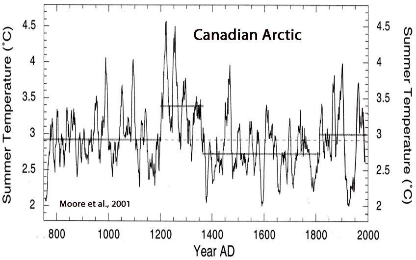
Moore et al., 2001
Summer temperatures at Donard Lake [Canadian Arctic] over the past 1250 yrs averaged 2.9 °C. At the beginning of the 13th century, Donard Lake experienced one of the largest climatic transitions in over a millennium. Average summer temperatures rose rapidly by nearly 2 °C from 1195–1220 AD [+0.80 C per decade], ending in the warmest decade in the record (~4.3 °C).
Elbert et al., 2013


Aagaard-Sørensen, 2014
The sSSTMg/Ca [sea surface temperature] values [Fram Strait, Arctic Ocean] increase and vary between 2.1°C and 5.8°C [+/-3.7°C] from ~2.7 kyr BP [2,700 years ago] to the present.
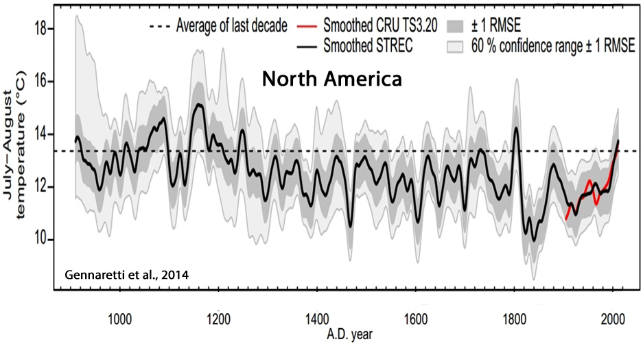
Gennaretti et al., 2014
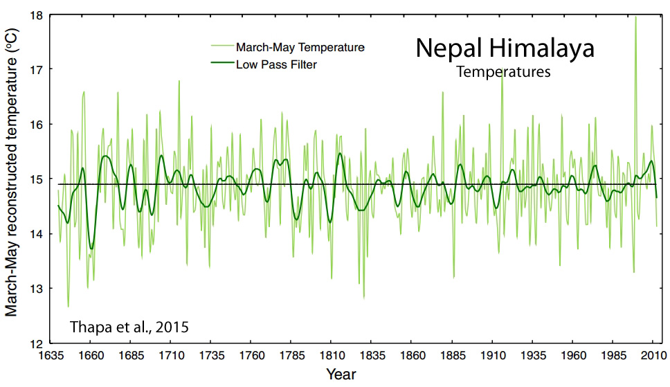
Thapa et al., 2015
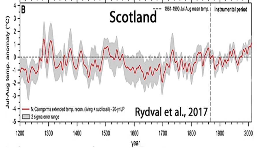
Rydval et al., 2017
[T]he recent summer-time warming in Scotland is likely not unique when compared to multi-decadal warm periods observed in the 1300s, 1500s, and 1730s
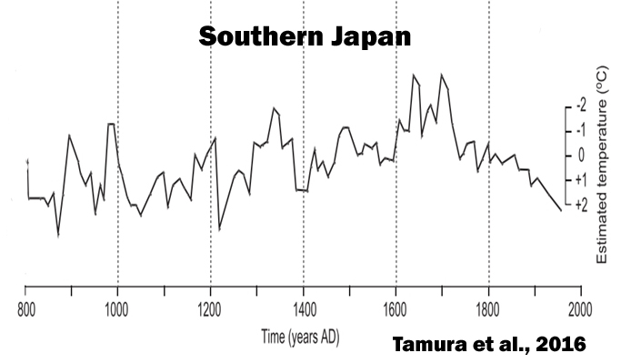
Tamura et al., 2016
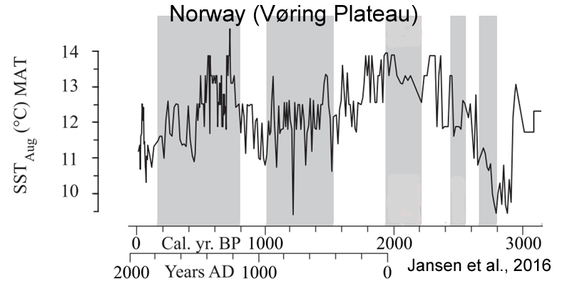
Jansen et al., 2016
We suggest that deviations in ELA fluctuations between Scandinavian maritime and continental glaciers around 7150, 6560, 6000, 5150, 3200 and 2200 cal. yr BP reflect the different response of continental and maritime glaciers to drops in total solar irradiance (TSI).
Sun et al., 2017
Our findings are generally consistent with other records from the ISM [Indian Summer Monsoon] region, and suggest that the monsoon intensity is primarily controlled by solar irradiance on a centennial time scale. This external forcing may have been amplified by cooling events in the North Atlantic and by ENSO activity in the eastern tropical Pacific, which shifted the ITCZ further southwards.

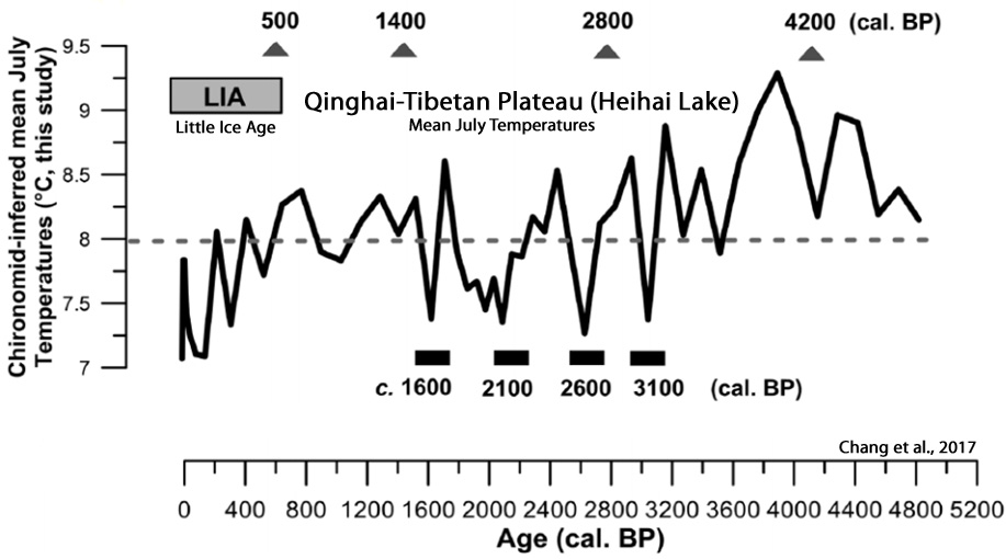
Chang et al., 2017
The chironomid-based record from Heihai Lake shows a summer temperature fluctuation within 2.4°C in the last c. 5000 years from the south-east margin of the QTP [Qinghai–Tibetan Plateau]. … The summer temperature changes in this region respond primarily to the variation in the Asian Summer Monsoon. The variability of solar activity is likely an important driver of summer temperatures


I hope you realize that this is essentially the curve fitting exercise so many “scientists” have done before (see Lüdecke and Weiss, 2017 that you linked to in the past) and not some magic bullet just because it contains the words “machine learning”. It’s the same nonsense that you posted before with someone doing an FFT analysis and then constructing the graph from the found frequency components.
Anyway, this author explains the problems with this approach better than I ever could:
https://andthentheresphysics.wordpress.com/2017/08/22/machine-unlearning/
Ignoring physics isn’t the best way to understand how our climate changes 😉
Secondly, it seems to be your opinion that current climate change isn’t that different from past climate changes and therefore the current climate change could be as well all natural. You do this while completely ignoring the physical reasons. I wonder why …
And last but not least … isn’t that the same story that Breitbart published a few days ago (http://www.breitbart.com/big-government/2017/08/22/delingpole-global-warming-is-almost-entirely-natural-study-confirms/) and got already debunked by so many climate scientists?
https://twitter.com/hausfath/status/900105322169118720
https://twitter.com/ClimateOfGavin/status/900341454232371200
They faked their proxy data? Why would they do that?
(a) I don’t read Breitbart.
(b) It has not been “debunked” in the slightest. Northern Hemisphere temperatures do not look like hockeysticks unless they’re the ones preferred by Gavin. Here are 3 other many-proxy NH reconstructions that look similar to the one enclosed here.
https://notrickszone.com/wp-content/uploads/2017/04/Holocene-Cooling-Northern-Hemisphere-Abrantes-17.jpg
–
https://notrickszone.com/wp-content/uploads/2017/04/Holocene-Cooling-Northern-Hemisphere-Schneider-2015.jpg
–
https://notrickszone.com/wp-content/uploads/2017/04/Holocene-Cooling-Northern-Hemisphere-Stoffel-2015.jpg
The “fake” graphs are the ones that make NH hockey sticks, or that remove the -0.5 C of cooling between 1940 and 1970:
https://notrickszone.com/wp-content/uploads/2017/01/Northern-Hemisphere-1881-1975.jpg
I don’t think you understand the problem:
https://www.theguardian.com/environment/planet-oz/2017/aug/26/institute-of-public-affairs-paper-claim-global-warming-natural-junk-science
It is junk science that ignores the physical mechanisms and compares their result with a graph that they made up.
Oooh, The Guardian. Sorry, but we don’t hold that newspaper in high regard with respect to climate science.
The graph of NH temperatures that you here claim is “made up” has actually been reproduced by other scientists using proxy evidence from the NH. The NH cooled by -0.5 C between 1940 and 1970 and only recently reached the amplitudes achieved during the 1930s and 1940s (it’s warmed by about 0.5 C since the 1970s, which is the same amplitude of the cooling between 1940 and 1970). The Arctic temperature trends over the last 100 years look similar to the trends for the entire Northern Hemisphere. In other words, the hockeystick graphs you and Gavin and The Guardian prefer are not reflected in the temperature record from the paleoclimate. For example, about 70% of the graphs in this 300-non-hockeystick-graph record comes from the NH. There is nothing unusual or unprecedented about modern NH temperature trends.
https://notrickszone.com/global-warming-disputed-300-graphs/
You still haven’t addressed the question that was posed by this paper and others like it:
Why do you believe that there is something unusual happening now when the paleoclimate record shows that temperatures and sea levels naturally rose at 10 to 40 times (!) the rate of the last century – without human interference? Why were sea levels 2 meters (and more) higher than they are now 5,000 years ago, when CO2 levels were in the 270 ppm range? What natural mechanisms caused the rapid climate changes of the past, and at what point did natural mechanisms cease causing natural climate changes?
What physical mechanisms are you ignoring in explaining that CO2 concentrations are what caused ocean temperatures to rise by a whopping 0.09 C since 1955 – a rate that doesn’t even come close to falling outside the bounds of natural variability?
In addition to the match with other NH temperature reconstructions (links above), here are 5 other sets of reconstructions from the same regions identified in the paper (New Zealand, Southern South America, Tasmania, North America, Scandinavia) that also show no hockey sticks during modern times. So in what way are these “made up”?
New Zealand
https://notrickszone.com/wp-content/uploads/2017/06/Holocene-Cooling-New-Zealand-Cook-2002.jpg
–
Tasmania
https://notrickszone.com/wp-content/uploads/2017/06/Holocene-Cooling-Tasmania-Cook-2006.jpg
–
Southern South America
https://notrickszone.com/wp-content/uploads/2017/06/Holocene-Cooling-Southernmost-South-America-Anomaly-Neukom-2011.jpg
–
Scandinavia
https://notrickszone.com/wp-content/uploads/2017/03/Holocene-Cooling-Finland-Tsuolbmajavri-Birks-Seppa-04.jpg
–
https://notrickszone.com/wp-content/uploads/2017/06/Holocene-Cooling-Sweden-West-Central-Fuentes-2017.jpg
–
https://notrickszone.com/wp-content/uploads/2016/12/Holocene-Cooling-Scandinavia-Zhang-16.jpg
–
https://notrickszone.com/wp-content/uploads/2017/02/Holocene-Cooling-Northern-Europe-Esper-14.jpg
–
North America
https://notrickszone.com/wp-content/uploads/2017/06/Holocene-Cooling-North-America-Gennaretti-2014.jpg
You are still missing the point. Read the Guardian article and/or the two Twitter links in my original comment.
I did read The Guardian and the two twitter links. Apparently you find these sources persuasive?
The approach used here is not much different than using models to project global temperatures and sea level rise 100 years from now.
On the other hand, periodicity studies like this actually look for patterns based upon natural cycles from the past. There is no precedence to look for from a geological standpoint that has global temperatures changing dramatically after CO2 concentrations have changed significantly. The “pattern” for advocates of DAGW is based upon modeled assumptions about what CO2 variations will do to ocean temperatures and the assumption that correlation = causation (i.e., ocean temperatures have risen by 0.09 C since 1955; CO2 has risen since 1955; therefore, CO2 rise caused ocean temperatures to rise).
Why do you believe that there is something unusual about modern temperatures or rates of change when, for example, surface and ocean temperatures have risen and fallen at rates and amplitudes far greater in the past, or without human interference, than in recent decades? Sea levels were multiple meters higher than they are now throughout the globe just a few thousand years ago. Temperatures rose and sea levels rose at rates 30-40 times faster than in recent decades while CO2 levels remained essentially constant. Shouldn’t there be something unusual about modern temperatures and/or sea level rise rates before claiming that what’s happening now falls outside the range of natural variation?
https://notrickszone.com/2017/04/13/new-paper-northern-hemisphere-temperatures-rose-4-5c-within-a-few-decades-14700-years-ago
What are the physical reasons that ocean temperatures naturally rose and fell in the past? For example, explain the causes of the amplitudes and rates of warming and cooling found in this graph:
https://notrickszone.com/wp-content/uploads/2016/11/Holocene-Cooling-Pacific-Heat-Content-Rosenthal13-copy.jpg
Or, for that matter, why did Greenland’s temperatures rise at a faster rate during the 1920s and 1930s than in recent decades? Why did the Arctic cool for 50 years just as CO2 emissions were rising dramatically…if the physical reasons for modern warming are significantly due to CO2 emissions?
Box et al., 2009
http://journals.ametsoc.org/doi/full/10.1175/2009JCLI2816.1
“The annual whole ice sheet 1919–32 warming trend is 33% greater in magnitude than the 1994–2007 warming. … The 1955–82 cooling phase was most significant during autumn in east and southern Greenland.”
Why has there been an oscillation in the Arctic’s temperatures, and would past patterns suggest that we are due for another cooling?
https://notrickszone.com/wp-content/uploads/2017/04/Arctic-Temperatures-1920-2017-HadCRUT4.jpg
Kenneth,
Maybe seb means those things like ‘Teleconnections’ that was Gavin Schmidt only real defense of Michael Mann’s hockey stick paper.
After all they’re physically explainable aren’t they? Science knows the physics behind them?
And what was Mann’s paper about anyway? It did not show and basic physics, just a curve fitting exercise concocted from from hidden data and methods.
It is fundamentally different! One is based on the understanding of physical mechanisms and the other is just numerology or pattern recognition. Do you know that they used the same algorithm for predicting stocks? You can probably do that with a seemingly random data source and be better than just guessing, but do you honestly think that is a proper way to predict future temperature change?
Especially when they compare their prediction to a fake graph and claim that the difference isn’t that big? 😉
Because – as you’ve written – it’s new that CO2 change proceeds temperature change. May I ask why you need the current climate change to be special in other ways to accept that it is not natural and has something to do with us emitting greenhouse gases?
I’ll reply to your other comment in this comment to not split up the conversation:
The important thing is that there are mechanisms that caused these changes. They didn’t just happen randomly to match some pattern. And the models that are based on our understanding of these mechanisms work for the past and they have been working quite well for predicting the last decade.
The problem with extrapolating past patterns is that they don’t include the influence CO2 has. It’s ignoring the physical mechanisms … it’s junk science. It’s like those older couples in casinos that write down the numbers at the roulette table in hopes of predicting the next few numbers. It doesn’t work!
The approach used here is not much different than using models to project global temperatures and sea level rise 100 years from now.
So what were the physical mechanisms that caused ocean temperatures (0-1000 m) to rise and fall by 1.0 degree C per century 100% naturally and without changes in CO2 throughout the Holocene (Bova et al., 2016), whereas you believe that the 0.1 of a degree C per century change since 1800 (+0.25 C since 1600-1800 C.E. in the 0-700 m layer) was caused by CO2? The “natural” or non-CO2 induced changes are far more pronounced than could be inferred by the more recent changes in CO2 concentrations. Sea levels rose at rates of 5 meters per century while CO2 levels remained stationary, whereas sea levels have only changed by 0.17 of a meter per century since 1900. So why do you believe the changes since 1900 fall outside the range of natural variability if natural variability includes amplitudes and rates that are 30 times greater than the modern changes?
If sea levels rise by 5 meters per century without changes in CO2, and sea levels rise by 0.17 of a meter per century with changes in CO2, why do you believe the 0.17 of a meter per century change was caused by CO2 if rates of change that are 30 times larger occur without changes in CO2?
Furthermore, what are the physical mechanisms that cause sea levels to rise naturally at rates of 5 meters per century? What happened to these mechanisms during the modern era? Did they disappear? If so, at what point has that disappearance of natural causes been confirmed?
Do you think this happened randomly to satisfy some pattern?
How many times will you make me repeat it until you understand what I am saying? It doesn’t matter that past changes in temperature/climate could have happened faster and were larger than the currently observed beginning of our influence on the climate.
It doesn’t make sense to argue the way you do. When you get robbed, do you then also claim that your empty wallet could be caused by natural events because it got empty before when you paid for things? Do you then also ignore that you just have been robbed and chalk it up to natural events?
So what were the physical mechanisms that caused ocean temperatures (0-1000 m) to rise and fall by 1.0 degree C per century 100% naturally and without changes in CO2 throughout the Holocene (Bova et al., 2016), whereas you believe that the 0.1 of a degree C per century change since 1800 (+0.25 C since 1600-1800 C.E. in the 0-700 m layer) was caused by CO2? The “natural” or non-CO2 induced changes are far more pronounced than could be inferred by the more recent changes in CO2 concentrations.
Sea levels rose at rates of 5 meters per century while CO2 levels remained stationary, whereas sea levels have only changed by 0.17 of a meter per century since 1900. So why do you believe the changes since 1900 fall outside the range of natural variability if natural variability includes amplitudes and rates that are 30 times greater than the modern changes?
Is this response an answer to my questions? I’m asking for the physical mechanism that caused far more pronounced and extreme climate changes than the tiny, modest changes we’ve endured/enjoyed over the last century, and this is your response? Is it that you know, but don’t want to admit the physical mechanisms, or do you just really not know the answers to such fundamental climate science questions?
It most certainly does matter that modern climate changes don’t even come close to falling outside the bounds of natural variability. Why else do you think the hockey team has tried so desperately to erase the Medieval Warm Period, or hide their proxy data from FOIA investigation? They care about trying to make the modern period appear unusual and unprecedented. That’s why they remove past warming and make hockey sticks and replace tide gauge data with satellite altimetry devices that they can manipulate.
But what if the currently observed beginning of our influence on the climate isn’t even detectable…especially within the context of a much larger natural variability?
The Greenland Ice Sheet has contributed just 0.39 of a cm to sea level rise since 1993. In the 60 years between 1940 and 2000, the GIS contributed nothing to sea levels. A contribution of 0.39 of a cm in 70 years is, in my opinion, not especially worrisome. Obviously, since you believe in dangerous AGW, you necessarily must view the 0.39 of a cm contribution from GIS in 70 years with consternation. This is, according to you and those on your side, a significant human impact. (This assumes, of course, that the entire 0.39 of a cm of sea level contribution is a result of human activity, which is also dubious speculation at best.)
Unlike you, we skeptics take a look at that 0.39 of a cm contribution from the GIS and think that that’s really not significant at all…especially in light of the past contributions from glacier and ice sheet melt that led to sea level rise rates of 5 meters per century (!). That’s the perspective in which we are coming from, SebastianH. You’re trying to convince us that we need to be equally as inclined to wring our hands about 0.39 of a cm of sea level rise contribution as you are…so you ensconce yourself in your blogs that confirm your biases and then expect us to follow along with you and agree that we’re dangerously impacting on the climate with our CO2 emissions. It’s not working. You’re not convincing us that today’s climate changes are dangerous and worrisome and worth spending trillions to try to counteract. That’s why your attempts to support your beliefs about dangerous AGW with twitter feeds and The Guardian have not been effective. Did you expect that they would be?
Don’t get angry because of that reply. It was appropriate for your attempt to distract from the topic at hand: the validity of the paper you are celebrating in the article. Or do you really think there is no physical mechanism behind climate and it’s all just following patterns no matter what variable changes?
It does not.
Oh dear, the “all their data is fake or not relevant” argument again.
There more I read from you the less hope I have that you might one day understand the underlying mechanisms and wonder how you could ever post the things you regularly do. Ignoring how things work doesn’t make you right, I hope you’ll realize that some day.
What if the natural variability would have caused considerable cooling by now and the only thing causing warming/stable temperatures is the increased greenhouse effect? Do you know?
You have been told multiple times now that the current sea level rise is largely coming from thermal expansion and glaciers melting, not melting Greenland ice: https://www.ipcc.ch/pdf/assessment-report/ar5/wg1/WG1AR5_Chapter13_FINAL.pdf
Sorry Kenneth, but you are the one who is laser focused on Greenland ice mass and its contribution to sea level rise.
Why would I convince you about that? My objective is that you understand basic physical mechanisms and stop ignoring them in almost every post/comment you make. It would make you a better skeptic that doesn’t make himself look as ridiculous uninformed as you do now (see your conversations with Ed Bo Link).
I expect that you inform yourself about the problems that the paper you are posting about has. You can follow links that people give you or convince yourself that those links only contain nonsense and stay ignorantly uninformed. Your choice.
Is this response an answer to my questions?
I’m not angry…more amused by your floundering behavior here than anything else. You claim that I “don’t understand” the physical mechanisms behind modern climate change. So when I ask you to identify the physical mechanisms underlying natural climate changes that are an order of magnitude more profound than anything we are currently experiencing, you complain that I am distracting from the topic at hand. I could have predicted such a response. You refuse to answer the physical mechanism questions because you know that if you actually do so, you undermine the narrative that says 110% of climate change has been human-caused since the 1950s.
The topic at hand is the extent to which natural climate forcing and natural variability might exceed the changes in the modern record. Asking you to identify physical mechanisms for past climate changes is rather fundamental to answering this question. For if the natural physical mechanisms haven’t disappeared and are still acting on the climate (and they haven’t and are), then the position that it is humans who cause climate changes with their CO2 emissions and natural forcing factors no longer contribute…is less feasible. Obviously, that is why you refuse to answer the question. Not because of your concern for staying on topic…which is laughable considering you routinely veer off into analogies that have little to nothing to do with the real topic.
Since I didn’t actually write that, you do not have my permission to make up statements I didn’t think or write and falsely claim that I wrote it. Stop fabricating, SebastianH.
This charge you keep leveling – that I am ignoring how things work – is rather ironic coming from someone who cannot bring himself to identify the physical mechanisms that caused sea levels to rise at rates of 5 meters per century, ocean temperatures (0-1000 m) to rise at rates of 1.0 C per century, relative sea levels to rise to 3 meters above present 5,000 years ago…all without contribution from CO2 concentrations. If there is anyone “ignoring” the processes eliciting climate changes…it is you.
Together, thermal expansion and glaciers contribute about 1 mm/yr to sea level rise (0.4 mm/yr for glaciers, 0.65 mm/yr for thermal expansion). So where is the other 2.3 mm/yr of sea level rise coming from to reach the satellite altimetry estimates of 3.3 mm/yr?
And you realize, of course, that if thermal expansion alone causes 0.4 of a meter of sea level rise for every further degree of warming (IPCC), this would imply that the Holocene Thermal Maximum, or Mid-Holocene, was about 5 degrees (or more) warmer than today due to 2-meters-higher sea levels that existed at that time. So why were the ocean waters so much warmer 5,000 years ago…since CO2 levels were in the 270s ppm?
So, in your view, you are doing me a favor by helping me to understand how this climate thingy works? Should I be thanking you?
I think I may have a different perspective on what it means to be “ignorantly uninformed”. I don’t find Gavin’s insights, or Michael Mann’s insights, to be especially enlightening. On the other hand, I read skepticalscience and RealClimate articles every week (or whenever one comes on board…sometimes there’s nothing new for weeks at a time). I have both websites among my bookmarks. And yet when I read articles at each site, I find them less and less convincing.
What would the “natural variability” that would have caused considerable cooling have consisted of, SebastianH? What’s the mechanism causing that considerable cooling that was fortunately thwarted by human CO2 emissions in your thought experiment? Could the supposed cooling be caused by declining solar irradiance and increased volcanism like we had during the 1450-1900 Little Ice Age? If so, do you think the high level of 20th century solar activity (a rare Grand Maximum) and decrease in volcanism could have played a role in the 20th century warming? If so, how much of a role? Would it be greater than zero, as Gavin believes?
But do answer the question: Why would you think that the climate should be cooling? What’s the mechanism?
It would be foolish of him to give up his main weapon.
No. See my other reply to your barrage of comments.
The topic is that their conclusion is wrong.
Why would they disappear or not act today? Are you making something up that nobody wrote?
You wrote “that they can manipulate.”. It’s the good old “all their data is fake anyways” tactic.
It’s 1.1 mm/yr thermal expansion and 0.76 mm/yr glaciers without Greenland and Antartica. The rest is from glaciers in Greenland, Greenland ice sheet, Antartic ice sheet and land water storage.
It’s interesting how you jump to conclusions. Have you considered other reasons for an increased sea level yet?
You should really read and study what the IPCC has to say about past, present and future sea level changes: https://www.ipcc.ch/pdf/assessment-report/ar5/wg1/WG1AR5_Chapter13_FINAL.pdf
Nothing here is convincing material when you routinely get the basics wrong and can’t even admit that an error has been made (see the now endless discussion about the stretched and scaled NH reconstruction they were using in the paper, that couldn’t be more obvious).
Unbelievable, I count 8 new questions for me to answer and you haven’t answered a single one of mine 😉
Together, thermal expansion and glaciers contribute about 1 mm/yr to sea level rise (0.4 mm/yr for glaciers, 0.65 mm/yr for thermal expansion).
Not quite. It’s 0.64 mm/yr from thermal expansion (2005-2013) and 0.41 mm/yr from mountain glaciers (2003-2010) excluding Greenland and Antarctica…which amounts to 1 mm/yr during a period of time that sea levels were claimed to be rising at a rate of 3.3 mm/yr. So again, where is the other 2.3 mm/yr coming from?
Thermal expansion: 0.64 mm/yr (0.77-0.13 mm/yr)
http://www.nature.com/nclimate/journal/v4/n11/full/nclimate2387.html
Direct measurements of ocean warming above 2,000 m depth explain about 32% of the observed annual rate of global mean sea-level rise. Over the entire water column, independent estimates of ocean warming yield a contribution of 0.77 ± 0.28 mm yr−1 in sea-level rise and agree with the upper-ocean estimate to within the estimated uncertainties. Accounting for additional possible systematic uncertainties, the deep ocean (below 2,000 m) contributes −0.13 ± 0.72 mm yr−1 to global sea-level rise and −0.08 ± 0.43 W m−2 to Earth’s energy balance.
–
Mountain glaciers: 0.41 mm/yr
http://www.nature.com/nature/journal/v482/n7386/abs/nature10847.html
“Here we show that GICs [glaciers and ice caps], excluding the Greenland and Antarctic peripheral GICs, lost mass at a rate of 148 ± 30 Gt yr−1 from January 2003 to December 2010, contributing 0.41 ± 0.08 mm yr−1 to sea level rise.”
Did you realize that terrestrial water storage on average removes about -0.35 mm/yr from sea levels? So again we’re still left with about 1 mm/yr (with Greenland and Antarctica included). Where is the rest coming from?
Land Water Storage: -0.35 mm/yr
http://science.sciencemag.org/content/294/5543/840.full
“terrestrial water storage … is in the range of –1.1 to + 0.4 mm/year with a median value of −0.35 mm/year”
Except I didn’t write that “all their data [are] fake”. You wrote that. So you lied. Again.
I wrote that the overseers of the satellite altimetry modeling are able to manipulate their results to show higher sea level rise than what the tide gauges say. This is true. There is an enormous difference between falsely claiming that I have written that (a) “all their data [are] fake” and (b) “overseers of the satellite altimetry data sets are able to manipulate their data to show greater rise than tide gauges“. I wrote the latter…because it’s true. You wrote/fabricated the other one. Stop fabricating, SebastianH.
So you are going to ignore what I wrote and the IPCC report says … fine.
Writing “they can manipulate data” while insinuating they are actually doing that because the data doesn’t match the observation (it does) is not same as the usual skeptics fallback that their data is fake anyway? I see.
So are you ignoring what the scientific literature says? The IPCC estimate conveniently excludes the sub-2000 m layer (the majority of the ocean) in their thermal expansion contribution estimate. Why do you believe that over half the ocean water shouldn’t be included, SebastianH? Is it because the sub-2000 m layer has been cooling since the early 1990s?
No, the global tide guage observations(1.0 to 1.7 mm/yr) do not match the satellite altimetry data (3.4 mm/yr). Tide gauges continue to show a deceleration since the 1920-1950 period. To “correct” this, modeled altimetry data sets were deployed in the early 2000s.
I don’t write that “all their data [are] fake”. Ever. Stop fabricating.
Anyone would think ‘climate science™’ was all about actual physical effects that were all known and can be resolved into neat mathematical formulae. BUT IT AIN’T SO!
And here in all it’s glory is the BS in your link —
“This highlights the key problem with the approach in this paper; you can’t try and understand what causes our climate to vary, or how it might vary in future, using machine learning alone. Even though our climate is complex, it is still a physical system and we do understand the underlying physical processes quite well. You do need to take this into account. “
UTTER PIFFLE! — This paper is not trying to understand climate process, it is a validation process against the Mann hockey stick paper (and all the others), and from the results glean some basic fundamentals about how some climate parameters vary over time.
This is what the paper is about —
Time-series profiles derived from temperature proxies such as tree rings can provide information about past climate. Signal analysis was undertaken of six such datasets, and the resulting component sine waves used as input to an artificial neural network (ANN), a form of machine learning. By optimizing spectral features of the component sine waves, such as periodicity, amplitude and phase, the original temperature profiles were approximately simulated for the late Holocene period to 1830 CE. The ANN models were then used to generate projections of temperatures through the 20th century. The largest deviation between the ANN projections and measured temperatures for six geographically distinct regions was approximately 0.2 °C, and from this an Equilibrium Climate Sensitivity (ECS) of approximately 0.6 °C was estimated. This is considerably less than estimates from the General Circulation Models (GCMs) used by the Intergovernmental Panel on Climate Change (IPCC), and similar to estimates from spectroscopic methods.
And it does what it set out, very well.
You also don’t understand the problem with their paper.
They let a neural net learn some proxy data from before industrialization happened. They do that by analyzing the frequency components (e.g. pattern recognition and Fourier transformations). Then they let the neural net predict the future for a given time series and compare that prediction with the actual proxy data for that period.
This should show the difference between a continued pattern and what actually happened due to the influence of humans. So far so good.
But:
1) That’s more or less the same as others have already shown to work. Nobody doubts that it is possible to reconstruct time series data from the frequency analysis. It’s completely ignoring the underlying physics. Nobody is stopping you from doing that, but it is the same as writing down numbers at the roulette table and recognizing a pattern in those numbers. It’s the same as guessing stock market prices with this algorithm (they did that before if you read Marohasy’s blog post about their paper).
2) They are comparing their computed result to the wrong graph. Their graph is a stretched and shifted version of another graph (as has been shown). It is completely missing the warming of the last 50 years.
Sorry seb,
You said I don’t understand the problem with their paper.
1. What they have done is little different from what other have done but used a ANN. (And yea I thoroughly understand what that is, (so GET OFF YOUR HIGH HORSE fool!).
2. No they have not, you’re just parroting other people’s criticism without UNDERSTANDING what has been done.
John says:
SebH must be reasoning that the CO2 makes the atmosphere warmer and then it dissolves in the oceans and makes them warmer.
But warmer oceans expel more CO2 and the warming cycle continues.
SebH might want to explain what he thinks.
SebastianH believes that oceans are now a net sink…because of anthropogenic emissions.
Clarifying, he believes there is a natural equilibrium for atmospheric CO2 (~290 ppm), and that the oceans used to be a net source prior to the 1800s (when CO2 was ~290 ppm), and this is why CO2 concentration changes followed temperature changes in the past glacial-interglacial (lowering when temperatures dropped, rising when temperatures rose) transitions and in variations in temperature during this interglacial (i.e., the 8.2 K event, the 1450-1900 Little Ice Age).
Now he believes temperatures follow CO2 changes. The physics changed once humans started burning fossil fuels.
He’ll probably correct me on some of the wording, but this is what he has explained he believes previously.
John, that’s not how warming works, but nice try at trolling Mr. “caves are warm, so Earth has its own temperature”.
Kenneth,
you still don’t understand the mechanism. Have you even tried to learn how it works? Or does it just sound funny to you and you write it off as the whole nonsense that climate science is? Is your own imagined random natural events cause everything theory enough for you as an explanation? Aren’t you the least bit curious how CO2 is absorbed/emitted from the oceans/nature?
No, nothing changed in the physics department. It is the same mechanism. Understand how it works and you will hopefully stop making ridiculous comments like this one 😉
No trolling SebH. The truth is what you hear.
You have not explained why Earth has no temperature. Sun is not in the caves but they are not cold. Explain!
Another debunking of Abbot and Marohasy: http://rabett.blogspot.ca/2017/08/marohasy-mess-up.html
I think you may be missing what the word “debunking” means.
Northern Hemisphere temperatures do not look like hockeysticks unless they’re the ones preferred by Gavin. Here are 3 other many-proxy NH reconstructions that look similar to the one in the Abbot and Marohasy paper.
–
https://notrickszone.com/wp-content/uploads/2017/04/Holocene-Cooling-Northern-Hemisphere-Abrantes-17.jpg
–
https://notrickszone.com/wp-content/uploads/2017/04/Holocene-Cooling-Northern-Hemisphere-Schneider-2015.jpg
–
https://notrickszone.com/wp-content/uploads/2017/04/Holocene-Cooling-Northern-Hemisphere-Stoffel-2015.jpg
–
The “fake” graphs are the ones that make NH hockey sticks, or that remove the -0.5 C of cooling between 1940 and 1970:
https://notrickszone.com/wp-content/uploads/2017/01/Northern-Hemisphere-1881-1975.jpg
Jack, can you explain what it is that causes Northern Hemisphere temperatures to naturally rise by 4-5 degrees C within a span of “a few decades” while CO2 levels remained stationary?
Can you explain why it is that sea levels were 2 meters higher than they are now 5,000 years ago, when CO2 levels were in the 270 ppm range? Can you explain why sea levels rose at rates of 5 meters per century while CO2 levels remained stationary…if CO2 levels are the reason sea levels are rising at a rate of a whopping 0.17 of a meter per century today?
Can you explain why it is that ocean heat content has only risen by 0.09 C (0-2000 m) since 1955, whereas temperatures rose/fell by 2 degrees C in 200 years (0.1 C per decade) just a few thousand years ago…without CO2 variations?
Can you answer these questions?
It’s not about making graphs look like hockey sticks, it is about their graph being fake. They stretched it an scaled it … Their year 2000 is not the year 2000. They are missing 35 years of warming in their graph.
You keep oddly claiming the graph in the paper is “fake”, and yet the very same oscillatory trend in NH temperatures (including significant cooling between the 1940s and 1970s) is found in several other reconstructions. Are you going to continue refusing to address this because of your biased preference for Mannian hockey stick graphs?
–
https://notrickszone.com/wp-content/uploads/2017/04/Holocene-Cooling-Northern-Hemisphere-Schneider-2015.jpg
–
https://notrickszone.com/wp-content/uploads/2017/04/Holocene-Cooling-Northern-Hemisphere-Stoffel-2015.jpg
–
https://notrickszone.com/wp-content/uploads/2017/04/Holocene-Cooling-Northern-Hemisphere-Abrantes-17.jpg
–
https://notrickszone.com/wp-content/uploads/2017/04/Soon-Connolly-2015-NH-Temps.jpg
–
https://notrickszone.com/wp-content/uploads/2017/04/Holocene-Cooling-Northern-Hemisphere-Temps-B%C3%BCntgen-2017.jpg
–
The “fake” graphs are the ones that make NH hockey sticks, or that remove the -0.5 C of cooling between 1940 and 1970:
https://notrickszone.com/wp-content/uploads/2017/01/Northern-Hemisphere-1881-1975.jpg
–
At what point will you finally answer why you believe that modern climate changes are unnatural and man-made when they don’t even come close to falling outside the range of natural variability?
Because it is stretched and shifted.
When will you stop believing that the emphasized part of your quote is enough to declare the current change of climate to be natural? You are ignoring the physical mechanisms … in almost every comment/post you make. Just to promote your skeptical – pardon, agnostic – viewpoint. Aren’t you curious how things work? Or is that not required to be a good skeptic?
You keep oddly claiming the graph in the paper is “fake”
I’ve provided links to several other graphs of NH temperatures that show the same oscillatory pattern as the one found in this paper. Will you claim that all those reconstructions are “fake” too because you prefer the hockey sticks?
What are the physical mechanisms that cause sea levels to rise at rates of 5 meters per century (vs. 0.17 of a meter per century today), or ocean heat content (0-1000 m) to rise and fall at rates of 1 degree C per century throughout the Holocene (vs. 0.1 C per century today)? Are you planning to continue ignoring these questions regarding physical mechanisms, SebastianH?
This is not about other reconstructions it is about their reconstruction. I don’t want to repeat the problems with their paper when you could just read the links I provided and save us both some time. Too lazy? Is that against your conviction? I try to read and understand most of the things you link to … that’s how I know that you often cherry pick quotes and ignore everything else a paper is saying 😉
Yes. You know the physical mechanisms behind those events or what can be reconstructed regarding those events. And this is a distraction from the topic at hand, the junk science status of this particular paper.
But out of curiosity. When did that alleged 5 meters per century sea level rise happen? And last but not least, the IPCC is not ruling out that past sea level change rates were higher than modern rates (https://www.ipcc.ch/pdf/assessment-report/ar5/wg1/WG1AR5_Chapter13_FINAL.pdf chapter 13.2.1.3)
I have read your twitter links and the article from The Guardian. Twice. Their leaps to conclusions are anything but persuasive. So why do you find it necessary to keep on insinuating that I haven’t read them because I’m “too lazy”?
Are you planning to continue ignoring these questions regarding physical mechanisms, SebastianH?
Yes, I know that I know. I’m not asking you for information as a means of informing me. I’m asking you to provide evidence that YOU know the answers to the questions. Of course, the reason why you won’t answer my “What are the mechanisms?” questions is that you know that if you actually provide an answer, the follow-up questions will be devastating to the narrative you ascribe to.
For example, if you acknowledge that the reason why 0-700 m ocean temperatures plummeted by -0.9 C between the MWP and LIA has to do with the decline in solar irradiance (Sporer, Maunder, Dalton, high volcanic activity), then you will have to admit that one of the reasons why ocean temperatures have risen by +0.25 C (Wow!) since the 1600-1800 period is that we have enjoyed a rare Grand Maximum of solar activity and less volcanism, and thus the paradigm that says the Sun has next to nothing to do with temperature variations in the oceans will have taken a hit. So, instead of answering these questions, you abscond. That way you can avoid acknowledging the role of natural forcing factors and focus on anthropogenic CO2 emissions instead.
It’s not as if what you’re doing here is fooling anyone.
–
Donoghue, 2011
For much of the period since the last glacial maximum (LGM), 20,000 years ago, the region has seen rates of sea level rise far in excess of those experienced during the period represented by long-term tide gauges. The regional tide gauge record reveals that sea level has been rising at about 2 mm/year for the past century, while the average rate of rise since the LGM has been 6 mm/year, with some periods of abrupt rise exceeding 40 mm/year [4 meters per century]. … Sea level has at times risen at rates more than 20 times that of today, more than 40 mm/year. At such rates, the regional shorelines would have retreated by as much as 40 m/year, or more than 75 cm/week.
–
Ivanovic et al., 2017 (Greenland)
During the Last Glacial Maximum 26–19 thousand years ago (ka), a vast ice sheet stretched over North America [Clark et al., 2009]. In subsequent millennia, as climate warmed and this ice sheet decayed, large volumes of meltwater flooded to the oceans [Tarasov and Peltier, 2006; Wickert, 2016]. This period, known as the “last deglaciation,” included episodes of abrupt climate change, such as the Bølling warming [~14.7–14.5 ka], when Northern Hemisphere temperatures increased by 4–5°C in just a few decades [Lea et al., 2003; Buizert et al., 2014], coinciding with a 12–22 m sea level rise in less than 340 years [5.3 meters per century] (Meltwater Pulse 1a (MWP1a)) [Deschamps et al., 2012].
–
Hodgson et al., 2016
Rapid early Holocene sea-level rise in Prydz Bay, East Antarctica
The field data show rapid increases in rates of relative sea level rise of 12–48 mm/yr [1.2 to 4.8 m per century] between 10,473 (or 9678) and 9411 cal yr BP in the Vestfold Hills and of 8.8 mm/yr between 8882 and 8563 cal yr BP in the Larsemann Hills. … The geological data imply a regional RSL [relative sea level] high stand of c. 8 m [above present levels], which persisted between 9411 cal yr BP and 7564 cal yr BP
–
Zecchin et al., 2015
Episodic, rapid sea-level rises on the central Mediterranean shelves after the Last Glacial Maximum: A review
The evidence presented here confirms drowned shorelines documented elsewhere at similar water depths and shows that melt-water pulses have punctuated the post-glacial relative sea-level rise with rates up to 60 mm/yr. [6 meters per century] for a few centuries.
Kenneth,
You may be interested in this paper too, called ‘Harmonic Analysis of Worldwide Temperature Proxies for 2000 Years’ and is freely available from https://benthamopen.com/FULLTEXT/TOASCJ-11-44.
Because you keep ignoring that they made up their NH proxy graph or digitized it wrong. This makes their conclusion invalid … simple as that. And yet you come up with other proxy data trying to show me exactly what? That Hockeystick graphs are fake?
Not quite … but it’s the follow-up that is the problem with your distracting questions. Whenever someone falls for that trap the conversation will suddenly be about something completely different than the commenter originally intended. I am not falling for that trap of yours, not this time.
Oh dear, nobody is saying that. You don’t have to demonstrate that you don’t understand how CO2 could possibly cause warming of the oceans or that you don’t want it to be real every time this comes up.
Because that is the new thing in modern times. A variable that changes more rapidly than ever before in the recent history of this planet. Is that so hard to understand?
Regarding your 5 m per century sea level rise … do you consider the current times to be comparable to being at a glacial maximum or coming out from one?
You have an accusation that they “made up” their proxy NH graph — one of 12 graphs in the paper itself. You have no access to their proxies, but yet you feel free to make this claim anyway. You have no verification that they just made it up. And so your “proof” is that you can cite some twitter graphs that have vertical hockey sticks in them. These hockey stick graphs do not in any way resemble the graphs of NH from satellites that show no such vertical amplitude after the 1980s.
These hockey stick graphs also do not resemble the shape of other NH proxy graphs that show a warming and cooling oscillation trend and no significant net difference between the 1940s and 2000s (Schneider et al., 2015, Stoffel et al., 2015, Soon and Connolley, 2015, Abrantes et al., 2017, Buntgen et al., 2017). So, in other words, all you are doing is parroting the claims of Gavin and his ilk. You have no proof or verification, but you have decided to smear these authors anyway. And this, apparently, is the best “rebuttal” you can muster: providing links to The Guardian and twitter graphs.
the paradigm that says the Sun has next to nothing to do with temperature variations in the oceans
SebastianH, the IPCC says that: https://notrickszone.com/wp-content/uploads/2017/01/IPCC-Solar-Irradiance-vs.-Anthropogenic-Forcing-Since-1750.jpg
seb is just a parrot!
“Because it is stretched and shifted.” arrr! “Because it is stretched and shifted.”
You do not even understand what you are saying.
Precisely were is this stretching? Or are you going to have to ask Zeke et al for the info, then recite it here.
When you’ve read the paper you will understand — until then you’re a parrot!
Look at figure 12:
https://www.researchgate.net/figure/318931349_fig12_Fig-12-Proxy-temperature-record-blue-and-neural-network-projection-orange-based-on
And figure 13:
https://www.researchgate.net/figure/318931349_fig13_Fig-13-Proxy-temperature-record-blue-and-neural-network-projection-orange-based-on
And now compare figure 13 to something like the Hadcrut4 NH temperature record. Do you see any similarities? Do you really think their year 2000 is the year 2000?
Here are both graphs overlayed over each other:
http://imgur.com/a/T06nP
Do you see the problem? I wonder what their neural network is predicting for those 50 years between their end date of 1965 (not 2000) and now.
According to the National Academy of Sciences and NASA (1981), Northern Hemisphere temperatures rose by about 0.8 C between the 1880s and 1940, then dropped by -0.5 C through the mid-1970s:
https://notrickszone.com/wp-content/uploads/2017/01/Northern-Hemisphere-1881-1975.jpg
According to RSS, Northern Hemisphere temperatures have risen by about 0.5 or 0.6 C since the late 1970s, which means that they’ve effectively returned to the amplitude reached in the early 1940s. So there has been an oscillation, and no significant net NH warming in 75 years – consistent with the graphs I provided links to yesterday.
https://notrickszone.com/wp-content/uploads/2017/01/Northern-Hemisphere-RSS-1979-2017.jpg
Your links from the twitter accounts show a consistently near-vertical rising hockey-stick after the 1970s. The satellite temperature data sets show flat temperatures from the 1980s to early 1990s, a 0.4 C warming between the early and late 1990s, and then largely flat temperatures after that. In other words, the nearly vertical hockey stick graphs that you and Gavin prefer are not represented in the data. So if anyone is putting out “fake” graphs…it’s not Abbot and Marohasy.
But this isn’t even the point here. They have 5 other reconstructions too, all from other parts of the globe. And all show that there isn’t anything unusual about the modern temperature record relative to the past. The climate naturally cools and warms at similar rates and amplitudes as has been observed in recent decades. That’s the point – today’s climate does not fall outside the range of what has been achieved naturally.
Thank-you Kenneth you got there first.
P.S. I thought it a hook that Zeke’s original tweet could even get the correct paper to reference. What dimwit!
So seb what is this paper about?
What is it’s purpose?
Are the results valid for what they intend for it?
Or are you about to scurry-off to find another tweet to answer this very basic question?
Hint the introduction tells you!
The lovely myths of skeptics, but nevertheless compare that graph to their reconstruction of the NH values and you’ll see the problem.
Another skeptics myth.
They just insert the observational record, which is what it is. If you can’t compare a tree ring proxy to what has actually been measured in the same period of time because they differ, then what do their (the authors of the paper) results matter?
That is not the point and at this point (no pun intended) I don’t expect you to understand it …
See you in the next post, where you will also ignore everything non-believers say or link to 😉 Because it can’t be that a paper that you are writing a whole article about got something wrong and marks all checks of being junk science, right?
The climate naturally cools and warms at similar rates and amplitudes as has been observed in recent decades. That’s the point –
How ironic that you think I don’t understand what the paper is about when you have here spent nearly the entire comment section trying to persuade us that the NH graph from the Abbot and Marohasy reconstruction is incorrect…because twitter hockey stick graphs from Gavin say so.
Yes, the point of the paper is that natural variability is similar to or exceeds the temperature variations in the modern era, and thus detecting an anthropogenic signal amidst the noise of natural variability is not as clear-cut as you and “110%-cause” Gavin believe.
Here is a key few sentences taken from their NZ reconstruction:
That’s what the paper is about.
Yeah, tell me … what do you think this paper is about? And why doesn’t it matter that they just predict the temperature to within 0.2°C up until 1965 and not 2000 as they claim? Something must have gone wrong when they “digitized the proxy records” (as they put it). And that’s not a problem for the validity of the conclusion? Why?
The “it only goes to 1965” claim is a made-up charge by Gavin and his ilk. Other Northern Hemisphere proxy records (like the one used in the paper) also show that NH temperatures through 2000 do not resemble the vertical hockey sticks found in your twitter links. In other words, the Abbot and Marohasy reconstruction is not unlike most other proxy records of the Northern Hemisphere. So if this is your main problem with the paper, it’s a rather feeble response.
–
https://notrickszone.com/wp-content/uploads/2017/04/Holocene-Cooling-Northern-Hemisphere-Schneider-2015.jpg
–
https://notrickszone.com/wp-content/uploads/2017/04/Holocene-Cooling-Northern-Hemisphere-Stoffel-2015.jpg
–
https://notrickszone.com/wp-content/uploads/2017/04/Holocene-Cooling-Northern-Hemisphere-Abrantes-17.jpg
–
https://notrickszone.com/wp-content/uploads/2017/04/Soon-Connolly-2015-NH-Temps.jpg
–
https://notrickszone.com/wp-content/uploads/2017/04/Holocene-Cooling-Northern-Hemisphere-Temps-B%C3%BCntgen-2017.jpg
“seb is just a parrot!” – tom0mason
Oh, darn. You beat me to it! 🙂
Chatbot_SebH asks if we see a problem with the two graphs.
I don’t.
Fig 12 is for the time period beginning in year 50, and fig 13 is for the one beginning in 1880. Both end at the same time. Fig 13 is completely consistent with the equivalent period in Fig 12. There is no stretching, and no rotation.
Much ado about nothing. Par for course with chatbots.
Oh I didn’t mean the point of the paper, I meant the point I am making about the problem with their paper.
Apparently, you do understand the problem, but don’t want it to be true?
Is it?
http://www.co2science.org/data/mwp/studies/l1_mobergnh.php
Does that graph look familiar to the NH graph in the paper? And does the Moberg graph end in 2000? Maybe you could try to find that out for us.
Those other reconstructions you keep bringing up don’t look like they’ve been shifted and scaled. And they do not look like the one from Abbot and Marohasy.
Just look at this picture and tell us that you don’t recognize that the Abbot/Marohasy graph is stretched and it’s real end date is around 1965. You must be blind if you still think that the Abbot/Marohasy graph is perfectly fine.
http://imgur.com/a/RiCKO
The “it only goes to 1965” claim is a made-up charge by Gavin and his ilk.
Yes. A line extending to 2000 can easily be fit onto the graph, as shown here:
https://notrickszone.com/wp-content/uploads/2017/08/Holocene-Cooling-Northern-Hemisphere-Abbot-Marohasy-2017-addendum.jpg
Furthermore, the authors point out in their press release that the peak occurs in 1980, not 1965, for their proxies. They point out that the NH proxies decline after that, and that this is referred to as the “divergence problem” for which Mann and those like him have to hide to conceal the decline. You claim that the proxy evidence they use is “made up” or fake. Prove it, SebastianH. Since you have no access to their proxies, you obviously cannot prove anything. The post-1970s vertical hockey sticks you prefer are not consistent with the proxy record…nor the satellite record.
https://www.spectator.com.au/2017/08/big-data-finds-the-medieval-warm-period-no-denial-here/
“Ignoring for the moment the MWP and LIA, you might want to simply dismiss this temperature series on the basis it peaks in 1980: it doesn’t continue to rise to the very end of the record: to the year 2000. In fact, this decline is typical of most such proxy reconstructions – derived from pollen, stalagmites, boreholes, coral cores and especially tree rings. Within mainstream climate science the decline after 1980 is referred to as “the divergence problem”, and then hidden. In denial of this problem, leading climate scientists have been known to even graft temperature measurements from thermometers onto the proxy record after 1980 to literally ‘hide the decline’. Phil Jones, the head of the Climate Research Unit, University of East Anglia, aptly described the technique as a ‘trick’. Grafting thermometer data onto the end of the proxy record generally ‘fixes’ the problem after 1980, while remodelling effectively flattens the Medieval Warm Period. There are, however, multiple lines of evidence indicating it was about a degree warmer across Europe during the MWP – corresponding with the 1200 AD rise in our Northern Hemisphere composite. In fact, there are oodles of published technical papers based on proxy records that provide a relatively warm temperature profile for this period. This was before the Little Ice Age when it was too cold to inhabit Greenland.”
You obviously cannot provide the evidence that the proxies used for the Abbot/Marohasy graph of the NH are made up, or that the peak is in 1980 (not 1965 as Gavin concocts) and a slight decline occurs after that. Since you can’t provide this verifying evidence, all your subsequent claims are rooted in speculation and a penchant for smearing those with whom you disagree.
You keep surprising me, yonason. Why would you think that it’s those two graphs that differ (e.g. one of them being stretched/scales)? They are both the same as you correctly recognized. And it is a digitized version of the Moberg multiproxy reconstruction, but they somehow managed to scale that data and shift it so the endyear is 2000.
It’s almost impossible to not see this and yet you managed to do it. Congratulations …
SebastianH, you have in your mind what you think the “right” temperatures are for the NH. And they look like hockey sticks after the 1980s, of course. Abbot and Marohasy’s proxies taken from “pollen, stalagmites, boreholes, coral cores and especially tree rings” from across the NH show that temperatures peaked in about 1980, and then slightly declined after that. You don’t think this is accurate (because…Gavin), and so you smear the authors by claiming they just made up their proxies. No proof. Just smear. That’s what’s happened here.
And did you notice that the point of the paper – that natural variability temperature amplitudes meet or exceed the modern changes – has been lost because you attempted to focus all your efforts on accusing the authors of making up proxy data without proof? We did. So what has been gained in all these attempts to convince us that the proxy evidence has been faked?
Kenneth, you really don’t understand the problem or what I and those I linked to are saying, are you? The graph is shifted/stretched in the horizontal axis! Of course, the above things are true for such a graph, since … well … it is stretched and shifted. It is beyond me how you could even come up with something like this to “prove” that it is not.
This reply is equally weird. I have told you their proxy data is the Moberg data, but stretched and scaled. I have provided you with multiple overlayed graphs that clearly show the problem. And you still want proof or say that we don’t have access to their proxy data?
Seriously, how desperate are you that you need this graph to be correct so badly that you argue like this?
Gavin (and I) say that the end of the graph is 1965 not the peak. The peak of that NH proxy data is in the 50s, like in the Schneider proxy data you provided: http://imgur.com/a/RiCKO (it should be very obvious from this picture how wrongly scaled/stretched/shifted the Abbot/Marohasy graph is, if not use this one where I shifted it so it’s correct: http://imgur.com/a/T06nP).
Are we in Kindergarten now? Why is it so difficult for you to see and accept the problem and be done with it? Why do you need their graph to be correct no matter the price (making yourself look like a know-nothing)? I don’t get it.
Oh boy, you are obsessed with this. Get over your ego and accept that they digitized the Moberg proxy data (as they put it in their paper) and made a mistake while doing so. It’s so blindingly obvious that I wonder if you are trolling me right now.
The conclusion (the small temperature increase due to CO2 up until now and the low sensitivity) of the paper is invalid when you consider that they didn’t use their algorithm to predict temperatures from past patterns until the year 2000, but only to the year 1965.
Any observer should have clearly seen that you are blind to reason and can’t read graphs. Neither can you accept critique or see evidence as what it is. In essence: discussions with you are pointless … you are the pigeon playing chess (http://www.urbandictionary.com/define.php?term=Pigeon%20chess)
Why is it that you believe Abbot and Marohasy used only Moberg proxies for their NH reconstruction? Has it not occurred to you that they used other proxy evidence in addition to Moberg’s, and that the shape of their NH graph has also been heavily influenced by other proxy sources as well? Their peak from the conglomerate of proxy data (including other sources than just Moberg’s) occurs in 1980. It declines slightly after that (through 2000), and this is reflected in their NH graph and is specifically pointed out in the press release for the paper.
https://www.spectator.com.au/2017/08/big-data-finds-the-medieval-warm-period-no-denial-here/
“Ignoring for the moment the MWP and LIA, you might want to simply dismiss this temperature series on the basis it peaks in 1980: it doesn’t continue to rise to the very end of the record: to the year 2000. In fact, this decline is typical of most such proxy reconstructions – derived from pollen, stalagmites, boreholes, coral cores and especially tree rings. Within mainstream climate science the decline after 1980 is referred to as “the divergence problem”, and then hidden. In denial of this problem, leading climate scientists have been known to even graft temperature measurements from thermometers onto the proxy record after 1980 to literally ‘hide the decline’. Phil Jones, the head of the Climate Research Unit, University of East Anglia, aptly described the technique as a ‘trick’. Grafting thermometer data onto the end of the proxy record generally ‘fixes’ the problem after 1980″
Here is another reconstruction of Northern Hemisphere temperatures using 91 proxy locations. Notice that temperatures decline after 1940, start rising in the 1970s, and then don’t quite reach the peak of the 20th century warming (1940s) by the year 2000 (the end of the record). Do you think the proxies used in this reconstruction are just made up because they don’t show a hockey stick trajectory to 2000 like the ones you and Gavin prefer?
https://notrickszone.com/wp-content/uploads/2017/08/Holocene-Cooling-Northern-Hemisphere-20th-Century-Christiansen-Ljungqvist-2012.jpg
One point that hasn’t been brought up yet, and needs to be remembered in all this, is that the degree to which the data has been corrupted by the gatekeepers makes any comparison of the results by independent researchers all the more difficult to interpret and their significance to assess. (probably by design)
http://www.c3headlines.com/2016/12/fake-science-conviction-us-govt-physicist-gets-18-months-in-prison-for-data-fraud.html
(see very long list of supporting articles at bottom of page there)
https://realclimatescience.com/history-of-nasanoaa-temperature-corruption/
================================================
And, SebH, here’s yet ANOTHER reason I won’t read anything by the scoundrels at scepticalscience blog.
https://nigguraths.wordpress.com/2011/10/10/skepticalscience-rewriting-history/
Good one, yonason 😉
From your link:
This gave me a good laugh. The words-mean-nothing-anymore “leadership” … yeah right.
But very well then … Kenneth, is that finally fitting the description of an “all their data is fake anyways” tactic? Or do you think yonason means something different with what he is writing here?
seb,
YOU fail to get the message. So here it is
1. I’m not Kenneth! He has a huge amount of patience and resilience to keep replying to your repeat dumb questions, I do not.
2. I do not care that you stay ignorant of reality, as it appears to be the aim of your endeavor.
3. I do not reply to questions that I feel are just reciting previous questions just because you (or anyone else) can not be bothered to read previous answers (whether they were question for you or not).
You know the idea of a blog is an exchange of ideas not just reciting the same old, same old, same old UN-IPCC script that you appear to wish to do.
Kenneth,
Because it is the same data shifted and stretched. Do you need a shifted and stretched version of the Moberg proxy data overlayed over the Abbot/Marohasy graph to see that? Then look at the first graph in this tweet: https://twitter.com/ClimateOfGavin/status/900341454232371200
It has nothing to do with belief.
It’s just you being blind here for whatever the reason might be. And yes of course they say what they say in a press release. It’s what their graph shows! That doesn’t make the graph and the conclusion they derived from using that wrongly digitized data correct.
tom0mason,
what a nice reply …
And you don’t want to know that there is a problem with an idea/conclusion? I see.
Same old, same old is the Kenneth strategy here. It’s the endless repetition of falsehoods garnished with cherry picked quotes without a true understanding of the physical mechanisms.
@tom0mason 30. August 2017 at 11:40
Hear, hear!
SebastianH,
Your “it ends in 1965” claim is fake.
Your “they digitized it wrong” claim is wrong.
Both assume that you and Gavin know what the proxy data that Abbot and Marohasy used looks like (you don’t), and it also assumes there is a “right” shape for the NH temperature, and it looks like the one Gavin likes, and not like the one A & M reconstructed from proxies.
Here are 4 more graphs of Northern Hemisphere temperatures. Notice that all show the same trajectory: no net warming after 1940 all the way through to 2000. In fact, 3 of 4 of them have NH temperatures cooling after 1980…just like A & M (2017). Of course, since these reconstructions don’t align with your beliefs, you can baselessly insist that these scientists made up their proxy data too.
–
https://notrickszone.com/wp-content/uploads/2017/08/Holocene-Cooling-Northern-Hemisphere-Xing-2016-Tree-Rings.jpg
–
https://notrickszone.com/wp-content/uploads/2017/08/Holocene-Cooling-Northern-Hemisphere-DArrigo-2006.jpg
–
https://notrickszone.com/wp-content/uploads/2017/08/Holocene-Cooling-Northern-Hemisphere-20th-Century-Christiansen-Ljungqvist-2012.jpg
–
https://notrickszone.com/wp-content/uploads/2017/08/Holocene-Cooling-Northern-Hemisphere-Schneider-2015-Wilson-2016.jpg
I’d invite you to identify this “endless repetition of falsehoods”. What, specifically, might those be? Or are you just lodging false charges again?
RE – SebastianH 30. August 2017 at 2:40
Translation of the comment SebH made there.
“LOOK! SQUIRREL!”
Ok, one more endless repetition for you: it’s neither fake nor is the claim wrong. We know what the proxy data they digitized looks like and there is no need for this data to be right or wrong or that it looks like something someone likes.
Is this something personal for you? You don’t trust those damn internet people telling you that someone made a mistake? Maybe you should let one of your trusted friends look at this image (http://imgur.com/a/3ZEZY) and let them tell you if the black and the blue lines match.
Some examples would be:
1) natural events caused big climate changes in the past and since the current climate change is smaller it is most likely of natural origin too
2) the increase in CO2 concentration is not entirely man made
3) the CO2 greenhouse effect doesn’t work on [insert planet name]
4) (static) pressure and/or gravity is responsible for warm surface temperatures … no need for GHGs
5) data is fake (“hide the decline” nonsense, insinuating that data can be manipulated, not understanding the cause for adjustments, etc)
to be continued …
You repeat those claims over and over. And when someone challenges you in the comments you repeat the same answer over and over without even a small hint that you understood the problem. Like in the last few days with this proxy data nonsense. It’s as if you can’t accept the possibility that something you posted or linked to could ever be incorrect.
1) natural events caused big climate changes in the past and since the current climate change is smaller it is most likely of natural origin too
Not my wording. Current climate change (0.05 C per decade since 1850, surface, 0.1 C per century, 0-700 m ocean) is well within the range of natural variability, which changes at rates 30-40 times the rates of modern times without any CO2 fluctuation. And since, for example, there are natural explanations for the climate change (i.e., the Modern Grand Maximum, the reduction in volcanic eruptions, cloud cover changes) that can easily be linked to climate changes and that have not been ruled out, calling this perspective a “falsehood” is unsupportable. Falsehoods are when someone knowingly makes a false statement…something we are all too familiar with.
2) the increase in CO2 concentration is not entirely man made
This is not a “falsehood” either. I don’t share your belief that 100% of CO2 ppm concentration changes are caused by humans. I think a small portion – and I don’t know what percentages would be – could be assigned to humans. There has been no net increase in CO2 emissions from humans for 4 years now, and yet CO2 ppm levels have risen by 9 ppm, and analyses have revealed no year-to-year correlation between emissions and CO2 ppm changes. The Holocene temperature/CO2 record does not support your claims that temperature changes determined CO2 up until the 1800s, and then humans took over. The 8.2 K event is incompatible with this. The LIA is incompatible with this. The Dark Ages to MWP temperature change is incompatible with this. The decline in CO2 while the Holocene reached its highest temperatures (4-6 degrees warmer than now) is incompatible with this. Essentially your entire Holocene argument as it relates to CO2 changes is internally inconsistent.
It is not a belief. We know this to be true. It’s basic math.
Regarding the second part of your argument:
http://www.cicero.uio.no/no/posts/klima/can-we-trust-emission-statistics
You still don’t understand the mechanism. Flat (human) emissions don’t mean flat CO2 concentration. How many repetitions of this simple truth do you need to understand this?
“jack dale” is confusing “rabid” with “rabett,” and “debating” with “debunking.”
Of course, if one gets one’s “information” from advocates rather than unbiased sources, then one will naturally be confused.
@Jack Dale
Hardly a ‘debunking’ – an example of nasty yellow press for the AGW congregation.
Apparently they believe that Gavin and The Guardian are reliable transmitters of climate science “Truth”, and that calling papers “junk science” is enough to claim they’ve been “debunked”.
Yes Kenneth
Worse some believe Zeke knows what he is talking about.
Rest assured, not many consider blogs like this one a reliable source of the “truth”. But enough with those smearing attempts, why do you guys think that the arguments against this strange new paper Breitbart and now you guys are celebrating are not valid? Have you read them?
“why do you guys think that the arguments against this strange new paper Breitbart and now you guys are celebrating are not valid? “
Because most of them are misunderstanding what this study is about.
Woosh! It goes over their head as they assert wild-a$$ thought bubbles for why Jeniffer Marohasy and John Abbot have done their paper and what it actually means.
So seb what does this paper actually do?
And what does it mean?
I doubt you or Zeke can answer that without stumbling.
You first, what do you think it means besides what they write in their “Conclusions” section? 😉
seb
“You first, what do you think it means besides what they write in their “Conclusions” section? “
Insults eh?
You misunderstand, I asked the question.
You failed to reply with a high probability YOU DON’T KNOW!
I’m not going to spoon feed you with hard earned knowledge.
This paper would appear to be not significantly different than the ones that point out that modern climate changes do not fall outside the range of natural variability.
–
Hu et al., 2017
http://journals.ametsoc.org/doi/abs/10.1175/JCLI-D-16-0348.1
[I]t was a challenge to predict the evolution of this warm event, especially for its growth. That is consistent with the fact that the SSTAs [sea surface temperature anomalies] in extratropical oceans are largely a consequence of unpredictable atmospheric variability.
–
Bordbar et al,, 2017
http://onlinelibrary.wiley.com/doi/10.1002/2016GL072355/abstract
The observed trends in the tropical Pacific surface climate are still within the range of the long-term internal variability spanned by the models but represent an extreme realization of this variability. Thus, the recent observed decadal trends in the tropical Pacific, though highly unusual, could be of natural origin. We note that the long-term trends in the selected PWC indices exhibit a large observational uncertainty, even hindering definitive statements about the sign of the trends.
–
Smith and Polvani, 2016
http://link.springer.com/article/10.1007%2Fs00382-016-3230-4
We also examine the relationship between the Southern Annular mode (SAM) and Antarctic temperature trends, in both models and reanalyses, and again conclude that there is little evidence of anthropogenic SAM-induced driving of the recent temperature trends. These results offer new, compelling evidence pointing to natural climate variability as a key contributor to the recent warming of West Antarctica and of the Peninsula.
–
Bügelmayer-Blaschek et al., 2016
https://www.researchgate.net/profile/John_Andrews10/publication/279974385_Multiple_Tills_Radiometric_Ages_and_Assessment_of_the_Wisconsin_Glaciation_in_Eastern_Baffin_Island_NWT_Canada_A_Progress_Report/links/56fe810f08aee995dde73137.pdf
[T]he relationship between TSI and IMF is due to internal dynamics of the coupled system. From our experiments we conclude that internal ice sheet variability seems to be the source of the multi-century and millennial-scale iceberg events during the Holocene.
–
Parker, 2016
http://www.sciencedomain.org/media/journals/PSIJ_33/2015/Dec/Parker922015PSIJ22017.pdf
The Arctic climate pattern is characterised by high and low frequency oscillations, with longer periodicities up to about 60 years. These correspond to a long term trend of moderate warming and shrinking of ice that started in the 1800s. The pattern appears to be mostly, or even entirely natural.
Just to make it clear, you will only consider accepting that the climate change is human made when the temperature, etc exceeds the range of previous natural climate changes? Only then? What past climate change is the benchmark here?
Or is this argument just another straw to grasp when arguing that it isn’t warming at all or that CO2 is not causing it but the sun/cloud cover/cosmic rays is, doesn’t work anymore?
Even if I were to accept, for example, that 100% of the Greenland Ice Sheet’s contribution to sea level rise has been due to rapidly rising CO2 emissions since the 1940s, what does that mean I am accepting? That humans have caused the GIS to contribute a whopping total of 0.39 of a centimeter of sea level rise since 1940. Whoop-de-doo.
Even if I were to accept that the 0.25 C of warming in the 0-700 m layer (Pacific Ocean) since the 1600-1800 period has been 100% human caused, I am still left thinking that the human contribution is paltry relative to what has occurred in the past, when ocean temperatures rose and fell at ten times the rate (1.0 C per century) of the last few hundred years (0.1 C per century).
Even if I accept that the 0.0042 mm/yr acceleration in sea level rise since 1900 has been 100% human caused, I’m still left wondering why I should view an acceleration of 0.0042 mm/yr as worrisome.
In other words, SebastianH, even if I were to become a believer that the weather and climate are 110% caused by humans (as Gavin believes), I’m still left thinking that there is nothing unusual or unprecedented about the modern climate changes in light of the amplitudes and rates of past changes. Our impact is rather insignificant…even if we’re the 100% causers of that impact. And the idea that we’re the 100% cause is, as you know, even tougher a sell.
This is what you’re up against, SebastianH. You’ve got to try to convince us that 0.39 of a cm of sea level rise contribution from the Greenland Ice Sheet since 1940 is both scary and worth spending time, money, and effort doing something about it. And that’s without even getting into causation or attribution. This is why it might seem like we don’t really take your “rebuttals” and arguments too seriously around here.
You want us to be as alarmed as you are about 0.09 C of ocean warming since 1955. Sorry, but we don’t think that level of change is worth getting worked up about…or jacking up energy prices about.
Then just say so. The current impact is pretty insignificant compared to past changes of climate, I can totally agree to that.
The point is that climate change could become rather severe if we continue to increase CO2 emissions the way we have been in the past. And the word severe doesn’t mean world ending catastrophe in this context. It just means that the costs for adapting to it could become rather high compared to trying to get a more sustainable economy going.
No, I don’t. You need to stop focussing on Greenland so much.
If you want to know more about the possible economic damages that continued climate change could cause, there are many papers/studies available to read. Maybe you even have some of them in your database.
I expect nothing less, there is probably nothing that could convince you.
Good. So you agree the human impact on sea levels and sea level rise rates, glacier and ice sheet melt, ocean temperatures, polar temperatures, global sea ice… has been “pretty insignificant” relative to the past.
Oh, so now we need to worry about prevention…because although it hasn’t been severe yet, someday it might become so. What does “severe” climate change look like since you agree that a 0.39 of a cm sea level rise contribution from the GIS isn’t severe, or a 0.09 C change in ocean heat content over a 55-year period isn’t severe, or a SLR acceleration of 0.0042 mm/yr isn’t severe?
And here I thought you would prefer Greenland. Because Antarctica hasn’t warmed in almost 40 years, and Southern Hemisphere sea ice extent has been expanding since the 1970s, what polar worries with regard to human impacts do you have? Aren’t you at least worried about polar bear populations?
“Just to make it clear, you will only consider accepting that the climate change is human made when the temperature, etc exceeds the range of previous natural climate changes? Only then? What past climate change is the benchmark here?”
So YOU know what the proper temperature of the earth should be?
So what is it seb?
What is the proper condition of the climate now, and how far have we puny humans moved it off the proper track?
That’s an interesting question. I don’t know the answer, do you?
Does that mean we aren’t the cause? Wohoo, problem solved?
seb
“Does that mean we aren’t the cause? Wohoo, problem solved?”
Yet another insulting comment from the parrot.
If you can’t answer that question upon what criterion do YOU say humans have changed the temperature? By what mechanism?
What this paper shows is that the natural cyclic variations in temperature over long periods indicate that man has done virtually nothing to it.
I await your next insulting BS claim.
“…modern climate changes do not fall outside the range of natural variability.” – K.R.
Oh, noooos! Everything is normal and boring, and becoming exponentially ever more so at an exponential rate. Whatever shall we doooo?!
Can you tell the difference between a warmist activist and a clown?
Neither can I.
yonason,
Noooo! 🙂
Next you’ll be telling me that climate variability follows the usual curvy shapes the ALL the rest of nature does.
Ramps up, hold up then, slides down.
Then, … repeat slightly changed, maybe a bit slower/more/faster/less, then repeat…maybe a bit more/less/faster/slower…, repeat…
🙂