GISS surface temperature data is overall in very close agreement with the RSS satellite data. But for some reason, the GISS winter temperature trend for the Arctic profoundly diverges from RSS satellite data.
===================================
GISS Ground Based Versus Satellite Temperatures
By Ed Caryl
In my article Cowtan and Way – Which bias was it again?, Figure 1 showed that the GISS temperature measurement for the Arctic north of 60° latitude was trending upward much faster than the satellite (RSS) data:
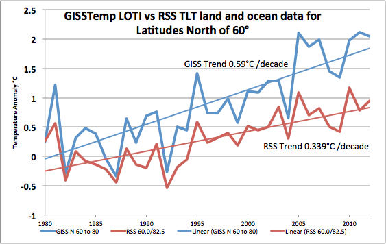
Figure 1: Annual temperature anomaly plots for land and ocean north of 60°.
The anomaly maps from GISS always show large warming areas in the Arctic areas warming faster than the global average. In my article titled A Light In Siberia, several surface stations seemed to be affected by Urban Heat Island warming phenomenon, even if they are small research outposts. This article will focus on winter warming of the northern latitudes.
First, GISS and RSS nearly agree on the warming of the entire globe in all seasons:
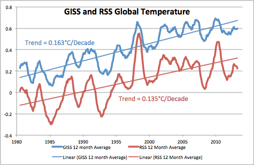
Figure 2: GISS and RSS annual global temperatures for the period 1980 to the present. Data from Woodfortrees.
The global trend for both plots is much less than in the trend depicted in Figure 1. Moreover, the GISS and RSS global trends are almost identical in slope. The offset simply reflects the baseline year difference used by the two data bases.
Next, Figure 3 shows the winter temperature trends for over 60° latitude in the northern hemisphere.
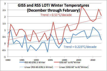
Figure 3: GISS and RSS northern hemisphere land and ocean winter temperatures.
Here, the winter trend for the satellite data is less than the annual trend for RSS data in Figure 1, but the GISS trend is much greater than in Figure 1.
If heat-island problems are increasing the GISS trend, this shouldn’t show up in the summer when the outside temperature is much closer to the inside temperature at the measuring stations.
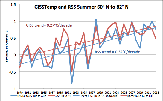
Figure 4: Summer trends in the Arctic.
In the summer, the GISS data and the RSS satellite data are nearly identical. In fact the satellite data shows an insignificant slightly higher trend.
Notice that the summer temperature trend is not continual, but took place in a step at 1997, the year of the super El Niño. That step accounted for most of the 33-year rise. In that year the summer temperature trend changed, going from one flat level to a higher flat level, the present “pause”.
What happens when we exclude the ocean data in the winter? If heat-island is the problem, then it will appear as a marked increase in the GISS trend. And indeed it does:
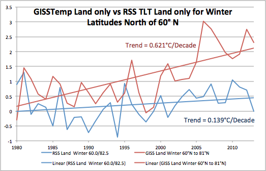
Figure 5: GISS and RSS land data only for the Arctic. Note the major deviation that appears.
Here, at more than six tenths of a degree per decade, the GISS trend is highest of all. The RSS trend is only slightly more than the global annual trend. Arctic amplification is supposed to take place in a warming world. The poles are assumed to warm faster than the rest of the globe. This certainly isn’t taking place in the Antarctic. In the Arctic, only the summer is warming faster than the global average. This is seen in both data sets in Figure 4. In Figure 5, the RSS satellite data show no amplification, no warming greater than the global average. The GISS land station data warming trend increase must be all from winter heat-island effects.
What do we see in the southern hemisphere? Does it look anything like the Arctic?

Figure 6: GISS and RSS data (for as far south as the RSS data goes) for the southern hemisphere summer (January through February).
Above we see why the Antarctic ice is increasing. There has been summer cooling for over 30 years! Next let’s look at the Antarctic winter:
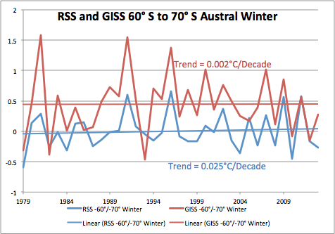
Figure 7 is a plot of GISS and RSS Antarctic winter temperature anomalies.
Both data sets largely agree on trends for summer and winter in the southern hemisphere. The winter temperatures show no long term trend, but a cooling since 1995 is apparent in the GISS data.
I have compared all the latitude bands available for both GISS and RSS data (not shown here). Only in the Arctic does the temperature trend between GISS and RSS differ by a large amount. For those that were impressed by the large red and orange Arctic areas due to map projection in the previous post, I offer the polar map plots for the same 1995 to the present temperature trend:
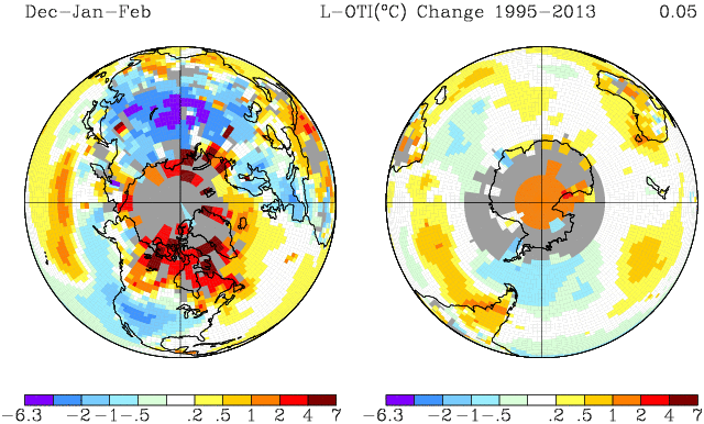
Figure 8 from GISS. A trend map from 1995 to the present of winter temperatures.
The above projection enlarges the polar regions slightly relative to the temperate regions, but it does show how much of the Arctic and Antarctic are missed. Dark red to yellow is warming, purple to light green is cooling. Now drop the color coding by 1.5 degrees for latitudes above 60° north to account for the extra heat-island warming. The satellite data says the average winter Arctic warming is only 0.5°C, not 1 to 7°C as the map above, or 2 to 2.5°C as the GISS data in Figure 5 suggests.
For those that think the south pole is warming, I offer this web cam photo of the Amundson-Scott Station taken yesterday.
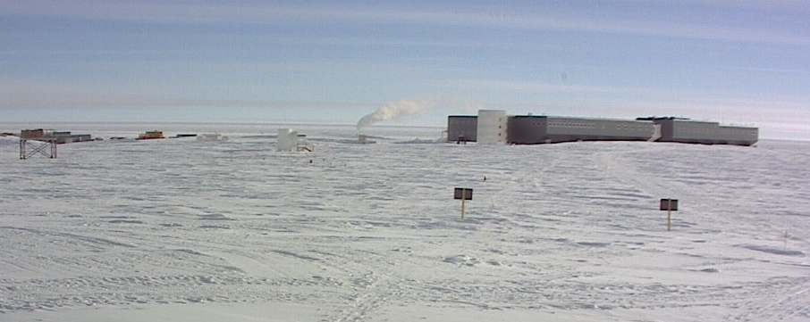
Figure 9 is the Amundsen-Scott South Pole Station. Webcam here.
Note the water vapor plume from the power plant and the size and color of the living and lab quarters. This infrastructure has been built and expanded since 1995. The previous building was buried in the ice. Now think about the heat island influence on local temperature at an average year-around temperature of minus 49° C.
Yes, there is man-made global warming! But it is largely by one heating system and power plant at a time. The warming is not at all due to CO2, it is due strictly to the Btu’s produced by burning fossil fuels for warmth and light in the winter. In the Arctic and Antarctic, these are primarily diesel and JP-8 jet fuel. The alternative is freezing to death in the dark.


The initial versions of satellite and radiosonde datasets suggested that the tropical surface had warmed more than the troposphere, while climate models consistently showed tropospheric amplification of surface warming in response to human-caused increases in well-mixed greenhouse gases, as shown by the diagrams above . This observation gave rise to deep concern, and resulted in a number of studies (e.g. NRC 2000 ) where strong attempts were made to find warming in the troposphere. As new data sets have been made available and new corrections introduced, the scientific literature have witnessed a number of attempts of reconciling the modelled and the observed atmospheric warming pattern. Conflicting conclusions have, however, been reached. Some scientists conclude that a discrepancy between modelled and observed trends in tropical lapse rates still exists, while other argue that there is no longer a serious discrepancy. A few key references on this debate are represented by Lindzen 1999 and 2007 , NRC 2000 , Douglass et al 2007 , and Santer et al 2008 . Ongoing web-based discussions can be followed here and here . This debate reflects the importance of the point raised by Lindzen (1999) on monitoring temperature changes at the height in the troposphere corresponding to an infrared optical depth near 1.
In the GHCN set we have for latitude >66 at the end of 1939 a number of 79 stations. In the next thirty years 162 were included and 12 were dropped, leaving 229 at the end of 1969. In the next thirty years 66 were included and 252 were dropped, leaving 43 at the end of 1999. During 2000-2010 another 6 were included and 8 dropped.
So the surface station data are not longitudinal. If inclusion and drop-out were not random, no one can guarantee that there is not a selection effect in the graph. Are you sure, Ed, that among all those dropped stations there are not relatively more with individual cooling trends than among the few that remained? Can you show that UHI stations had a larger survival rate than the drop-outs?
Good question.
RSS is not the best data set for the arctic. It stops at 82.5°N.
There is no satellite data for north of 82.5 north because of the orbital paths. That is not a problem for comparison purposes because there is no surface data for those latitudes either.
The DMI has data going back to 1958: https://notrickszone.com/2011/11/06/80%c2%b0n/
Figure 1 in that article looks just like figure 5 above for the same years. I will bet that DMI is just using GISS data and modeling. There are no measurements except for sporadic drifting buoy data above 82 degrees north. I will go back and look at that file and compare tomorrow.
I looked at the DMI data. The over-all trend looks like the trend for Alert, Krenkel, (Gmo E. K.) and Eureka averaged together, but the year to year and winter to winter details don’t match at all. I looks like the DMI data comes from a dartboard.
I am astonished that RSS and GISS agree about the global trend. Has Gavin removed the Hansen adjustments? It falsifies AGW by the way as the troposphere is supposed to warm quicker than the surface.
So do all the other data sets.
This comment belongs under Stephen Richards comment above.
I have a picture of a sign taken the season 89-90 at the South Pole. It said the average temp was -56 F. The sign was up for a few years before I photographed it.
So, if the average now is -49 C , the temperature hasn’t changed for 25 years.
Before 2000, the South Pole was cooling at 0.2° C/decade. Since 2000, it has warmed at 0.3° C/decade. That isn’t much, but GISS plays it for all it’s worth. It’s all due to that power plant.
[…] Data Comparison Shows GISS Arctic Winter Temperature Trend Grossly Overblown, Arctic Data Contaminat… (notrickszone.com) […]
[…] Data Comparison Shows GISS Arctic Winter Temperature Trend Grossly Overblown, Arctic Data Contaminat… […]