By Ed Caryl
Recently, Roy Spencer posted a graph that appeared to be a data record of some kind for the last 100 years. Then he revealed that it was generated in Excel with a simple random number function. The graph showed details that resembled things like El Niño’s and La Niña’s, pauses, and sudden warming and cooling.
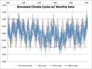
I decided to repeat his graph introducing cycles into the mix. We know that the climate follows ~60 (AMO ocean cycle), ~210 (de Vries or Suess solar cycle), and ~1000 year (un-named) cycles (approximately). The following is a graphic of what happens if these cycles are introduced into the random number generator. The graph extends to 1014 simulated years by month. The random number generator is constrained to + and – 0.5, and each month adds 0.9 of the value of the previous month. The cycles use the sine function (SIN()) with input from the fractional year value, multiplied by 0.1 to produce a 62 year cycle, 0.029 to produce a 215 year cycle, and 0.006 to produce a cycle just over 1000 years. For this last cycle the COS function was used to shift the cycle phase by 90 degrees. Each month, 1/40th of each cycle value is added along with the 0.9 of the previous month. This produces a graph that roughly resembles earth’s climate over the last 1014 years with extension to the next 200.
Figure 1 is a simulation of the last 1014 years, with the applied climate cycles shown.
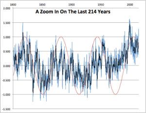
Figure 2 is a magnification of the last 214 years from Figure 1. Blue is monthly data, black is the annual average, the red trace is the simulated AMO 62-year cycle.
Each re-calculation will completely change the data, but similar features always appear. In this iteration, an El Niño appears at 1999, that looks just like the real El Niño of 1998. We see a warming trend in the early twentieth century, and another in the late twentieth century, just like the real warming trends.
In figure 1, we see a Medieval Warming period and two periods of Little Ice Age. A minimum is seen that resembles the Dalton Minimum of the early 1800s, and the cool 1910s and 1970s appear. Even the cool Maunder Minimum appears in the correct place. Most of this result is not coincidence because the 62-year cycle is timed to match the real AMO, and the 204-year and 1000-year cycles roughly match real solar activity.
In this simulation, two successive warming periods very like the actual twentieth century warming periods, can occur from natural cycles alone, no extra “forcing” from CO2 is required.
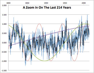
So, what will the future bring? Now that we have this model, that reflects the past, as we know it, with general accuracy, can we project that into the future? Sure…this is just an Excel spreadsheet after all. I pasted on 200 more years. As I did so, Excel of course recalculated the whole table. So here is a second example of the last 214 years that it came up with, in case someone accuses me of “cherry-picking”. Note that we get much the same pattern of warming and cooling, with a couple of El Niño’s in approximately the right place in the last 20 years.
Figure 3 is another calculation of the same period as in figure 2. The black trace is an annual average of the monthly data. All three cycles are shown.
Note the resemblance between figures 2 and 3. Each is a different calculation using different random numbers, yet the small addition of non-random sine wave cycles pushes the output into shapes that resemble the climate that happened in this period.
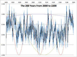
Figure 4 is the future, as projected by our model. The black trace is an annual average of the blue monthly data. All three cycles are shown.
As you can see, the future holds nothing to fear. There will be a few El Niño’s in the next ten years, then a moderate cooling as we come off the peak of the 62 and 204 year cycles. There will be more of those in mid-century, as the AMO rises again, then more cooling for a period at the end of the century as both of those cycles bottom out. No extensive warm periods will appear until late in the twenty-second century, as both peak again.
This model is not new. On the side-bar of this blog, an illustration from Nicola Scafetta’s model is similar, with the addition of some shorter cycles. An earlier post on this blog from a paper by Prof. H. Luedecke and C.O. Weiss (cited above) also used a similar model. The chief addition is random “weather”.
No CO2 molecules were harmed in the generation of these graphs. Nor, for that matter, were they considered.
For those with Excel expertise, I have posted the file to Dropbox here.

Christopher Essex illustrated that computer-generated random numbers are not and cannot be random, and are the cause of patterns and cycles after very few cycles in iterative calculations. More: Believing Six Impossible Things before Breakfast, and Climate Models. Christopher Essex, Ph.D.
Depends very much on the nature of your iterative simulation. One step in an iterative GCM contains millions of cell computations, that’s what Essex refers to – like in a Moiré pattern, patterns from the random number might emerge – ; in Ed’s simple model, with one random number per cycle, you’d be hardpressed to be bitten by this – the “pattern” would emerge only after millions of simulated years.
Hmmm…., but Christopher Essex is quite specific in his video, in stating that models cannot forecast the climate (at 7:23), and that the periodicity of random number generation with something like Math-Lab becomes apparent quite strongly and quite clearly after about 2000 calculation (at 21:50).
At any rate, it seems fairly certain that the periodicities in Ed Carlyle’s simulations are the consequences of some factors that are not random and that emerge after considerably less than millions of simulated years.
Okay, I found his paper.
http://www.apmaths.uwo.ca/~rcorless/frames/AM261/paper4.pdf
Will have to work through it. But I don’t think he talks about periodicity of random number generators. The ones we had in the BASIC 8bit microcomputers of 1980 had very short periodicity but a modern double precision RNG is much much better.
Hmmm…., but Christopher Essex is quite specific in his video, in stating that models cannot forecast the climate (at 7:23), and that the periodicity of random number generation with something like Math-Lab becomes apparent quite strongly and quite clearly after about 2000 calculation (at 21:50).
At any rate, it seems fairly certain that the cycles in Ed Carlyle’s simulations are the consequences of some factors that are not random and that emerge after considerably less than millions of simulated years.
Oh for policy folks, media folks, and even science folks with the numeracy to appreciate the significance of such illustrations! They are so few that the Alinskyite Alarmists can continue in their wicked ways to deceive and divert them all from pursuing sensible policies, open-minded reporting, and high-integrity science.
The fun thing is that there must be a continuum of liars and true believers in the spectrum of warmunists, as even small time Greenpeace members happily “exaggerate” whatever they think they know, and the complete disdain for honesty even in the small fries lets them easily slip into professional lying while rising up the command chain.
You know that a single run of a climate model will be mostly noise and not like any climate, but when you average them you will get the real signal.
Is that sarcasm or transcendental wisdom?
Am I correct, Ed, that the infamous Models are bad in reconstructing the past? Somehow you have to demonstrate that your cycles-plus-noise model is better than models with the sensitivity parameter. A likelihood ratio test is perhaps too much but the idea is that the data given your model should be much more likely than the data given their models. Otherwise Occam’s razor should do the job: if both types of model perform equally well, choose the one with the least assumptions. They also use noise but you did not use a sensitivity parameter. A nice article, anyhow.
The GCM’s use invented (or, assumed) histories of aerosol forcing to fix their hindcasting.
That’s also why the warmunists try to NOT find out the real climate forcing of aerosol classes, they give huge uncertainties, as they need this as a wildcard for the fixing of the hindcasting.
Each time some dolt from Max Planck or so makes real measurements the maneuvering space of the modelers gets tighter.
Dirk, the models also use supposed CO2 forcing (which can not be as a molecule of CO2 can not force anything -the units are wrong). There is actually very close to zero sensitivity as defined by the IPCC and the actually CO2 levels in the 19thcentury and around the 1940’s are very likely to be much higher than the assumed 280ppm. The work of EG Beck shows that.
They went wrong when they used the term “forcing” for what is really a perturbance or perturbation in conventional systems theory; to describe a change from nominal behaviour, of some factor .
But too many climate scientists believe themselves to be special. Some believe that they are doing ground-breaking “work” when it’s all been played out in some basement using SimEarth; using a billionth of the processing power and electricity … with similar model performance.
Must irk them when they realize that all their model projections have probably been played out by a Captain Sweatpants and published on a BBS.
Ed, Roy Spencer’s little experiment is great news. And it’s about time.
One of the key problems in industrial engineering is process-control, or monitoring the “health” of the process. If a process is in proper statistical control and you collect a lot of data on some attribute, that attribute will be distributed over the well-known Gaussian shape.
But what happens when you are running a manufacturing process and you sequentially sample an instance of that attribute serially over time? You’re grabbing numbers that change over time – but how do you know if it’s just random statistical noise, or if the process is actually “drifting.” That last sounds a lot like the AGW “problem” with good reason – it’s the same thing.
One of the pitfalls of sequentially sampling a statistical system over time is that the sequential data can appear to be manifesting “trends.” These trends look real in a plot, but they can be produced by a system that is in perfect statistical control, with bulk data providing a nice and proper Gaussian shape.
This situation was first examined by Walter Shewhart, but it was applied to great effect by W. Edwards Deming (who was almost a cult figure 25 years ago, known as “the quality control guy” – he’s rightly credited with teaching receptive Japanese automakers his ideas and methods, kicking off the big quality-cars revolution that came out of Japan). Deming in particular would – on the fly – run a d*mning experiment where he would have a bin filled mostly with white marbles and a few red ones – the red ones represented the statistical incidence of defective manufactured parts. He would have four different people take turns pulling out some fixed number of marbles at random, and count up the red ones they got as the number of defective parts they produced that day. By charting each person’s performance on successive days – with a system that was statistically-identical for each person and where each instance of drawing would lead to some statistical number of red marbles – very quickly some people would emerge as “star” employees while others were obviously screw-ups who should be fired. This was all just random luck, but the sequentially charting showed “trends!”
It’s the same thing with temperature. The main reason that I became a convinced skeptic nearly a decade ago is because I understand statistics and process control and the Deming stuff – and if you take temperature data (at least back then you could still find un-fiddled-with-stuff) and plot it, it looks just like the Deming stuff – you see trends all over it… but if you bulk-histogram it, it’s nicely Gaussian. The best part was making a plot of temperature data over time and a plot of the numbers you can get when you roll a pair of dice and make a sequential plot over the same number of “years.” You can’t tell them apart!
I wondered how the warmists were getting their warming trends. Then “Climategate” came along.
The bottom line is that when you sequentially sample a statistical system, you will see what look like trends – but they are not real and are just artifacts of the statistical system. Basically, there is “effect” without “cause” (the “effect” is all in your mind as you look at plots).
And from what I could tell all those years ago (and still can), temperature data behaves in exactly the same way. The “variations” are statistical noise that doesn’t need any particular “cause” to be that way.
If you could explain this to the public! How pathetic the whole situation is. Super computers are running hot on GCM’s of which 97 percent fail to predict two decades of data. They are beaten by formulas that fit on the back side of an envelope. The last move is to consider the 3 percent not-wrong as a success. If you fail on an exam on 97 percent of the items, you should present the remainder as evidence of your mastery of the subject. Could it be the case that climatologists succeeded for their statistics exams this way?
Nice one Ed. Whichever way you cut it, simple cycle models beat GCMs hands down.
Using variants of Nicola’s approach I get three cycles fitting over 90% of the variance in southern SST data. No GCM, with all their rigging, gets close to that.
Model:
cycle yrs,	wt ˚C,	phase yr

818,	0.58,	1956

194,	0.30,	2014

60,	0.07,	1937
RMS model error = 0.1 ˚C
Total range of model = 0.9
Total range of data = 1.3 ˚C (including short term variation)
Period of top cycle is poorly determined. Second has been 190 – 230 yr.
dai
you are fitting a curve to teh data and then notice, that it fits the data well?
3 fitted sine waves will basically explain absolutely all autocorrelated data very well.
————————-
As Svend said above: you need to average a couple of runs to get a meaningfull result.
With your sine waves, the most easy way to do this, is by skipping te random noise taht you add.
then you just get a sum of the 3 waves. and the long wave basically gives linear warming for the last century.
Yes! You noticed. The average of many runs will just be the sum of the sine waves without the noise. That is climate. The random noise is weather. The big El Niño of 1998 was just weather, but it got all the CAGW crowd hot and bothered.
That is just plain out false. there are plenty of real climate effects, which are not sine functions. Volcanoes are an example.
But your curve fitting would still give a very good fit, just because you fit it, so that you get a good fit.
No sob,
Volcanoes are a short term (2-5 years) WEATHER effect.
you are looking at rather small volcanoes.
Have you tried to read one of the thousands of scientific articles on the subject of volcanoes and climate?
Agreed there are lots scientific articles on the subject. Have you bothered to read a single one of them? The literature almost unanimously states that volcanoes only have a short term effect. Pinatubo VEI=6 for example cooled the planet only for a year or two. As usual you are only trying to distract from the main thrust of the discussion.
all those scientific articles specifically mention an effect on climate, NOT weather.
I am not distracting, i just gave an example of an effect that is not cyclical and will not be representated well by a sine wave.
But by fitting the curve, you can obviously even get a good fit on these. But that is plain and obviously a “trick”.
There also are runaway effects that do not happen on a sine wave pattern. The cyclical approach to climate is missing basically all the important stuff, as the approach already predicts the result!
Yes s.o.b., I have.
They affect the WEATHER, even the big ones only have an affect for a couple of years, usually only in the hemisphere where they happen.
While this may feed through to the calculated global temperature, it is only temporary.
It is therefore not “climate™”.
It takes a super-volcano, like Toba, to kick climate out of the natural cycles, and even then it is difficult to entirely blame them for the result, and the effects last at most, a few hundred or a thousand years. See:
https://notrickszone.com/2014/06/03/history-is-clear-humans-prospered-in-climates-that-were-warmer-than-todays-died-in-cooler-ones/
I will repeat again, for your thick mindless skull.
Volcano effects are short term weather effects.
They happen then they disappear.
They are noise in the climate record.
End of story.
And seriously, “runaway effects”. roflmao
You seriously have drunk the climate sewer brew, haven’t you.
The cyclical aspects of climate ARE the important part. Anything else just causes short-term spikes or troughs.
That 1998 El Nino is, in fact, the only real warming in the whole satellite record.
ie, If you remove the 0.3C warming effect of that El Nino EVENT from the temperatures after the step….
… there has been zero other warming since 1979.
“3 fitted sine waves will basically explain absolutely all autocorrelated data very well.” ????
To fit is not to explain. The sine waves are not arbitrary. They match known natural cycles.
I am testing a linear component in a relaxation process. The data prefers a quasi-millennial cycle to a straight line. Do you deny the existence of past millennial ‘climate optima’ – as historians have routinely called them?
If the cyclic models are right we will know within a decade.
Nice work Ed,
The fun begins when you realise that the cycles most probably aren’t a tightly set frequency or amplitude.
We just don’t have enough information about our rather chaotic climate system.
The fact that you get so close to actual reality, WITHOUT needing the artificial pro of CO2 is very telling . 🙂
arghhh.. the unexplainable auto moderator strikes again.
(I have a perfectly benign post in moderation)
Wish I knew why, so I could avoid it.
ps.. if the post does appear, the word in the last sentence should be “prop”.
[…] Ed Caryl skrev härom veckan ett underhållande inlägg på NoTricksZone om hur man åstadkommer en temperaturkurva som liknar den verkliga. I modellen finns inlagt tre cykler som förutsättningar; en 60-års cykel för de stora havsströmmarna, en 210-års för de Vries eller Suess solcykel, samt en 1000-årscykel, som kanske kan motsvara korta Bond Events eller Dansgaard–Oeschger cykler. (Vi har diskuterat cykler åtskilliga gånger här på KU, bl.a. här.) Koldioxidhalten finns överhuvudtaget inte med i modellen. […]
[…] článku Přirozené cykly jsou v náhodném světě nezaměnitelné. V budoucnu není nic, čeho se bát jsme ukázali grafy simulovaných teplot vygenerovaných v Excelu pomocí součtu tří cyklů […]