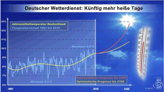
Recently the German Weather Service (Deutsche Wetterdienst DWD) released its 100-year temperature prognosis chart to the public, claiming that Germans should expect more hot days in the future.
German Weather Service: More hot days in the future
Light blue line (before 2010): temperature record from 1881-2010
Yellow line (before 2010): 5th degree polynomial smoothing (annual mean temp.)
Orange line (after 2010): optimistic prognosis
Red line (after 2010): pessimistic prognosis
Not surprisingly, the chart has the typical catastrophic hockey stick shape. Peter Heller at Science Skeptical here closely examined the chart and found a number of deceptive irregularities that all serve to dramatize the future. As a result he dubbed it: a spot-the-errors diagram.
Can you spot the errors? Peter Heller has.
========================================
German Weather Service Publishes A “Spot The Errors” Diagram
By Peter Heller
For some people, especially children, a spot-the-errors diagram is a lot of fun. But there is nothing funny about errors and inaccuracies in scientific diagrams. This at times is purposely done in political debates in order to hide just how poorly certain claims truly are. How diagrams can be used to mislead is well known. There are books and plenty of articles about it everywhere. Still, it’s attempted time and again, and often successfully. One particularly perfidious example has been produced by the German Weather Service (Deutsche Wetterdienst – DWD). The following graphic was brought to my attention by the European Institute for Climate and Energy (EIKE) in a recent article.
Figure 1: The DWD “spot the errors” diagram. (Click to enlarge)
Figure 1 shows the diagram with curves and three dots I’ve added to denote 1) the error, 2) the deception done on purpose, and 3) the inconsistency.
Dot no. 1: the error
The DWD uses a 5th degree polynomial curve (yellow) to smooth Germany’s temperature record (annual mean 1881-2010) in order to clearly illustrate the trend. No question here – that’s perfectly okay to do. Figure 2 is my attempt to reproduce the curves and it shows a somewhat different polynomial trend curve, namely at the end it is flat and in no way increasing upwards as calculated by the DWD. The flattening of the curve is due to the comparatively cool 2010, for which the DWD calculated a mean temperature of 7.8° C. Using the polynomial curve that the DWD uses, I also get a flat end…that is when I use a temperature of 8.6°C for the year 2010. Probably an error.
Figure 2: My reconstruction. (Click to enlarge)
Dot no. 2: the deception
Of course the purpose of the graph is to show the horrific climate change that lies ahead for Germany. This becomes especially pronounced when one draws curves that rise upwards as dramatically as possible after 2010. To amplify the the rate of increase, one simply employs a more effective horizontal scale. Hey, who is going to notice? And so after only 40 years the curves shoot up into an apocalypse. But notice how the horizontal axis shows the year 2100. Maybe DWD just wanted to make some room for the thermometer to make the chart look prettier. In the end, this ends up being an intentional deception in order to make the future look more dramatic.
Figure 3: Graphic using a correct scale for the future. (Click to enlarge)
Dot no. 3: the inconsistency
In Figure 3 I simply superimposed my diagram over the original DWD diagram and gave the chart the correct scale on the right side of 2010. You can already see the difference in both polynomial curves (yellow). The gray line is the linear trend (which the DWD opted not to show) that allows a prognosis. Suddenly much of the drama gets lost. Here one must recall the following: A prognosis is always the extrapolation of a known trend. One can make a prognosis completely independent of having knowledge of the fundamentals behind the trend. And in the following case, making a prognosis would simply mean extending the fluctuation of the annual mean temperature (yellow line) about the gray line. The orange and red lines in Fig. 3, on the other hand, are DWD projections and not prognoses.
To do these projections, models were used that most likely are in accordance to what is propagated by the IPCC, see Figure 4. In any case, there is good agreement with the calculations used in the recently DWD published “Regional Climate Atlas“, which is green in the graphic. The “Klimaatlas Deutschland” has quite identical results and can be seen at the DWD website.
Interestingly the course of the DWD projection between 2011 and 2100 in Figure 1 is completely different than what is shown in Figure 4. It is concave, turning sharply upwards, and not convex. I would at least call this an inconsistency.
We can summarize as follows: The DWD, as a public institute directly subordinate to the German Federal Government (Ministry of Transportation, Construction and Urban Development), believes it is correct and important to take a clear position in a highly political issue in a press conferencez. And to support this position it resorts to using a diagram that has errors, deceptions and inconsistencies that contradict to its own calculations. All of these are perfidiously placed in the diagram in a way they are not easily detectable. One indeed has to look very closely. All three of the elements happen to dramatize the situation. That’s not a good way to build trust.
Peter Heller
(Translation/editing by P Gosselin)
=================================================
Peter Heller points out that he does not value it as very important, and adds. “Handling of diagrams of all kind in this way happens everywhere and every time – especially in climate related discussions.”


If it happens only once, then one can “not value it as very important”. But when it happens all the time, then it is a serious problem.
See also how the little cloud at 2010 prevents us from seeing that the average temperature for 2010 is 7.8 degrees. It would hurt the warmists too much to acknowledge that 2010’s average temp was smaller than in 1881, when the Earth had no extra cooling protection through man-made CO2. How is that even possible when the Earth has constantly received more radiation than it can radiate (under the AGW hypothesis). Do warmists know anything about physics? Anything?
A trend does not contain any information about the future if we do not know hard boiled physical effects behind it. In this respect it is irrelevant whether you fit linearly or polynomially. Just note the midday temperatures during the spring. If the temperature rises one degree every week, extrapolation of the trend will give you the prognosis that after one year we get roasted. Without knowlegde about causes, trend extrapolation is completely irrational.
A good post PG, I still would argue, the trend, or, extrapolation can be bucked, this is still statistical guesswork, the pointers, from many sources from; solar minima to oceanic decadal oscillations are for a prolonged period of cooling.
That would ‘buck’ all their projections!
Interesting graphs here, I acknowledge and hope M A Vukcevic doesn’t mind my posting this here:
http://www.vukcevic.talktalk.net/NorthAtlanticOutlook.htm
@ mindert eiting:
I just wanted to note the difference between the words “prognosis” (a trend based on past developments), “scenario” (a trend based on model assumptions which can change the direction of a past development) and “projection” (a trend based on coupled scenarios). What the DWD shows is a projection based on the coupled scenarios for “emissions” (economic model) and “climate feedbacks” (climate models). Please note that the IPCC itself always uses the correct wording in its papers, they underline, that they do not perform a prognosis, but a projection.
The difference is well known and established in future research (which is in some aspects my profession) – but it is not known and generally not understood by the general public.
You are correct in underlining, that one has to be careful about timescales when identifying a trend.
I do not really criticize the word “prognosis” in the diagram – this is not important. The important point is, that the shape of the projections shown does not match the shape of the climate projections given (e.g.) by the DWD itself. It seems as if the creator of the slide has used the powerpoint-tool to create a curve to underline the message of a “short-time, large and accelerated warming, which does not give us enough time to adapt”. It is a symbol for the crash between politics and science.
” It is a symbol for the crash between politics and science.”
I disagree. Since about 1988 science serves the politicians; the diagram is a symbol of the unity of EU science and EU politics.
I’d call it more a government takeover of climate science. Clearly pure science would never produce such a deceptive chart on its own. This kind of thing happens only when science gets political. The field of climate science has been taken over, pure and simple. It’s all quite unsettling.
Ok, I am not an english native speaker. What I meant was, that the rules of science and the “rules” of politics are incompatible. So, when they join, some type of “crash” will occur and one will be destroyed, the other one will survive. In this case everybody can see the result, if a scientific organization like the DWD wants to be a player in politics. Science loses – the diagram shows a purely political message and is no longer based on scientific knowledge.
It’s just like dialectic materialism in the USSR.
Peter, in that case the DWD is not fulfilling its official duties which they have been entrusted to do. Have the taxpayers no possibility to seek recourse?
I want them to predict our weather for the weekend, as they are supposed to do, and to not produce phoney climate scenarios 100 years into a future very few of us alive will ever see. Where could someone lodge an offical complaint?
In that case we can do some science of ‘politics having taken over science’. For what reason the diagram? Perhaps politicians want to scare people because frightened and helpless people easier accept governmental measures as being good for them. Giving a diagram a scientific flavour may help in convincing the public. Furthermore, our economy is based on trust. Apparently, we have to trust that the CO2 market is based on something.
Who’s the Greenest Desert Dictator? Well, Gadafi is – ahem – was.
http://news.bbc.co.uk/2/hi/6989977.stm
found here
http://www.thegwpf.org/uk-news/2569-gaddafis-useful-idiots.html
Greenpeace manages to stop construction on a Dutch coal power plant (half finished), using the usual worries about environmental impact and courts. This will help their own very expensive energy provider, Greenpeace Energy, by driving up the general price level of electricity.
http://www.welt.de/print/welt_kompakt/print_wirtschaft/article13563999/Friesisches-Fiasko.html