By Ed Caryl
The recent issuing of four papers by Dr. Richard Muller, et al, has increased the on-line discussions of temperatures over the last decade. There are several claims in the first of these papers that deserve study:
1. “…The global land mean temperature has increased by 0.911 ±0.042 C since the 1950s…”
2. “The World Meteorological Organization (WMO) gives an operational definition of climate as the average weather over a period of 30 years (Arguez and Vose 2011).”
3. “No part of the Earth’s land surface shows appreciable cooling.”
These assertions will be addressed in the course of this article. For material, 83 locations were selected from the GISS database. In an attempt to limit urban warming affects and the “adjustments” applied by GISS, a strict selection process was used. The selection criteria were: less than 10,000 population, as much as possible, a continuous record from 1940 or before to the present, and no splicing of records. Fifty-six of these locations are in the U. S. in four regions. Twenty-two stations were in the mid-west, in Kansas, Nebraska, and Iowa; fifteen stations in the north-west “inland empire,” eastern Oregon, Washington, and western Idaho; nine stations in the desert south-west, southern Utah and New Mexico; and ten stations in the south-east, Alabama and Georgia.
In the rest of the world, ten stations were found in the Arctic and Siberia, six stations bordering the North Atlantic Ocean, and thirteen stations in the southern hemisphere, in South American, Australia, the south Atlantic, and south Pacific. All of these stations are well away from any population centers and are isolated or in or close to very small towns and villages. These will be explored in Part 2.
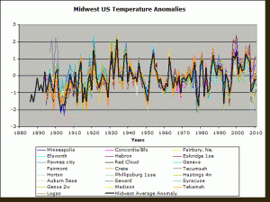
For each station, a temperature anomaly was computed, using the average temperature from 1930 to 1980 as the baseline. This baseline was chosen because it is in the middle of the period for many of the records, and because it includes both a warm and a cold era. Figure 1 shows the result for the 22 stations in the U.S. mid-west.
Figure 1. This is the temperature anomaly from a 1930-1980 baseline for 22 mid-western small-town locations. The bold black trace is the average for those stations.
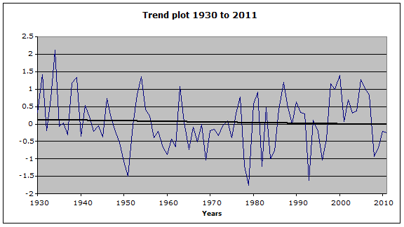
It can be seen that for this region, the highest temperature occurred in 1934, the next highest in 1921, and the third highest in 1931. The year 2000 was only the fourth highest in the twentieth century. Since 1930, the mid-west U.S. temperature trend has been cooling by about 0.1° C. (Figure 2)
Figure 2: This is the average anomaly and a linear trend plot from 1930 to 2011 for the mid-western U.S. showing about 0.15 degrees C cooling over that period. Since 2005 the cooling has been about 1.5 degrees C.
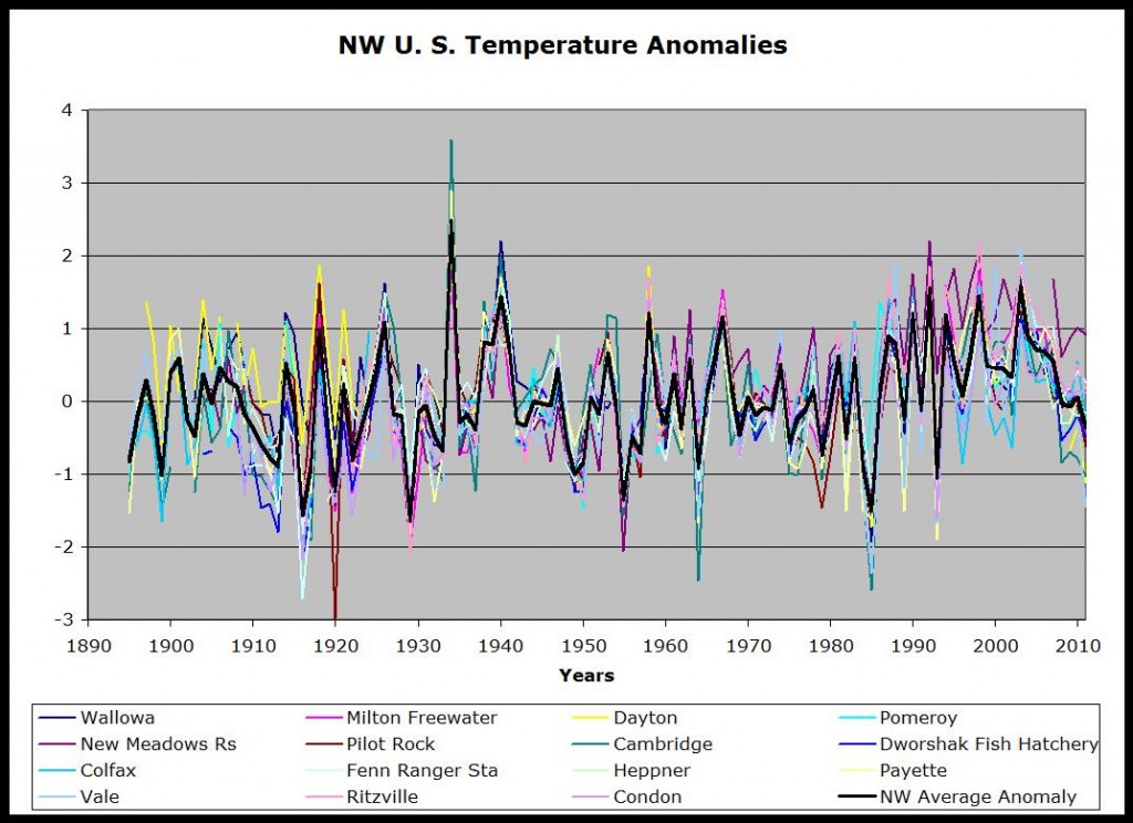
Figure 3. The Temperature Anomalies for 15 northwest U.S. stations. The bold black trace is the average anomaly for those stations.
In Figure 3, the trend for the last century has been warming, but taken in 30-year periods described at the top of this article, the first 30 years was flat, followed by a sudden warming, then cooling until 1980, then another sudden warming, followed by a sudden cooling since 2003. The warmest year was again 1934, almost a degree warmer than 1992, 1998, and 2003.
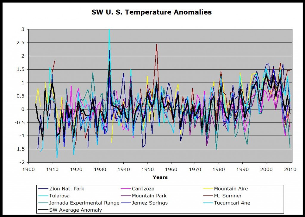
Figure 4: These are the temperature anomalies for 9 stations in the southwest U.S. The bold trace is the average temperature anomaly for the SW U.S.
In Figure 4, the situation is the same as the other regions: flat from 1900 to 1930, a sudden warming to the warmest year, 1934, cooling until 1980, warming to 2000, then cooling in the last decade.
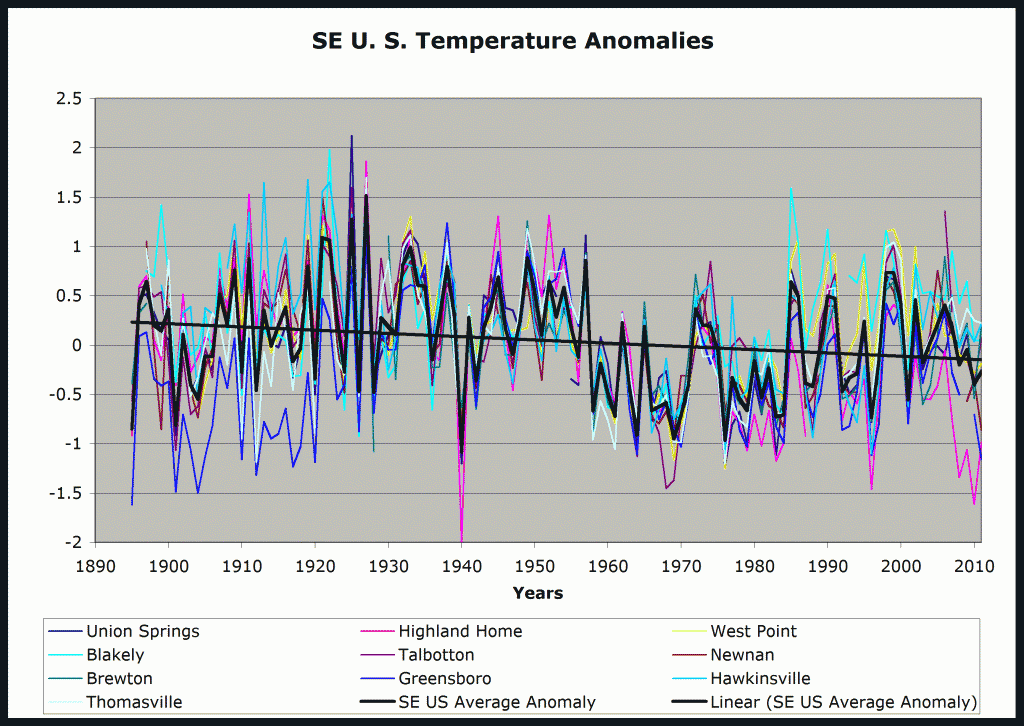
Figure 5: Temperature anomalies in the SE region of the U.S. The bold black traces are the average anomaly and a linear trend line applied to that average.
In Figure 5, the trend for the entire 20th century has been cooling in this region by nearly half a degree C. The four warmest years are all in the 1920’s, 1921, 22, 25, and 27. The next warmest is 1933. 1998 and 99 are not even in the top 10.
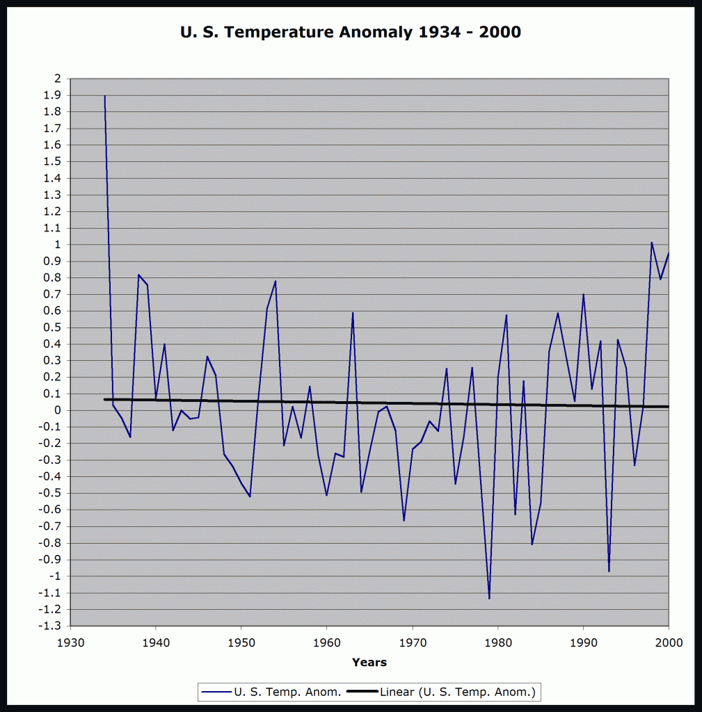
If all 56 locations are averaged together, the trend is warming from the late 19th century to the late 1930’s. After that date, the trend is cooling until 1980, and then warming by the same amount to 2000. See figure 6, showing the temperature anomaly for all the U. S. locations examined, with a trend line from 1934 to 2000, one complete cycle of the 66-year peak-to-peak temperature cycle.
Figure 6: The average U.S. temperature anomaly for 56 rural stations from 1934 to 2000, with a linear trend line plotted. The trend over that period is about -0.06° C, or -0.074° C per century cooling.
Conclusion
Now, let’s revisit the claims by Dr. Richard Muller:
…The global land mean temperature has increased by 0.911 ±0.042 C since the 1950s…”
Strictly speaking, that claim is true. But what is left out is that the same amount of cooling took place from the late 1930’s to the late 1950’s. The temperature is cycling with a period of about 66 years, with about one degree amplitude. Dr Muller is only looking at one-half of the temperature cycle.
The World Meteorological Organization (WMO) gives an operational definition of climate as the average weather over a period of 30 years (Arguez and Vose 2011).”
See 1 above. That definition is too short by at least a factor of two. There are many cycles seen in the temperature record. See this paper from the Chinese Science Bulletin. They mention 110, 199, 800, and 1324-year cycles; and their Fourier
analysis plot shows other cycles at 66 (one third of the 199 year cycle) and about 38 years. The 66-year cycle is clearly seen in the above plots. The 38-year signal may reflect the slower cooling part of the cycle followed by quicker warming. This author submits that any attempt to define climate as some time-average weather is a futile exercise.
No part of the Earth’s land surface shows appreciable cooling.”
Dr. Muller did not define appreciable, or a time period. For over 80 years, the SE and mid-west U. S. are cooling. Over the last decade, the U.S. and Canada are cooling. Anthony Watts here, and Matti Vooro here, have described this phenomenon. The so-called climate scientists must get over thinking that the linear trend over the last thirty years is telling them anything about the climate.
In Part II, the other (global) 27 rural and isolated stations will be analyzed.



From what I read, most of the GISS adjustment is introduced during the splicing. A station turns from rural to urban as the city nearby grows and swallows it, and over time, a growing UHI effect drives the temps of that station up. Then, the station is moved to a new location outside the city limits, and the records are spliced.
Rinse, leather, repeat – GISS can produce any amount of warming from this. Clever exploitation of the UHI effect. They even describe the procedure on their web pages.
Don’t know whether BEST managed to produce their warming without that trick.
Splicing (or the avoidance of it) is the key.
My source:
http://www.warwickhughes.com/blog/?p=753
Hi Ed, Thanks for this analysis. You cite Muller that
“…The global land mean temperature has increased by 0.911 ±0.042 C since the 1950s…” and you go on comment that “Strictly speaking, that claim is true.” I think I’d use some other word than ‘true’ in this context. Perhaps ‘possible’ would fit.
Muller seems to be claiming precision to one thousandth of a degree C. That seems unrealistic to me. Also I wonder about his use of the expression ‘global land mean temperature’. If he had added ‘estimated’ or ‘ We estimate that…’ before ‘global…’ . Perhaps I’m just being pedantic. But I’d be more interested in his results if he displayed more caution. I had hoped Muller might come up with a new approach, but it looks like turning out to be the same old story.
RE-Conclusion: “This author submits that any attempt to define climate as some time-average weather is a futile exercise.”
The WMO definition of climate as the average weather; “must surely be regarded as quite inadequate” was the verdict of H.H. Lamp, founder of the Climatic Research Unit in 1972 in the School of Environmental Sciences at the University of East Anglia, back in 1969 (Lamp, Nature, 1969, Vol. 223, p. 1209ff). 40 years later science has achieved nothing in this respect but is still using a layman’s term.
I think the article below throws some light on Muller’s paper. Skeptics have never disputed that that there has been no gradual warming during the last century . What we dispute is the prime cause of this past warming , how much of this past waming [and future warming] is caused by man if any and how much warming there will be during the next 100 years , what will be the pattern of future climate which will include periods of warming and cooling rather than only unprecedented warming as the warmist claim and what will be the real key drivers of this future climate .We dispute the urgency of global warming threat .
http://www.forbes.com/sites/jamestaylor/2011/10/26/the-death-of-global-warming-skepticism-or-the-birth-of-straw-men/
The WMO’s 30 year average was established to provide a measure of what was “normal” for the reporting station. Further, insofar as it was based on a period of years ending in zero (examples: 1980, 1990, 2000) and changing every 10 years – it was not meant to focus on “climate.” Just the opposite! A 40 or 50 year person would not have been around 100 years ago and thus would have no sense or personal feel of the weather back then. The 30-year sliding average provides a measure to which an adult person can relate. It was not intended to be the measure of “climate” as is now used. For climate see http://koeppen-geiger.vu-wien.ac.at/
At a general meeting, in Warsaw, 1935, the International Meteorology Organization (IMO, 1873-1950) confirmed that: “Climate is the average weather”, and adopted the years 1901-1930 as the “climatic normal period”. The difference to a laypersons approach is the focus on a ‘snap-shot’ image of expected weather conditions, in the sense of the expectation of walking, travel or holiday weather. Meanwhile science has extended the “classical period” to a “period of time ranging from months to thousands or millions of years”
Concerning ‘climate’ the late F. Kenneth Hare said just 30 years ago that the word “climate” could be hardly heard professionally before the 1940s, as it was a layman’s word.
See page 3 at: http://www.oceanclimate.de/Archiv/pdf/may6_10.pdf
Where I see a problem can be explained by the analogy where one uses only night temperatures as indicator of a total day temperatures or only summer temperatures as a measure of the year’s temperatures . By comparing only recent short 30 year warm climate periods of today with recent 30 year cold climate periods of the past to account for global warming that must have been caused by man is quite simply wrong . It will always show warming but not for the reasons selected.If you are going to project 100 year ahead , look at the last 100 year not the warmest 30 years of the century that just past
Ed
Good selection of periods. Your analysis will add to the growing evidence disputing the warmist science claiming catastrophic warming due to man’s greenhouse gases emissions .
Rather interesting to read about the basis for this survey, that is to select towns with a population of less than 10,000 souls. The aim presumably being to reduce the impact of UHI effect.
In Australia , I have undertaken a study of two inland centres(Coastal towns were avoided, because of possible oceanic effects), where two temperature stations have been running concurrently. Records are being kept for a stations with an “in town” siting and “an airport” siting. presumably the airport siting is away from the effect of pavements, building, airconditioners and so on. Both these towns are small, less than 1,200 people and yet the UHI effect seems to appear. It may well be that the size of the town is not so important, that it may well have more to do with what development happens to be nearby.
Altitude variations are only 5 and 13 metres respectively. Distance variation was less than 4 kilometres.
However, both towns showed a warming bias for all minimum temperature recordings throughout the year, for the “in town” sites. The warm anomaly for one centre varied between .45C and 1.0C and for the other between .95C and 1.41C. The greater anomalies ocurred during the cooler months.
My conclusion is that it is questionable to discount UHI effect, no matter the size of the town. When we are considering such tiny variations in temperature over the millenium, discounting UHI effect is an error.
John, Dr. Roy Spencer had some analysis on WUWT a year or two ago where he recognized that it is in small towns getting bigger where most of the CHANGE in UHI happens; and of course it’s this change that delivers the warming trend. London, for instance, has been a big city for more than a century so its UHI doesn’t contribute to a warming trend in the 20th century.
http://wattsupwiththat.com/2010/03/04/spencers-uhi-vs-population-project-an-update/
http://wattsupwiththat.com/2010/03/03/spencer-using-hourly-surface-dat-to-gauge-uhi-by-population-density/
John Westman,
You also need to look at where the measurement instruments are relative to the nearest occupied buildings. Heat use in the winter and air conditioning use in the summer will jack-up the temperatures if the instruments are not positioned well away from buildings. I suggest at least 50 meters, if not 100. See my next article.
John Westman,
I agree. A study was done for Barrow, Alaska.
http://www.cas.umt.edu/geography/documents/Hinkel_etal_2003_winter_UHI.pdf
Even small research stations in the far North can have significant UHI because of the large temperature differential between inside and outside. I believe that much of the recent measured warming is due to the change from thermometers in Stevenson Screens to electronic sensors cabled to the nearest dwelling. This change alone moved the measurement device much closer to heated buildings. (People don’t like to dig long trenches, especially in their lawns.) The other slow change has been the growth and improvement of airports. This always results in laying more asphalt paving. Jet aircraft also act like large blow-torches.
Ed
The NCDC calculations for CONTIGUOUS US ANNUAL TEMPERATURE trend 1934-2000 works out to +0.06F or +0.03 C which is quite close to your -0.06 C. This is now for all of contiguous US and covers all areasaccording to their data.
Ed
I failed to notice that the NCDC trend figure of +0.06 C is a PER DECADE figure. This works out to a trend +0.6 C per century of warming to compare with your trend figure of -0.074 C per century of cooling. Your figure is for rural areas , NCDC figure is for all areas of CONTIGUOUS US.
I have done a full analysis of African GISS stations, using similar selection rules to yours, Pierre. There is only ONE rural station that meets your criteria, Galvinia in South Africa, and this shows no warming trend.
UAH analysis also shows temp increase in Africa since 1979 are much smaller than GISS claim.
https://notalotofpeopleknowthat.wordpress.com/2011/11/19/giss-and-their-african-temperatures/
Interesting and af course all your data is freely available unlike others we could mention.
A lot of warming was introduced in 1990 when there was a 66% drop in stations reporting and most of these were in cold areas giving an automatic warm bias.
Many thanks for the extra data for the discussions.
I noticed that the NCDC annual Contiguous US trend figure of 0.06 for the period of 1934-2000 is in F , not C and it is per decade . So the real correct NCDC comparable figure is +0.33 C per Century with Ed’s – 0.074 C per Century . Still a significant difference and worthy of note . Good work Ed.
I also notice that the Berkeley graph shows still a significant upward trend for the period 1998 to the present . Most data sets show a flat trend and even slight cooling for the last 10-14 years particularly in US.
Matti,
In https://notrickszone.com/2011/04/24/anthropogenic-global-warming-is-real-but-it’s-not-all-from-co2/
I calculated that the temperature rise in the US due to energy use would be 0.89 degrees C. I failed to take into account the long wave radiation to space. Trenberth says that about 2/3rds escapes from the atmosphere to space. That leaves about 0.3 degrees C warming, close to NCDC’s figure.
So far the discussion has revolved around temperature fluctuation over a 60 year cycle and that it shows no correlation with CO2. But what causes a 60 year cycle? One possible answer is the “big hands, small fingers”(Landscheidt), “epitrochoid” (Markey) or “trefoil”(Charvatova), depending on who you are reading, orbital variation of the Sun caused by the Jovian planets. Each small loop, in which we currently find ourselves, represents a cooling period of 30 years and each large radius portion represents a warming. These cycles correlate with each of the cycles that are cited here. Further, we have just left an “ordered trefoil” (Charvatova) and are headed into a “disordered trefoil” which is typified by a general cooling despite the large radius and small loop status. It would appear that the orbit reflects the magnetic intensity and polarity associated with the Sun. At least that is my understanding. The Sun causes our weather and climate.
Girtland Griffin
A short summary might be :
The oscillations of the global temperature anomaly can be visualized to consist of a steadily rising component and an oscillating component to give us an approximately 60 year oscillating climate cycle .In my opinion the steadily rising component is caused by minute changes in solar/cosmic effects and the oscillating component is caused by oscillating ocean effects. Oceans receive/ release heat to the atmosphere via the ENSO and AMO cycles and deep ocean currents primarily but there are others too [melting of major glaciers]. Global warming occurs when the positive or warm phases of these cycles overlap simultaneously like the 20-30 years after the 1970’s and global cooling happens when the negative or cool phases overlap like in the 1950-1970’s. These effects combine to give us the near cosine type of rising global temperature anomaly pattern of about 0.5 degrees rise per century. The rising Co2 levels have a negligible effect in my opinion, on this pattern as we have seen during the last 10 years when CO2 was rising but temperatures were cooling. The real greenhouse gas is water vapor .This pattern is modified by other short term and sometime long term events like volcanic eruptions ,man’s deforestation, land usage and heat island effects, man introduced aerosols, major solar/lunar tides , changes in interstellar atmosphere that our solar system travels through periodically and large scale atmospheric nuclear testing like we saw in the past. It is more complicated than this but this a short version
You are right that there are a number of other short and longer term cycles that can interact with these basic patterns to alter the global temperature anomaly pattern