We know that many warmists just don’t know what they are taking about. Remember Al Gore claiming the center of the earth was 1 million degrees?
Another classic example I just happened to come across is one by warmist Ramez Naam who runs a blogsite, which had not been known to me previously.
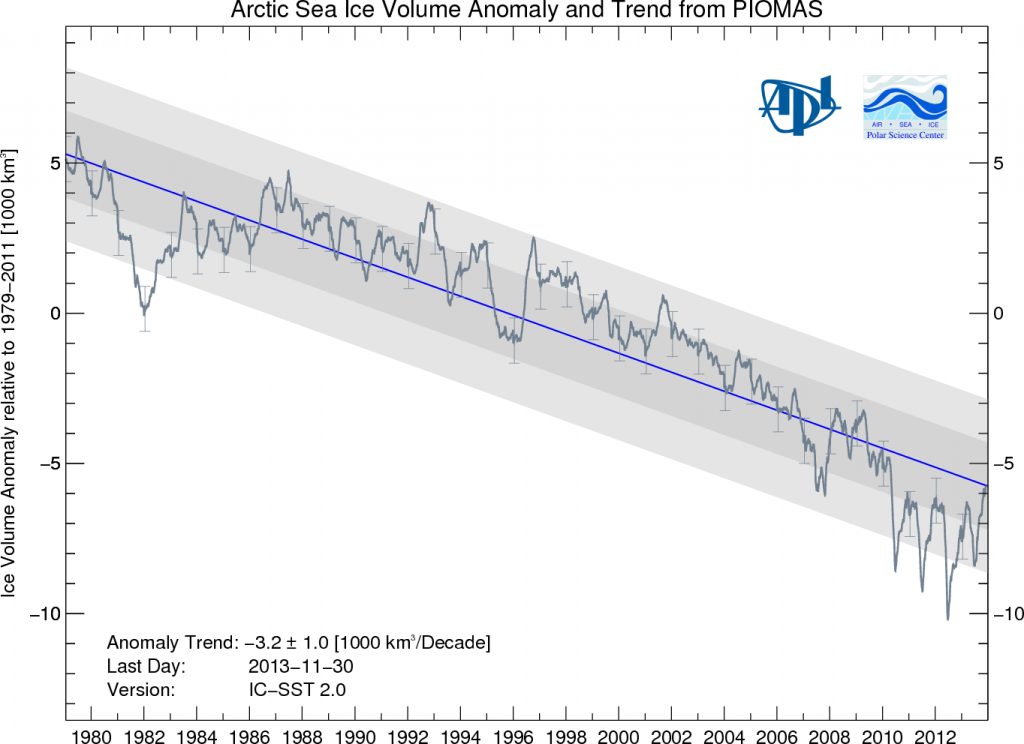
In his latest article he claims that 2013 December Arctic sea ice is less than 2006 summer sea ice, and is less than every summer before that – probably for the last 1000 years! The chart he presents is as follows:
Source: psc.apl.washington.edu/arctic-sea-ice-volume-anomaly/
Do you see how the curve is currently less than what it was in the summer of 2006?
Unfortunately Mr Naam is not able to read a chart correctly and so he draws a totally preposterous conclusion. The chart on which he bases his conclusion is not one that shows absolute Arctic sea ice volume, but one that shows Arctic sea ice volume ANOMALY.
Although it’s possible that there have been years in the last 1000 years where summer volume has actually exceeded the current December 2013 volume, there’s no way in hell that volume now is less than it was in September 2006.
Naam actually gets invited on television as an expert on climate economics and energy policy, see here for example, has over 5000 Twitter followers, has authored books and won awards.
Honest mistakes can happen, and hopefully Naam will issue a correction.




Difficult to see your point, Pierre, unless it is explained how the anomaly is computed. From the original: they take for each day of the year the mean value over the period 1979-2011, and next take the difference between the observed daily mean and that value. That’s plotted. So you cannot compare December and September. My suspicion began by noting that the graph did not show the enormous ups and downs through the year. If it were a simple anomaly, you only had to put other numbers on the y-axis to get the absolute numbers. Am I correct?
Should have said ‘the difference between the observed daily value and that mean’. This is one of the dishes from the climatology kitchen making me to avoid their restaurant all together. This only works because we have an annual cycle, otherwise the days of the year do not have more in common than a name. Assume that they omit February 29. Apparently, Naam did not look in their kitchen and ran away with the dish.
But until this utterly stupid mistake is corrected it will go ’round the globe a hundred times while the correction will be printed in very small print in some dark corner of this warmist’s blog.
Actually, you are correct that I used the wrong graph. Looking at the raw PIOMAS data, the most recent monthly data (November 2013) is lower in Arctic sea ice volume than any month of any year on record prior to September 2005. Still a rather dramatic effect.
I will update the blog post and plot a graph from the full volume data when back at my computer this evening.
Best,
Ramez Naam (from my phone)
Thanks for the reply. Perhaps this link, thanks to reader John Hultquist, can be of help: http://psc.apl.washington.edu/wordpress/wp-content/uploads/schweiger/ice_volume/BPIOMASIceVolumeAnomalyCurrentV2_CY.png
Also it helps to take a step back and look at the big picture: https://notrickszone.com/2012/08/27/oh-no-six-thousandths-of-one-percent-0-006-more-of-the-worlds-ice-melted-this-summer/.
Granted the Arctic has melted significantly over the last 20 years, but why only the focus there. Look at the Antarctic. And globally sea ice area is above normal. Won’t that reflect the sun’s energy back out into space and cool the planet?
Globally, sea ice area over the year is clearly in decline. Antartic sea ice area is slightly above normal in March, but Arctic sea ice area is substantially below normal in September. The Arctic drop is somewhere between 3-5 times larger than the Antarctic gain.
See: http://nsidc.org/cryosphere/sotc/images/arc_antarc_1979_2012.png
This is important for the reason you mention: reflection of sunlight – and thus heat – back into space. Antarctica, with its kilometers thick layers of ice, will not melt in our lifetimes, and probably not for centuries. It is a very different place than the Arctic.
The Arctic, however, shows signs that it may be ice free well ahead of previous forecasts. Given that for 3 or so months of the year, the Arctic is actually the sunniest place on Earth, this is a substantial impact. I haven’t seen a sophisticated calculation of the amount of additional heating impact of an ice free Arctic in June (more on that in a second) but back of the envelope says it could roughly double the rate of anthropogenic warming. That is before taking into account any additional warming impact of released methane from melting permafrost or (less likely but more dangerously) release of seabed methane clathrates.
On the topic of an ice free Arctic in June: Most discussions of an ice-free Arctic are about an ice-free Arctic day in September. That will be a day to take not of, certainly. However, in September, the sun is very low in the Arctic, practically on the horizon. What is of greater concern – and will not happen for quite a while longer – is if the Arctic becomes ice free for the months of June and July, when parts of it receive 24/7 sunlight. It’s conceivable that could happen as soon as 2040.
I wrote about this in a blog post for Scientific American last year, with a nod to the many uncertainties that exist:
http://blogs.scientificamerican.com/guest-blog/2012/09/21/arctic-sea-ice-what-why-and-what-next/
Best,
Ramez Naam
No comment about the use of the sea ice anomaly chart and the conclusions you drew from it? I get the feeling you’re dodging the issue.
Moreover, the sun in the summertime in the Arctic is still at a very oblique angle, and thus not really that much sunlight gets absorbed. I’ve got solar panels on my home and angle is very important.
I erred. I was in a hurry, glanced at something, and snapped off a post with obviously the wrong graph without due thought. It turns out that the error doesn’t meaningfully change much, though.
In terms of total solar energy in the Arctic, it’s surprising, but the total heat energy delivered, even after factoring in angle of incidence, is higher in the Arctic in June than at the equator at any month of the year.
See the second diagram at:
http://earthobservatory.nasa.gov/Features/EnergyBalance/page3.php
This may interest you as well: https://notrickszone.com/2013/10/24/stunner-germanys-alfred-wegener-institute-confirms-antarctic-sea-ice-may-have-reached-record-volume/
Yes, in the Antarctic, sea ice is indeed growing. But the the decline in the Arctic is roughly three times greater than the increase in the Antarctic (by area, anyway – I have not seen a comparison by volume). Overall, the world is seeing a clear decline in sea ice area.
http://www.skepticalscience.com/print.php?r=432
“Looking at the raw PIOMAS data”
What? PIOMAS is a model. Do you talk about raw data that they feed INTO PTIOMAS? Because PIOMAS surely can’t OUTPUT anything “raw” or “data”.
Are you a pure journalist without any concept of physics or data acquisition? It seems so.
“expert on climate economics and energy policy”
OIC. You have indeed no knowledge about physics or data acquisition.
Yet Ramez Naam throws around words like “the raw PIOMAS data” AS IF he knew what he was talking about, which he obviously doesn’t. It just needs to SOUND good enough for the TV people, am I right, Ramez? You know exactly what you are doing there. Nice gig eh? Easy money eh?
Long hair, beard and moustache. Ecotypical numpty.
“Naam actually gets invited on television as an expert”
It’s not called the dummy box for nothing.
This chart shows PIOMAS Daily Arctic Ice Volume:
http://psc.apl.washington.edu/wordpress/wp-content/uploads/schweiger/ice_volume/BPIOMASIceVolumeAnomalyCurrentV2_CY.png
Dates include mean of 1979-2012, 2007, and 2010 through 2013 (2013 lacks Dec.). These numbers look as I would expect them to look after flushing out a lot of the older ice a couple of years back. While the surface can freeze, volume is slower to rebound. That it seems to be doing as Nov. 2013 vol. is greater than 2010, ’11, and ’13.
Mindert Eiting 27. Dezember 2013 at 21:38
ANOMALIES.
These people are too stupid to know that they are sooo stupid.
The only way to convince these morons is to fly them to the Arctic circle strip them down to their underpants, and set them adrift on an ice flow and watch them freeze to death, unless of course they aren’t first eaten by a near extinct polar bear.
Funny how you dedicate an entire blog post to an unknown blogger getting it wrong but cannot be bothered with pointing out (let alone demand a correction) that Joe Bastardi essentially committed the very same ‘error’ not too long ago, an ‘error’ which you eagerly replicated on your own blog:
https://notrickszone.com/2013/12/22/veteran-meteorologist-joe-bastardi-on-nasa-november-temperature-a-fraudulent-report-tampering-with-data/#comment-907949
Thanks. I’ll check it out.
“Funny how you dedicate an entire blog post to an unknown blogger”
Wait a moment…
“Naam actually gets invited on television as an expert on climate economics and energy policy, see here for example, has over 5000 Twitter followers, has authored books and won awards.”
Now suddenly you don’t cherish him anymore as a leading light of warmism? My, how the mighty have fallen! Run from him! No True Scotsman anymore!
“Now suddenly you don’t cherish him anymore as a leading light of warmism? ”
To be able to ‘cherish’ someone you first need to know that person. I never knew about Naam before Pierre decided to dedicate an entire post to him (and I am pretty sure that neither did Pierre).
This still leaves Pierre’s December 22nd post based entirely on a video by Joe Bastardi (18,444 Twitter followers and a frequent TV news show guest) where Bastardi tried to fool his audience by not telling them he was using two completely different graphs which cannot and should not be compared by any respectable meteorologist only to do just that. He (and Pierre right here) posted graphs from which essential data was missing (ie, their titles); titles which would have been a clear indication that the two were not to be compared.
Not surprisingly, the regular ‘skeptics’ here completely missed it. And when I pointed it out in the comments, none, not even you, were skeptic enough to even acknowledge the ‘misstake’ let alone comment on it.
Bastardi’s video was clearly deceiving and the response here from the ‘skeptics’? Zero, zilch, nada. Ramen commits a misstake on his own blog, admits and corrects it and has the integrity to engage with his critics here and he is welcomed with namecalling and childish remarks about his looks.
Way to go ‘skeptics’.
I checked this and I’m not sure what you’re talking about. It is clear that the GISS chart does not agree with other charts like from RSS or UAH. Maybe Joe used the wrong chart, but the fact doesn’t change. That’s why no one is wasting their time on this.
It’s charts numbers 2 and 3 used in your post which reads “Does this [chart 2] look like this, [chart 3].
Those two charts do not show the same info and should therefor not be compared. The fact that they do not show the same info is obscured from both your screengrabs as on Bastardi’s video.
PIOMAS is indeed a model. Yet it’s a model that has been validated against direct measurement by researchers in the field and by ice breeches of US submarines. The agreement between model and data is quite good. You can read more here:
http://psc.apl.washington.edu/wordpress/research/projects/arctic-sea-ice-volume-anomaly/validation/
PIOMAS also broadly agrees on ice thickness (the key variable that it contributes) with direct satellite observations from the relatively new CryoSat-2 satellite.
For example, see comparison of some data points here:
http://dosbat.blogspot.com/2012/08/piomas-and-cryosat-indication.html
And note specifically that researchers who’ve compared both data sets find them in close agreement, as mentioned in a couple places here:
http://neven1.typepad.com/blog/2013/02/cryosat-2-reveals-major-arctic-sea-ice-loss.html
(I would rather report purely observational data, but as that doesn’t yet have a long enough record when it comes to volume, it’s difficult to construct a long term graph doing so.)
If they can plot anomalies, then I see no reason why it is not possible to plot absolute volume itself.
To be clear:
1) PIOMAS does include plots of absolute ice volume, but not the exact plot that I wanted.
2) PIOMAS does release their full data sets, including both the output of the models, the inputs, and the agreement (quite good) with independent observations.
3) The issue with CryoSat-2 is that it has only been in orbit for 3 years. So there is no way to compare CryoSat-2 measurements of, say, 1980 with today. That said, as I point out above, the agreement between CryoSat-2, direct human observation, submarine observation, and PIOMAS is all quite good.
“and the agreement (quite good) with independent observations.”
PIOMAS is regularly replaced with newer model versions so what you see are post hoc adjustments giving the illusion that PIOMAS worked very well in the past – it didn’t, but everytime it went off the rails it got prodded with a cattle prod – the usual smoke and mirrors of the government scientists. Good luck with further predictions. Are you an economist? Then you should know the technique from the IMF growth forecasts.
Oh, so you misspoke when you said raw data from PIOMAS. Just like your president. If you like your modeled ice volume you can keep your modeled ice volume.
Hi Boys… Maybe you can help me read a chart or two. I’m not the “brightest bulb in the package” and I sometimes have trouble reading charts. I figured that before the ice melt season starts in late March of 2014 for the Arctic….you could take a look at the first couple of charts on this link:
http://climatechangegraphs.blogspot.com/2012/08/arctic-sea-ice-volume-extent-charts_30.html
And of course, what also looks a little troublesome, is this warming of the sea surface temperatures of oceans around the world. I wonder what that is from? Again, I’m not the sharpest tool in the shed, so maybe you can shed some light on those charts:
http://climatechangegraphs.blogspot.com/2013/02/sea-surface-temperature-anomaly-weekly.html
Happy New Years boys and girls…:)
Yeah, but you should have changed your nickname.
Please do not worry. The Guardian and Beeb reporters are still stuck in pack ice they didn’t expect because they believe like you in Global Warming.