Depending on which global temperature data one looks at, temperatures have not increased in the last 18 or so years. The reasons proposed have been various, ranging from natural cycles to increased aerosols, to heat escaping to space or the deep ocean.
Perhaps there are some other reasons that have not been considered. The following is a simple list, with illustrations. The list is divided into two sub-lists. Things that are natural and things that are anthropogenic or man made.
SOME NATURAL REASONS
1. It’s The Atlantic Multidecadal Oscillation (AMO)
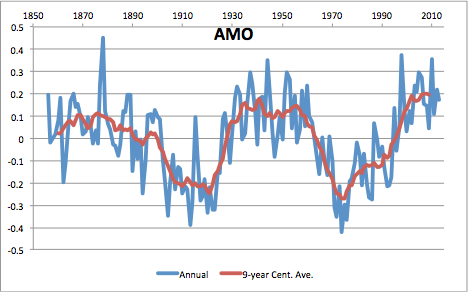
The AMO has been at the top of it’s warm phase since 1998. The index doesn’t get much higher than it is now. It can only go down from here. It was at a similar peak during the warm 1930s through the 1960s. It was negative during the cool 1970s. The peaks of the AMO tend to be flat for a couple of decades before flipping cool. We don’t know what drives the AMO. Data here.
2. It’s The Pacific Decadal Oscillation (PDO)
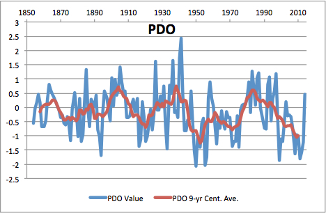
The PDO has been trending down since the early 1980s. It also was up during the 1930s and negative during the 1970s. The AMO and the PDO are the natural ocean cycles that climate scientists talk about. The PDO reached a peak in the 1980s and has been declining since. This index is volatile. The PDO has a huge effect on weather on the Pacific Coast of North America. Data here.
3. It’s The AMO and PDO together
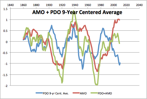
They are sometimes roughly added together. (Even though they are not measuring the same thing.) If one adds them together, it can be seen why the late 1930s were warm and the 1970s cool. The sum (green trace) reached a peak in 2000 and is now declining because of the declining PDO. (Computed by author.)
4. It’s the sun

The sunspot number (SSN) average has declined since the mid-1990s. One can see a cause for the 1970s cooling in the SSN, but not for the 1930s warming. The early 20th century cooling may have been caused by the low SSN around the turn of the century. The sun is excused for the recent pause because the total solar index (TSI) changes only by a fraction of a Watt/m2 over large changes in SSN. But other factors may be in play. (Source: WDC-SILSO, Royal Observatory of Belgium, Brussels.)
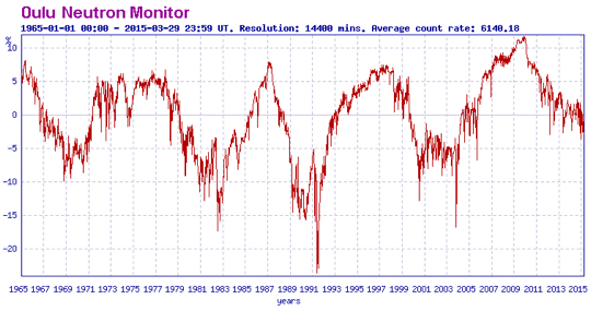
5. It’s cosmic rays
The neutron count is an indicator of the cosmic ray flux at the top of the atmosphere. Here is the neutron count at Oulu, Finland since 1965. It is thought that cosmic rays seed cloud formation. Therefore high recent count is providing cooling clouds. Graphic downloaded from here, the Sodankyla Geophysical Observatory, University of Oulu, Finland.
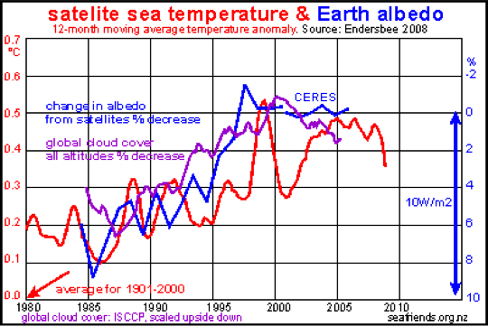
6. It’s clouds and earth’s albedo
Albedo and cloud cover reached a peak in the 1998-2000 era, at the beginning of the pause. Clouds, especially high clouds, reflect solar energy. Each 1% of albedo change translates to 1 W/m2. There is another graphic of albedo from the EarthShine project, here. All the albedo data show a significant rise in albedo after 1998. The cosmic ray/neutron count may not match the albedo/cloud cover, but cloud cover really did increase. Graphic used by permission of Dr. J. Floor Anthoni, and seen here.
PAUSE IS ANTHROPOGENIC
I mean by anthropogenic that man may have caused the pause by manipulating the temperature data. These manipulations seem to enhance the warming trend in support of politics, though the stated intent for many was to enhance accuracy. Here are some examples:
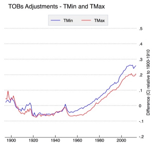
7. It’s the time of observation (TOBs) adjustment
Observing times have been gradually changed from afternoon to morning hours. The bias from this adjustment was about 0.2°C for TMax and 0.25°C for TMin. This impacts the historic data, but also, this adjustment is now finished. Most measurement sites now use morning observing times and no more changes will be made, hence the pause. No more warming will come from this source. The TOBs adjustment is clearly visible in the DIFFERENCE BETWEEN RAW AND FINAL USHCN DATA SETS graphic below, though it is only half of the total. Figure from here.
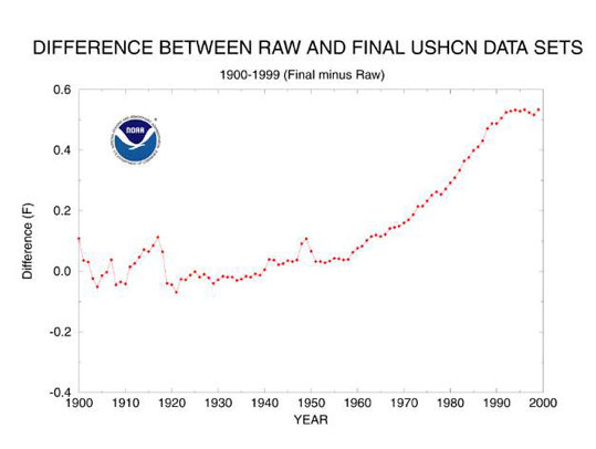
8. It’s all adjustments including TOBs
This graphic shows the result of all adjustments: homogenization, sensor changes (CRS vs MMTS), and TOBs. Note also that the warming due to all these changes is about 0.5°C, much of the warming that is supposed to have taken place since 1950. Note that these changes went flat during the 1990s decade. Note the similar shaped curve to the TOBs adjustment with a flat shape in recent times. There should be no more warming from this source. Figure from NOAA/NCDC here.
9. It’s the number of stations
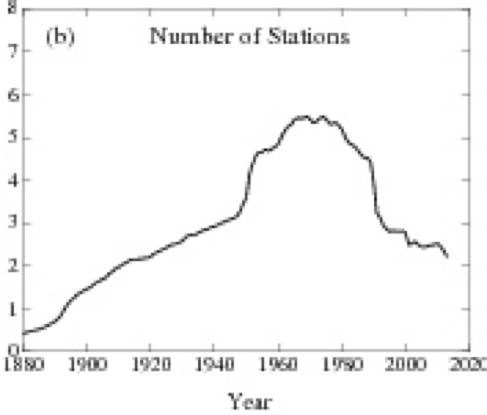
Since 1980, the number of stations reporting temperature data has declined by half. Some of the decline was due to the collapse of the Soviet Union. This resulted in loss of data from the Russian high arctic and Siberia, among the coldest land stations in the Northern Hemisphere. Some of these stations have resumed reporting in recent years, but most have not.
Other stations in Africa and Asia were closed by newly independent former colonies. World-wide, many stations closed instead of being upgraded. On average the remaining stations are at lower elevations and in warmer, populated areas. This situation has now stabilized. Figure from NASAGISS here. A discussion of this problem is here.
These are nine possible reasons for the pause. One or two are sufficient. Nine is overkill.


Good summary of factors affecting this issue. I think the ocean oscillations are key, but the adjustments are rampant and distorting our perception of reality.
Unfortunately, records of reporting stations are now being deleted, in addition to selective cooling of the past.
https://rclutz.wordpress.com/2015/03/17/adjustments-multiply-warming-at-us-crn1-stations/
Thanks, Ed. Two short remarks. First, your question is not ontological but epistemological. It has to do with our (false) knowledge and not with reality. There is no cause of something in nature deviating from our expectations. If you expect that I am a vegetarian the reason that I eat meat has no explanation beyond your false knowledge. Second, the station number issue may be interesting. I have found that the best predictor of station drop-out is the degree its time series deviates from other stations in the same latitude region. About eighty percent of the old stations were closed. Don’t forget that the station number in the graph is a net number and includes many new stations. The drop-out was not accidental but deliberate and amounts to creating an artificial signal from noise. The pause however can be seen in satellite data and therefore the surface station issue can be forgotten here.
Yes, the pause can be seen in the satellite data, but at the time of the great dropout, the GHCN data and satellite data begin to show a difference of slightly more than 0.1°C. So the surface station issue can’t be forgotten. All these issues add up, and all in the same direction.
Simplest model around?
http://i273.photobucket.com/albums/jj237/tolou1/Global%20climate%20model_2015_zps1asmzkpk.png
If the sun isn’t gonna fly anytime soon, and the AMO is going to revert into negative around 2035, we are looking at some lower temps soon enough.
[…] Full post […]
General observation:
The metric of most interest (one would think, at least) should be the observed Temperature TREND in the latitude bands where the majority of human beings actually live.
Shouldn’t it be possible to obtain (with reasonable accuracy) the land surface temperature at several locations within those latitudes, ensuring that the sensors themselves were as isolated as possible from human activity (in order to avoid UHI and other effects), then compute the mean long-term trend observed at only the best-quality temperature sensor sites?
I’m thinking a few dozen per continent would be sufficient to establish what the long-term TREND is to the best possible accuracy. 60 N to 60 S should do it, perhaps reduced: 55 N to 35 S. The average of min & max temperature recorded in a 24h period would probably be sufficient as well.
The current mix of different datasets only adds to the overall confusion.
Here is my observation of a couple of years ago.
https://notrickszone.com/2013/11/24/giss-data-confirm-winters-definitely-getting-colder-over-northern-hemisphere-continents-since-1995/
Winters are getting colder where people live.
Thanks, Ed.
Not too many people are aware (of the winter cooling in the inhabited NH), I would think — certainly doesn’t make it to the mainstream press.
That would explain why so many of those condemning CO2 are hanging their hats on ¡dangerous, unprecedented arctic warming! (complete with infilling) in order to keep the drum beat going strong.
There does appear to be some “bi-polar behavior” going on, too (could this correlate with Arctic Sea Ice trend being opposite to Antarctic Sea Ice trend)?
Have any climate alarmists realized and/or commented on the cooling of winters in the “inhabited NH”?
Here’s the why and wherefore on Arctic Ice.
http://icecap.us/index.php/go/in-the-news/making_the_case_for_arctic_ice_recovery1/
It’s another cycle!
Ed, you might be interested in the research conducted under the ReSolVe (a Finnish Center of Excellence, funded by the Academy of Finland) that is “studying the long-term solar variability and its effects in near-Earth space, atmosphere and climate”:
http://www.spaceclimate.fi/resolve/
one of their publications (J. Geophys. Res) focuses on the “spatial distribution of Northern Hemisphere winter temperatures during different phases of the solar cycle”:
http://onlinelibrary.wiley.com/doi/10.1002/2013JD021343/abstract
They found “significant differences in the temperature patterns between the four cycle phases, which indicates a solar cycle modulation of winter surface temperatures. However, the clearest pattern of the temperature anomalies is not found during sunspot maximum or minimum, but during the declining phase, when the temperature pattern closely resembles the pattern found during positive NAO. Moreover, we find the same pattern during the low sunspot activity cycles of 100 years ago, suggesting that the pattern is largely independent of the overall level of solar activity.”
One of the scientists of that paper even suggest that the IPCC needs to reconsider the effects of the sun on earth’s climate and explain the current warm winter in Europe partly with strong solar wind:
http://www.oulu.fi/yliopisto/tutkimus/tutkimuksen-esittely/tutkimusartikkelit/aurinkotuuli-osasyy-lämpimään-talveen (unfortunately only available in Finnish)
Kurt, that’s the purpose of the CRN categories, which were invented by French meteorologists to rate stations for siting away from urban heat sources. For an example of trend analysis see: https://rclutz.wordpress.com/2015/03/21/is-it-warmer-now-than-a-century-ago-it-depends/
Thanks, Ron.
Good start. The lack of warming is somewhat remarkable, given all we’ve heard the past 20+ years from a compliant media.
Now you need a better geographical spread for N. America. Then do the same for So. America, Europe, Asia and Australia. Ignore the poles.
300 high quality rural sites should do it. 500 would be even better. Ideal would be an approx. equal geographical distribution, covering distinct climatic zones.
The long-term trend is what matters; not excitement over +/- a few tenths of a degree C.
kurt
Kurt, that was the purpose of the CRN categories for rating sites for being away from urban heat sources, first invented by French meteorologists. An example of trend analysis is here: https://rclutz.wordpress.com/2015/03/21/is-it-warmer-now-than-a-century-ago-it-depends/
Ed says: “They are sometimes roughly added together. (Even though they are not measuring the same thing.) If one adds them together, … ”
I just posted the following to another site:
The PDO index has + and – (plus & minus) numbers and gets referenced as warm or cold. This misses the nuance of the PDO and the index. Something did happen in the Pacific Ocean in the 1970s but the PDO was an after effect, not the cause. It has been reported that “ … the midlatitude atmosphere drives the ocean into a new state, …”. See:
http://horizon.ucsd.edu/miller/download/climateshift/climate_shift.pdf
Title: The 1976-77 Climate Shift of the Pacific Ocean
Oceanography – Vol. 7 No. 1 – 1994
A. J. Miller, Et al.
Ed Carlyle writes about the AMO and PDO: “They are sometimes roughly added together. (Even though they are not measuring the same thing.)”
They are wrongly added together by people who do not understand what they represent. You’ve acknowledged “they are not measuring the same thing” so why repeat their error, Ed? It doesn’t help your post.
Additionally, the PDO is inversely related to the sea surface temperatures of the extratropical North Pacific. The PDO data are also negatively correlated to Northern Hemisphere surface temperatures. Including the PDO in you post doesn’t help it either.
Cheers
Thanks for the criticism, but at least do get the names of the people you criticize correctly. There is no Ed “Carlyle” here
I’m used to it.
Would it make more sense to invert the PDO before adding, then?
Ed, my apologies for misspelling your last name.
Regarding the multidecadal variations in the sea surface temperatures of the North Atlantic and North Pacific, the variability of the North Pacific is less than, and runs in and out of synch with, the North Atlantic.
The simplest, most straight-forward and most logical method to combine them would be to detrend Northern Hemisphere sea surface temperature anomalies, similar to the method used to determine the AMO. The result is somewhat similar to the AMO but of a lesser magnitude.
Inverting the PDO doesn’t help, because global sea surface temperature anomalies are subtracted from extratropical North Pacific sea surface temperature anomalies before the Principal Component analysis used to determine the PDO. The PDO data are also standardized, which inflates their value about 3 times.
Sorry, again about the misspelling.
Cheers
The added number is not represented as a logical consequence of the two, but merely as an index. Anything can turn out to be an index of anything: skirt hems → stock prices, e.g.
The PDO value is an indication of “pattern.”
It is not a proxy for temperature.
Look at a rugby ball. From the side it is oval.
From the end, it is circular. Twist it and the pattern changes.
If you want to “combine” something from the Pacific Ocean to something from the Atlantic Ocean use 2 temperature measurements. Do not use Temperature from one and Pattern from the other.
The first three points (ocean cycles) have all been considered, and could be factors. See, for example
http://www.realclimate.org/index.php/archives/2015/02/climate-oscillations-and-the-global-warming-faux-pause/
David Appell:
Minor detail – that would be a “fausse pause” (if you want to keep gender coherence). But couldn’t the combination of natural cycles equally have made the temperature increase post 1975 a “fausse hausse” (or didn’t that enter your mind)?
Or are you betting on a temperature increase to manifest itself soon?
Care to say when?
I try not to make predictions.
Some people are saying that (1) since the PDO has recently turned to its positive phase, and (2) we’re having an El Nino, we could be in for a quick jump up in temperatures. For example:
http://thinkprogress.org/climate/2015/04/02/3640842/global-warming-jump-imminent/
One mechanism, that is missing on this list, which I’m researching on with an ANN (Artificial Neural Network), is through ENSO which is directly driven by tidal forcing and solar electromagnetic forcing.
The solar influence is not by galactic cosmic rays a la Svensmark, but rather through direct influence from electromagnetic solar variations which seems to make change in the trade winds of the Pacific, which in turn drives ENSO through The Walker Circulation.
Strong solar electromagnetic activity => huge swings in ENSO index => global warming.
Weak solar electromagnetic activity => small swings in ENSO index => global cooling.
Expect ENSO index to increase in the coming months, but to take a sharp downturn just before Christmas.
Ed Caryl wrote:
“I mean by anthropogenic that man may have caused the pause by manipulating the temperature data. These manipulations seem to enhance the warming trend in support of politics, though the stated intent for many was to enhance accuracy.”
According to Zeke Hausfather, a data analyst for the BEST project, the net effect of adjustments is to lower the long-term trend:
“Turns out that global temperature adjustments actually reduce the long-term warming trend, mostly due to oceans.”
— Zeke Hausfather, BEST analysist https://twitter.com/hausfath/status/564921572096348160