A new temperature record for all of India shows no obvious net warming since 1951 or 1705. But when scientists select a cold year and draw in a red-hot short-term upward trend from that point, warming appears.
Pages 21 to 45 of a new Springer book entitled Assessment of Climate Change over the Indian Region and authored by 12 Indian meteorologists (Sanjay et al., 2020) assesses the temperature changes for India as a whole throughout the last few centuries.
A proxy temperature reconstruction since 1705 reveals no obvious net modern warming – and a warmer 18th century than recent decades.
When the drawn-in trend lines are removed, an annual, max. and min. instrumental record that begins in 1951 also shows no obvious net warming.
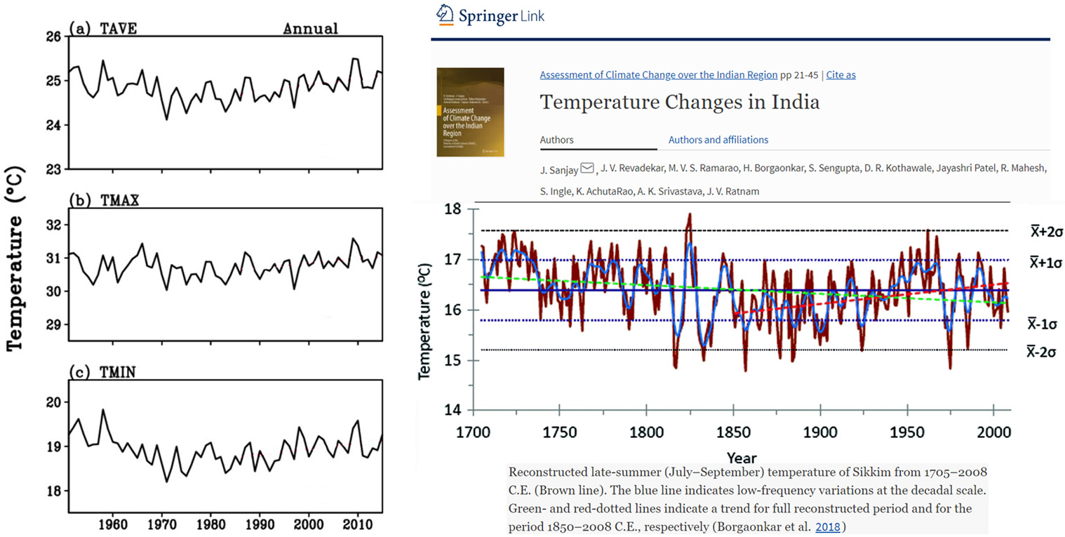
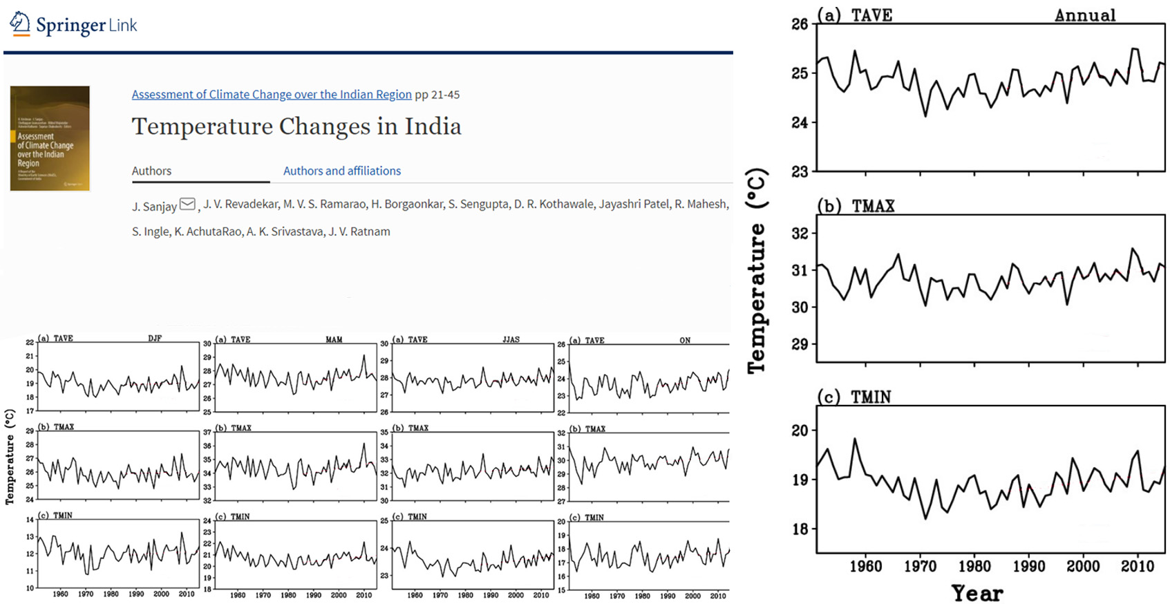
Image Source: Sanjay et al., 2020
Since a non-warming trend during an era when CO2 concentrations rose from 315 to 415 ppm would not support the narrative that the globe has been rapidly warming due to human activity, the authors took the necessary steps to create a warming trend where none existed.
A cold year, 1986, was selected as the starting point for the newfangled global warming in India. From there, a red-hot warming trend line was drawn-in and a per-decade rate of warming (i.e., 0.15°C) also emerged in flaming red tones.
And, just like that, India is in the fold, sweltering in the throes of anthropogenic global warming.
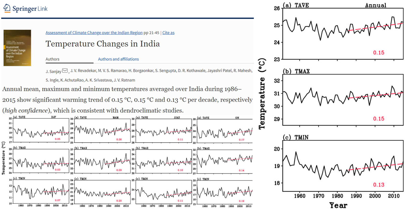



https://www.amazon.com.au/How-Lie-Statistics-Darrell-Huff/dp/0393310728
Going strong since 1954
Thanks a lot!
Methinks that the first graph (top right of the story) is all that needs to be depicted. There is NO long-term systematic trend, and the variations around the mean are just statistical noise; in particular, the data are mostly-confined within one standard deviation of the mean, and the data very rarely get out anywhere near two standard deviations (let alone three).
Anyone with experience with this kind of statistics of sequential sampling will recognize also that the “trends” (sic) are readily-produced with those kinds of systems (i.e., phantom trends).
(If anyone finds this difficult to believe, just do the following simple experiment. Get a piece of graph paper, a pen-or-pencil, and a pair of playing dice. Create a graph on the x-axis where you start with 1700 and then go forward one year at a time. Roll the dice for 1700 and mark the y-axis (2 to 12). Roll for 1701, 1702, etc. Plot each. Watch what happens.)
I guess the pressure to find warming is extreme as Modi’s OSOWOG is doomed to fail :
https://canadianpatriot.org/2020/06/11/the-sun-never-sets-why-modis-green-bri-doppelganger-is-doomed-to-fail/
The One Sun, One World, One Grid Plan, a green counter to China’s BRI seems to pander to London’s Great Reset.
With trillions of dollars at stake, what’s a few graphs!
Can’t you just explain to people that a quickly available backup reserve is needed for times when the wind doesn’t blow and the sun doesn’t shine, The windmills create unsightly landscapes and disturbing sounds and kill birds. The backups cost lots of money and raise your electric bill.
How temperatures were measured in India in 1700 and how reliably?