Monthly newsletter
by Prof. Fritz Vahrenholt
The IPCC’s latest climate report was published on August 9th and I have been able to take a look at it. One thing is clear: It will give all the alarmist forces a strong tailwind.
But before we look at the IPCC report, we first take a brief look at the temperature curve:
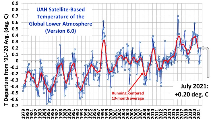
The global mean temperature anomaly (reference period 1991-2020) of satellite-based measurements rose to 0.2 degrees Celsius in July 2021. The end of the La Niña has led to a slight interim recovery in global temperature, which will not last long, however, as the next La Niña is already approaching. Temperatures in the Pacific ENSO region are already back in negative territory. For November to January, the US NOAA estimates the probability of a new La Niña at 66%. Then the above temperature curve will probably be pushed below zero °C again.
Now we look at the new IPCC report.
The new IPCC report: climate change 2021 – widespread, rapid, worsening climate change
The new IPCC 6th Assessment Report published on Monday, August 9th, makes a clear statement in the title of its “Summary for Policymakers”: Climate change is continuing to spread rapidly at an accelerated pace.
What are the main changes compared to the 5th Assessment Report of 2013?
1. Global warming from 1850 to the present is reported to have been 1.07 °C. The warming from 2011 to 2020 increased by 0.19°C since the last reporting period from 2003 to 2012.
2. There are new models (CMIP6), but some of them produced completely implausible results (Science, Paul Voosen: U.N. Climate Panel confronts implausibly hot forecasts of future warming). Since CO2’s influence was assumed to be too strong, the backward modelling of the temperature development of the last millennia of some models led to unrealistically cold temperatures. Looking into the future, many models ran too hot. Even Gavin Schmidt of the NASA GISS Institute, who is close to the IPCC, stated: “insanely scary – and wrong”.
As a result, the models relied on by the IPCC were constrained. Nevertheless, the holy grail of climate research, the climate sensitivity ECS (temperature increase with doubling of CO2) was raised. Until now, the IPCC calculated a temperature increase range of 1.5° to 4.5° Celsius with a doubling of the CO2 concentration from 280 ppm (1850) to 560 ppm in the future. Against the background of the new models, the IPCC now gives a temperature range of 2° to 5°C, with a narrower confidence interval of 2.5°C to 4°C. They even venture so far as to assign a mean value for climate sensitivity of 3°C for a doubling of CO2.
Entire Holocene warmth gets airbrushed
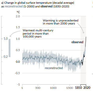
3. Surprisingly, the IPCC has deleted the Medieval Warm Period (MWP) from 900 to 1200 from the climate report and thus from humanity’s climate memory. The first graph in the report, SPM.1, shows the temperature curve for the last 2000 years. From year 1 onwards, the curve shows a steadily decreasing trend until 1850, after which the temperature rises sharply until today. A new hockey stick has been created. So the IPCC can claim that it has never been as warm as it is today for 125,000 years.
Numerous scientific publications (I was involved in five of them) document that the Medieval Warm Period was about as warm as today (as described in the 5th State of the Climate Report).
But now even the period of 6500 to 8500 years ago is also rewritten as cold. That was the time when hippos roamed the Sahara and shortly afterwards, Ötzi wandered over the Ötztal Alps. Dozens of publications had proven that the temperatures at that time were 3 degrees higher than today. All no longer true. (see “Unwanted truths”, p.34 to p.54). In the last IPCC report of 2013 it was still stated: “On a continental scale, temperature reconstructions of the medieval climate anomaly (years 950 to 1250 show with high confidence intervals of decades that were as warm in some regions as in the late 20th century.
Extreme weather gets linked to human misbehavior
4. For the first time, the IPCC links extreme weather events to man-made climate change. In the last special report on extreme weather from 2012, it was still stated that there is no reliable trend information that suggests an anthropogenic influence. Now it says that there is evidence of human influence on observed changes in extremes such as heat waves, heavy precipitation, droughts and tropical cyclones. This now makes it possible to link any extreme weather event to CO2 emissions. This is a much more effective way of generating political pressure than through the relatively unexciting temperature trend.
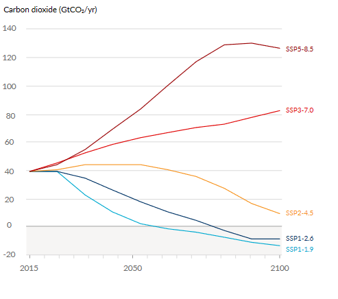
5. The report distinguishes between 5 different CO2 development scenarios. Three of them, however, can be very quickly relegated to the realm of fairy tales. In the SSP5.8.5 scenario (SSP from shared socio-economic pathway, and the last number stands for the warming effect generated by CO2), annual CO2 emissions would increase threefold by 2080 – an absurd scenario, as we would soon run out of coal, oil and gas.
Scenario 6.0 is similarly unrealistic, as it would double CO2 emissions by 2100. The third scenario, which can be easily ruled out, is the reduction of CO2 emissions from 2020 and a reduction to half by 2035, a time when China and India will have added another 30% CO2 emissions.
This leaves two scenarios:
The 4.5 scenario allows emissions to rise only slightly until 2050 and then to fall to a quarter of today’s emissions by 2100. The other scenario, 2.6, reduces emissions by half by 2050 and then comes to zero in 2080. Comparing these two scenarios, the temperature in the 4.5 scenario develops as follows:
2040: 0.43°C additional increase
2060: 0.93 °C
2100: 1.63 °C.
In the 2.6 scenario, the development up to 2040 is also 0.43 C additional warming, for 2060 it’s 0.63°C and 2100 it’s 0.73°C.
Up to 2060, there are few alarming differences. China will take note of this with satisfaction. And we in Germany calculate what our 2% global share of CO2 contributes to temperature increase (mind you, calculated using models that are too hot).

6. Since none of this is really dramatic, the IPCC gives wide scope to the completely unreal 8.5 scenario. According to the IPCC, sea levels could rise by almost one meter by 2100, and to 7 metres by 2300.
Then it could be that the Atlantic Ocean Current AMOC (commonly understood as the Gulf Stream) could collapse. Until now, such speculations have been rejected by climate researchers like Jochem Marotzke from the Max Planck Institute in Hamburg.
German High Court ruling gets contradicted by IPCC
7. The IPCC also addresses the natural sinks for CO2 emissions, a topic that has become common knowledge since the controversial ruling of the German Federal Constitutional Court. As we described in our book on the Constitutional Court ruling “Unchallengeable?”, the court’s ruling is wrong: “Only small parts of anthropogenic emissions are taken up by the oceans and the terrestrial biosphere. The large remainder of anthropogenic emissions, however, remains in the
atmosphere in the long term”.
In the FAQs (Frequently Asked Questions) published with the report, the IPCC confirms our criticism of the Constitutional Court. Point 5.1 states: “Observations… show that the atmosphere has absorbed only about half of the CO2 emitted by fossil fuel combustion and land use changes such as deforestation. Natural processes of the carbon cycle
on land and in the oceans have absorbed the rest of these emissions.
This removal on land and in the oceans, or ‘sinks’, has grown largely in proportion to the increase in CO2 emissions, absorbing 31% (land) and 23% (oceans) of emissions over the period 2010-2019.”We have converted this to ppm in the book “Unchallengeable?”: 4.7 ppm are emitted, 55%, or 2.6 ppm are absorbed by nature.

From this graph 5.8 (on page 5-184) of the IPCC report, we learn two things. First, how scientifically wrong the Federal Constitutional Court is. And secondly, that the real uptake of the oceans increasingly exceeds the model calculations. But it gets even better. In FAQ 5.3, the IPPC states. “If the emission and uptake of CO2 are equal, the CO2 concentration stabilizes. If the CO2 removal is greater than the emission, the concentration would decrease”. If this is taken to its logical conclusion, it would mean that halving emissions would be sufficient to lower the concentration because the uptake of oceans and plants does not depend on the annual emission, but rather on the respective concentration in the atmosphere. And it is right: if we emit a little less than the huge sinks of oceans and plants absorb (today already 20 billion tons of CO2 annually, the total emission of CO2 is 38 billion tons), the CO2 concentration will decrease. (To explain the graph 1 Pg C is equivalent to 3.66 billion tonnes of CO2, which is 12.8 billion tonnes for 2019). To avoid arriving at this fabulous solution, the IPCC writes under B4.1, “Based on model projections, under the intermediate scenario 4.5, which stabilizes CO2 concentrations in the air, uptake of CO2 by land and oceans would decline”. According to the models, this would apply from the second half of the century. There is hardly any physical connection to suggest this. But models that fail, in retrospect prove it! We simply paint the world as we need it.
Solar activity factor completely ignored
In the new IPCC report, the sun plays no role in the warming. It is given as zero in the graph SPM.2 in the report. Therefore, I am adding something from the real world of measurements, to which one should rather orientate oneself as a natural scientist The sunshine duration in Europe and the cloud cover in Europe, measured by satellites in the framework of the Copernicus program. The authors write that significant above-average sunshine from January to May has increased the annual sunshine hours for 40 years. 200 more hours of sunshine per year, more than half an hour per day – that’s newsworthy. There has been a similar trend worldwide since 2000.
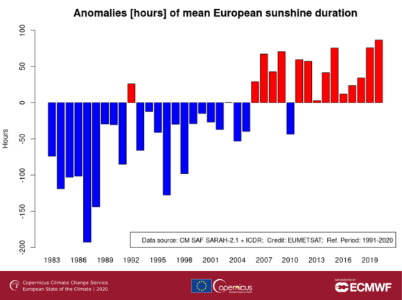

This exciting development of the last 40 years, described in the scientific literature as cloud thinning, has influenced the climate development of the last decades to a much greater extent than previously believed. This effect is not mentioned in the summary for policymakers.
The question that remains to be answered is whether the increase in sunshine hours is a natural process, or whether it is related to the decline in sulfur and dust aerosols since the 1990s, or whether this has been caused by a CO2 feedback on the clouds. We don’t know yet, but in a few years we will certainly find out.


This link has a lot of detail about global cloud cover.
http://www.climate4you.com/ClimateAndClouds.htm
Cloudiness appears to have stopped dropping around 2000 and has drifted up a little since so it may be that the trend mentioned above has now come to an end.
Also, around 2000 the temperature rise paused.
Hamilton, D.S., 𝑒𝑡 𝑎𝑙. 2018. ”Reassessment of pre-industrial fire emissions strongly affects anthropogenic aerosol forcing” nature communications
https://www.nature.com/articles/s41467-018-05592-9.pdf?origin=ppub
DOI: 10.1038/s41467-018-05592-9
Hamilton 2018: ”Here we show that revised assumptions about pre-industrial fire activity result in significantly increased aerosol concentrations in the pre-industrial atmosphere. Revised global model simulations predict a 35% reduction in the calculated global mean cloud albedo forcing over the Industrial Era (1750–2000 CE) compared to estimates using emissions data from the Sixth Coupled Model Intercomparison Project [CMIP6]. An estimated upper limit to preindustrial fire emissions results in a much greater (91%) reduction in forcing.”
”Analyses of ice core records, charcoal measured in lake and marine sediments, and tree-rings, suggest that fire activity varied considerably over the last 500 years, but that generally fire occurrence increased to a peak around 1850CE, before declining to [Present Day (PD)] levels⁷⁻¹³.”
”This runs contrary to existing ideas about the pristine nature of the Earth system in the [pre-industrial era], …”
”It has been widely assumed, in global climate models, that aerosol emissions from fires in the [pre-industrial era] were lower than in the [Present Day (PD)]¹⁴⁻¹⁶, based on a misconception that total fire emissions have increased with human population density¹⁷. Globally, most fire ignitions are caused by humans¹, which makes a positive scaling of total burned area, and hence total fire emissions, with human population density [seem] logical, at first. However, recent analysis of global fire occurrence shows that, at a global scale, burned area declines with increasing population density¹⁸ ¹⁹ due to land use change²⁰.”
”The revised assumptions about [pre-industrial era] fire emissions lead to substantial changes in the regional magnitude and pattern of the net aerosol radiative forcing over the industrial period. Our modelling results imply a substantial change in our understanding of the way the energy balance of the atmosphere has evolved over the industrial period, particularly over the Atlantic, with several possible implications for climate studies. In particular, compared to the simulation using CMIP6 fire emissions, we estimate that the revised fire emissions reduce the magnitude of the net (cloud albedo and direct) aerosol radiative forcing contrast between the Northern and Southern Hemispheres by 0.2W/㎡ for both the SIMFIRE-BLAZE and LMfire simulations, but with very different spatial distributions (Fig. 4). In many coupled atmosphere-ocean climate models, the inter-tropical convergence zone would likely be positioned further southward in the [pre-industrial era] compared to models participating within CMIP6, as tropical precipitation patterns are sensitive to changes in the gradient in the inter-hemispheric aerosol forcing⁴⁹ ⁵⁰.”
”The exponential increase in human population over the Industrial Era has restructured the fire landscape on all inhabited continents and created a permanent change in the energy balance of the atmosphere that has not been fully accounted for in climate models. Furthermore, it is highly likely that models participating in CMIP6 would simulate smaller anthropogenic aerosol radiative forcings over the industrial period if they used higher [pre-industrial era] fire emissions.”
”Depending on the emitted species, modelled total global fire emissions in the [pre-industrial era] are estimated to be between approximately two-and-a-half and five times higher than those in the CMIP6 dataset (Supplementary Table 2), reflecting the large contribution to the uncertainty in fire emissions from fire modelling processes and assumptions about land use change (see Methods). These differences also lie well outside the perturbations assumed in multi-model sensitivity studies36, and have a different spatial distribution due to differences in fire emissions corresponding with changes in the location of PI fire occurrence rather than a uniform global increase. Seasonal patterns in fire emissions are similar between fire models, except in spring where LMfire simulates significantly more emissions than SIMFIRE-BLAZE in both hemispheres (Supplementary Figure 4). Overall, the fire model simulations suggest that a large source of [pre-industrial era] aerosol emissions is currently missing from climate models and the CMIP6 experiments.”
In section 3 where you say the Holocene warmth gets airbrushed in the hockey stick graph is an example where temperature measurement methods affect the results. For instance tree ring data in cold climates only measure what happens in the growing season which is just a few summer months. When Michael Mann found that his tree ring data (summer months) did not rise as fast as the instrumental data (measuring the entire year) he cut that out of the paleo record (Mike’s Nature trick). The instrumental data is a record of every day of the year. Tree ring data is the summer growing season. The instrumental record shows that fall winter and spring have warmed but that summer has stayed the same. So the flat lining of the tree ring data in the last 40 or 50 years should have been a warning that his paleo data splice on the instrumental record was extremely flawed. Unfortunately, that did not fit his narrative.
[…] Related: IPCC AR6 Focusses On “Absurd”, “Fairy Tale” Scenarios, Ignores Hundreds Of Publications, Maj… […]
so could cloud cover perhaps explain most of the warming trend since the 60s?!
Yes, but why is there a decreasing cloud cover? Guess what the alarmists will say?
A lot of the warming had nothing to do with CO2 levels in the atmosphere. In the 1960’s nuclear power plants were being built (electricity was going to be so cheap we could heat with it) highway systems were built, mostly on what had been farmland. Large dams were built. New cities were built with high rise blds. shopping centers and parking areas. They all needed wastewater treatment plants
Power lines heat up the environment. Solar panels heat up the environment. Volcanoes heat up the environment, land volcanoes or under the ocean, it doesn’t matter.
[…] F. Vahrenholt, Aug 11, 2021 in […]
According to this IPCC report, science has learned NOTHING since Svante Arrhenius.
[…] https://notrickszone.com/2021/08/11/ipcc-ar6-focusses-on-absurd-fairy-tale-scenarios-ignores-hundred… […]
The increase in sunshine hours since 1995 is due to weaker solar wind states since then driving a warm AMO phase. It’s an amplified negative feedback.
https://www.linkedin.com/pulse/association-between-sunspot-cycles-amo-ulric-lyons/
[…] IPCC AR6 Focusses On “Absurd”, “Fairy Tale” Scenarios, Ignores Hundreds Of P… […]
[…] Fritz Vahrenholt, IPCC AR6 Focusses on “Absurd”, “Fairy Tale” Scenarios, Ignores Hundreds of P… […]
[…] Fritz Vahrenholt, IPCC AR6 Focusses on “Absurd”, “Fairy Tale” Scenarios, Ignores Hundreds of Publications, Maj… […]