Ed Caryl brings us his latest essay. We are aware that Antarctic sea ice has trended up over the last 30 years or so. Ed takes a look at some temperature plots from stations in Antarctica and compares them to the Southern Oscillation Index and wind. Forget the back seat! – CO2 is only riding the rear bumper of the climate science bus.
A Wind In Antarctica
By Ed Caryl

High winds in Antarctica. Source: Wikimedia
The Anthropogenic Global Warming (AGW) crowd claims that warming caused by CO2 will appear first in the Arctic and Antarctic. We showed that there is little to no warming at locations in the Arctic that are sufficiently isolated from Urban Warming. In Antarctica this should not be a problem because research stations are mostly small, and many have been of constant size since they were established. Yet, we have this example to cast doubt on that idea.

Figure 1
(Note: All temperatures in the following charts are plotted in Excel from GISS raw temperature data.)
In Figure 1, McMurdo and Scott Base are only 5 kilometers apart, and Marble Point is just 87 kilometers away from both. Temperatures at all three track one another except that McMurdo and Scott Base are warming at just under a degree over the 50 years seen here, and Marble Point is flat over the 30-year record we have. Why the large temperature difference between McMurdo and Scott Base? Unknown. If any reader has been there, and can answer the question, leave a comment.
The answer may be as simple as that the population of McMurdo is over 1000 people every winter, and Scott Base population is 10 over-winters, and those figures have been roughly the same since the beginning of both bases. Marble Point is an automated station, one of the few in Antarctica that authorities have managed to keep operating with any consistency. Usually the wind blows the automated stations away, or the snow buries them. Automated station = no people = no warming.
If we shorten the records to the last 30 years, we get a slightly different result (Figure 2).

Figure 2
McMurdo has been warming just slightly since 1980, Marble Point is flat, and Scott Base has been cooling nearly as much as it had warmed in the previous 25 years. Conclusion? McMurdo base has an urban warming problem.
Are there other patterns in warming and cooling in Antarctica?
There certainly are. Here are two charts, both covering the last 30 years, Figures 3 & 4. The cooler stations near the bottom of the first chart are closer to the South Pole.

Figure 3

Figure 4
Notice that the temperatures on the Continental chart and the Peninsula chart go in opposite directions. In any year when the stations around the rim of the Antarctic continent are cooling, the stations on the Antarctic Peninsula tend to be warming and vice-versa. Especially obvious is 1989. Why should this be?
There is a similar pattern in the Antarctic Oscillation Index. The AOI is the difference in mean sea level pressure between 40°S and 65°S latitudes. The same pattern is seen in the Southern Hemisphere Annular Mode Index or SAM. This index is similar to the AOI, but it is the pressure difference between 40°S and 70°S. In the plot below, Figure 5, the SAM index is in phase with the Antarctic Peninsula average temperature, and is inverted compared to the Antarctic Continental average. The Continental average has been inverted in this plot.

Figure 5
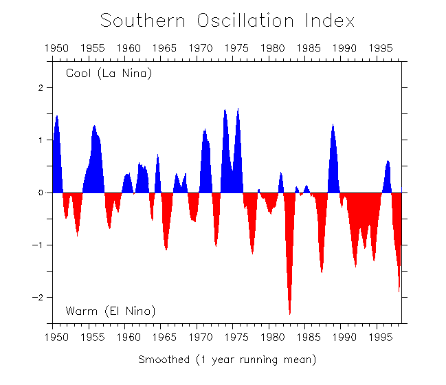
The Southern Oscillation is also somewhat related to winds and temperatures in Antarctica. The Southern Oscillation is an index calculated from the difference in barometric pressure between Tahiti and Darwin, Australia. It is also referred to as the El Niño Southern Oscillation or ENSO.
The SOI is also in phase with the temperatures on the Antarctic Peninsula, and inverted compared to the Antarctic Continental station temperatures. This isn’t totally consistent, but remember that these charts are of yearly averages, so some detail is lost.

Figure 6
Figure 6 is also an average of the Antarctic Continental and Antarctic Peninsula station temperatures, the Continental plot is inverted, and all compared to the SOI. 1988-89 was a strong La Niña year. 1995 also had a La Niña, as did the period from 1998 to 2000.

Figure 7
Figure 7 source: http://faculty.washington.edu/kessler/ENSO/soi-1950-98.gif
Is the Antarctic warming?
So, we still have not answered the question: Is the Antarctic warming? The problem with the answer is that most of the stations in Antarctica, including the peninsula, were only established in the mid-1950’s, during the 1957-1958 International Geophysical Year. This means that most of the temperature records don’t span the longest ocean cycles, like the AMO.
Only Base Orcadas, Figure 9, on Laurie Island in the South Orkney Islands goes back to the early 20th century, to 1903. It clearly shows the AMO signal of cooling in the 1920’s and 30’s, warming to the late 1950’s, cooling to the 70’s, and warming to the present.

Figure 8
The total warming of Base Orcadas in the last 100 years is about 1 degree C looking at the 6 year moving average. Three other stations are cooling: Halley, Mawson and Neumayer; all are on the Antarctic continent. Only two have records going back to 1957 or earlier, Halley and Mawson. Halley is the only one with significant cooling over the last 50 years (Figure 9).

Figure 9
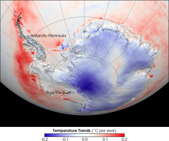
So, why is the Antarctic Peninsula warming? The answer seems to lie in increases in the circumpolar winds in that region. These cause increased adiabatic (down-slope) winds as the circumpolar winds blow over the spine of the peninsula. These adiabatic winds heat the air as they compress it flowing to sea level. The resulting heating can be seen in this NASA image, Figure 10.

Figure 10
Figure 10 source: http://www.coolantarctica.com/Antarctica%20fact%20file/science/Antarctic_temps_AVH1982-2004%20source%20NASA.jpg
The reason for the heating is paradoxical. The Antarctic Continent is cooling, especially at the South Pole. The continent is mostly a high plateau, subject to continuous high pressure. This leads to winds that flow downhill, the adiabatic winds. The earth’s rotation (coriolis force) bends these winds into the Polar Easterlies. As these flow over the Antarctic Peninsula, the west side of the peninsula is heated.
Figure 11 is the annual average pressure at Vostok Station on the plateau and the wind speed at Syowa Station on the coast. The atmospheric pressure is slowly increasing at Vostok over the period measured and the wind speed is also increasing on the coast. (These locations were picked because they had the most continuous records.)

Figure 11
Will the pressure and wind increase, and the Antarctic Continental cooling and Antarctic Peninsula heating continue? The recent trend in Antarctic sea ice and the current succession of La Niñas suggests not, see Figure 12.

Figure 12
Source: http://www.bom.gov.au/watl/enso/
In the above plot, Figure 12, La Niñas are positive and cooling, and El Niños are negative and warming as in the first SOI plot above (Figure 7). Remember that the ENSO is a pressure difference index. During a La Niña, winds are blowing the warm surface waters away, and during an El Niño, the winds calm, allowing the surface waters to warm. It is rather surprising that these are commonly thought of as equatorial events, but have affects at the South Pole.
What do these indicators say about AGW? It casts doubt. It says that to see the truth, we need to look at more factors over a longer time span, and over wider distances than we have in the past. As in the Arctic, we need a few more years of careful measurements.


Fascinating stuff, thank you Ed, you are a fastidious and conscientious fellow, you have my admiration and respect – (the graphics are great too!).
Reports of southern (Antarctic) warming (in the MSM and by alarmists sites) always focus on the peninsula (and the emperors too), quite apart from any other factor, the Antarctic peninsula is most influenced by the fact of it’s geographical proximity and it’s stretching into the ocean, even at these latitudes, the seas influence is brought to bear.
By March. no doubt we’ll be regaled with stories of the Scripps ice sheet ‘going’ again – this is influenced by oceanic induced stresses, not melting.
The southern ocean sea ice has had another bumper year, now this is not necessarily indicative of cooling in the interior but things sure have been cool in the SH this year.
The central interior of Antarctica is becoming colder but still we hear reports of greater melt!
Well under pressure, frozen water can melt up to -33C – and we know so little of ice sheet mechanisms and processes in the southern ice sheet.
Very slowly in some areas the enormous ice sheet may be melting, the evidence is sketchy and I don’t think we need worry about it anyway, if it is occurring it is contrary to the above article.
So much of the Antarctic is a mystery to mankind, all of us (alarmists included), should be wary of drawing any conclusions until we have better and more comprehensive info’ and statistics.
La Nina most definitely influences the southern ice – the relationship is unclear but all are interlinked………. and CO2?………..red herrings anyone?
Great piece Earl, thanks.
It’s Ed, Ron.
[…] on 10. November 2010. Ed Caryl brings us his latest essay. … Read the original here: A Wind In Antarctica Share and […]
Compare the red SST trend 1982-2004 in Figure 10 with the actual Southern ocean SST record:
http://i54.tinypic.com/zn8roi.jpg (from Bob Tisdale blog)
It is carefully picked start and end period to get linear warming trend, where is none.
True. The temperatures swap every now and then. Usually when the SOI goes negative. I have two anomaly images I didn’t use, that show show exact opposite cooling/warming patterns, depending on the years picked. It all depends on the pressure and the winds.
Nicely researched and presented Ed, a very interesting read.
We run a professional operation here. 🙂
Might you please let me know the sources of your temperature data for the Australian bases at Mawson, Casey and Davis? I have Aust records of these that do not appear to be in good agreement with yours.
Different adjusters do differnt things to rawish data. Here is a version of GISS compared to a version of Australin BOM for Macquarie Island.
http://i260.photobucket.com/albums/ii14/sherro_2008/BOMminusGISS.jpg
Here is BOM for Mawson – I take responsibility for any infilling that there might be. Did it 2-3 years ago and can’t remember.
http://i260.photobucket.com/albums/ii14/sherro_2008/Mawsonavanntemp.jpg
Second topic. Do you ever see Antarctic evidence of the globally anomalous hot year 1998?
Geoff,
Sorry it took a year for me to notice your comment. The temperatures all came from GISS. I’m surprised but not shocked to see a difference between BOM and GISS. I have no explanation for the difference, and I am a bit surprised that the difference seems to be random.
1998 was not an unusual year in Antarctica. It was slightly warmer than average, but it doesn’t stand out.