First, regrettably, while I was on holidays in the US, Joe Bastardi sent me something he wanted posted and it wasn’t until this morning that I discovered it in my spam. So I’m a little late getting this out, and maybe this already got published at other sites in the meantime. Oh well, in any case, without further ado, here it is. Joe has got some questions.
==================================================
![JoeBastardiSmallSmall[1]](https://notrickszone.com/wp-content/uploads/2011/08/JoeBastardiSmallSmall1-150x150.jpg)
How Do The AGW People Get Away With This?
by Joe Bastardi
A few graphics make the position of the AGW people completely absurd. It’s why I am so confident as to my position on this matter, and by the way it does have something to do with the weather because if you know where the weather has been, you have a better chance to know where it’s going.
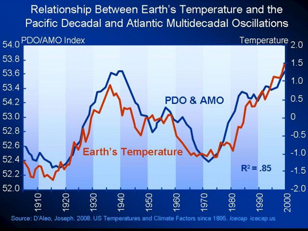
Exhibit one, from my co-partner here at WeatherBell Joe D Aleo ( I wonder if we will share the same cell when the warmingistas come to get us. And will they let us have the same tattoo artist to brand us deniers?)
PDO and AMO are strongly correlated to the earths temps…now watch CO2 vs temps over the past century:
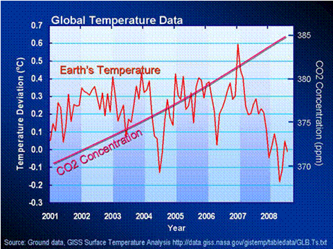
Even more damming than this, look at the past 10 years:
Or the last 15 years:
Which leads to the question: How do these people have any credibility? How do they get away with this? It’s mind boggling that its gotten to a point where the EPA is dictating policy based on what is an obvious fraud, or if you want to be gentle about it, creates enough doubt to back off.
Here is something to consider.
Over a year ago I advised a client of mine at the time to purchase less air conditioners than for 2010 because the summer of 2011 would be cooler than the summer of 2010. Now there is talk that this is going to turn out like last summer, but assuming it won’t, the forecast was made. BEFORE LAST SUMMER. The client had to put in their order for air conditioners a year beforehand because they were ordering them FROM CHINA.
Now every red blooded American gets up in arms because all those jobs should be here in USA, right? But why aren’t they? Well in large part because of policy that is based on absurdities like this, a factory making anything here is now being clamped down on by the EPA so hard, so why bother? Its like Obama said: ” So, if somebody wants to build a coal plant, they can, it’s just that it will bankrupt them because they are going to be charged a huge sum for all the greenhouse gas that will get emitted”.
That is a direct quote and is like his energy Sec saying that they seek to take away choices that people waste their money on. Astounding that things like that are being pushed by people in control, or that they even got control in the first place. That is our fault, based on what is obviously flat out nonsense. But combine that with labor costs, and the fact the that the corporate tax rate in the US is higher than China, which few people in our nation seem to get, and this is what happens.
Now let’s say we wanted to make sure that a person here working in an air conditioner factory can make a decent wage from a helping hand ( how do like my populist line…from the Ghost of Tom Joad?) Well, get rid of the EPA running roughshod over factory owners, and lower the corporate tax rate to below China’s ( it is so hard to believe that Chinese tax rates are lower) and you will find that companies will stay here and pay a decent wage to build air conditioners, But not if you are clamping down on people based on questionable, don’t-have-a-leg-to-stand-on ideas about co2 warming the planet.
Again, it defies logic as to how they got to where they did with this issue, and the facts are there for all to see.
=============================================
Joe Bastardi runs the professional weather services company Weather BELL Analytics LLC together with Joe D Aleo.
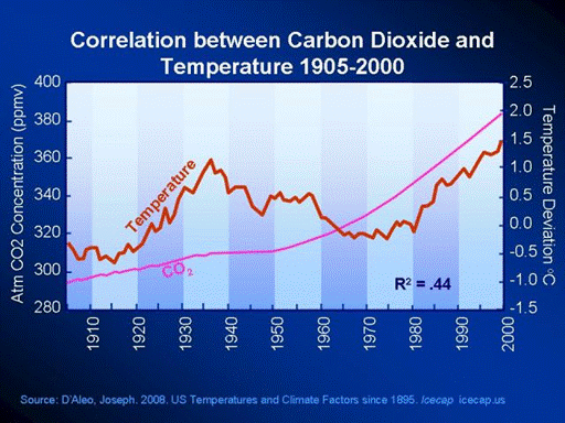




The figure 2 here, comparing CO2 and temperature, shows the obvious fraud best. You don’t even have to get into involved discussions about statistics. It is striking (to this physicist, at least): The alarmist scientists merely fit their temperature reconstructions to the CO2 curve ONLY AFTER 1970, ignoring the clear lack of correlation before that time, and then making up ever more complicated physics to justify their scientific fraud. This cannot be overemphasized, and should have been front-page news long ago.
* picture 2 shows US temperatures only. this article however is about Global Warming. whom is Bastardi trying to fool?
* picture 3 shows 10 years. why not 30, or 100, which makes it possible to see the signal in the noise?
pierre, this is extremely weak stuff, even for your standards.
p.
At RC and Klimalounge disagreeing comments never see the light of day, Hartmann. Though, don’t get the idea you can come here and provoke everyone and pick fights. That I will not tolerate.
Concerning the timescales, why not go back 300 years? or 1000 years or 10,000 years?
http://www.freerepublic.com/focus/f-chat/2608687/posts
And if you want to see “weak”, just go look at Rahmstorf’s sea level paper where only one selected bore sediment core off the coast on NC was used to draw global conclusions over the next 100 years. Such comedy at least was the source of entertainment for the entire science community.
Why 10 years? Warmists keep saying that the warming is accelerating. Well clearly it isn’t.
Captain Pithart, pic 2 is labelled correctly, no trick there; and as Global Warming is supposed to be global, it should work for the US as well. One would expect one or the other microclimate to deviate from the trend, but the entire landmass of the US? So you’re postulating that the entire land mass of the US deviates significantly from the Global Warming trend? That is such an enormous hypothesis, i think you should better provide a reason for why such a deviation should be possible.
Remember: It’s GLOBAL warming.
When I splice together the Law Dome CO2 record from 1900 through 1958 with the Mauna Loa record from 1959 through 2010 and check the correlation with GISTEMP (using annual values for all three), I find CO2 and global annual average temperature are correlated over that period with an R squared value of 0.81, much higher than the 0.44 d’Aleo got for CO2 and US temperatures. So yes, over short timescales compared to an analysis covering a little less or a little more than a century, the US can deviate significantly from the global trend.
Don’t use global GISTEMP; it’s designed to show a correlation.
If you insist, open to dispute though your opinion of GISTEMP is. If I do the same thing with annual temperature data from the Hadley Center instead, the R squared is 0.7984. Not a lot of difference in the result wouldn’t you agree?
BTW, the third chart above uses GISTEMP data as well. Why get on my case about using GISTEMP but not on his?
Yeah, by using only US temperatures, Bastardi probably skewed the data. Now if we factored in the freezing temperatures in Bolivia, Japan, Argentina and other countries, no doubt the global warming fraud would be even more obvious.
Of course, recent satellite evaluation indicates a lot more heat is being dispersed into the atmosphere than figured into those infamous computer models, so the whole question is moot anyway.
Cmon, even the IPCC admits global temps have leveled off the past 15 years as co2 rises. Man contribute 3 to 5 % of the roughly 1.5 parts per million of the increase a year. That means in the entire population of the US, its like picking out 20 people.. that is what man contributes.
We are hearing all sorts of excuses.. The missing heat is in the ocean, its here its there. Anything but the truth. The truth is this. Energy can neither be created or destroyed. That is the 1st law of thermodynamics. The co2 that is in the system is part of the total energy package of the system, the same way as there are natural variances of all elements of the given system. If you are looking for a new energy source to add or subtract, it must come from outside the system.. and the logical conclusion is the sun.
What is amusing about people who attack me is that they refuse to understand that if I am wrong, the rise will resume, and that is it. So why get bent out of shape. If I am wrong, then the global rise will start anew. My forecast is simple and based on logic. Lower sunspot activity, change the cycles of the ocean, the temp will lower and we can now watch it OBJECTIVELY without using tree rings or adjusted temps or whatever less than direct method we wish to us.
One more thing. You guys that come after me. I know what I have to see to prove myself wrong. For instance if August is not as cool as I think in the northern plains and midwest, then it is like last summer, where August was hot.
If the global temp resumes its overall rise pattern while the drivers I say will reverse it ( and are) then I am wrong. BUT TELL US, PLEASE, WHAT MUST YOU OBSERVE TO THEN ADMIT YOU ARE WRONG? I suspect no matter what happens, you wont admit it, and there is the big difference between people searching for the right answer and the ilk that attacks anyone that dares disagree with them
joe,
the second image is misleading. it should explicitly say that only US temps are depicted, right now it only indicates so in the tiny reference which most people will not see. you talk about global temps, and have a graph up having a big red “global temperature” in it, then without any caveat show unlabeled local temps, then switch to global temps again. this is either sloppy or dishonest. correct it.
p.
What do you care? It’s not peer reviewed. And i have heard a certain Captain say that only peer reviewed papers count.
Maybe you ought to get some new glasses.
“Man contribute 3 to 5 % of the roughly 1.5 parts per million of the increase a year.”
Please explain that conclusion. Thank you.
Our CO2 emissions in relation to the natural carbon cycle.
http://wattsupwiththat.files.wordpress.com/2009/02/eia_co2_contributions_table3.png
production
natural 770000 (Mill t of Gas)
human 23000
absorption 781000
Annual increase 11700
(2001)
Okay. I was confused. Joe’s talking about the ratio of the rate of CO2 emissions into the biological carbon cycle. He’s not claiming that human activity isn’t responsible for the increase in the concentration of CO2 in the atmosphere -rather that they’re not the same molecules.
I have asked Pierre to put on the co2 vs actual temp data the past 15 years from the Hadley center to show you denialists the obvious disconnect. As far as the entire time scale, the rise of co2 since 1800 can be explained readily by the fact we were abnormally cold in the 1700s and sunspot cycles have essentially ramped up since then. That is a stronger correlation than the co2. The fact is there is no reason for the earths temps to level off if co2 is causing all this, and in fact the argument was 15 years ago we are approaching the point of no return, the tipping point. In reality its simply Le Chateliers principle…any system in distress returns toward normalcy…with the exception of this argument, since there is nothing normal about the denying of the facts here on this matter by those pushing an agenda of control down the throats of people.
Just added the chart, but don’t expect Hartmann to look at it.
Joe, i guess they have a hard time accepting that they’ve been wrong after so many years. They’ll keep waiting for the tipping point to arrive like a UFO cult on a mountain top.
Re your August forecast: Here in Braunschweig, Germany, we had 5 summery days that just ended and lots of clouds today, and the temperatures begin a downward march, hope this link works, live 4 day forecast from meteomedia:
http://wetterstationen.meteomedia.de/station=103480&wahl=vorhersage
Increasing cloudiness as well. Bad for the solar cells. 😉
Joe
Many of us have also wondered how the AGW science gets away with questionable science. I think the situation is quite different in each country and sometime there appears to the public a real disconnect between the global warming policy of the ruling political government and its environmental or science arm .For example if you read Environment Canada web page on Global warming http://ec.gc.ca/default.asp?lang=En&n=2967C31D-1
one gets the impression that the government is a strong supporter of anti global warming efforts. Yet publicly the current ruling government has stated that they will no longer support renewal of Kyoto, killed a recent Canadian Federal CLIMATE CHANGE BILL C311 bill which would have greatly elevated anti global warming efforts, they stated that they do not support a carbon tax bill and recently laid off 700 Environment Canada scientists many of whom were working on global warming projects. I support our current government in these latest moves. In Canada the problem is also the media and news papers many of whom simply will not publish or report news on science that disputes global warming science despite the obvious and very credible new findings that call to question the global warming science. I have personally spent countless hours and sent out hundreds of letters to try to change things. There are a few excellent TV networks and perhaps and a few national news papers that are the exception. Dan Gardner in his excellent book called Future Babble observed that people like to believe what the experts tell them but when the experts are proven to be completely wrong, the people and the media at their own peril still believe the original false science and continue to report the original falsehood instead making a shift in beliefs. It is a peculiar human nature. That is why any questionable science has to be stopped early with the real truths. Global warming science got an early start with no questioning of its validity until quite recently. If you tell an untruth thousand times people will believe it to be the truth, unfortunately. However not all is lost as Nature will by herself prove the experts wrong as the next cooling cycle gets underway for the next 20-30 years
Joe
The web page CLIMATE 4 YOU
http://www.climate4you.com/
Look at the section called Greenhouse gases on the left hand side and the graphs near the end of section that shows CO2 LEVELS and various Global temperature anomalies per different data sets . The graphs show the following
1955-1977 negative [ graphs go in opposite direction]
1977-2003 positive [both graphs go up]
2003-2011 negative [ both graphs go in opposite direction]
These confirm the graphs that you posted. Man made Co2 does not cause tempertaures to go up since the opposite is true. Rising temperatures raise the co2 levels and man made greenhouse gase are very minor component of total co2 levels and have negligible impact on climate.
Careful with your wording. You can say with certainty that CO2 is the sole driving force in climate, and you can successfully argue that it is not the dominant one. However, you cannot say that it doesn’t affect climate significantly.
The 100 year graph in particular is suggestive that CO2 is a significant driving force with various oscilations put on top. It is only on the longer scales with the Medieval and Roman Warm Periods that you seen the full data and can safely rule that CO2 is quite likely not a dominant player in climate.
The AGW community is famous for leaps of faith and rabid certainty on poor data. We should not not make the same mistake
Well done Joe and Pierre you have shown AGW for the scam it is unfortunately the cult will not go away because of the money involved. The economic situation that is about to ensue might put an end to it. The world will come to see things a little more in perspective when the reality of standards of living now and prognosis for the next generation seems to appear bleak, becomes part of our collective mindset. Not the way I would have liked it to go. I would prefer open and honest science to have been its death knell.
Hardship focusses the mind.
Thanks P. Gosselin for a wonderfully lucid post from Joe.
As a layman, could you explain what is meant by R2 on the graphs?
John,
I assume you have run across the phrase “correlation does not mean causation.” The r – squared you ask about is one sort of the measure of correlation. Description and graphs here:
http://en.wikipedia.org/wiki/Pearson_product-moment_correlation_coefficient
Thanks John
If you think of 2 sets of data “pointing” in certain directions ( this actually is the mathematics in spaces of as many dimensions as there are data points ) , the correlation , r , is the cosine of the angle between them . The r^2 is the total amount of “variance” of one set of data by the other . That is , in the first graph , if you subtracted the ocean related graph from the temperature graph , you’d only have 15% as much slope and squiggle left . In the second one , if you subtracted the CO2 graph from the temperature graph , you’d still have 66% of the slope and squiggle left .
I only posted the report. Joe gets all the credit for creating it.
Actually, the view that “the next generation will be poorer”, a.k.a. “après nous le déluge”, best exemplified in Douglas Coupland’s novels, like “Generation X” (1990), has been the core of the collective mindset in the West since at least the late 1960s, codified with “The Limits to Growth”. It does not seem to have derailed material and technological progress notably (the worldwide ban on DDT may be the exception – and that was revoked by the UN in 2006). Bans on certain technologies have never lasted for long; and where they were put in place for good (like the demonization of GM foods here in Germany), this worked because the failure to adopt them resulted in no harm or economic loss. “The economic situation that is about to ensue”: regardless of the current headlines and the Euro crisis, “the world” is not “on the brink of bankruptcy” (as Der Spiegel puts it in this week’s cover story) – though this particular currency may well be. Still, it is always good to squander taxpayers’ money on things that benefit these taxpayers directly (if they become rich enough they, not the state, will finance all those Noble Achievements of Humanity like postcolonial studies or atonal operas), rather that fritter them away to implement austerity measures. The public face of virtue needs the private vices to come about: the whole point of Bernard Mandeville’s “The Fable of the Bees” (1725), the oldest relevant economics text (and the first text of classical liberalism). All of which was nicely summed up by Chesterton: “The human race, to which so many of my readers belong, has been playing at children’s games from the beginning, and will probably do it till the end, which is a nuisance for the few people who grow up. And one of the games to which it is most attached is called “Keep to-morrow dark,” and which is also named […] “Cheat the Prophet.” The players listen very carefully and respectfully to all that the clever men have to say about what is to happen in the next generation. The players then wait until all the clever men are dead, and bury them nicely. They then go and do something else. That is all. For a race of simple tastes, however, it is great fun.” (The Napoleon of Notting Hill, 1904).
The worlds greatest fraud did not happen by happenstance. This was carefully constructed over decades by a criminal cabal and their puppet front men. The ‘science’ is cherry picked, the data is photoshopped and the hyperbolic sales pitch was ALMOST hypnotic. Luckily Rational Heretics stepped forward to promote truth and expose the lies. The games that the cabal play are explained in “Pinata Planet Syndrome” posted at http://www.FauxScienceSlayer.com along with insights into a wide range of institutionalized deceits. Find and share truth !
The clincher is Fig 1 from Willie Soon’s 2005 paper.
Identical. The close correlation of TSI to temperature shows its the Sun which is ultimately running both the temperature and the ocean oscillations.
Before anyone gets unhappy about Soon 2005, the inconvenient truth is you can easily generate the same graph yourself by combining independent TSI and Arctic temperature datasets.
Good work , this is the scam of the century.
Every time there is bad weather somewhere; they blamed it on CO2. On that same day, on a million other places on the planet is a good /perfect weather; they don’t blame the good weather on CO2… Is there any scientific reason for it ?!
Whoe, Jo, the most political I’ve ever seen you been … although your stance has always been hidden in plain sight. Bravo!
“An Obvious Fraud” indeed it is.
The supposed all powerful “backradiation” is in fact no different than “backconduction”. When a molecule radiates/conducts heat it does not check with its neighbors first, it just sends the energy out in all directions. If the neighbors to the west are warmer the NET heat flow will be towards the east.
This is the second law, engineers have understood it for years and used it to improve everybody’s quality of life.
So what does the increase of “greenhouse gases” accomplish; I posit that increases in “GHGs” cause a very small increase in the amount of heat energy flowing through the atmosphere at the speed of light (quite speedy) versus the speed of heat (comparatively sluggish).
The end result; the gases in the atmosphere warm up slight faster after sunrise and cool down slightly faster after sunset. I also posit that this effect is so small that we could probably never afford to measure it. The historical temperature databases do not contain the necessary information and several decades of waterboarding them until they confessed to Global Warming have rendered them useless.
Cheers, Kevin.
You’re right with the analogy between backconduction and backradiation. I would assume that backradiation, which is based on equivalent amounts of absorption and re-emission, is such a quick process that it reaches its equilibrium after seconds, at most minutes. In other words, only a small quick buffer between us and outer space in the respective wavelength window.
Why, then, is a cloudy night warmer than a clear night? After all, CO2 and H2O are both GHGs.
I would think that the mechanism is entirely different – it’s the temperature of the water droplets themselves and the thermal inertia of the water stored in them that makes the difference. And this thermal inertia of cloud droplets also enables them to store heat.
Clouds may keep us a little warmer; CO2 doesn’t. (because it’s such a tiny mass compared to the water in the atmosphere)
Ironically, the AGW brigade has it exactly wrong – water stores heat, CO2 doesn’t (to any significant amount).
Figure 2 is indeed indicative for the entire world. See, for example
We’re not ready
The media (in this case USA Today) have been quite content to push AGW alarmism of the worst sort on the basis of such trash “science”, and if you go through all the comments on that article, you will probably find me calling it a fraud, or “fraudulent science”, outright.
Or see figures “B” and “D” at
agw models and proxies
And go and research other examples for yourself; they are there.
So figure 2 here from D’Aleo and Bastardi is not weak at all, but representative. I can’t get people to focus on just how obvious the fraud is, they really did essentially just fit their various temperature reconstructions or proxies to CO2 or its proxies ONLY for recent decades, particularly after about 1970.
As for the real effect of added atmospheric CO2, again, I present the simplest, and definitive evidence that corrects current climate science on not just one but a handful of basic points at
Venus: No Greenhouse Effect
and I explain there and in earlier posts that the real effect of increased CO2 is merely to increase the efficiency/speed of heat transfer within the atmosphere. This explains why the dark side of Venus (with 96.5% CO2) is as hot as its sunlit side, and indeed why climate scientists have been fooled into thinking CO2 controls the global temperature, since the IR radiation, once any is absorbed by ANY ELEMENT in the atmosphere, is just one path for the transfer of heat, so increasing CO2 just causes the IR portion of the heat transfer to become more concentrated in it, as one of the most efficient IR absorbers/emitters. (Consensus scientists focus upon the radiative transfer only, ignoring convection and conduction, and thus are disconnected totally from the real thermodynamics of the atmosphere.) This fundamental understanding, of the real effect of increased CO2, alone should literally remake climate science, if I could get people to stop throwing out more complicated theoretical “explanations” and study my simple contributions. Of course, in addition to disproving the CO2 greenhouse effect, my Venus/Earth comparison also demonstrates that the atmosphere is heated by incident solar IR radiation, not from the surface, so you can forget surface or cloud albedo effects upon the overall, governing atmospheric temperature structure, strange as that may seem (sorry, Dr. Spencer, clouds are basically just a localized effect, even on Venus). Even the skeptics are not sufficiently disconnected from their favored theories to focus on the simplicity and clarity of my explanations and the consequences of my Venus/Earth comparison, but it should be seen as the proper point from which to correct and truly progress climate science.
Thinking about what Kevin and Harry have said further: Kevin, you’re wrong with regard to sunset/sunrise. If increased CO2 leads to better/more IR radiation diffusion, it would in my opinion dampen the geographical temperature differences (and vertical temperature differences) ever so slightly. So, at any given point, temperature rise at sunrise would be slighty slower. But very difficult to measure; maybe with Spencer’s “box” experiment.
Roy Spencer, The Box, measuring back radiation
http://www.drroyspencer.com/2010/08/help-back-radiation-has-invaded-my-backyard/
Yes , the far greater effect of CO2 on our atmospheric temperature is to reduce its diurnal and equatorial-polar variance . That no one ever talks about this effect on variance rather than mean is one of the first things which formed my poor opinion of the quality of the understanding of the most basic physics one sees in these discussions .
On a sunny day , when the ground heats , CO2 absorbs much of that thermal radiation within 10s of meters of the ground . It then transfers that heat to the more transparent gas molecules around it warming the rest of the mass of the atmosphere . At night , the process reverses .
The earth is only about 10c warmer than a gray ( flat spectrum ) ball in our orbit ; the moon perhaps 5c colder in the mean . But the variance , of course , of the earth’s temperature is hundreds of times less .
Thanks for the confirmation. Not being a physicist, i’m more or less guessing at the system dynamics.
yet still it warms, solar maximum/solar minimum still it warms
Obvious fraud is the lying whores of denial
Is it just me or in the first chart does temperature lead PDO & AMO?
DirkH wrote;
“Kevin, you’re wrong with regard to sunset/sunrise. If increased CO2 leads to better/more IR radiation diffusion, it would in my opinion dampen the geographical temperature differences (and vertical temperature differences) ever so slightly.“
Well, at first I though this as well. But then I realized that increases in “GHGs“ must be displaced by decreases in “non-GHGs“ (after all there are only 1 million ppmv in any volume).
So I still posit that increases in “GHGs“ (through which energy flows at close to the speed of light) are displaced by decreases in non-GHGs“ (through which energy flows at a much slower speed of heat (i.e. conduction/convection/advection)). This results in the gases in the atmosphere warming up slightly faster after sunrise and also cooling off slightly faster after sunset.
Still this is just a hypothesis, I would like to see data or alternative hypotheses.
Cheers, Kevin.
Whoops, I meant:
at first I thought this as well,
not;
at first I though this as well
DirkH wrote;
“Why, then, is a cloudy night warmer than a clear night? After all, CO2 and H2O are both GHGs”
Well, this may be way too simple, but clouds (water dispersed in the air) have a much higher thermal capacity, i.e. they absorb heat and then release it more slowly than the “non-GHGs (oxygen, nitrogen, etc.). This does mesh with my “speed of heat” theory.
Cheers, Kevin
Ooops, my formatting for another blog didn’t work. Here’s the post with the quotes, please delete the one above.
Of the top 3 climate monitoring units on the planet only Hadley says 1998 was the warmest, and the European Centre for Medium-Range Weather Forecasts (ECMWF) has pointed to a cooling bias with the Hadley data.
http://www.skepticalscience.com/global-warming-stopped-in-1998-intermediate.htm
Two of the three most powerful temperature databases on the planet confirm 1998 as the THIRD warmest year on record, even when 1998 had one of the most frighteningly powerful El Nino’s we’ve ever seen. Check it out — NOAA, NASA, then Hadley’s CRU.
The NCDC at NOAA says:
///For 2010, the combined global land and ocean surface temperature tied with 2005 as the warmest such period on record, at 0.62°C (1.12°F) above the 20th century average of 13.9°C (57.0°F). 1998 is the third warmest year-to-date on record, at 0.60°C (1.08°F) above the 20th century average.”
http://www.ncdc.noaa.gov/sotc/global/2010/13
NASA GISTEMP confirms the same thing and says:
“Global surface temperatures in 2010 tied 2005 as the warmest on record, according to an analysis released Wednesday by researchers at NASA’s Goddard Institute for Space Studies (GISS) in New York.///
http://www.giss.nasa.gov/research/news/20110112/
And now Phil Jones at the CRU, but don’t forget the ECMWF has had a go at this particular dataset.
///The time series shows the combined global land and marine surface temperature record from 1850 to 2010. According to the method of calculation used by CRU, the year 2010 was the equal third (see footnote) warmest on record (with 2003), exceeded by 1998 and 2005. The years 2003, 2005 and 2010 are only distinguishable in the third decimal place. The error estimate for individual years (two standard errors is about ±0.1°C, see Brohan et al., 2006) is at least ten times larger than the differences between these three years.
The period 2001-2010 (0.44°C above 1961-90 mean) was 0.20°C warmer than the 1991-2000 decade (0.24°C above 1961-90 mean). The warmest year of the entire series has been 1998, with a temperature of 0.55°C above the 1961-90 mean. After 1998, the next nine warmest years in the series are all in the decade 2001-2010. During this decade, only 2008 is not in the ten warmest years. Even though 2008 was the coldest year of the 21st century it was still the 12th warmest year of the whole record.///
http://www.cru.uea.ac.uk/cru/info/warming/
But rather than argue over hundredths of a degree, which is all that seems to separate the temperatures, have a look at the 15 year trend *all* 3 agencies report. Brilliant graphic here.
http://www.metoffice.gov.uk/climate-change/guide/science/monitoring
Even Denialist’s are admitting it. At the 2009 Heartland Institute conference (of global warming sceptics), well known climate denialist Dr Patrick J Michaels warned against using the 1998 El Nino super-spike as some sort of ‘proof’ of a cooling trend. Take the advice of the words of a fellow Denialist.
///”Make an argument that you can get killed on and you will kill us all… If you loose credibility on this issue you lose this issue!”///
http://www.youtube.com/watch?v=QwnrpwctIh4
If you’re going to selectively zoom in on data you can concoct whatever story you want to.
http://www.youtube.com/watch?v=y15UGhhRd6M
I don’t know where Joe D’Aleo got his “Earth temperature” graph, but it bears little resemblance to mainstream global temperature indices (GISS, Hadcrut). This is the only plot I’ve ever seen showing a 2C peak to peak drop between 1935 and 1975. Funny how it changes to a different value in the 2nd plot. The pattern of variation matches but the magnitude of change in temperature is different.
Graphs 2, 3 and 4 of temperature vs. CO2 use one of the oldest and weakest tricks in the book: plotting 2 different datasets on arbitrary relative scales. It’s SO arbitrary that the relative scaling is substantially different in all three graphs. We can only hallucinate by what basis. Why don’t you try at least approximating reality by plotting CO2 on a scale that gives 0.18C/ decade from 1975 to 2010, the average rate of change of global temperature since the mid-70s.
Yes, there is an obvious fraud being perpetrated – by Joe Bastardi and Joe D’Aleo. How do those two get away with it?!
Mmm, which oil-company is paying Joe Bastardi ? As an addition to the great comment by Eclipse Now – Joe should for once present the earth temperature and CO2 concentration from the last 600.000 years (as obtained from south-pole ice cores) – a period of 100 years disappears totally then – and the the BIG PICTURE is THERE – rising CO2 = Rising temps — falling CO2 = Falling temps.