Yet another study has appeared in the Journal of Geophysical Research, this one looks at the precipitation history on the Tibetan Plateau of the last 1000 years.
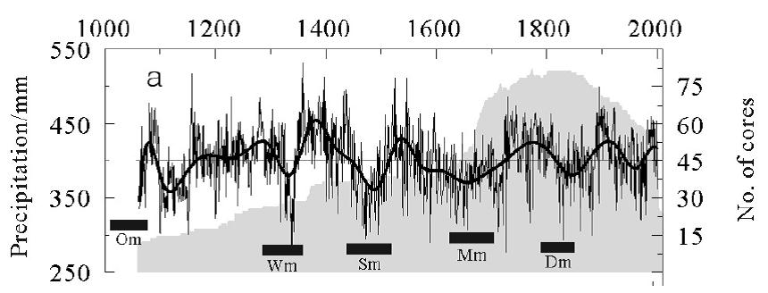
Figure 1: Reconstruction of precipitation amounts for the edge of the Tibetan Plateau. The bars on the chart depict prominent weak phases of solar activity, which correspond to Om = Oort Minimum; Wm = Wolf Minimum; Sm = Spörer Minimum; Mm = Maunder Minimum; Dm = Dalton Minimum). Figure from: Sun & Liu (2012).
Geologist Dr. Sebastian Lüning and chemist Prof. Fritz Vahrenholt have written a summary of this paper, which I’ve translated in the English:
==============================================
New Study of the Tibetan Plateau: Whenever Solar Activity is Weak, the Rains Disappear
By Sebastian Lüning and Fritz Vahrenholt
The Tibetan Plateau is at 3000 to 5000 meters elevation the highest and most expansive high plateau on Earth. Therefore it reacts sensitively to climate changes. Junyan Sun and Yu Liu of the Chinese Academy of Sciences studied tree rings in the northwest plateau edge from two living 1000 year old trees. Tree growth in the area of study is particularly sensitive to the amount of precipitation.
Both scientists were able to reconstruct the distinct precipitation fluctuations occurring over the last 1000 years. The corresponding wet and dry periods each lasted some decades. A comparison to the other climate reconstructions coming from the same region shows great similarities in moisture development and that we are dealing with a representative regional climate signal. There were pronounced periods of droughts from 1092-1172, 1441-1517 and 1564–1730. Especially the Great Drought of 1441-1517 is mentioned in numerous historical documents and catastrophe reports. The Great Drought occurred during a weak period of solar activity, the so-called Spörer Minimum, which occurred from 1420 to 1570.
Interestingly, almost all other periods of drought occurred during times of solar minima, among them the Oort Minimum, Wolf Minimum, Maunder Minimum and Dalton Minimum (see Figure 1 above). Every time the sun goes into a slumber for a few decades, the rains on the Tibetan Plateau stay away. A frequency analysis of precipitation curves also delivers evidence on solar cycles. Here the Gleissberg Cycle (60-120 year period) and the Suess/de Vries Cycle (180-220 years) are seen in the datasets.
The study once again documents the enormous importance of solar activity fluctuations on the development of climate. Why the IPCC degrades this important natural climate driver to a secondary small player in theoretical climate models (See our article: “What is the coming solar activity slumber bringing? The Hadley Centre Leaves Its Back Door Open“) simply boggles the mind.
=====================================================
Indeed. And with every passing study, it is becoming increasingly clear that the CO2 warmists are either in deep denial or complete intellectual oblivion.



It should have been clear, and quickly have become front page news worldwide, after November 2010, when I compared the temperatures in the atmospheres of Venus and Earth, and found the Venus/Earth temperature ratio was due only and precisely to the ratio of their distances from the Sun. It should have been clear 20 years ago, when the Venus data I used was first taken by the Magellan spacecraft, and the “greenhouse effect” should have been dropped from science then. The issue is scientific competence, and the subornation of all of our institutions (starting with the universities) to the incompetent climate consensus. I have been writing about the delusion of miseducated climate “experts” and the many self-styled “defenders of settled science” that infest the internet and every public venue, for 18 months. All of the “authorities” are insane on this issue (and using it as a club for factually unsupported Leftist political activism), which is why I coined the phrase “War of the Insane Left”.
Dear Harry, excellent calculation and comparison…….. as the Venus atmosphere consists by ~ 95 % of carbon dioxide, this is seems to be the ultimate proof, that water vapor is not so important as greenhouse gas, as the Vanus atmosphere has only 20 ppm water vapor content 😉
L. J. Gray, 1,2 J. Beer, 3 M. Geller, 4 J. D. Haigh, 5 M. Lockwood, 6,7 K. Matthes, 8,9 U. Cubasch, 8 D. Fleitmann, 10,11 G. Harrison, 12 L. Hood, 13 J. Luterbacher, 14 G. A. Meehl, 15 D. Shindell, 16 B. van Geel, 17 and W. White 18
SOLAR INFLUENCES ON CLIMATE,
Reviews of Geophysics, 48, RG4001 / 2010
http://edoc.gfz-potsdam.de/gfz/get/16051/0/47f93c10b11cb5e46f62534518b5e73b/16051.pdf
Pseudoscience. Fig 4 omits water vapor as the biggest greenhouse gas.
DirkH
14. Mai 2012 at 14:16
http://cei.org/sites/default/files/DOC062509-004.pdf
Check out page iv of the executive summary which says, quote:
“that the crucial assumption in the GCM models used by the IPCC concerning strongly positive feedback from water vapor is not supported by empirical evidence and that the feedback is actually negative.
Also see here for more : http://hockeyschtick.blogspot.co.uk/2012/03/simple-disproof-of-runaway-greenhouse.html
I know. But one way or the other, the omission of water vapor in the table cited by that gang of 15 is very telling because
…the fraud happened at the foundation of modern post normal climate science. They had the dilemma that water vapor totally dominates the greenhouse effect. How could they blame CO2? Well, they found an answer. By totally ignoring water vapor, calling it a “feedback”, not a cause of the greenhouse effect, they could concentrate on the bit player
CO2. This lie dominates the “climate change” scare news until today.
And it is necessary to point it out again and again until the “spacescience” script explains to us how an IR photon emitted from CO2 is worse than an IR photon emitted by water vapor.
The video about the experimental takedown of positive water vapor feedback is very well done. Thanks a lot.
Ironically, youtube linked from there to Andy Dessler explaining how positive water vapor feedback works and that he’s publishing a paper about it.
http://www.youtube.com/watch?feature=player_embedded&v=5JpcfzxrL4M
Didn’t see the guy before, looks like a clone of Gavin, Richard Black and Michael Mann. They all come out of the same factory. The beard is like a secret handshake.
Attached also the original article from Paltridge et al. given as reference by the NCEE referee for justification of the comment:
Paltridge et al.
Trends in middle- and upper-level tropospheric humidity
from NCEP reanalysis data
Theor Appl Climatol (2009) 98:351–359
http://www.drroyspencer.com/Paltridge-NCEP-vapor-2009.pdf
Also the according “explanation” by W.Gray
Climate Change: Driven by the Ocean
not Human Activity
by
William M. Gray
http://typhoon.atmos.colostate.edu/Includes/Documents/Publications/gray2009.pdf
Enclosed also a citation from
TROPOSPHERIC WATER VAPOR, CONVECTION, AND CLIMATE
S. C. Sherwood, 1 R. Roca, 2 T. M. Weckwerth, 3 and N. G. Andronova 4
Reviews of Geophysics, 48, RG2001 / 2010 :
according Paltridge et al.
“Paltridge et al. [2009] examined trends in reanalysis
data from the NCEP over 1973–2007, reporting downward
trends above 850 hPa in the tropics and southern midlatitudes
and at altitudes above 600 hPa in the northern midlatitudes.
However, this result had already been reported by Chen et al.
[2008], who also noted nearly opposite results in the ERA‐40
reanalysis. Numerous studies have concluded that reanalysis
data are easily corrupted by time‐varying biases and are
therefore not useful for trend analysis [see U.S. Climate
Change Science Program, 2006]. Each of the principal
observational systems (HIRS and radiosondes) that went into
these reanalyses shows consistently upward trends.”
http://www.agu.org/pubs/crossref/2010/2009RG000301.shtml
http://web.science.unsw.edu.au/~stevensherwood/2009RG000301.pdf
This comment delivers the death blow to the positive water vapor feedback hypothesis.
http://hockeyschtick.blogspot.com/2012/03/simple-disproof-of-runaway-greenhouse.html?showComment=1332558067400#c2031512486689428024
As Andrew Montford noted in “The Hockey Stick of Illusion”, tree rings are a poor proxy for anything. The strongest factor in ring growth is precipitation, followed by prevation (consumption of leaves and bark by insects and grazing animals). There is POOR corrolation of precipitation and temperature, leaving temperature as an almost independent artifact. Photoshopping ring data from one tree for a twenty year period and two trees for the following thirty year period is scientific malfeasance. This Malthusian Malfeasance continues in the FALSE science of the companion lies about the human use of energy. There is NO net energy in any green energy scam and petroleum is NOT finite, left over dinosaur juice. Read a summary of the three big green meanie lies in “Becoming a TOTAL Earth Science Skeptic”. Find and share Truth.
ups typo probably….
I compared solar activity (sunspot numbers detrended and averaged over the solar cycle length) with Esper et al’s 2009 tree ring paper. Here’s the result.
http://tallbloke.files.wordpress.com/2012/05/esper_2009_ssn.png
Sovello, a solar company with 1,200 employees, based in Thalheim, East Germany, is insolvent.
http://www.ftd.de/unternehmen/industrie/:insolvenzantrag-solarhersteller-sovello-ist-pleite/70036831.html
This looks like as good a debunk of Svensmark as you could ask for.
According to Svensmarks theory, as solar activity decreases cloud cover should increase. More clouds means more precipitation.
Yet here we have confirmation that when the atmosphere cools off it actually holds less moisture. A well known and inconvenient fact that Svensmark appears to be unaware of.
As witnessed here in the UK over the last few very cold and very dry winters.
We have by now no obvious short term correlation between cloudiness and GCR’s (which are modulated by the 11 year solar cycle).
I am also eager to hear what Svensmark, Shaviv et.al. come up with to explain that.
“More clouds means more precipitation.”
It seems like a reasonable assumption, but I would like to see the data nonetheless. My own experience is that it can be cloudy for weeks on end yet dry. So I’m not sure your assertion is correct.
“…it can be cloudy for weeks on end yet dry.”
You must live in England!
Roger,
the study in this post concerns precipitation. In particular, how precipitation decreases with solar minimum.
Are you attempting to infer that a decrease in precipitation\solar output should correlate with an increase in cloud cover as per Svensmark, or are you merely contradicting me for the sake of it, as seems to be your typical want.
Also, in my experience, working outside in all weathers, year in, year out, for best part of 30 years, increases in clouds do indeed increase precipitation.
I don’t need to see any data to know that.
Here in the UK, this winters cold dry conditions were accompanied by clear blue skies.
In contravention to Svensmark in my view.
EON, electricity supplier mostly in Bavaria, wants to shut down 1 GW of gas powered peaker plants next year; 3 plants from the 1970ies.
The continuing expansion of renewable energy, especially wind and solar, reduces the number of hours in a year where the peaker plants are needed, but not the needed capacity. Last year the plants in question operated only 100 hours. Operating them is therefore not profitable.
Politicians and regulator Bundesnetzagentur are alarmed.
http://www.ftd.de/unternehmen/industrie/:trotz-energiewende-eon-droht-mit-schliessung-von-gaskraftwerken/70036623.html
[…] No Tricks Zone Share this:PrintEmailMoreStumbleUponTwitterFacebookDiggRedditLike this:LikeBe the first to like this post. This entry was posted in Climate Change and tagged climate research, climate science. Bookmark the permalink. ← Why Don’t the Masses “get it”?: A Review of Peter Jacques’ ‘A General Theory of Climate Denial’. […]
An interesting innovation at the WWF. To be able to shift blame for the destruction of the planet to somebody else than the US – because you can’t make headlines by saying the same thing each year – they now compute your ecological footprint in acres and compare it with the area per capita in your nation. If your footprint is larger than the are per capita, you’re evil.
This innovation in blaming gives us a great new blame distribution:
Katar 11,7 Gha
Kuweit 9,7 Gha
Vereinte Arabische Emirate 8,4 Gha
Dänemark 8,3 Gha
USA 7,2 Gha
Belgien 7,1 Gha
Australien 6,7 Gha
Kanada 6,4 Gha
Niederlande 6,3 Gha
Irland 6,2 Gha
http://www.sueddeutsche.de/wissen/wwf-bericht-zur-umweltzerstoerung-ueberraschende-top-ten-der-umweltsuender-1.1357595
Somehow I miss Singapore there and by jove, how did the Australians get in there? And the Canadians? And the treehugging Danes? On the other hand, building all of the world’s cars and exporting them gives an attaboy for Germany…
What the hell did the knuckleheads at the WWF do there? Let’s see how their eco-lickspittles in the media explain all of this. That will make for some nice contortions.
[…] comes via a review by “Cold Sun” authors Sebastian Lüning and Fritz Vahrenholt, as translated by Pierre […]
“Yesterday, I received updated Yamal data (to 2005) from Rashit Hantemirov, together with a cordial cover note. As CA and other readers know, Hantemirov had also promptly sent me data for Hantemirov and Shiyatov in 2002. There are 120 cores in the data set, which comes up to 2005.”
http://wattsupwiththat.com/2012/05/15/mcintyre-gets-some-new-yamal-data-still-no-hockey-stick/
I wonder where is the hockey stick?
From:
http://en.wikipedia.org/wiki/Richard_A._Muller
about Richard A. Muller:
“In a 2004 Technology Review article,[8] Muller supported the findings of Stephen McIntyre and Ross McKitrick in which they criticized the research, led by Michael E. Mann, which produced the so-called “hockey stick graph” of global temperatures over the past millennium, on the grounds that it did not do proper principal component analysis (PCA).[9] In the article, Richard Muller stated:
McIntyre and McKitrick obtained part of the program that Mann used, and they found serious problems. Not only does the program not do conventional PCA, but it handles data normalization in a way that can only be described as mistaken.
Now comes the real shocker. This improper normalization procedure tends to emphasize any data that do have the hockey stick shape, and to suppress all data that do not. To demonstrate this effect, McIntyre and McKitrick created some meaningless test data that had, on average, no trends. This method of generating random data is called “Monte Carlo” analysis, after the famous casino, and it is widely used in statistical analysis to test procedures. When McIntyre and McKitrick fed these random data into the Mann procedure, out popped a hockey stick shape!
That discovery hit me like a bombshell, and I suspect it is having the same effect on many others. Suddenly the hockey stick, the poster-child of the global warming community, turns out to be an artifact of poor mathematics. How could it happen?[8]”
And now Richard Mullers latest own results:
http://berkeleyearth.org/pdf/muller-testimony-31-march-2011.pdf
indeed, there is no hockey stick graph shown on page 4 !!
Muller, front person for the geo-engineering NOVIM group and his own geo-engineering consultancy Dr. Muller & Associates, who would both profit greatly from taxpayer-subsidized geo-engineering consultancy work, and thus have a vested interest in the CO2AGW scare, have only reprocessed what Hansen has falsified.
http://www.real-science.com/hansens-y2k-dilemma
(Warning: This is a link to the old hijacked site of Steve Goddard, owned by an unknown hacker now. Commenting on that blog lets the hacker have your e-mail addr. So don’t do that.)
(You find similar comparisons on Steve’s new site http://stevengoddard.wordpress.com/author/stevengoddard/
but I still have to bookmark a link to a blink comparator there)
Here is the same blink comparator graph on Steve’s new site
http://stevengoddard.wordpress.com/2012/05/16/tormented-hansen-in-the-months-before-he-corrupted-the-us-temperature-record/
Why did Hansen start to falsify the 1930’s temperature record ca. from the year 2000 on?
Maybe the 1,200 million USD that NASA gets from the warmist scare can explain that:
http://www.whitehouse.gov/sites/default/files/microsites/ostp/FY12-climate-fs.pdf
[-flush]
Space,
I’m tiring of you dragging in this bozo Muller, who is nothing more than a CO2 hack sponging off academia. If you want to start a fan club of his, fine. But you’ll have to do it somewhere else. All the stuff you’re digging up is old and debunked. Bring in some new science and I’ll give you the mike. What’s next? Old Vatican documents showing that the Earth is the center of the universe? -PG