Obviously the German Weather Service (DWD) just couldn’t be bothered to update the chart it prominently features as part of its website logo. Perhaps it’s because an updated version would completely spoil the desired message of “uninterrupted warming“.
Figure 1: Part of the DWD internet logo totally misleads the public. Source of graphic: DWD
The chart-part of the DWD logo is definitely misleading, and likely controversial legally. Notice how the curve starts to fade already in 2005 (compare to Figure 2 below) and ends in the warm year of 2007, conveniently leaving out the colder years that follow, which would almost totally spoil the impression of warming.
Worse, only the section from about 1975 [correction: 1955] to 2006 is shown – the only section that shows real warming from the entire 120-year long chart. The rest is ignored!
No wonder Harald Martensen was fooled and bought a house at the Baltic Sea, thinking it would become the new Mediterranean.
Apparently the DWD allowed former Chancellor Gerhard Schröder to have a peek at the up-to-date chart. Schröder went ahead and purchased a home down south in sunny, warm Turkey, which is supposed to burn up because of global warming.
I happen to have the up-to-date Germany temperature data for the readers.
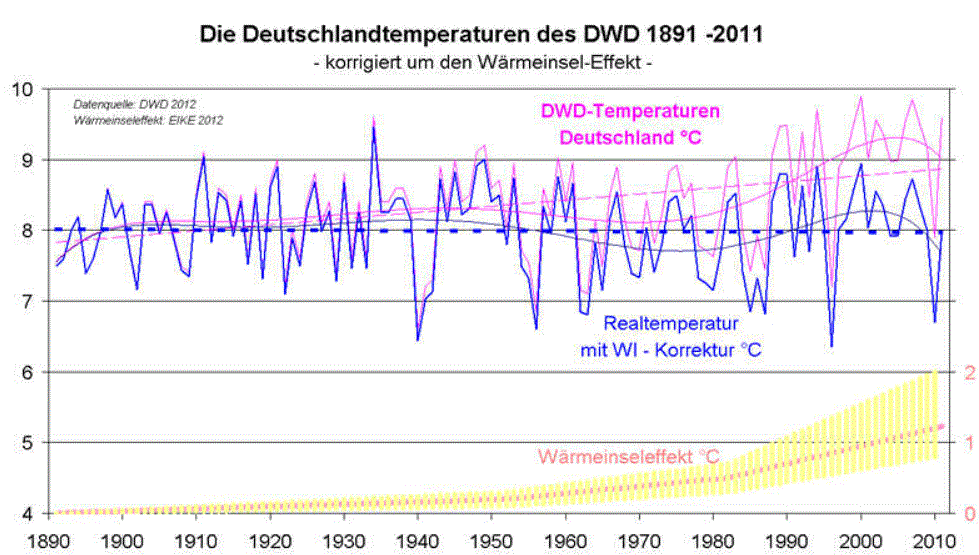
Germany’s annual mean temperature chart (Use the light blue curve, which is uncorrected for the urban heat island effect). Oh look! Now the temperature is cooling. Source: EIKE/.
I’m not a lawyer, but I think there’s an excellent chance to legally force the DWD to take down this old, very deceptive logo. False advertising. More importantly, the DWD ought to update it in order to maintain accuracy. The institute is supposed to help provide accurate forecasts based on real data, and not false ones based on speculation.
Over the last few years, lots of businesses planned for warm winters, and got burned by cold ones.
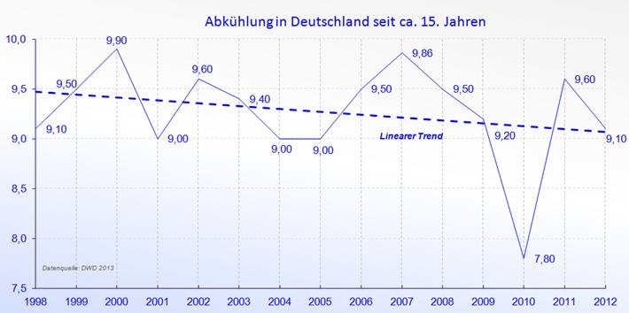
Here’s a chart showing the last 15 years, from EIKE/.
Figure 3: Last 15 years in Germany have been cooling.


As Warmists would say this is just cooling overlayed on warming. 🙂 Now tell that to the freezing Germans.
Global Weirding.
“…just cooling overlayed on warming.” Nicely said
I’m not a German speaker, but the lower, blue curve in Fig. 2 seems to be with one *with* the heat-island effect. Am I mis-reading this?
The blue writing says “real temperature with UHI correction”
That’s actually what I understood, which is why I asked the question; it seems inconsistent with the accompanying parenthetical statement: “Use the light blue curve, which is uncorrected for the urban heat island effect”
Looks like Pierre wanted to write “corrected” but didn’t 🙂
Yes, the lower blue curve is the one that is corrected for the UHI.
“Since records began it has never been so cold at the end of March in Brandenburg,” said Eva Wille from the German weather service (DWD).