As global warming is being used as justification for profound policy shifts, one has to wonder if the one-sided fudging of data that produces the appearance of more warming is a deliberate attempt to deceive and defraud the public.
=============================
Is GISS Also Cheating in the Arctic?
By Ed Caryl
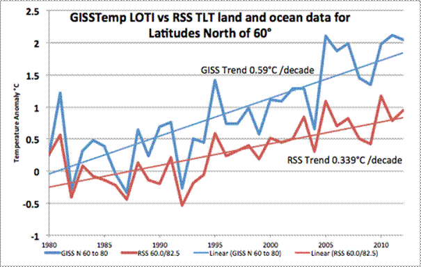
Almost four years ago, I wrote A Light In Siberia, where I examined 24 Arctic weather stations. The annual temperature data for those stations was downloaded from GISStemp. In light of all the recent controversy about weather station data corruption by “adjustments”, I decided to reacquire the GISS data for 19 of those stations for which I had kept the annual figures, and check for changes. There is also the matter of divergence, especially in the Arctic latitudes, between GISS LOTI and the satellite temperature readings. I examined this issue in this article back in November.
Is all that Arctic warming real?
Figure 1 is the annual temperature anomaly plots for land and ocean north of 60°.
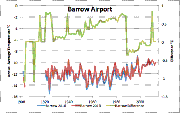
I won’t bore you with individual 19 plots of the changes (see Figure 3), but here is one sample that my be illustrative, from Barrow Alaska. The station is at the airport, across the runway from the terminal and hangar areas, but close to the asphalt paved runway. There may have been a move in 1989, giving an excuse for the large discontinuity at that time, but there is no excuse for the constant positive correction, in the same direction as the well-documented urban heat island temperature increase at Barrow.
Figure 2 is a plot of GISS annual temperature for Barrow, Alaska, downloaded in August of 2010 and June of 2014, and the difference between these two sets of data. This is just the adjustment that has been applied in the last 3 years and 9 months.
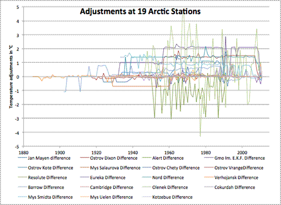
Figure 3 is a plot of all the adjustments for all 19 stations.
The difference plots for most of the other stations look like noise, with occasional large steps, but the adjustments are nearly always warmer for the last half of the 20th century. The next plot is the average.
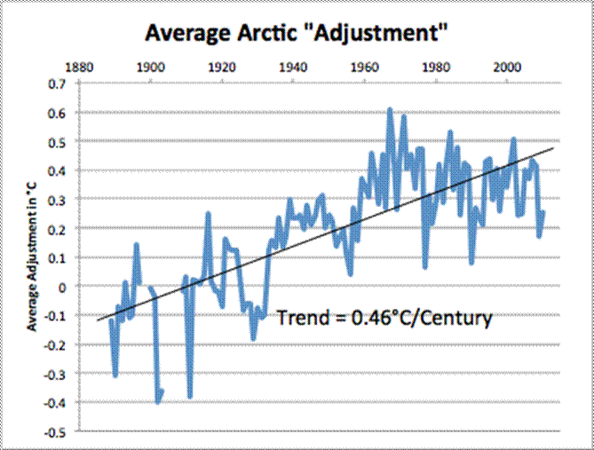
Figure 4 is a plot of all the adjustments that have been applied by GISS in the last three years and nine months for 19 Arctic stations averaged together.
Again, these are just the “adjustments”or “corrections” that GISS has applied in the last three years and nine months to the 19 Arctic stations. I have no way of knowing what they did before August of 2010.
Note the trend line in Figure 4. These recent changes to the data have resulted in more than half of all the warming that has supposedly taken place since the bottom of the Little Ice Age and a third of the difference between GISS LOTI and RSS seen in Figure 1.
We may never know what the real temperature change has been.





Ed, are those values both GISS Final Output?
If so have you looked at the actual Raw data, because that will show the total changes made by GISS and possibly USHCN if they hold the data.
Have you Station Numbers, Berkley also have raw data values.
That would be most interesting. Can almost smell a “worst-than-we-thought” outcome.
The numbers are “after GISS Homogeneity adjustment”. The other choices are: “GHCN v3 + SCAR” and “after removing suspicious records”. It is the Homogeneity adjustment that keeps changing.
A C, thank you for the nudge. I will have an interesting follow-on. Five minutes work, and I found some very interesting stuff.
As the Goddard buzz is going on, may I suggest people intersted in ‘adsjustements’ to look (or even get in touch) at Frank Larsner work at http://hidethedecline.eu/ .
For example this graph http://hidethedecline.eu/pages/posts/ruti-global-land-temperatures-1880-2010-part-1-244.php is consistant with history, as opposed to the newer ones that remove the cooling of the 40’s to 70’s and make it look like a plateau.
Hi Ed,
How does todays data look like compared with the data from this old Russian site (which has been inactive since about year 2000)?
http://nwpi.krc.karelia.ru/e/climas/Temper/tempGl_menu.htm
Thank you!
Can anyone explain this?
Original data V1
http://data.giss.nasa.gov/cgi-bin/gistemp/show_station.cgi?id=431042100000&dt=1&ds=1
Adjusted data V4
http://data.giss.nasa.gov/cgi-bin/gistemp/show_station.cgi?id=431042100000&dt=1&ds=14
Well, for all months from the beginning of the record, January 1880, they added 0.9°C to all months through April of 1927. After that, from May 1927 through April of 1948, they added 1.7°C to all months for which they had data. I leave it as an exercise for the reader to wonder and determine why. Why is the first of May significant? It doesn’t start thawing there until June. Why raise the temperature for those specific periods, by those specific amounts?
OF COURSE GISS cheats in the Arctic!
Didn’t you read this from Bob Tisdale:
http://bobtisdale.wordpress.com/2010/05/31/giss-deletes-arctic-and-southern-ocean-sea-surface-temperature-data/
“We may never know what the real temperature change has been. – See more at: https://notrickszone.com/2014/07/01/nasas-arctic-fudge-factory-more-than-half-of-claimed-arctic-warming-stems-from-data-adjustments/#comments”
Yes we can – it is claimed by those creating the temperature series by adjustment that they only need 50 meteorological stations to give a valid GTA and it is even claimed the the CET series is a good proxy for the global trend, though Hubert Lamb found a 6C difference along the arc of latitude between London and Moscow. The problem is the adjustments that ever cool the earlier temperatures so we need data from long run series with little to no siting moves and UHI impacts.
That said, perhaps the answer is to follow the advice of John Daly and use only those ´rural´ stations with a long record in areas where the response to CO2 ( if discernable) will be at its highest and competition with water vapour at its lowest – in the Arctic and Antarctic regions where the low temperatures give the highest IR output in the region where CO2 has its highest absorption bands. He selected 60 plus sites that meet the criteria of being minimally affected by UHI effects, most of which do not show any long term warming trend with many showing cooling.
http://www.john-daly.com/ges/surftmp/surftemp.htm
The raw data from these sites available in the BEST global station list (http://berkeleyearth.lbl.gov/station-list) agrees with that of John Daly with BEST then showing the adjustments they use that are in my opinion unjustified, often resulting from combining short run data from other local sites. A good example to see the effects is Sodankyla in Finland where the raw data show no warming trend from 1908 to 2013 but by unecessarily adding in four other local stations with data from 1959 onwards they have introduced a substantial. warming trend. This is a general feature of the BEST process that can be seen at other Arctic (and global ) stations that introduces UHI, siting and instrument errors into the data.
If the Arrhenius/IPCC meme on increased atmospheric CO2 is real we should see the effect most clearly at sites like Sodankyla, instead I sit here in Finland ´enjoying´ summer at 13C and below!
Yep… sometimes it pays to revisit the recent past. For example, check out the following warning in January 2010 by John Coleman:
https://www.youtube.com/watch?v=AsQfr7wRZsw
Try this. I use this as an exercise for my senior physics and chemistry students in observing and recording rates of change and error margins from data. Type in http://www.wolframalpha.com and in the dialog box enter without the ” marks, “temperature trend in barrow alaska”. The result is apparently drawn from data collected from the airport weather station, possibly without adjustment. Looks a bit different? I have no idea as to the accuracy of the data presented but my students often walk away with a different outlook on things.
So far, I have five data sets for Barrow, all different.
Make that six.
[…] Mehr: https://notrickszone.com/2014/07/01/nasas-arctic-fudge-factory-more-than-half-of-claimed-arctic-warmi… […]
[…] NoTricksZone, by P […]
[…] doomed the Black–Scholes models. We are facing the same crisis as it is now showing that the data is manipulated to serve a political agenda of raising more taxes – as always. These people would just adopt […]