The NOAA recently declared several months of this year as being the hottest on record, standing out in stark contrast to other datasets and observed reality.
The NOAA claims seem to be so odd that it has become the target of heavy criticism and ridicule (see here, here, here and here), especially with the backdrop of the cold winters the northern hemisphere has recently experienced and the growing global sea ice levels.
The latest condemnation comes from senior meteorologist Joe Bastardi at his latest Saturday Summary, where he called the seemingly rogue institute a “fox guarding the henhouse“. To back up his claim Bastardi presents charts contradicting the NOAA’s Orwellian hottest August claim. According to the veteran meteorologist other datasets such as UAH and NCEP (under +0.20°C) disagree with the NOAA’s outlier figure of +0.75°C.
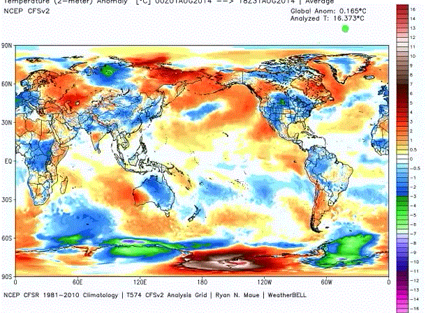
Bastardi believes the NOAA is no longer a credible source: “I don’t believe it anymore.” To explain why he thinks the NOAA is fudging a heat record, Bastardi shows the following NCEP chart:
He asks how can 0.165°C be the warmest ever when other months in the past, like May 1998, were far warmer?
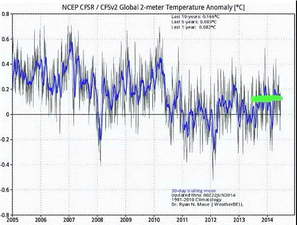
Probably his most compelling piece of evidence pointing to NOAA deception is the next NCEP chart, which depicts a global cooling taking place over the last years, with the current year among the coolest:
Bastardi, no longer able to hold back his laughter at the NOAA’s claim, asks how the NOAA could possibly say 2014 is the hottest when NCEP uses NOAA data? Looking at ocean cycles, Bastardi believes the planet will see cooler conditions like those in the 1970s by 2030.
NOAA claim “seems to be an outlier”
Dr. Roy Spencer here is less harsh with his assessment of the NOAA’s claim, writing that “the ‘record warm’ SST month of August, 2014 seems to be an outlier, with the SSTs being too warm (or the tropospheric temperatures too cool) compared to the usual behavior”.
For the general citizen observer, if August has set a record at anything, it’s probably the discrepancy magnitude between the NOAA claims and reality itself. With a “record hot planet” sea ice does not grow. Right now, especially at the South Pole, the sea ice is telling us a whole different story. Sea ice doesn’t lie.
Also read Steve Goddard here.world’s




O/T Employees of the ZDF’s “Heute Show”, their imitation of the Daily Show, which has been cited favorably here for comparing renewable madness to religion, have physically attacked the only Bundestag MP who participated in a pro Life March.
http://www.kath.net/news/47627
Mr. Hüppe tried to inform other participants that the ZDF team that interviewed them was there not for reporting, but to put the pro Life march through the agitprop meatgrinder of the Heute Shows Welke. As this torpedoed the intentions of the agitprop team, they physically attacked him to get rid of him.
NOAA, I long stopped caring about what they say or project.
NOAA, is an agency of warmist advocacy, there are NO scientists working in NOAA – just political science.
It is interesting to compare August RSS 1998 to August RSS 2014.
http://stevengoddard.wordpress.com/2014/09/18/out-of-africa/
Thanks – link now added to the article.
You are most welcome. Of note is to look at your linked NCEP map in the center of Africa. Notice that the RSS map shows the same cool anomaly for about 1/2 of the continent surrounded by above average T.
Yet GISS in- fills this entire area as above average, despite the fact that on UAH, RSS and NCEP, it is cool. See here. http://stevengoddard.wordpress.com/2014/09/20/keep-extrapolating-until-you-get-the-answer-politicians-are-looking-for/
Many other things to note comparing the two. For instance Gavin has nothing in the US below average after infilling, even removing some blue there before infilling?
In the above link please look at Gavin’s explanation for the change between the in-filled map, and the in-filled index. It makes no sense to me. I have had no response to my questions about this….
In explain why the index finale number can be different then the finale map, Gavin stated…”For data sets with full coverage this should make no difference….but for data sets where there is missing data, there can be a small offset. In such cases the number in the index file should be considered definitive because (here is the part that makes no sense to me) the full time series is involved with filling in the data gaps, whereas on individual maps, only the data on that particular map is used to estimate the global mean.”
Yet the individual map data has been in-filled, and so the gaps no longer show, and are colored coded based on the same 1951 to 1980 anomaly. Is Gavin saying they show the gap color on the map, based on…” “For the maps we subdivide into regions…. and fill in any gaps by the mean in the available data in that region, and then get a global mean.” but they do not count that infilling in the number posted next to the map? This makes no sense. In order to fill in a particular color in the gap area, they had to assign a number to it. Perhaps Gavin is talking about the difference in the maps that leave the gaps blank, vs. the maps that are in-filled?
As to the gap filling in the index, why would they use the “full time series” to fill in the data gaps in the index? Does Gavin mean they do not use the current surrounding temperatures in the index, like they do in the maps, but use the mean of the “entire time series” for those surrounding areas, based on the average anomaly?
This would make no sense, as current temperatures in that anomaly area could be vastly different then the historic mean. ( Like central Africa infilling in the previous RSS graphic, vs. Gavin’s graphic here.) Thus with the index area, you could get a reading completely wrong from the actual temperatures in that region. In which case the map method of using current surrounding temperatures would be superior to the index method that makes no sense.
Am I not understanding what Gavin is saying here?
They say a picture is worth a thousand words. This applies to a map, also. The map view for this post is designed to exaggerate the area at high latitudes – the polar regions. Look for the fine black line across the entire lower part between 60S – 90S. That’s the Antarctica coast. Or note the top of the map. The actually small Arctic Ocean stretches across the entire map while the great Pacific Ocean, at the Equator, only goes about 1/3 of the way across.
Because the map expands the area where the red colors are the impression of a hot Earth is likewise exaggerated. This is information out of a geography 100 level class – and often found in “how to lie with statistics” summaries. It has also been used to portray the USSR as the “red menace” because much of that land area is also at high latitude. See the map here:
http://canada-coldwartimeline.wikispaces.com/Anti-Communism+In+Canada
(I use this only because it is such a well known and often used example.)
Joe B. & Ryan M. could be more effective if they would correct this projection distortion by using an equal-area map, and making an issue of it. They should not uncritically use the Government’s propaganda maps.
Geologist Axel Bojanovski reports about Royal Society Global Warming snail extinction blunder (very accurately as always); gets insulted by Spiegel Online commenters as “journalist” and “intern”. My, warmist Spiegel Online commenters don’t even know the name of the only quality writer at Der Spiegel.
http://www.spiegel.de/wissenschaft/natur/schnecke-rhachistia-aldabrae-auf-den-seychellen-nicht-ausgestorben-a-992780.html
But NCEP CFSv2 is not a dataset one can just straighforward compare with NOAA observational records: it’s a reanalysis, it’s model output and remains model output even when updated with (NOAA) measurements in retrospect. So that explains why NCEP shows NOAA’s “own data” differently.
This doesn’t mean there’s no fudging going on but the question remains if NCEP CFSv2 is the best evidence to show that. It depends on your faith in the model.
Well, thanks; for some weird reason all the journalists proclaiming that the last month was the hottest ever always seem to forget to add “in the reanalysis model”. So it’s not a lie-lie, only a model-lie.
[…] https://notrickszone.com/2014/09/21/noaa-devolving-to-an-orwellian-political-farce-veteran-meteorolog… […]