The Atlantic Multidecadal Oscillation (AMO) is defined as the variability of the North Atlantic sea surface temperature compared to the rest of the global ocean from 60°N to 60°S once trends are removed. The AMO high is usually seen off eastern Canada and north and east of Iceland. The AMO low has the pattern reversed. Compare those areas in Figure 1 with Figure 3.
The Pacific Decadal Oscillation (PDO) is defined as the difference between the Northwest Pacific surface and the eastern Pacific surface temperature north of the equator. Figure 1 and figure 2 show the two phases. Both the PDO and the AMO affect the weather in the Northern Hemisphere. Both show up distinctly on anomaly maps. The GISS anomaly map found here was used to produce these figures.
There are four ways these patterns can interact. Each of these four ways result in distinctly different patterns. Beginning with the most recent pattern, from last February, that buried New England in snow, when both the AMO and the PDO were high.

In Figure 1, the western Pacific north of 20°N is cool, and the eastern pacific off the West Coast of the U. S. is warm. This makes the Western U. S. very warm. The jet stream has a huge loop diversion north past Alaska and south over the eastern U. S. all the way to Florida. This is the pattern when both AMO and PDO are high.
In contrast in November 2011, when AMO was high and PDO was low, the pattern changes to Figure 2.

In Figure 2, note that the Pacific temperatures are now reversed, the western Pacific is warm and the eastern Pacific off the U. S. coast is cool. This reverses the continental pattern with the West cool and the East warm. Note that the pattern over Europe and Asia is also reversed. This pattern filled the California reservoirs and buried Alaska in snow.
Figure 3 is the pattern when PDO and AMO are both low.
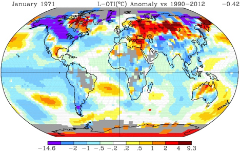
In Figure 3, both patterns were very low. Temperatures were very low over the entire Arctic and most of Canada and the northern U. S. This was during the ice age scare of the 1970s.

Figure 4 illustrates the conditions just ten years later in February of 1981. PDO was high and AMO was still low. The western U. S. and all of Canada was warm and Europe was cool. Each land mass is responding to the adjacent sea temperature.
These cycles affect the food chain as well as the weather. Salmon stocks in the Pacific North-west rise during the cool phase of the PDO, and fall during the warm phase. In similar fashion, Atlantic Salmon stocks follow the AMO, rising when the AMO is cool and falling when it is warm.
The recent spike in the PDO is temporary. The warm “blob” off the U. S. west coast will move south with the North Pacific/Japan/Kuroshio/California Current and be replaced by the cooler water behind it. The peak was reached in December and has fallen since then (as of March). The PDO data is available here. AMO data is available from NOAA, here.
As both the AMO and PDO affect Northern Hemisphere temperatures, and extremes are reached when both are in the same phase, it does make sense to combine them as I did in my last post on What Caused the Pause or Why Hate The Hiatus?
These cycles are weather. They can also be called natural climate cycles. They have nothing to do with CO2, and everything to do with driving many of the climate features that are gleefully pointed by climate alarmists. They determine the snowstorms, heat waves, floods and droughts pointed out by the alarmists as indications of “Climate Change”.


Well put, Ed.
Everyone who reads Pierre’s blog (or WUWT, or Climate Etc., or a host of others) knows this.
Every committed AGW scientist-believer knows it too (deep down inside), but nevertheless remains convinced that Climageddon caused by CO2 emissions WILL ARRIVE, any decade now, … er, ….
At this point it is instructive to review Trenberth’s (in)-famous e-mail to Mann et al. from five and a half years ago:
From: Kevin Trenberth
To: Michael Mann
Subject: Re: BBC U-turn on climate
Date: Mon, 12 Oct 2009 08:57:37 -0600
Cc: Stephen H Schneider , Myles Allen , peter stott , “Philip D. Jones” , Benjamin Santer , Tom Wigley , Thomas R Karl , Gavin Schmidt , James Hansen , Michael Oppenheimer
Hi all
Well I have my own article on where the heck is global warming? We are asking that here in Boulder where we have broken records the past two days for the coldest days on record. We had 4 inches of snow. The high the last 2 days was below 30F and the normal is 69F, and it smashed the previous records for these days by 10F. The low was about 18F and also a record low, well below the previous record low. This is January weather (see the Rockies baseball playoff game was canceled on saturday and then played last night in below freezing weather).
Trenberth, K. E., 2009: An imperative for climate change planning: tracking Earth’s global energy. Current Opinion in Environmental Sustainability, 1, 19-27, doi:10.1016/j.cosust.2009.06.001. [1][PDF] (A PDF of the published version can be obtained from the author.)
The fact is that we can’t account for the lack of warming at the moment and it is a travesty that we can’t. The CERES data published in the August BAMS 09 supplement on 2008 shows there should be even more warming: but the data are surely wrong. Our observing system is inadequate.
That said there is a LOT of nonsense about the PDO. People like CPC are tracking PDO on a monthly basis but it is highly correlated with ENSO. Most of what they are seeing is the change in ENSO not real PDO. It surely isn’t decadal. The PDO is already reversing with the switch to El Nino. The PDO index became positive in September for first time since Sept 2007.
see[2]http://www.cpc.ncep.noaa.gov/products/GODAS/ocean_briefing_gif/global_ocean_monitoring_c urrent.ppt
Kevin
Ed comes ever-so-close to saying – it is the pattern of the surface waters in the extratropical North Pacific Ocean (aka the PDO) that shows when the large currents of air go either into the Arctic (Fig. 1, top left quadrant) or come onto the west coast of North America (Fig. 2, top left quadrant).
Ed does say – “… that the Pacific temperatures are now reversed, the western Pacific is warm and the eastern Pacific off the U. S. coast is cool.” That is true, but the overall temperature during either episode may be above or below the long term average.
When air flows into the polar region during its low Sun season that air will flow out as very cold air. The temperature of the air flowing southward across eastern Canada and to the eastern half of the USA is not acquired while the air is over the North Pacific Ocean. The overall temperature of the sea surface there isn’t the thing of importance – it is the pattern.
Then Ed says – “The recent spike in the PDO …”
This terminology implies that the PDO is an index of temperature. It is not.
The so called “Blob” is something else; see the 5th paragraph here:
http://www.nwfsc.noaa.gov/news/features/food_chain/index.cfm
From the Wikipedia page linked above:
“The Pacific Decadal Oscillation index is the leading empirical orthogonal function (EOF) of monthly sea surface temperature anomalies (SSTA) over the North Pacific (poleward of 20° N) after the global mean SST has been removed, the PDO index is the standardized principal component time series.[2] ”
It is a temperature index in the same way the AMO is a temperature index.
Ed writes, “It [the PDO] is a temperature index in the same way the AMO is a temperature index.”
Incorrect. The PDO is a spatial pattern index. Warmer in the eastern extratropical North Pacific and cooler in the western and central portions yield a positive PDO. The temperatures of the North Pacific can rise and fall and as long as that spatial pattern exists, the PDO will be positive. The PDO is derived from the North Pacific SSTa data, but it does not represent temperature.
On the other hand, the AMO is normally presented as detrended North Atlantic sea surface temperature anomaly data.
The spatial pattern is a characteristic of the PDO but it isn’t the definition. http://www.atmos.washington.edu/~mantua/REPORTS/PDO/pdo_paper.html
I am utterly convinced that our so called climate scientist both in europe and america know only too well that the climate in the medium term is controlled by the oceans. Medium term = 300yrs. Beyond that I doubt that anyone has the first clue or moderately safe evidence for what changes the climate.
CO² is not one of those things. Unless, of course, you have evidence of engineering quality to say different. If you have bring it forth. No-one has so far.
Ed, in general i enjoy your articles, but i think that this one is flawed.
The anomaly maps put temperature into a context of a base period. So blue on the map says “colder than the base period”. You use the same base period, but your examples are from such different years as 1971 to 2015.
But in this dataset (and in the real world, by the way) the globe has warmed significantly in that time frame. This is shown in this graph:
http://data.giss.nasa.gov/cgi-bin/gistemp/nmaps.cgi?sat=4&sst=3&type=anoms&mean_gen=0112&year1=2014&year2=2014&base1=1965&base2=1975&radius=250&pol=rob
so what looks like “warm” in 1971 might actually be “cool” in 2015.
are there no examples of those 4 situations in more recent years?
———————–
The second important point is a simple one. While the maps are nice, they might also mislead us, as it is difficult to judge the effect on global temperature.
so the important graph on the page is the “latidude” graph at the bottom. It can tell us, what effect the 4 situations have on global temperature (this only works, after adjustment for the error i described above, of course).
1998 is the important example in this repect:
http://data.giss.nasa.gov/cgi-bin/gistemp/nmaps.cgi?sat=4&sst=3&type=anoms&mean_gen=0112&year1=1998&year2=1998&base1=1951&base2=2014&radius=250&pol=rob
Thank you Sod, but an anomaly map is just that. Red is warmer than base, blue is cooler. It matters little what that base is. If I had used an earlier base for the earlier years it would have just shifted the colors slightly toward the red, no colors would have been reversed. I checked.
To your second point: The global anomaly number is in the upper right corner of each map. That is one reason I didn’t change the base period between maps. There is little effect on global temperatures, just the gradual warming over time.
Ed Caryl writes: “The recent spike in the PDO is temporary. The warm “blob” off the U. S. west coast will move south with the North Pacific/Japan/Kuroshio/California Current and be replaced by the cooler water behind it.”
I hope you’re right but I fear it’s wishful thinking. Much will depend on the strength of the El Niño, assuming a stronger one forms this year, and whether a La Niña follows.
I’m working on a post about the blob and hope to post it Sunday or Monday.
The blob developed in 2013. It’s been in place for almost 2 years, and it does not appear to be slacking off.
https://bobtisdale.files.wordpress.com/2015/04/blob-ssta.png
Also, it is not simply a surface phenomenon. It shows up in the depth-averaged temperature data for both 0-700 meters and 0-2000 meters. The following map shows the depth-averaged temperature anomalies for the depths of 0-2000 meters for the year 2014. Unfortunately, that doesn’t tell us how deep the blob goes—just that it appears in the data to those depths.
https://bobtisdale.files.wordpress.com/2015/04/2014-01.png
Cheers
I will definitely watch for your post.
The PDO went positive in January last year. It peaked in December and is now declining. http://research.jisao.washington.edu/pdo/PDO.latest