Global Energy Emissions (during the climate bet)
By Robin Pittwood of the Kiwi Thinker
Having just updated the climate bet, which confirms the lack of recent warming (ie: the ‘pause’ or ‘hiatus’ as some call it), I thought next we should take a look at global energy emissions on the same time comparative basis.
For those who are not sure of the background, take a look at a few of my previous posts on ‘The Bet’ and you’ll soon catch on. We are comparing two decades; a past decade Jan 2001 to Dec 2010, and a current decade Jan 2011 to Dec 2020. Of course we are only part way through the current decade, so we’re not making a full comparison.
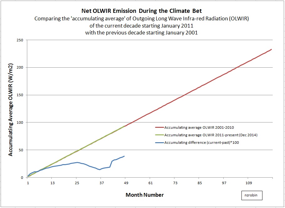
Here’s the (very unexciting … even boring) graph.
The data is monthly outgoing long wave infrared radiation (OLWIR) provided by the National Oceanographic and Atmospheric Administration (NOAA). I have totalled the energy emitted (OLWIR) in W/m2 units from each 2.5 by 2.5 degree latitude and longitude area to arrive at a global monthly average for each month. Then, in order to show emitting energy over the decade I have divided each monthly figure by 120 (the number of months in a decade) and produced an accumulating total.
The first four years of the comparison shows hardly any difference. The current decade (green line) sits right on top of the past decade (red line). The blue line zooms in on the difference, which is just the difference multiplied by 100. The heat is going into space in very nearly the same quantity as usual.
It is also worth noting (some would think worth highlighting) that the current decade shows slightly higher emissions, while temperature shows slight cooling. Higher outgoing energy, at the same time as a lower temperature, is exactly opposite to what the global warming models tell us will happen.
Also – all that talk of the missing heat hiding in the oceans. It’s just scary story. The missing energy is speeding away at 300,000,000 m/s, past Alpha-Centauri and beyond … and will never be seen again.
The spreadsheet workings are available for viewing here:
https://drive.google.com/folderview?id=0BwCJWmtRR6xeOFZSNzVrVW5rcVE&usp=sharing
The link to the source data from NOAA is here:


[…] From the No Tricks Zone: […]
I thought the long wave radiation was a measure of the temperature of the object from which it came. If it is giving more radiation then surely it is warmer?
Not only temperature. The Stefan-Boltzmann law is a product of the fourth power of temperature in Kelvin, the SB constant, and relative emissivity. If the equation holds true for LWIR emitted from earth (and it may not), then a slightly increasing LWIR while temperature is slightly declining or flat, implies an increasing relative emissivity. It implies the atmosphere has become slightly more transparent. It might be due to a reduction in the main greenhouse gas, ie: water vapour.
And that is, in itself, a little scary. The drier air exhibits larger (diurnal) extreme temperatures but instead of looking at the higher daily maximum temperatures, one should be thinking about where the water is going; and that may well be into growing polar ice caps.
What are the errors in the estimates?
Apologies. No error bars. I have simply totaled and graphed NOAA’s data.
Std dev 0-3 and 3-6 W/m2.
http://www1.ncdc.noaa.gov/pub/data/sds/cdr/CDRs/Outgoing%20Longwave%20Radiation%20-%20Daily/AlgorithmDescription.pdf
Errors swamp your results.
@Burns Does not say much about the energy budget then either.
It never was intended to be an ‘energy budget’ post. It was a simple graph of recent OLWIR emissions during the climate bet.
Many folk have talked about finding the missing heat, which is based on the presumption that the greenhouse effect must be increasing, because CO2 is increasing.
It simply shows, based on NOAA’s data, that net OLWIR emissions from earth do not seem to have reduced between this decade and the last.
Increasing CO2 would imply an increasing greenhouse effect, however it seems OLWIR (to the accuracy that it has been measured by NOAA anyway) has not declined while the temperature has rather conveniently, been reasonably flat.
Good God! This instrument only partially measures the radiance of only midband CO2 from the coldest tropopause. This is from nadir to 50o cross track. From that garbadage, they calculate some so called theoretical brightness temperature compared to a local bb and from space at the same few frequencies. Then they use that hypothetical temperature as though it were a actual black body radiating at all wavelengths into PI steradians, for a completely illusionary W/m^2. NOAA gets how much for this shtick drek? This is so bad they would get more accuracy by calculating the ratio of floaters/sinkers in the toilet each morning. I guess some folk will bet on anything no mater how rigged the scam. 🙂
Hi Will,
Do you have a link to better OLR data? I’d be happy to take a look at it.
As far as I know, there is no-one betting on olr.
This is shoddy work that isn’t explained at all and doesn’t prove a thing. (Naturally everyone at this blog will accept it without question.)
What is an “accumulating average?” Does it not strike you as highly suspicious that it’s an exact straight line for a decade? It does me.
Your spreadsheets aren’t labeled and are impossible to understand.
There is a reason scientists say science isn’t done on a spreadsheet over a weekend. You’re just proved them right.
Which real scientists say that it cannot be done over a weekend?
My lab. sessions at Uni took a couple of hours and the results were analysed within another few hours.
“My lab. sessions at Uni took a couple of hours and the results were analysed within another few hours.”
oh, so your typical assingment for a few hours was, to give an analysis of global temperature data and future climate? Great!
David Appell has recently on this blog given a polynomial equation and told us that it predicts global avg temperature because global avg temperature is now entirely dominated by antropogenic CO2 emissions.
Please get to gether with David and plan your next propaganda campaign so that we don’t get this internal warmunist inconsistencies will ya.
“What is an “accumulating average?” Does it not strike you as highly suspicious that it’s an exact straight line for a decade?”
An “accumulated average” will look like a straight line starting at zero most of the time.
Think of it, as in adding up global average temperature. It does not make any sense, as the numbers change only by a small amount. So you will not see any difference, even if you just plot the data, but it gets much worse if you add it all up (you have to increase the scale of the y-coordinate to plot the sum).
You would at least want to look at anomalies (removing the high amount of irrelevant data) and that graph simply does not make any sense at all.
‘You would at least want to look at anomalies (removing the high amount of irrelevant data) …’
No. olr is not an anomaly. Global average olr (W/m^2) multiplied by area (m^2) gives a measure of net olr power, from the planet. If the graph was multiplied by area of the earth in m^2, and time in seconds, the vertical axis would become net energy emitted in Joules, which is an absolute quantity – not an anomaly.
David Appell 6. September 2015 at 6:06 AM
This is shoddy work that isn’t explained at all and doesn’t prove a thing. (Naturally everyone at this blog will accept it without question.)
It clearly demonstrates that “no one at NOAA” has any competence or personal integrity.
Hi David,
‘What is an accumulating average?’
It is a way to view a developing average before all the elements of the sample are available. Rather than waiting till the end of the 120 periods and divide by 120 for the one final average, we take a look along the way by dividing each element available by 120, and accumulate them.
I too was surprised by the ‘straightness’ of the lines. It surprised me that the two decades were so similar too. It is why I did the post. But that’s the data, all I have done is graph it.
Sorry you can’t understand the workbooks. Maybe the following notes will help.
The thirteen workbooks named 2001xl, 2002xl, through 2013xl, are direct conversions of NOAA’s monthly NetCDF files to Excel spreadsheets. The first five tabs (NC_Info, lat, lon, olr, and time) are NOAA’s. I have not touched these sheets in any way. I have added one tab to each workbook (using the year as the tab label, ie: 2001, 2002, etc). This tab calculates the monthly average global olr. Col A is the month number, Col B is NOAA’s latitude counter, Col C converts the latitude counter to degrees, Col D calculates the cosine of the latitude (used to scale for area – sector area changes with Cosine latitude), Col E normalises the area weightings, Col F gets NOAA’s average olr for that latitude, Col G weights the olr by area. Cols I and J are the summary output. It is the monthly averages in cells J3 through J14 that are taken to the graphing sheet, named ‘accumulating average olwir during the bet’.
The workbook labelled 2014xl is a little different. NOAA had not completed their 2014 monthly summary data. However their daily data was available. I used this data to derive the average monthly data. The daily data sheet in the drive due to its size (27MB).
The workbook labelled ‘accumulating average olwir during the bet’ summarises the output from the fourteen workbooks. Cols A, B and C list the year, month and average olr for the years 2001 to 2010. Cols E, F and G list the year, month and olr for the years 2011 to 2014. Col I is the month number for the X axis of the graph, Col J is the accumulating average olr for the decade commencing 2001, Col K is the accumulating average olr for the decade commencing 2011, and Col L exposes the difference between the two decades by subtracting and multiplying by 100.
Oops – The sentence above regarding the daily data should read, “The daily data sheet is not in the drive due to its size (27MB)”
[…] https://notrickszone.com/2015/09/02/noaa-data-show-outgoing-long-wave-infrared-radiation-higher-this-… […]