By now most German readers here know the excellent site by global warming science skeptics Dr. Sebastian Lüning and Prof. Fritz Vahrenholt. The two authored the book “Die kalte Sonne“, which upset the German climate science establishment. The book is also available in English under the title: The Neglected Sun.
At their Die kalte Sonne site the pair has, as usual, another outstanding post on global warming and on how it has so far been totally exaggerated.
======================================
Global Temperature Rise Far Below “Most Probable” Model Projection
By Dr. Sebastian Lüning and Prof. Fritz Vahrenholt
(Translated/edited by P Gosselin)
Who doesn’t like looking through old books? Recently “Die kalte Sonne” chief editor Sebastian Lüning picked out from his living room bookshelf a copy of Klimaänderungen by Christian Schönwiese, which was published by Springer Verlag in 1995:
In English the title of the book by Christian Schönwiese reads “Climate Change: Data, Analyses, Prognoses”.
Flipping through the pages one comes across a figure depicting the projected temperature rise by 2100 (page 179, Fig. 54). How did scientiosts back then estimate the temperature development in the year the second IPCC report was released? Shown in the following figure are three estimates: a high estimate (if things really get serious), a best estimate (most probable warming) and a low estimate (if the climate danger is not as bad as feared).
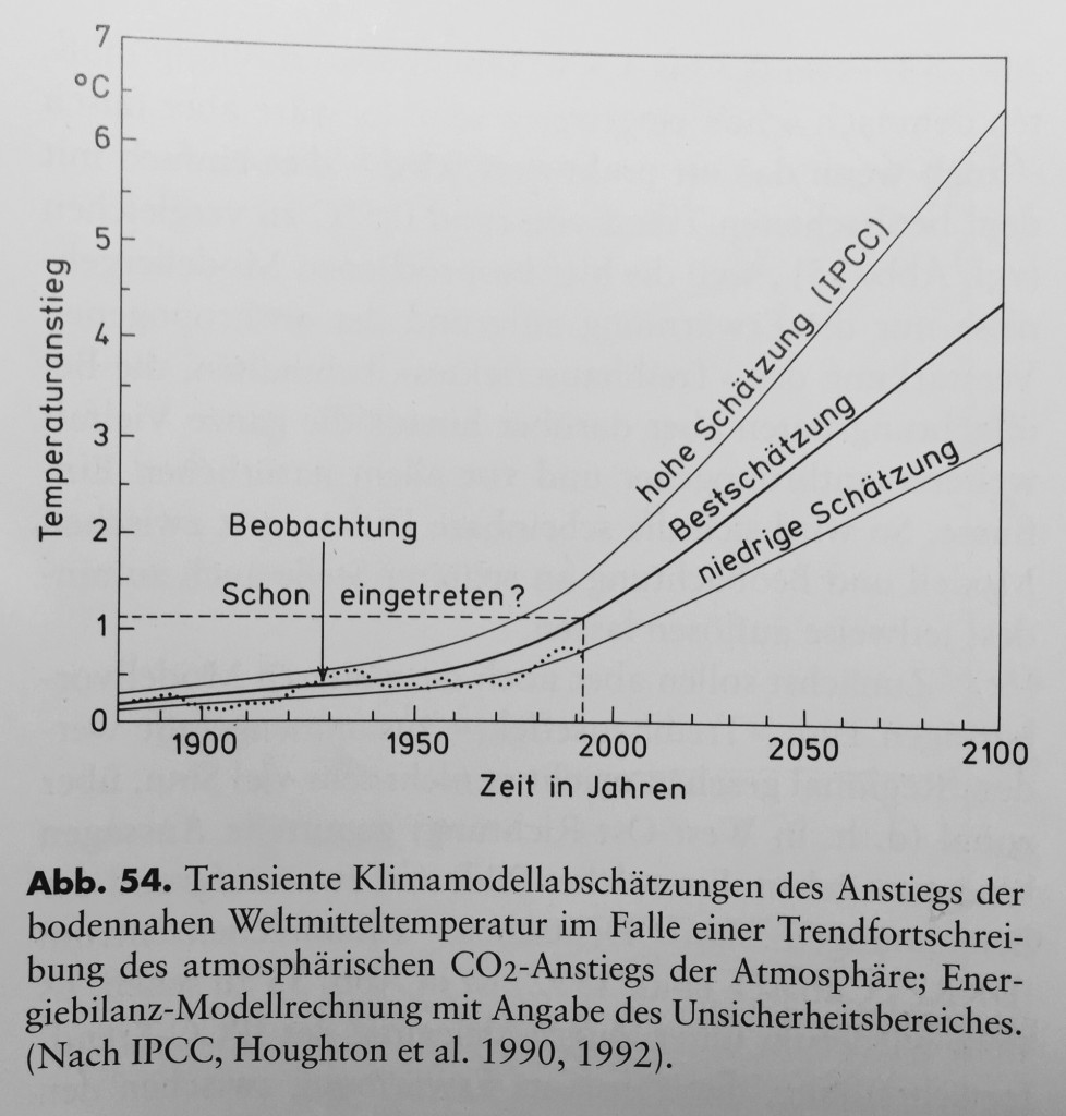
Figure 1: Temperature prognosis up to 2100. From: Schönwiese 1995.
Some 20 years later we are now able to look back and check to see just how well the predictions are turning out. Is the prediction right, wrong, or perhaps not even close?
We’ve taken the liberty of superimpsing on the 1995 – 2015 measured temperature curve to the above chart. To do this we used the global HadCRUT-data series. Quick and dirty, Figure 2 shows the result with the added 20 years of data.
Has nature followed along the projection? The real temperatures are actually slightly below the low estimate:
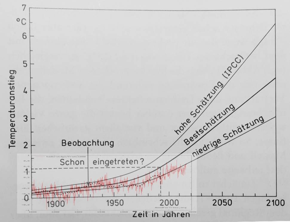
Figure 2: Temperature prognoses by Schönwiese, 1995, with superimposed temperature plot of HadCRUT 1995-2015 series (red). Chart of temperature vs time. “Schon eingetreten” – already measured; “Beobachtung” – observed; “hohe Schätzung” – high estimate; “Bestschätzung” – best estimate; “niedrige Schätzung” – low estimate.
So what could this possibly mean? According to the IPCC reports, the ‘transient’ short term TCR climate sensitivity is somewhere between 1.0-2.5°C warming for each doubling of CO2 concentration (Figure 3). That translates to a long-term ECS Climate Sensitivity of 1.5-4.5°C. Obviously the real temperature trend is currently below the lowest scenario.
Using the IPCC range, everything is pointing to a CO2 climate sensitivity of 1.0°C (TCR) or 1.5°C (ECR). Of course this is nowhere mentioned in the latest IPCC report. In the meantime curves and data have been shifted about, jerked around, and distorted so that the original prognoses over the years can be propped up. Of course none of it makes sense, but that is just the way it is. Complaints aren’t going to help. As the old saying goes: The one in charge is the one who is pulling the strings.
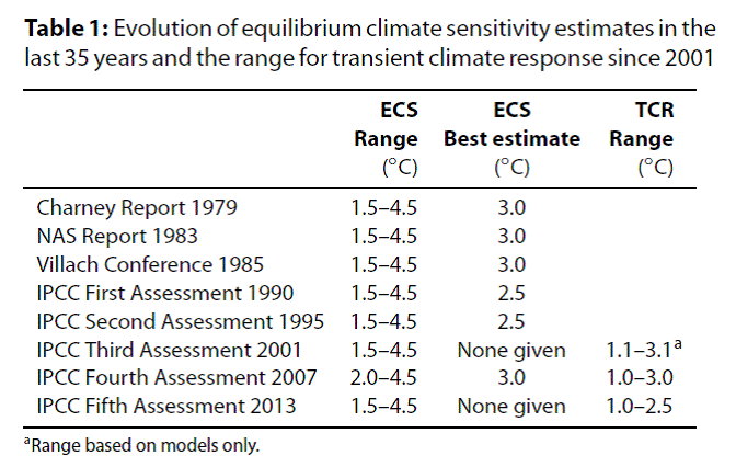
Figure 3: Overview of the IPCC reports for climate sensitivity. From Lewis & Crok (2014).



I’ve been asking this question for a long time: why, with the disconnect, haven’t the extreme scenarios been dropped? There has NEVER been a response, other than, “the disconnect isn’t so bad”.
From what I can figure, the recognized uncertainty of each temperature reconstruction – recognized by their authors but not their enviro-supporters and gamers – is sufficient to support ALL reconstructions (and, hence scenarios) at this time. GISS201506 is no worse or better than the UAH/RSS record in this view. All are squishy profiles based on assumptions, including what is good or bad data.
The argument is akin to that of who has the best fast-food hamburger, McDonalds or Burger King. Neither one of them is particularly good, compared to the ones you make at home (i.e. reality), but they are the ones at the shopping centre.
The extreme scenarios are the CAGW from the political established UNFCCC. And without them there is a less change of a radical change of western society?
“’ve been asking this question for a long time: why, with the disconnect, haven’t the extreme scenarios been dropped? There has NEVER been a response, other than, “the disconnect isn’t so bad”. ”
I think that you are simply wrong.
This is a figure from the fourth report. can you spot a difference?
https://www.ipcc.ch/publications_and_data/ar4/wg1/en/figure-spm-5.html
Looking at many commnnts being made here, i come to the conclusion that the IPCC reports do not get read a lot.
Thanks for showing that the IPCC is still in La-La-land.
It is difficult to make a man understand something when it is crucial for his livelihood to not understand it.
Run-of-the-mill cronies and anti-scientists at the IPCC. Defund all of them now!
” GISS201506 is no worse or better than the UAH/RSS record in this view. All are squishy profiles based on assumptions, including what is good or bad data. ”
I strongly disagree. UAH and RSS have at least a dense areal covering, in other words, they violate the Shannon theorem less in the spatial dimension – so they are of entirely different, higher quality than the flakey constructs GISS/HADCRUT etc. which need to make all kinds of assumptions to extrapolate temperatures into the area. (You have arbitrary models built into the surface temperature extrapolation algorithms just to get the “global average temperature” – giving the warmunists THOUSANDS of ways to manipulate at will. It cannot even be documented – the only way it is is by a giant mess of sourcecode that has never even been quality controlled or validated! And I’ve seen other huge messes of FORTRAN code written by perfessors who find source comments distracting so don’t force me to look into the warmunist’s code, HARRY.README was enough for me to draw my conclusions, and the conclusion was, yeah, that’s how these people work, no surprise there.)
This also means that UAH and RSS can be produced with FAR LESS SOURCECODE than GISS, HADCRUT etc. – All that UAH and RSS need is data acquisition, correction for aging, and a standard computer tomography algorithm as used in CT devices to reconstruct 3D distribution of temperatures from recorded data. Not some made up spatial extrapolation from thermometer stations only warmunists have a use for, justified by a stack of weird papers by Hansen et al which temselves make arbitrary assumptions like magic teleconnection over up to 1000 km no matter the geography.
This night in Brunswick saw temperatures of -16 deg C. All the heat radiated rapidly out to space and if CO2 did anything it probably radiated it out even faster in the stratosphere.
Where’s our promised warming CO2 blanket when we need it most? H2O doesn’t cannibalize CO2 at these temperatures. Cold winter nights are when CO2 can play out its warming capabilities the most. But! Nothing!
The scientists are wrong. They need defunded.
The only warming that actually happens comes from their supercomputers.
ASIDE
This page displaying arctic ice extent (all ice) USED TO LINK TO this page displaying arctic ice extent with coastal areas masked. I wonder why they no longer give us the option to view that second page, with it’s very inconvenient data (an about 5% increase in actual sea ice over recent years).
I took screen shots, for when it’s journey down the memory hole is complete, and it disappears entirely. Of course, it doesn’t have to. If they don’t link to it, no one will see it. And if you don’t see it, it’s as if it isn’t there.
I posted this in case anyone else thinks it’s worth taking screen shots, in case it does vanish completely.
Did you check whether it is available on http://www.archive.org ?
@DirkH
Great Idea…
yes, and there they have the following notice under the “all ice” graphic.
“The plot above replaces an earlier sea ice extent plot, that was based on data with the coastal zones masked out. This coastal mask implied that the previous sea ice extent estimates were underestimated. The new plot displays absolute sea ice extent estimates. The old plot can still be viewed here for a while.”
That’s been deleted, so unless you know where the old one is, you can’t get to it.
Of course maybe there’s an innocent explanation and it could just be paranoia on my part, but it seems too good a coincidence that they picked now to stop showing it.
Thanks for that suggestion. I probably don’t think of using them much anymore because anyone can block it’s content using robot texts. Some of my best proofs of Muslim treachery have been lost forever. Wayback Machine is useless when it counts the most. OH, and did you know they are a repository for Muslim propaganda.
https://archive.org/details/IslamicVideo_746
https://archive.org/details/Islamic_Tape-882_uP_bY_mUSLEm
Russia is not pleased.
http://www.themoscowtimes.com/news/article/russia-bans-wayback-machine-internet-archive-over-islamic-state-video/510074.html
@ DirkH
PS – see here for proof Siraj Wahhaj is a terrorist.
http://www.discoverthenetworks.org/individualProfile.asp?indid=716
– and see here for extensive material of his saved for posterity on the Internet Archive.
https://archive.org/details/ImamSirajWahaj
You can repeat the exercise for other Muslime spewers of hate, with similar results.
OK, so I should make a comment about temperatures. It’s been known for a long time that ground temps are problematic, with a bias to heating due to instrument location, and data manipulation.
The problem with ground temps has long been known, and is discussed here.
http://www.john-daly.com/surftemp.htm
Also, may I draw your attention to section 6. “SURFACE TEMPERATURE FROM REMOTE SITES” here
http://www.john-daly.com/cause/cause.htm
I trust the warmist narrative about as much as I trust the Muslime narrative – not at all.
Warmunist fanatics want climate skeptics dead and sing and dance in the streets celebrating the death of Bob Carter. Noteworthy, wikipedia editor William E Connoley amongst the celebrating crowd.
http://www.breitbart.com/big-government/2016/01/22/sick-warmists-gloat-over-the-death-of-climate-science-hero-bob-carter/
Understand: WARMUNISTS WANT YOU DEAD.
IF AT FIRST YOU DON’T SUCCEED…
tamper, tamper, and tamper again
And a whole LOT more material here.
http://www.c3headlines.com/climategate-climate-liars/
The surface temperatures are the most important. Perhaps that’s why they are torturing them so much? Here’s just one e.g., from the the above compilation.
NASA’s Recent Global Warming “Corrections” Equal A +95.0°C Per Century Trend
Pierre,
nice graph because I always wondered where those often quoted temperature figures came from. You know “we must keep below 2℃ etc”.
As near as I can see the bottom expectation was for 1.5℃, the middle for 2℃ and the top for 2.7℃ by 2015. So the warmists are just recycling the figures hoping they will happen real soon.
“nice graph because I always wondered where those often quoted temperature figures came from. You know “we must keep below 2℃ etc”.”
The magical 2 deg C goal was coined by Schellnhuber, director of PIK. He himself admits that he picked it out of his nether regions because it was a great propaganda vehicle for the politicians and media.
I would like to start by thanking the authors, for not using UAH/RSS data for the comparison.
I tried to find the source of the graph in the Schönwiese book, which should be one of the IPCC reports. I scanned the 1st and 2nd report, but could not find any graph that looks like this one.
https://www.ipcc.ch/ipccreports/far/wg_I/ipcc_far_wg_I_full_report.pdf
https://www.ipcc.ch/ipccreports/sar/wg_I/ipcc_sar_wg_I_full_report.pdf
All temperature projections have at least some of the scenarios bending downwards again towards 2100. I also find the offset between the graphs strange (why would the high scenario start higher in the beginning in 1900???),
Schönwiese of course needed a german labeled graph. Did he just draw this by himself?
Yeah, sod, go ahead and use the IPCC data. That way everyone will know not to take you seriously.
The only reason that scam is still going on is because there are so many fools and liars at the disposal of a rich powerful and utterly corrupt elite.
[…] https://notrickszone.com/2016/01/22/german-scientists-urgent-corrections-needed-global-temperature-ri… […]