The following clearly shows a complete lack of correlation between CO2 and temperature. Most of the 20th century warming occurred before 1945, and clearly was linked to natural factors at time the planet was emerging from the Little Ice Age.
====================================
Explosive (Non-Anthropogenic) Warming in the Early 20th Century
By Kenneth Richard
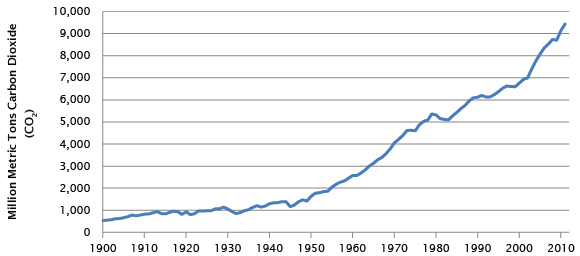
As Figure 1 depicts, human CO2 emissions were essentially flat during first half of the 20th century.
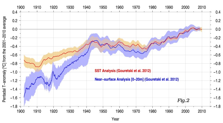
Yet, the world’s climate warmed dramatically throughout this period. For example notice how steep the rise in near-surface (0 – 20 m) ocean temperatures was between 1900 and 1945 according to Gouretski et al. (2012, “Consistent near-surface ocean warming since 1900 in two largely independent observing networks“).
As the Gouretski et al. (2012) graph indicates, near-surface ocean temperatures rose by about 1.2°C between 1900 and 1945. But then, in the next 65 years, between 1945 and 2010, the near-surface ocean only warmed by about 0.3°C in total, which includes a 30-year cooling trend (1945 – 1975).
If we compare the two trends, the early 20th century (1900 – 1945) near-surface ocean waters warmed at a rate of almost 0.27°C per decade, whereas the more recent period (1945 – 2010) only warmed at a rate of under 0.05°C per decade. Interestingly, it was the more recent 1945 – 2010 period that contained the rapid expansion of anthropogenic CO2 emissions, with rates rising from ~1 GtC/year (1900 -1945) to nearly 10 GtC/year by 2010.
These warming (and cooling) trends in the near-surface ocean are the opposite of what would be expected if human CO2 emissions were the primary driver.
Sea level rose 8 mm/year between 1930 – 1948
What follows are some of the details of this dramatic early 20th century warming as documented by Princeton geologist Dr. Erling Dorf, a veritable expert on the subject. Notice from the summaries provided below that sea levels were observed to be rising at a rate of about 8 mm/year between 1930 and 1948 (6 inches in 19 years), which is more than double today’s modeled satellite altimetry rate (3.2 mm/year).
These early 20th century temperature and CO2 trends beg the question: What were the physical mechanisms that caused this dramatic global-scale warming, since anthropogenic CO2 emissions were both low (~1 GtC/year) and stable during this period?
Summary of the 1900 to 1950 warm period as described in Dr. Dorf’s (1959) “CLIMATIC CHANGES OF THE PAST AND PRESENT”.
- A 14°F (+7.7°C) warming in the Arctic (North Pole region) between the early 1900s and 1950, with ice-free ports 7 months out of the year rather than the mere 3 months per year that were common at the turn of the century.
- A 5°F (+2.8°C) warming in Antarctica.
- “Catastrophic” and “violent” wasting away of glaciers, with Muir Glacier retreating 2 miles (3.2 km) in 10 years.
- A snow line rise by 2700 feet (823 meters) in the Peruvian mountains.
- A 6-inch (15 cm) rise in sea level between 1930 and 1948, a rate of about 32 inches (+80 cm) per century and 8 mm/yr (more than double today’s alleged rate per satellite altimetry [3.2 mm/yr]). A 600% increase in the rate of sea level rise in the 1920s.
- Agricultural crop lines shifted 50 to 100 miles (80 to 161 km) northward, with 10-day longer growing seasons.
- Tree lines moved 65 feet (20 meters) up the mountains in Sweden.
- Many birds and mammals extended their habitats northwards; about 25 species of birds advanced from the south up into a warmer Greenland; codfish replaced seals along the coasts of Greenland, which led “Greenland Eskimos” to switch to cod-fishing rather than seal-hunting.
Excerpts from Dr. Erling Dorf, 1959:
CLIMATIC CHANGES OF THE PAST AND PRESENT
It has been observed, however, that the greatest temperature increases during the last hundred years have been in the Arctic regions. In Spitsbergen, only about 10 to 12 degrees from the North Pole, the mean winter temperatures have risen about 14° F. since 1910 (Willett, 1950). Ice-free ports there are now open to navigation about 7 months of the year as compared with only 3 months fifty years ago (Ahlmann, 1953, p. 32). If the warming trend of the north polar region should continue at its present rate, it has been estimated that the entire Arctic Ocean would be navigable all year long within about a hundred years. At the opposite end of the world, according to recent reports from the Weather Bureau (Wexler, 1958), the Antarctic region has undergone a rise of about 5°F. in average temperature in the last fifty years. There has been no appreciable rise, however, in the mean annual temperatures in the tropical regions of the world.
What have been some of the notable results of this warming trend during the last hundred years? Glaciers throughout the world have been melting away at a rapidly increasing rate. Brooks (1949, p. 24). the eminent British paleoclimatologist, stated that “Since the beginning of the 20th Century glaciers have been wasting away rapidly, or even catastrophically.” In the Juneau region of Alaska, all but one of the numerous glaciers began melting away as far back as 1765. Muir Glacier, for example, has retreated as much as two miles in 10 years. Baird and Sharp (1954, p. 143) have referred to the “alarming retreat of glaciers” in the Alaskan region; along the Pacific Coast of North America and in Europe they believe the glacial melting “appears to be progressing violently.” In the north polar region, measurements of melting of the ice islands in the Arctic Sea indicate an approach toward an open polar sea (Crary, Kulp, and Blarshall, 1955). In only a few regions of the world, such as the Pacific Northwest, are there any records of glaciers advancing during the past century, and these have been mostly since 1950 (Hubley, 1956). The warmer temperatures have also caused a general rise of the snow line throughout the mountainous regions of the world, even in the tropics: in northern Peru it has risen about 2700 feet during the 60 years.
Believed in large part to be the result of the melting of the world’s glaciers, sea level has been rising at a rapidly increasing rate, amounting to as much as a 6-inch rise from 1930 to 1948 (Marmar, 1948). This is about four times the average rate of sea level rise during the past 9000 years, as recorded by Shepard and Suess (1956). It should be noted that more than a six-fold increase in the rate of sea level rise occurred in the mid-1920’s at the same time there was a striking change in the rate of glacial melting in the north (Ahlmann, 1953, Fig. 11).
Changes in vegetation brought about by the warmer temperatures include the encroachment of trees into the subpolar tundra as recorded in Alaska, Quebec, Laborador, and Siberia. In the Canadian prairies the agricultural crop line has shifted from 50 to 100 miles northward as a result of the lengthening of the growing season by as much as ten days. In parts of northern New England and eastern Canada the birch trees have been dying off over large areas, and the spruces and balsams have begun to suffer as a result of the rise in summer temperatures. In Sweden the timberline has moved up the mountain slopes as much as 65 feet since 1930 (Ahlmann, 1953, p. 35).
In the animal world many southern types of both birds and mammals have been extending their habitat ranges northward as a result of the warming trend. The cardinal, the turkey vulture, the tufted titmouse, and the blue-winged warbler, as well as the warmth-loving opossum, have slowly moved their ranges into the northern United States. A good many central European species of animals have been shifting their ranges northward into Scandinavia, Greenland, Iceland, and the Faero Islands. Twenty-five species of birds alone are reported to have invaded Greenland from the south since 1918 (Jensen and Fristrup, 1950). Codfish from the Atlantic have replaced the seals in the waters along the coast of Greenland. It is reported that compared to a shipment of 5 tons of codfish from Greenland in 1913, the 1946 shipment had risen to over 13,000 tons; the Greenland Eskimos have become cod fishermen instead of seal fishermen (Kimble, 1950). Farther south tunafish have moved northward into the waters off New England, and tropical flying fishes have become increasingly common off the coast of New Jersey.


So what happened? Why has this science been airbrushed away? Personally this just further confirms AGW is real fraud.
No – It just further confirms that people like you will swallow this BS
So youfoool, no arguments against the actual paper….
… just the normal desperate alarmist bluster, hey.
Well, the modern ocean measurements have a completely different accuracy.
so we know the right part of the graph has a good chance of being right.
You will not like it, but the most likely explanation is, that the old data is wrong and will be adjusted.
PS: if natural influences can cause sudden spikes of 1-2°C global temperature changes, then this is not good news. Such changes can happen in ADDITION to AGW, not instead of it.
To my knowledge it has already been altered…60+ years later by people who were not even around back then.
sod 22. May 2016 at 1:48 PM | Permalink | Reply
“Well, the modern ocean measurements have a completely different accuracy.”
Unfounded claim.
“so we know the right part of the graph has a good chance of being right.”
Corruption of natural sciences has been rampant so it has a good chance of being a lie. Proof: climategate emails.
“You will not like it, but the most likely explanation is, that the old data is wrong and will be adjusted.”
It will be adjusted – because it is likely CORRECT. By modern academic collectivists who depend on more taxpayer money to “fight Global Warming”.
“PS: if natural influences can cause sudden spikes of 1-2°C global temperature changes, then this is not good news. Such changes can happen in ADDITION to AGW, not instead of it.”
Now you have completely lost it. If such temperature swings occur all the time, it shows
a) the Hockey Stick is a lie
b) Earth’s climate is resilient (and human civilisation as well)
c) CO2’s influence is small compared to natural swings
d) the MWP and the LIA existed, implying
e) The Hockystick is a lie.
sod: “the old data [that shows more non-CO2 warming] is wrong and will be adjusted.”
The “adjustments” have already occurred. Data that do not conform to the presupposition that CO2 is the predominant cause of warming in the oceans are altered to fit the presupposition.
The “old data” (pre-1980s) also show that there was a -0.6 degrees C Northern Hemisphere cooling from the 1940s to the 1970s — while human CO2 emissions were exploding. Decades of cooling while CO2 emissions were dramatically rising was not convenient to the cause — so the cooling was subsequently removed, or “adjusted” out of the record.
Here’s how they do it:
Climate scientists Tom Wigley to Phil Jones, who oversees HadCRUT dataset:
“If you look at the attached plot you will see that the land also shows the 1940s blip (as I’m sure you know). So, if we could reduce the ocean blip by, say, 0.15 degC, then this would be significant for the global mean — but we’d still have to explain the land blip. I’ve chosen 0.15 here deliberately. This still leaves an ocean blip, and i think one needs to have some form of ocean blip to explain the land blip (via either some common forcing, or ocean forcing land, or vice versa, or all of these). When you look at other blips, the land blips are 1.5 to 2 times (roughly) the ocean blips — higher sensitivity plus thermal inertia effects. My 0.15 adjustment leaves things consistent with this, so you can see where I am coming from. Removing ENSO does not affect this. It would be good to remove at least part of the 1940s blip, but we are still left with “why the blip”.
Phil Jones:
“I’ve just completed Mike’s Nature trick of adding in the real temps to each series for the last 20 years (ie from 1981 onwards) amd from 1961 for Keith’s to hide the decline.”
Tom Osborn:
“Also we have applied a completely artificial adjustment to the data after 1960, so they look closer to observed temperatures than the tree-ring data actually were” …. “Also, we set all post-1960 values to missing in the MXD data set (due to decline), and the method will infill these, estimating them from the real temperatures – another way of “correcting” for the decline, though may be not defensible! “
The article mentions warming in the Arctic, and the recovery from the devastating effects of the LIA.
This is also shown in this “Sea Ice around Iceland” chart which I think came from Pierre a few months ago.
http://s19.postimg.org/fj69ahgoj/Iceland_Sea_Ice.jpg
“Well, the modern ocean measurements have a completely different accuracy” What is a “different” accuracy? Inaccuracy?
“Well, the modern ocean measurements have a completely different accuracy.”
The accuracy did not change much until ARGO in 2004.
Since then, well… warming is basically non existent.
https://bobtisdale.files.wordpress.com/2013/03/04-argo-era-raw-v-adjusted-ohc.png
Yes, the brutish primitives who collected the original data were obviously knuckle-dragging troglodytes. What could you expect from pre-collectivist, unenlightened actualists? Their primitive scientific method inhibited pursuing collectivist goals regardless facts. Thank goodness we have evolved to our modern state, Homo Perfidus.
“but the most likely explanation is, that the old data is wrong and will be adjusted.”
Er – don’t you mean “but the most likely explanation is, that the old data is RIGHT and will be adjusted”?
Now there’s something NASA and NOAA can’t tinker with.
If I may, there is something else that they can’t tinker with – and that is what has been written about the conditions of the climate and/or land (in this case Oklahoma) and how they viewed it – and it goes to show how foolish it is to think we can change things now.
I found such an example in Google books – a quote by Ethan Allen:
“Permanence of Climatic Conditions”
[Extract from letter of Mr. Ethan Allen to the Chief of Bureau Dated Perry, Okla., January 22, 1907]
“Observation has shown me that the weather conditions do not change; taking a number of years, say twelve, and making an average the rainfall will not vary more than an inch or two in any one period over any other. It is true that in some years the precipitation is slightly more than in others; during some years the precipitation is better distributed than in others; but take any period and the rainfall is about the same. After all is said the fact remains that this is a dry country, and there are natural causes why this is so and why it will remain so.
While there is no change in the rainfall there is a change in the people, and the people have learned better how to farm arid lands, how to plant crops better adapted to droughty conditions, how to utilize the moisture that does fall-until some confound the change in treating the soil with a change in climatic conditions.
All the dry land east of the mountains will ultimately be utilized with the rainfall that naturally comes, but it will be by adapting contitions to the rainfall-never by changing the rainfall, for that is impossible.”
1933 : Australia’s Chief Weather Expert Said That Belief In Climate Change Is An “Error Of Human Memory”
The Commonwealth Meteorologist (Mr. Watt) smiles when he is asked about what is wrong with tthe weather, because all the records show that it is normal.
“There has been no appreciable climatic change anywhere since the dawn of history,” said Mr. Watt today.
When people compare the present with the past, they remember only the abnormal. The ordinary is forgotten.
The belief that climate is changing is only an error of memory.”
https://stevengoddard.wordpress.com/2014/03/08/1933-australias-chief-weather-expert-said-that-belief-in-climate-change-is-an-error-of-human-memory/
Question 1: Why did you produce a new plot based on Gouretski et al. 2012 rather than show the original graph from the paper?
Question 2: Why does your new plot miss the actual relevant comparison from the original?
For reference, here is the original. You’ll note there are quite a few more lines than on the graph shown above. Most importantly, the line showing the SST data masked to geographical coverage of 20m data, a like-for-like comparison. It demonstrates that the large early warming indicated by the 20m curve is simply an artefact of poor geographical coverage.
Why did you neglect to mention that very relevant information?
You answered this question yourself by presenting the graph. Look at both lines and notice the trends. The trends are almost the same, just moved along the vertical axis. If the warming was “simply an artifact of poor geographical coverage” than the trend would have significantly changed. Instead, it kept a similar trend and changed the absolute values. That is the point of the information that was presented.
As for “recreating” the graph, that is commonly done – even in research papers that reference other research papers’ information – to draw attention to a specific feature of the data. Pretending that it’s nefarious to confirm or further your own beliefs is anti-science.
“You answered this question yourself by presenting the graph”
yes he did. If presented with multiple options, a “sceptic” of climate change will always choose the graph that fits his narrative.
You shouldn’t self-define yourself as a skeptic.
PaulS:
The graph itself comes from an early version of the paper. Notice the below link address is from the University of Hamburg (icdc.zmaw.de) – where Professor Gouretski teaches. It is therefore not a “new plot” that was artificially “produced.” The graph was available in 2012 when the paper was first released, and it’s useful here because it shows less congestion.
http://icdc.zmaw.de/uploads/pics/hc_fig2.jpeg
Interestingly, the shape of the 0-20 m trend from Gouretski et al.(2012) looks eerily similar to the sharp spike in glacier melt contribution to sea level rise from the 1920s to 1940s, as shown in Gregory et al., 2013 (Figure a):
http://journals.ametsoc.org/na101/home/literatum/publisher/ams/journals/content/clim/2013/15200442-26.13/jcli-d-12-00319.1/20130821/images/large/jcli-d-12-00319.1-f2.jpeg
What do you think might have physically caused this sharp spike in warming, “catastrophic” glacier melt, and extremely rapid sea level rise during the first half of the 20th century — since anthropogenic CO2 emissions were flat during that period?
By the way, SST data are not much more helpful to “the cause” than the 0-20 m data either. According to HadCRUT, sea surface temperatures warmed by more than 0.5°C between 1910 and 1940, which is +0.17°C per decade:
http://woodfortrees.org/plot/hadsst3gl/from:1910/to:1945/trend
Since 1940, SSTs have warmed by about the same amount, or slightly less than 0.5°C, which is about +0.065°C per decade:
http://woodfortrees.org/plot/hadsst3gl/from:1940/to:2016/trend
So, like the 0-20 m layer, the surface ocean temperatures warmed much more (2.5 times more) rapidly *before* anthropogenic emissions began to rise exponentially (from about 1950 onward).
What physical mechanism(s) caused that early warming?
“What physical mechanism(s) caused that early warming?”
This i can not answer, but i can answer what “mechanism” caused your false data result.
it is called MIN/MAX trend and is a favorite mechanism of “sceptics”.
You chose your first time period, to start in a minimum and end at a maximum.
you did chose your second period, to start with a downward trend (pure chance, i guess?).
your result is utterly false.
a better comparison looks as the second trend starting in 1975. it shows stronger warming for the modern period (with only one end point cherry picked) in comparison to your1^910 to 1945 masterpiece of cherrypicking!
http://woodfortrees.org/plot/hadsst3gl/plot/hadsst3gl/from:1975/trend/plot/hadsst3gl/from:1910/to:1945/trend
“to start with a downward trend ”
roflmao.
poor sob, fell straight into the hole left for him.
Well done Kenneth 🙂
The real story is of course that the warming trend “after” the 1940-1970 cooling period (thanks for highlighting that, sob) is actually pretty much the same as the warming period from 1910-1940.
ie.. there is ABSOLUTELY ZERO CO2 WARMING SIGNATURE.
http://woodfortrees.org/plot/hadsst3gl/from:1910/to:1945/trend/plot/hadsst3gl/from:1910/to:1945/plot/hadsst3gl/from:1971/to:2015/trend/plot/hadsst3gl/from:1971/to:2015
KR: “What physical mechanism(s) caused that early warming?”
sod: “This i can not answer”
If you cannot answer it, what are you doing here? Do you not have the scientific curiosity to look into it? If I was asked this fundamental question, I’d be embarrassed to respond by running away from it.
And you talk about cherry-picking – and then turn around and claim that we should start the SST trend in 1975. Guess what year the IPCC cherry-picks as the start date for the anthropogenic signal? It’s not 1975. It’s 1951. I wonder if there’s a reason why that odd year was chosen. Can you think what that reason might be?
Similarly, is it cherry-picking to claim that the sea level rise rate has been 3.2 mm/yr since 1993? Is selecting 1993 as a starting point *not* cherry-picking? Or is it only cherry-picking when climate realists select start and end points, but when alarmists cherry-pick, it ceases to be cherry-picking anymore?
Finally, did you realize that the IPCC “cherry-picks” the 1910 to 1940 period specifically (AR4) for surface temperature data comparisons to modern decades? Did you realize that the IPCC “cherry-picks” the years 1920-1950 as the period when sea levels rose at the same rate (3+ mm/yr) as they supposedly have (per modeling) since 1993? Is it cherry-picking when the IPCC selects a year like 1951 as a starting point? How about when the IPCC selects the 1998-2012 period to discuss the “hiatus” as they called it in AR5? Is it OK to consider 1998 as a start year for temperature trends as long as the IPCC is the one doing the cherry-picking?
Weird, I am getting confused with the allegations of skepticism over scientific debate here.
Sod23 stated:
“it is called MIN/MAX trend and is a favorite mechanism of “sceptics”.
You chose your first time period, to start in a minimum and end at a maximum.”
Wait a second, I am unsure of this way of going about scientific data but are you implying a person inferring increased rate of a graph is in fact a skeptic?
Would not a skeptic be better served of inferring the opposed?
Start in a a minimum increasing to a maximum implies in my book the temperature increases and I have never seen anyone before accused of being an “AGW skeptic” for increasing temperatures 😀
Or did I miss something of value here?
“Or did I miss something of value here?”
yes, you did. This is about the first trend early in the 20th century. “sceptics” want this trend to be big. so they start at a minimum and end at a maximum.
They indeed do the opposite for the late (AGW) warming. they start in 1940, when temperature went down (starting at a maximum).
the graph i did (eyeball minimum and a meaningful number, so trend starts in 1975) already is stronger than the ultra hardcore cherrypick of the early phase.
http://woodfortrees.org/plot/hadsst3gl/plot/hadsst3gl/from:1975/trend/plot/hadsst3gl/from:1910/to:1945/trend
Even with massive cheating, the facts tend to burn the “sceptics”.
sod: “‘sceptics’ want this trend to be big. so they start at a minimum and end at a maximum.”
The opposite also shows a non-correlation with anthropogenic CO2. From 1850 to 1910 – when CO2 rose by ~20 ppm – sea surface temperatures cooled:
http://woodfortrees.org/plot/hadsst3gl/to:1910/trend
And again between 1940 and 1975, when human CO2 emissions exploded, sea surface temperatures cooled:
http://woodfortrees.org/plot/hadsst3gl/from:1940/to:1975/trend
Can you explain why, with the exception of the non-anthropogenic 1910 to 1940 warming, we had cooling while CO2 concentrations were rising? Why didn’t “basic physics” work until the last few decades?
sod 24. May 2016 at 2:44 PM | Permalink
““Or did I miss something of value here?”
yes, you did. This is about the first trend early in the 20th century. “sceptics” want this trend to be big. so they start at a minimum and end at a maximum. ”
???? Warmunists at GISS constantly cool the past and warm the present via a magic potion of homogenization, thermometer death and adjustment; to maximize a trend, so you define Gavin Schmidt as a skeptic?????
That Vegan diet has accelerated the death of your brain. Can’t you hear it screaming for Vitamin B? I can from here.
Check out:
http://realclimatescience.com/2016/05/science-arctic-to-be-ice-free-by-1978/