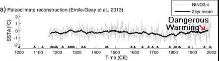
When Michael Mann and the IPCC coordinated efforts to make the Medieval Warm Period disappear from the paleoclimate record in the early 2000s, they employed the visually slick and effective tactic of adding red to the “dangerous” warming trend, and blue to the “safe” cooling trend. The original Mann et al. (1998, 1999) graph that claimed to reconstruct surface temperatures for the entire Northern Hemisphere (by extrapolating from a few select trees located in North America) was published without color. The graph’s red “hockey stick” blade effectively allowed readers to see for themselves just how “dangerous” modern warming really is .
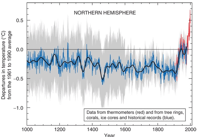
The IPCC has since abandoned Michael Mann’s (Mann et al., 1998, 1999) artwork depicting late-1990s Northern Hemisphere surface temperatures as +0.9°C warmer than they were during Medieval times. (For example, the 2013 IPCC report even acknowledges that many NH regions were as warm or warmer than present during the “Medieval Climate Anomaly”.)
Removing the Mann “hockey stick” graph from the paleoclimate record has come at a cost, though. In many of the graphs of the Middle and Late Holocene constructed since then (with some exceptions), it has become much more difficult to distinguish between warming that is “safe” (for example, warming that will not endanger the lives of polar bears) and warming that is “dangerous” (for example, warming that will endanger the lives of polar bears).
The difficulty distinguishing between “safe” and “dangerous” warming arises because, unlike Mann’s “hockey stick” graph, many recent millennial-scale reconstructions just don’t show enough of a difference between the past climate and the present one to know which is which. In fact, many reconstructions depict the 20th/21st centuries as not any warmer — and in some cases, cooler — than temperatures from a few hundred to a few thousand years ago. This makes the detection of “dangerous” warming even more problematic.
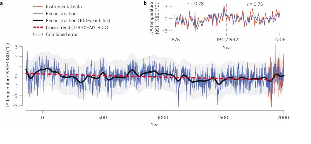
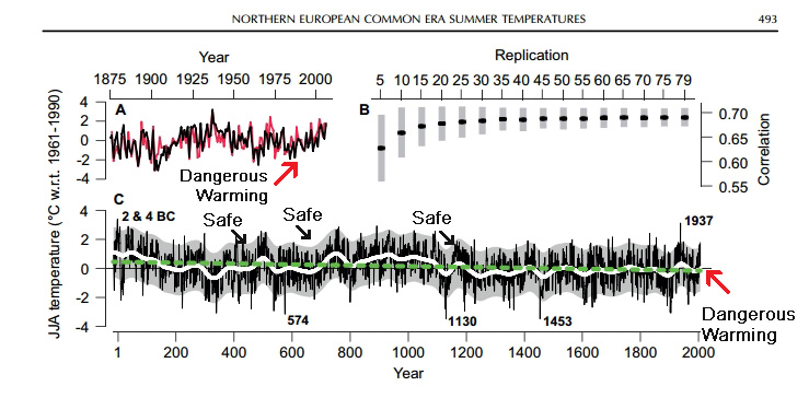
Although it helps to add the color red to aid in deciphering which warming trend is “dangerous” and which is “safe”, sometimes even the additional coloration isn’t enough to tell a difference. For example, consider Esper et al. (2012) . In the main graph from the paper (a), the authors redden the 20th/21st centuries to aid in identifying the warming that is “dangerous” versus that which is blue and thus “safe”. However, the long-term trend is one of cooling, not warming, and the secondary graph (b) even shows that Northern Europe has been cooling overall since the 1940s or so. This can become confusing for the reader concerned about detecting “dangerous” warming.
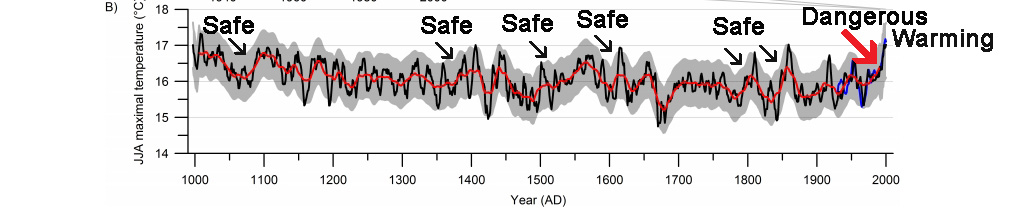
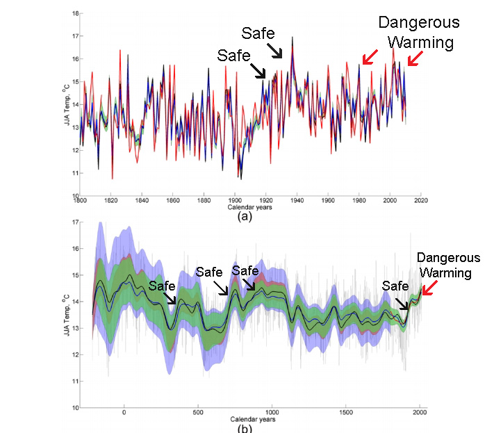
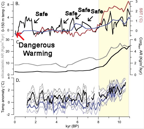
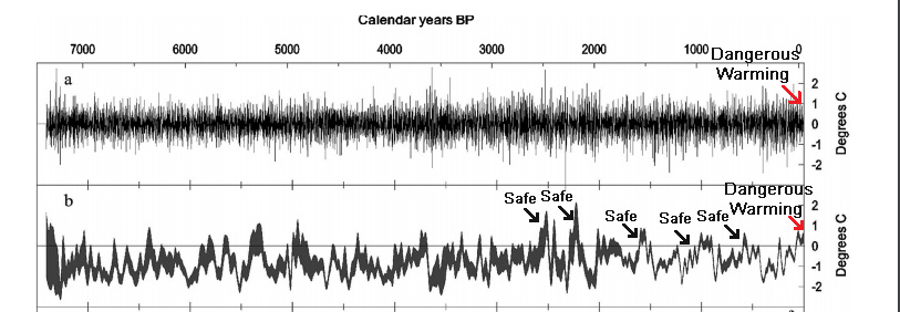
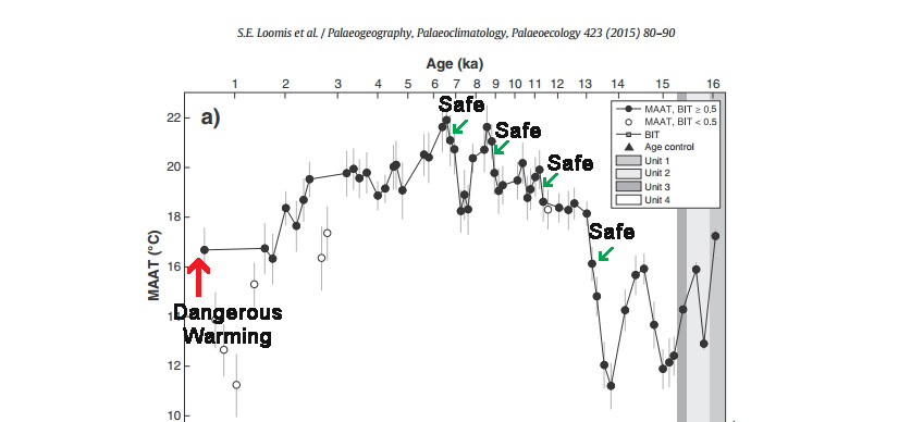
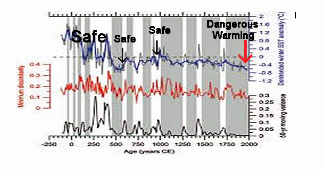
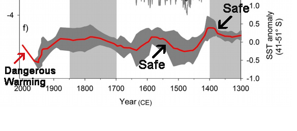
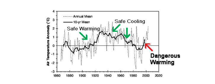
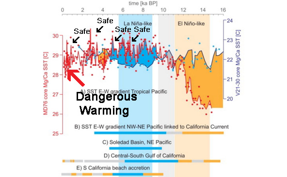
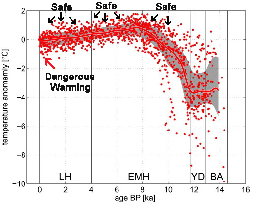
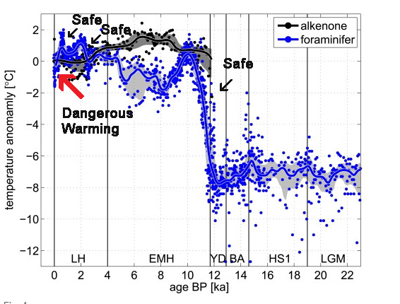
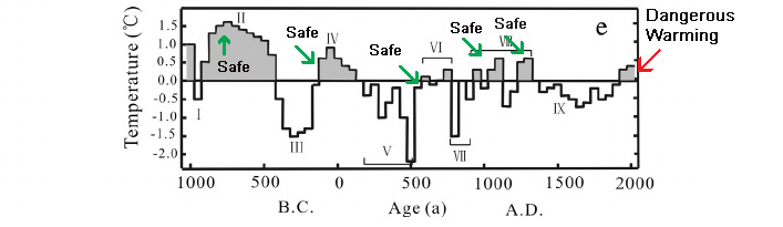
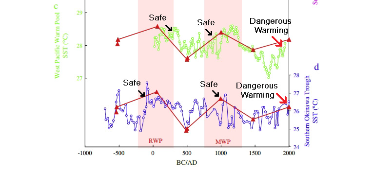
So . . . as a service to those who may not be able to find the “dangerous” warming in modern scientific publications, below is a helpful guide with easy-to-understand pointing devices (arrows), labeling (“Safe” versus “Dangerous Warming”), and red coloration embedded into the paper’s graphs. The consistently-used bright red hue on the arrow tracking the graph’s “Dangerous Warming” allows readers to locate the “Dangerous Warming” right away — without needing to scan the entire graph. With practice and repetition using these 20+peer-reviewed scientific papers, the average reader will ultimately become adept at distinguishing between the “dangerous” warming that kills polar bears and the “safe” warming that doesn’t kill polar bears.
Naulier et al., 2015 (China)
Matskovsky and Helama, 2015 (Finland, Sweden)
Gennaretti et al., 2014 (North America)

Esper et al., 2014 (Northern Europe)
Kolansky et al., 2015 (Pacific Ocean)
Meyer et al., 2014 (Russia)

Grudd et al., 2002 (Sweden)
Gajewski, 2015 (Canadian Arctic, Greenland)

Loomis et al., 2015 (Northern Africa)
Munz et al., 2015 (Arabian Sea)
Rebolledo et al., 2015 (Chile)
Drinkwater, 2006 (northern North Atlantic, Greenland)
Antinao and McDonald, 2013 (Tropical Pacific, California)
Eldevik et al., 2014 (Norway, Norweigan Sea)
July surface coastal temperature for coastal Norway
Reconstructed temperature anomalies for the Norwegian Sea
Hu et al., 2015 (South China)
Cook et al., 2009 (Canada)

Yan et al., 2015 (South China Sea)
Ault et al., 2013 (Equatorial Pacific)
Kylander et a., 2013 (Sweden)

Fortin and Gajewski, 2016 (Canadian Arctic)
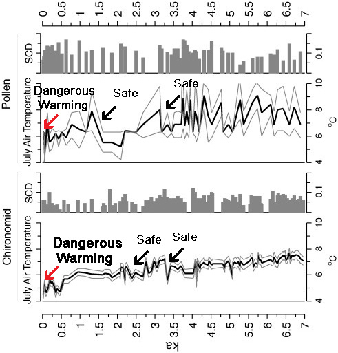
“Peak Holocene temperatures occurred prior to 5.0 ka [5,000 years ago], a time when overall aquatic and terrestrial biological production was high. Chironomid-inferred summer air temperatures reached up to 7.5°C during this period. The region of Lake JR01 cooled over the mid- to late Holocene, with high biological production between 6.1 and 5.4 ka. Biological production decreased again at ~ 2 ka and the rate of cooling increased in the past 2 ka, with coolest temperatures occurring between 0.46 and 0.36 ka [460 and 360 years ago], coinciding with the Little Ice Age. Although biological production increased in the last 150 yr, the reconstructed temperatures do not indicate a warming during this time“


Science has becomes a tool of government used to constrain rather than enlighten. News organizations have joined the bandwagon pushing narratives that support the implementation of barriers. Governments man the gates to these barriers and soon you end up in a permissions based economy where nothing can happen until you have the government on board and businesses are ready to pay a toll. Innovation and risk taking becomes a thing of the past so economies stagnate. Governments use money and monetary policy to jump start economic activity but to no avail. The simply cannot accept the fact that they may be the problem
There is a rumor that global warming threatens the color red. There is a tipping point beyond which there will be no additional red arrows formed. The ones you now have should be used judiciously.
If you are trying to map a phenomena with one variable, in this case temperature influenced by carbon content, once you identify a temperature bump, as seen during the medieval warming period, the scientific method and basic statistics dictates that you acknowledge that CO2 cannot be a sole predictor of warming and cooling.
If these warmists were really interested in finding out what causes climate change, they would be excited scientists when they found a bump in temperature that was not caused by humans.
Of course, they have abandoned the scientific method for fanaticism and end-of-the-world prophecy — so they twist, hide or explain away data that does not fit their simplistic models and demonize anyone who won’t play along with their unscientific charade, ironically dubbed ‘settled science.’
Brilliant.
However …today is special in the alarmist’s world. Social structures, food supply,biohabitats of nonhumans. Even physics – the sun has no influence over the last 150 yrars
Brilliant.
However …today is special in the alarmist’s world. Social structures, food supply,biohabitats of nonhumans. Even physics – the sun has no influence over the last 150 years. So unharmful – nondangerous – in the past is not persuasive for the modern alarmed sensitive.
The modern alarmed sensitive is young and has probably not read more than one book in his short life. His today is so special because it is everything he has.
….. and all he will EVER have.
Thanks! We laymen need all the help we can get when trying to understand wiggly lines!
Indeed. I have been searching for proof of CAGW on skepticalscience.com and realclimate.com but this presentation makes everything much clearer.
I can now spread alarmism and promote renewables with much more confidence that the science has been settled.
Where’s sod?
The land based data is manipulated by incorrect “homogenization” based on weather stations affected by urban crawl. There is also selective elimination of weather stations that don’t show enough warming. Raw data from some Australian stations in Northern Victoria for example shows no warming in over 100 years. Only satellite measurements are relaible and, as is to be expected, they show no warming dince 1998. There is, however, long-term warming of about half a degree per century since the “Little Ice Age” but it can be expected to become about 500 years of long-term cooling before the end of this century if past natural cycles continue.
However, regardless of any warming, carbon dioxide cannot be the cause as there is no valid physics that can give any reason for such. The infant science of climatoogy (in which there are few with qualifications in physics) has abused the laws of physics and ignored the prerequisites for such laws to apply.
Their first fundamental error was to assume that, in the absence of so-called “greenhouse gases” (1% water vapor, 0.04% carbon dioxide and some others) the Earth’s surface temperature would have been the same as that about 5Km up into the troposphere. This ignores the effect of gravity which (as has been discussed since the 19th century) forms a stable equilibrium non-zero temperature gradient in every planet’s troposphere. Now, in the 21st century, experiments with centrifuges and vortex cooling tubes demonstrate centrifugal force also creating a radial temperature gradient for the same reason that gravity does. Furthermore, a correct understanding of the process of entropy maximization in physics enables us to explain why this happens as gravity acts on molecules between collisions. So there is no need to explain the warmer surface temperature with radiation, and radiation is not the cause thereof.
The second fundamental error is that, in their unnecessary attempts to explain the fact that the surface temperature is warming than that 5Km above, climatologists have incorrectly assumed that they can just add together the flux of radiation from the Sun and about double that flux from the colder atmosphere. The latter can have no warming effect what-so-ever on the warmer surface, whilst even the solar radiation does not always raise the existing surface temperature, especially in winter and in the early morning and late afternoon. Once again, we can confirm that radiation can not be compounded like that with a simple experiment. We can measure the temperature to which a single electric bar radiator will raise an object and then see if several such radiators achieve the results that climatologists would like to see. They don’t come anywhere near doing so.
Wonderful essay, thank you.
Our current beneficial, warm Holocene interglacial has been the enabler of mankind’s civilisation for the last 10,000 years. The congenial climate of the Holocene epoch spans from mankind’s earliest farming to the scientific and technological advances of the last 100 years.
When considering the scale of temperature changes that alarmists anticipate because of Man-made Global Warming and their view of the disastrous effects of additional Man-made Carbon Dioxide emissions in this century, it is more useful to look at climate change from a longer term, century by century and even on a millennial perspective.
Northern Hemisphere Ice Core records from Greenland show:
• the last millennium 1000AD – 2000AD has been the coldest millennium of the entire Holocene interglacial.
• each of the notable high points in the Holocene temperature record, (Holocene Climate Optimum – Minoan – Roman – Medieval – Modern), have been progressively colder than the previous high point.
• for its first 7-8000 years the early Holocene, including its high point “climate optimum”, had virtually flat temperatures, an average drop of only ~0.007 °C per millennium.
• but the more recent Holocene, since a “tipping point” at ~1000BC, has seen a temperature diminution at more than 20 times that earlier rate at about 0.14 °C per millennium.
• the Holocene interglacial is already 10 – 11,000 years old and judging from the length of previous interglacials the Holocene epoch should be drawing to its close: in this century, the next century or this millennium.
• the beneficial warming at the end of the 20th century to the Modern high point has been transmuted into the “Great Man-made Global Warming Scare”.
• eventually this late 20th century temperature blip will come to be seen as just noise in the system in the longer term progress of comparatively rapid cooling over the last 3000+ years.
The much vaunted and much feared “fatal” tipping point of +2°C would only bring Global temperatures close to the level of the very congenial climate of “the Roman warm period”.
https://edmhdotme.wordpress.com/2015/06/01/the-holocene-context-for-anthropogenic-global-warming-2/
thanks ed. use your graphs etc regularly
Warming = BENEFICIAL.
Cooling = not so much !!
Arctic sea ice low = MASSIVE BENEFITS for those living up there.
Arctic sea ice high = a monumental PITA.
This whole warming SCARE is an exercise in absolute STUPIDITY
What if we now know the difference between local and global changes and if we do not cherrypick our graphs?
sod: “What if we now know the difference between local and global changes and if we do not cherrypick our graphs?”
As has been explained previously, the conceptualization of a “global-scale” warming has been fabricated. Large regions of the Earth have been cooling in recent decades, or since the 1940s. The cooling/non-warming regions include: Canada/Canadian Arctic, the southeastern U.S., Britain, Antarctica (East *and* West), the Southern Ocean, the tropical Pacific from Chile to Alaska, southwestern South America, South Africa, Northern Europe, the “entirety” of the Pacific Ocean and Indian Ocean, as well as the eastern Atlantic, have been cooling below depths of 2000 m (“about 52% of the ocean lies below 2000 m”) since 1992. In light of these cooling trends that span large regions of the Earth (which can all be supported with peer-reviewed scientific publications — see link below), please explain exactly what you might be referring to when you insist that the *globe* has been warming. What warming regions of the Earth might *you* be cherry-picking to support this claim?
“Abundant Scientific Evidence That Global Warming Is A Made-Up Concept”
https://notrickszone.com/2016/08/15/abundant-scientific-evidence-that-global-warming-is-a-made-up-concept/#sthash.vTfKiOAX.dpbs