USA’s National Oceanic and Atmospheric Administration (NOAA) provides data here on snow cover.
Because global warming is supposed to be leading to less snow, one would think that snow cover in terms of area would be trending downwards over the past 50 or so years. However, the data tell us a very different story.
Surprisingly wintertime snow cover area has actually been trending upwards over the past 50 years and all-year snow cover in the northern hemisphere has been pretty much steady, and even of the rise over the past 25 years!.
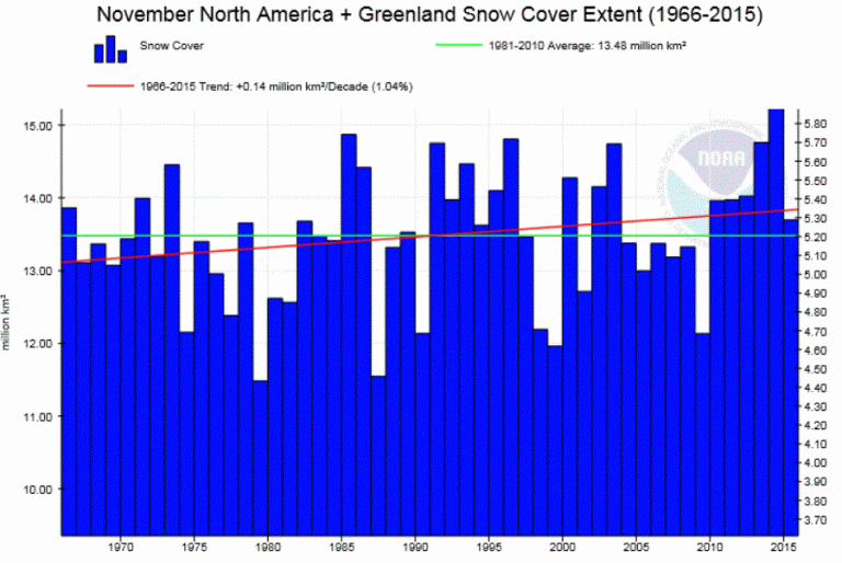
The following NOAA chart shows us the northern hemisphere show cover for November:
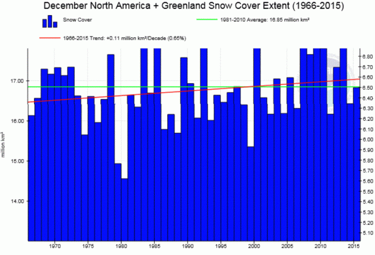
Clearly the November trend is solidly upwards, with especially great area extents over 5 of the last 6 Novembers. The next chart is for December:
In December as well we see especially vast snow cover over many of the past 15 years – even higher than the winters of the 1970s, when we were being bombarded with warnings of global cooling.
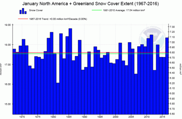
Next we present the data for January, where see no change over the past 48 years:
However in January, over the past 25 years we can make out a rising trend as well. Claims that snow is becoming a thing of the past are very false.
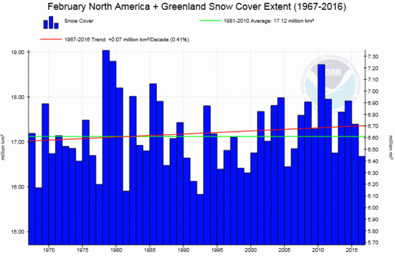
February’s trend tell us the same story: greater snow cover:
Again here as well the powerfully upward trend is clearly visible since 1990.
The same is true for the autumn months of September and October.
The spring and summer months, however, show a downward trend, and so global warming alarmists may be quick to seize upon these data as evidence supporting their hypothesis.
But here as well when you leave out the cold 1970s and 80s and look at the trend since 1990, little is really happening during the spring and summer months.
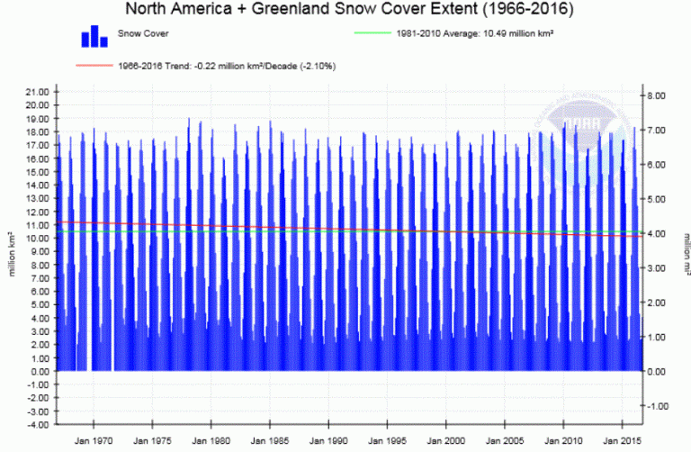
The next chart shows the northern hemispheric snow cover for the whole year:
The whole year trend is only very slightly downward – hardly anything that looks “catastrophic” and would put us on the verge of the dramatic-sounding climate system “tipping point”.
In fact eyeballing the all-year trend from 1990, here as well we see that snow cover is tending upwards rather than downwards, hence there’s no reason for any alarm with regards to snow cover.
As far as northern hemispheric snow cover is concerned, everything remains well within the range of natural variability.



While those graphs aren’t actually for the whole northern hemisphere the Rutgers Snow Lab anomaly graph, which does cover all of the NH, also shows no trend for at least the last 20 years.
This supports the AMSU satellite global temperature series, and pretty much proves the NASA GISS series is a load of rubbish. Snow doesn’t care about ‘adjustments’, it just melts when it is actually warm.
Bruce: The trend of NH snow cover over the last 20 years is -19,000 km2/yr, according to Rutgers data.
Source:
http://climate.rutgers.edu/snowcover/table_area.php?ui_set=2
This is where the foolish worrying about the amount ice at the North Pole being a good climate indicator comes unstuck.
The ice at the polar region indicates little about the climate per se, it does indicate variation in sea temperature and the local wind changes.
However the slow variation on the land around the arctic, of the snow cover indicates so much more. IMO, as each decade passes the area of snow cover (and therefore the albedo variation) of the Northern Hemisphere from 60th parallel and north, would be a better indicate the NH climate trend.
Meanwhile the Left Coast State of Washington has embedded this mantra:
“Warmer temperatures mean more precipitation will fall as rain, not snow, and more snow will melt earlier in the spring.”
Here’s the list:
Receding glaciers
Lower summer stream flows
Salmon declines
Lower groundwater tables
Hydropower loss
Recreational loss
More water pollution
All of this (and similar for all the States) was bought and paid for at least 10 years ago. Consultants cut & pasted from one State’s documents to the next, trying and sometimes failing to not let that show. Of course 10 years ago the science was settled.
This year we get to vote on the “Washington Carbon Emission Tax and Sales Tax Reduction, Initiative 732.”
This taxes “carbon” and lowers the sales tax. Green groups don’t want it passed because it doesn’t take other people’s money and give it to them and their favorite toys.
Last December one of the ski areas set records for snow:
117-Inches of Snow in 7 Days…
Impact of record snow on the government minds was zero.
If you want to see how significant trends look like, simply switch to sea ice.
https://www.ncdc.noaa.gov/snow-and-ice/extent/sea-ice/N/2
So what? No problem there at all you numpty https://www.ncdc.noaa.gov/snow-and-ice/extent/sea-ice/N/0
Global SIE at a record low:
http://davidappell.blogspot.com/2016/10/global-sea-ice-extent-is-crashing.html
sop yet again, shows he DOESN’T HAVE A CLUE about natural cycles
Last 10 years of Arctic Sea ice, sop..
https://s19.postimg.org/425r9zipf/Arctic_ice_area_trend.png
please go and learn something about the AMO.. you are continually coming across as low-IQ child-mind, incapable of even the most basic understanding.
My NOAA Chart:
https://s15.postimg.org/t5rln7pej/NOAA_feb.jpg
Your original NOAA Dramatic Decline chart:
https://s11.postimg.org/a3nff8ez7/noaa_feb_1.jpg
Same Data, even same Chart but formatted otherwise.
Yep, sop using juvenile visual aids is nothing unusual.
The only person he is FOOLing, is himself…
“My NOAA Chart:”
oh my god. you know less than nothing about statistics.
The sea ice trend will be significant. the snow cover one is obviously much smaller.
Given what sod knows about statistics, Jan_Vermeer couldn’t possibly know less.
But this isn’t a matter of statistics, it is a matter of history, about which sod really does know “less than nothing.”
(despite having been given the information by so many here on so many occasions, he is obviously a very slow learner, as well)
ICE “LOSS” IN CONTEXT:
http://realclimatescience.com/wp-content/uploads/2016/10/Screen-Shot-2016-10-14-at-6.26.40-AM-down.gif
FROM HERE
http://realclimatescience.com/2016/10/symptoms-of-global-warming-and-global-cooling-are-identical-2/
TEMPERATURE HISTORY – AND WHAT THEY AREN’T SHOWING US:
http://realclimatescience.com/wp-content/uploads/2016/10/Screen-Shot-2016-10-29-at-3.26.44-AM-down.gif
FROM HERE
http://realclimatescience.com/2016/10/climate-fraud-is-unequivocal-substantial-and-ongoing/
(note how in every case they cool the past to make the present look less natural than it actually is)
He/she/it/whatever is STILL at it, and everything he/she/it/whatever knows is STILL wrong.
sop, what juvenile trick are you going to try next time.
Junior high beckons you yet again.. Try to pass this time.
Tell us all, sop, how does showing the data on a correct graph show that Jan knows less than nothing about statistics.
His graph is far more correct than your feeble attempt at statistical mis-representation.
Your graph wouldn’t even pass propaganda 101, that is how woefully bad it is.
Sod,
Your sea water temperature indicator tells you nothing — NOTHING! — about climate trends. Period, end, finish.
Just make sure to adjust the vertical axis so its origin is zero. Any small change can be made to look catastrophic if you expand the vertical axis enough.
the sea ice trend and the snow cover in the summer months are much stronger than the garbage that is mentioned in the original post.
Please add some measurement of correlation to your trends or you will always be on the wrong side of facts!
And your correlation of climate trends to polar sea ice?
average Arctic sea ice for last 10 years.
https://s19.postimg.org/425r9zipf/Arctic_ice_area_trend.png
You would certainly know which side is the wrong side of fact.. Your commission flat resides there.. permanently.
You should learn something about cycles , sop.. particularly the AMO.
Nah, too much for your enfeebled mind to comprehend.
trend in Arctic SIE over last 10.0 years = -42,000 km2/yr.
stat significance = 99%
Source:
ftp://sidads.colorado.edu/DATASETS/NOAA/G02135/
“Please add some measurement of correlation to your trends or you will always be on the wrong side of facts!” – sod, the neuron with an opinion and an attitude
speaking of being on the wrong wide of the historical facts, yes, he is.
http://realclimatescience.com/2016/10/symptoms-of-global-warming-and-global-cooling-are-identical-2/
His “history” only goes back to 1980, because going back to 1975 would be too inconvenient for his narrative.
Some large cherry picks here.
The Northern hemisphere snow cover trend — the entire trend, not just favored months — is negative from 26.1 years ago to today (Sept 2016). It is positive, slightly, from 4/1985 to 7/1990, and negative for all trends longer than that, back to where the data starts in 11/1966.
The total change over all the data is -1.3 Mkm2.
data: http://climate.rutgers.edu/snowcover/table_area.php?ui_set=2
26.1 years.. and you accuse others of cherry picking.
roflmao.
Its cyclic, bozo.. you only go peak to peak or trough to trough. (Or equal parts of a downward and upward leg.)
Going from an August to a September on a cycle that peaks in January is the UTMOST is statistical scamming.. or of statistical IGNORANCE.
Starting in month 11 and finishing month 9 is the UTMOST is statistical scamming.. or of statistical IGNORANCE
Which are you rotten-appell..
a SCAMMER or statistically IGNORANT..
Here is the real 26 year trend, measured peak to peak
https://s19.postimg.org/xpbucurjn/NH_snow_from_1990.png
And 27 year trough to trough.
https://s19.postimg.org/418ldxa7n/NH_snow_from_1990_t_t.png
Poor appell-grub.
Had any luck finding pics of those pristine surface data sites?
Any luck finding pics of birds killed by coal powered electricity stations?
Or will you just RUN and HIDE, like the coward you are.