Learning from the climate’s history: the Arctic heat waves of the 1930s and 40s
By Dr. Sebastian Lüning and Prof. Fritz Vahrenholt
[German text translated/edited by P Gosselin]
Climate alarm at the World Meteorological Organisation (WMO) was reported on 21 March 2017 at the German online derwesten.de:
Heat waves in the Arctic – climate scientists sound the alarm
[…] During the winter in the Arctic temperatures reached near the melting point. It wasn’t the only weather extreme that climate scientists reported on. Such a heat wave occurred in the Arctic at least three times at the start of 2017, so reported the World Weather Organisation (WMO) in Geneva. Mighty Atlantic currents had delivered warm, moist air to the Arctic. At the peak of winter in the period when it should be freezing, temperatures reached near freezing on some days. The polar jet stream – a wind current that circles the planet at high altitudes – thus impacts the global weather.”
Do we really find ourselves on the verge of disaster? Is it getting hotter and hotter in the Arctic?
Let’s look at the HadCRUT4 temperatures in Arctic (Fig. 1). One clearly sees the warming phase of 1990-2005. Before and after that there were a bit wavy temperature plateaus. There hasn’t been any significant warming in the Arctic in 10 years.
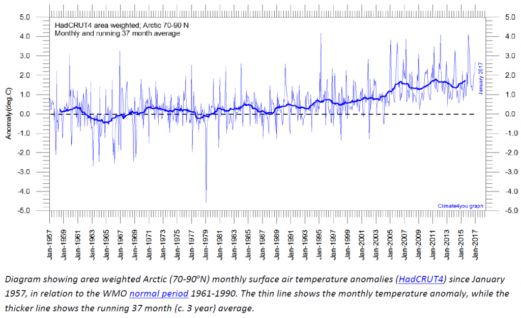
Fig. 1: Arctic temperature since 1957. Data: HadCRUT4, Chart: Climate4You.
Now let’s extend the time scale and look back 100 years. What a surprise: In the 1930s and 1940s there were two heat decades in the Arctic which were almost as warm as today (Fig. 2). This is just a small fact that went missing in the WMO press release and in the derwesten.de article.
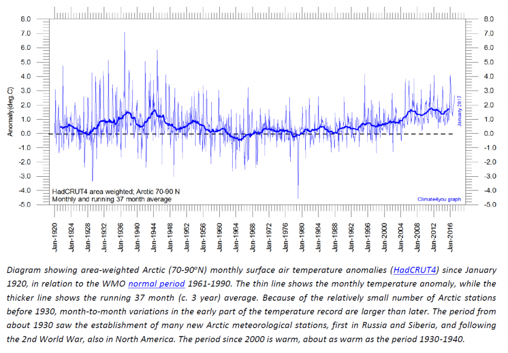
Fig. 2: Arctic temperature since 1920. Data: HadCRUT4, Chart: Climate4You.
The earlier Arctic heat years are impressive when we look at the temperature plot of the island city of Akureyri (Fig. 3):
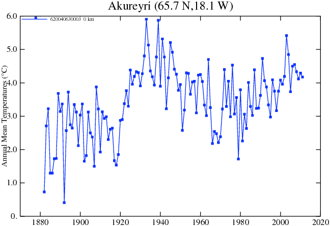
Fig. 3: Temperature plot of the Arctic location of Akureyri since 1880. Source: NASA/GISS.
Now what could have caused it to warm up in the 1930s and 1940s? Here it is enough to look back at the 60-year Atlantic Multidecadal Oscillation (AMO). This is easily done at the NOAA website (Fig. 4).
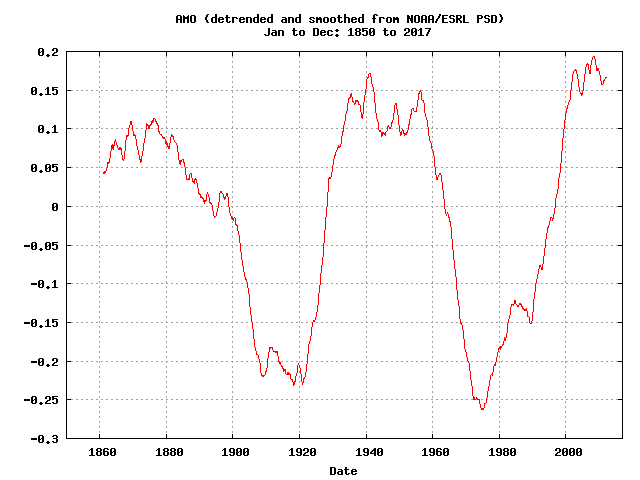
Figure 4: AMO
The curves at Wikipedia or elsewhere are perhaps more colorful, but they often don’t include the last years. The main drive behind the Arctic warming of the 1990s and 2000s was the simultaneously strong rise in the AMO.
The heat waves reported by the WMO happen to fit very well with the current high plateau of the AMO (Fig. 4). You don’t need to be a fortune teller to realistically estimate what remains ahead: the AMO plateau could continue for a few more years. A continued massive warming is not expected because the AMO peak has already been reached.
Eventually sometime in the coming years the drop in the AMO will begin. And correspondingly so will the Arctic temperatures . A look back at the climate history really pays off.
Winston Churchill long knew:
The further one looks back in the past, the further one sees into the future.
Some day the ladies and gentlemen at the news media will realize this. The art of fact-checking seems to have been left on the wayside since the invention of the copy-and-paste function.




I’m a bit lost. I’m told warm air rises and cold air sinks. So when warm air arrives over the ice sheet the bottom few millimetres of air cools. What happens next? The heat capacity of ice is rather more than that of air.
Just how does more warm air get down to the ice?
Reykjavik temperatures overlaid on the AMO.
https://s19.postimg.org/yavxs1i7n/amoreyk.jpg
7 Iceland temperature sites
https://s19.postimg.org/4q7819m2b/iceland_8.jpg
Greenland December temps
https://s19.postimg.org/r3eyo2n03/Greenland_DMI_ERA40.png
And going back a bit further
https://s19.postimg.org/ru7otupdf/Iceland_medieval.png
Its not Arctic, but here is the relationship between Swiss glaciers and the AMO.
https://s19.postimg.org/56sfnp9tf/swiss_glaciers.png
And just for interests sake.
https://s19.postimg.org/e337rn0fn/cape-town.gif
https://s19.postimg.org/cck6q5iwj/Texas_raw.png
https://s19.postimg.org/72f7yuynn/mt_baker.png
(might have to rotate and flip that last one. 😉 )
The noise in the 40s is much bigger. It is bad data. can you really not see it?
It just it not the same?!?
If it’s “bad data”, why do so many other temperature graphs of the Arctic and Arctic region agree with it? For example, here are 7 graphs of the Arctic/Arctic region that all show the 1920s-1940s were as warm or warmer than now. Are all of these “bad data” too? If so, what was the “correct” temperature for the Arctic during the 1920s-1940s relative to today?
https://notrickszone.com/wp-content/uploads/2017/04/Holocene-Cooling-Arctic-Hanhijarvi-13.jpg
https://notrickszone.com/wp-content/uploads/2017/01/Holocene-Cooling-Arctic-Air-Temperature-Yamanouchi-11-copy.jpg
https://notrickszone.com/wp-content/uploads/2017/04/Holocene-Cooling-Arctic-Atlantic-Hanhijarvi-2013.jpg
https://notrickszone.com/wp-content/uploads/2016/10/Holocene-Cooling-Greenland-Ice-Sheet-1840-2007-Box09-copy.jpg
https://notrickszone.com/wp-content/uploads/2016/12/Holocene-Cooling-Iceland-South-Chandler-16.jpg
https://notrickszone.com/wp-content/uploads/2017/04/Holocene-Cooling-Northern-Europe-Esper-14.jpg
https://notrickszone.com/wp-content/uploads/2016/12/Holocene-Cooling-Greenland-Southeast-Hasholt-16.jpg
“If it’s “bad data”, why do so many other temperature graphs of the Arctic and Arctic region agree with it?”
If you want to compare the two periods, you will need to do a statistical analysis.
And this will reveal that the periods are different, because the 40s are much more noisy (the data is worse than it is today). So the right statistical tool will show you, that the periods are different and that the modern warm is statistically significant, while the 40s high is not in the same way.
you can see it in the graph!
http://kaltesonne.de/wp-content/uploads/2017/04/seit1920-1024×711.png
So in other words, “bad” data is any result that doesn’t support one’s viewpoint.
“So in other words, “bad” data is any result that doesn’t support one’s viewpoint.”
no-. Read what i wrote:
“If you want to compare the two periods, you will need to do a statistical analysis.
And this will reveal that the periods are different, because the 40s are much more noisy (the data is worse than it is today)”
please do a real analysis!
Well, we can’t make the noisy “bad data” (the data you don’t like) change into something less noisy unless we decide to adjust the temperatures to fit our models. I assume that’s what you’d prefer, right? When the data don’t fit the modeled expectations, change the data.
“because the 40s are much more noisy”
Or the weather was much more “noisy”
That is a known fact
FACTS are never your friend, are they sob.
I assure you that in the 1940’s thermometers were read by people who were much more fastidious than many are now.
The readings back then almost certainly had less errors and noise than occurs nowadays.
Iceland especially were very finicky in the way temperatures were taken.
There is an absolute agreement is the basic shape of the data in basically EVERY unadjusted arctic temperature chart.
There is absolutely no reason to assume any more noise for anything after about 1920.
There can be NO DOUBT that the period around 1940 was similar or slightly warmer in temperature in the Arctic region compared to now.
REAL DATA PROVES THAT.
Furthermore, the trend leading up to the 1940’s was steeper than the trend from the bottom of the cold in mid-late 1970’s to now… DESPITE there being far less CO2
http://i734.photobucket.com/albums/ww350/infomgr/ArcticTempsvsCO2120yrspart2.jpg
You can also remove the noise by dropping the most noisy stations. The remaining signal can be declared significant because most of the variance seems to be disappeared as well. Perhaps, you wanted to say that the best data are from 1940.
Above latitude 66 we had 79 stations in 1939. In 1999 this number had become 43. If the latter were a random sample from the former, the noise about the signal should have been greater in 1999.
yes, this could have happened. Can you show evidence that it did happen?
“In the United States today, we have more than our share of nattering nabobs of negativism. They have formed their own 4-H club—the hopeless, hysterical hypochondriacs of history.”
Spiro T. Agnew
Seems sob and sed, the flower-pot men, have spread the manure far and wide.
“It is bad data.”
Only once Gavin and his data manipulative crew have been at it. !!
Sod, why do you deny every fact that does not fit your worldview? Why not accept this particular one, after all, it doesn’t necessarily totally disprove your AGW theory. Acting the way you do just makes you look stupid or like a spoilt little kid who goes off on a rant every time he doesn’t get his own way.
“The noise in the 40s is much bigger”
The noise around here is your constant meaningless yapping.
I doubt you were alive in 1940.. or your grandparents.
In Pierre’s second HadCrut graph…
What is the coldest year by far?
What year do the alarmist always start their sea ice charts?
Rather OT, except its about Akureyri getting it first kebab shop.
Don’t mind the occasional kebab. 😉
http://www.icenews.is/2017/03/31/aleppo-kebab-to-open-in-akureyri/#axzz4dIuT74Ny
Northern Atlantic Storm Shows How Natural Causes Affect Arctic Sea Ice
https://co2islife.wordpress.com/2017/04/01/northern-atlantic-storm-shows-how-natural-causes-affect-arctic-sea-ice/
Climate “Science” is Pseudo-Science; A Point-by-Point Proof
https://co2islife.wordpress.com/2017/04/05/climate-science-is-pseudo-science-a-point-by-point-proof/
Historical reports going back many years and other types of research (not direct temperature measurements) confirm ups and downs in Arctic warmth. It has all been discussed here on NTZ and elsewhere so I won’t try to summarize it.
Just because a person refuses to read about such things does not mean that warming and cooling did not happen.
In “climate scientists sound the alarm” —
… there should be ” ” enclosing the first 2 words.
[…] https://notrickszone.com/2017/04/04/the-wmos-dubious-omissions-arctic-of-the-1930s-and-1940s-just-as-… […]
[…] by Dr. Sebastian Lüning and Prof. Fritz Vahrenholt [German text translated/edited by P Gosselin] , April 1, 2017 […]
“Some day the ladies and gentlemen at the news media will realize this.”
You sure about that?
hi Rah.. 🙂
Busy weekend.
http://www.steamfest.com.au/trains/
You guys can look after the flower-pot boys, seb and sob for a couple of days.
Me, I’ll be breathing in the older days of REAL steam and coal power. The days that BUILT all the civilised nations on this glorious CARBON based planet of ours. 🙂
[…] Diatom and pollen studies have previously been published from this core. Arctic Warming Unalarming. A Light In Siberia. The Calculations Behind “A Light in Siberia” NOT A LOT OF PEOPLE KNOW THAT. Bipolar disorder – as in the Arctic, the Antarctic sea ice extent is affected by wind, unless of course it’s ‘climate change’ Remember the Arctic cyclone that busted up sea ice in 2012? It seems such storms are more common than previously thought. Study: Landmass shape affects extent of Arctic sea ice. Polar Vortex Blamed On Global Warming And Global Cooling. Cache of historical Arctic sea ice maps discovered. Arctic Ice: An Update – Evidence From the Past is Instructive. Why the Arctic did not have record-low sea ice this winter – Principia Scientific International. Arctic Ice Thickness Measured From Buoys. The WMO’s Dubious Omissions…Arctic Of The 1930s And 1940s Just As Warm As Today! […]