By Prof. Fritz Vahrenholt
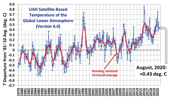
The global mean temperature of the satellite-based measurements remained almost unchanged in August compared to July. The deviation from the 30-year average (1981 to 2010) was 0.43 degrees Celsius.

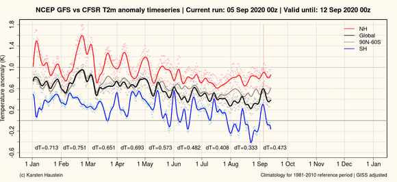
Temperature measurements on land and in the sea continue to decrease, as the graph of the JRC analysis shows, especially in the southern hemisphere (blue).

Approaching La Nina
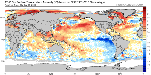
The research institutes predict with high probability a La Nina in the Pacific Ocean next winter. Therefore, a further decrease in global temperatures is expected until next spring. The following diagram shows the incipient cooling effect in the Pacific.


I have a feeling this La Niña will be big
The map projection used stretches (exaggerates) the high latitudes.
Note how large Greenland appears.
Go here: Bored Panda explains size
The red areas are actually much smaller than this illusion suggests.
Thanks, but we learned about the illusions of map projections when we were in primary school.
Prof. Fritz Vahrenholt,
You need to define your acronyms in blog postings. What does JRC mean? Possibly “Joint Research Centre”?
Please also provide a link to the source of the NCEP GFS vs CFSR graph.
The black global line shows the recent temperatures are the same as in early June, so I would call that “continue to decrease”. HadCRUT4.6 shows global temperature anomalies June 0.68, July 0.69 C.