Blogger Zoe Phin was curious about global snowfall trend in our era of “extreme global warming”. The results of a comprehensive analysis provide a surprise.
To find out what the global snowfall trend has been, the hotshot data analyst diligently downloaded all available monthly NASA images from 1980 to 2020 (inclusive), such as the one shown below, and then converted the pixel colors back to data using the provided scale.

Image source: Zoe Phin.
It seems NASA does not make this data directly available, or at least makes it almost impossible to find, and so for Zoe it was the only way for her to extract the dataset.
“As far as I know, you will not see this anywhere else,” she notes at her site.
Global snowfall rises 3% since 1980
After crunching all the data, here’s the global snowfall trend that emerges:
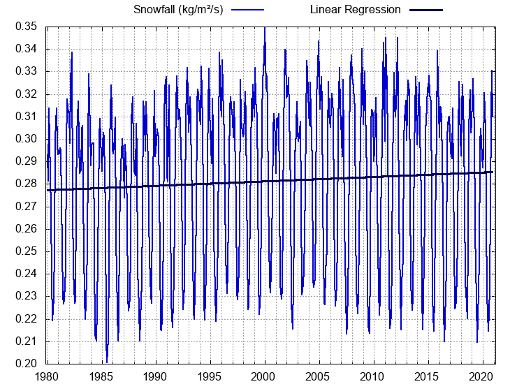
Snowfall in decigrams/m2/s. Chart: Zoe Phin
Lo and behold, “snowfall has increased by nearly 3 percent over the last four decades,” she concludes. Globally it went from 0.2773 to 0.2854 decigrams/m2/s, which is +2.90% more.
More snow in the south, less in the north
Zoe also broke it down into the northern and southern hemispheres. First we look at the northern hemisphere:

Global snowfall in decigrams/m2/s. Chart: Zoe Phin.
Over the Northern Hemisphere, where most of the Earth’s land mass and population are located, snowfall has declined by more than 9 percent, from 0.2722 to 0.2468 decigrams/m2/s.
Next Zoe looks at the Southern Hemisphere:

Southern Hemisphere Snowfall in decigrams/m2/s. Chart: Zoe Phin.
Here over the past 40 years snowfall has indeed grown from 0.6257 to 0.7057 decigrams/m2/s, or +12.77%. This trend, like many, is not global.
It just goes to show that when it comes to the chaotic system of climate, things are never simple and researchers get surprised almost daily.
You can generate your own charts using data archived here.



Oopsy. I meant centigram, not decigram.
+3 percent doesn’t seem like much of a trend.
How does that compare with the likely margin of error in the measurements?
Also, Rutgers University Snow Lab presents snow extent data, by season, since 1966. My eyeballs suggest not much of any trend since 1966.
Why start at 1980 ?
And how do these data compare with Rutgers snow extent data?
https://climate.rutgers.edu/snowcover/table_area.php?ui_set=1&ui_sort=0
Rutgers only does the Northern Hemisphere.
Can you find anyone that shows a global trend?
Me neither.
This MERRA2 data only goes back to 1980.
Margin of eror is plus or minus. As long as the same margin of error persists through time, we can get useful info out.
Thanks for the response.
I know Rutgers only presents Northern Hemisphere snow data.
But one of your charts does show only the Northern Hemisphere.
Would it be of any interest to compare the two?
The link I provided has Rutgers data by month, that includes the same years on your chart. I’d add them up and compare with your numbers for the N.H. but it would take me two weeks and I’d get the wrong total (very bad vision). Just thought you would be interested in a comparison of the two different sources of data.
But it’s much warmer snow, isn’t it?
RoHa 6
After we stop burning fossil fuels, there will be less air pollution, and the snow will be a brighter white. People will also sit around campfires cooking their meals, and singing Kumbaya, every time there is a blackout, which will be a lot more common with renewables. The government will supply all people with candles, which are romantic, and LED flashlights, which are very efficient.
I am a professional futurist, climate astrologer, and executive bathroom attendant. My climate prediction in 1997 has been 100% correct for the past 24 years: “The climate will get warmer, unless it gets cooler”. … Sorry, I think of the “no more snow” predictions, and I can’t take this subject seriously.
In the past, water froze at a much lower temperature than it does today. This has been conclusively demonstrated by homogenization of the data.
(Okay, okay – sarc off)
Chapeau, that’s a lot of work. In the electronic+internet age nothing can be hidden by not publishing the data.
Sorry, but you can’t count pixels on a Mercator (or similar) flat map projection. Such projections hugely expand the poles – where lines of longitude converge. Good luck with the research, but you need to find a way of counting pixels on a spherical surface!
Not Mercator. Each pixel is a degree of lat/lon. Obviously the area covered by latitude degree near equator is larger than towards poles. I account for this – see code. I use an area calculation technique that is accurate within 0.002%.
Thanks for that – it’s good to hear.
[…] P. Gosselin, May 5, 2021 in […]
I’m disappointed with describing Ms. Phin as just a “blogger”.
I’a blogger, since 2008, with three blogs.
Phin’s work is real, original science.
Based on real data.
Not a computer model imagining something.
Ms. Phin is a better climate scientist than many people who are called
climate scientists, such as Michael Mann. “Blogger” does not seem like an appropriate description.
Thank you very much.
The original post has been superceded by http://phzoe.com/2021/05/07/snow-in-the-era-of-global-warming/, thanks to a comment from JaKo in original post.
It’s Mrs., not Ms. 😉
Happily married ~9 years.
It used to be Mrs. or Miss. But today Miz (Ms.) is used for both married or unmarried – at least in Europe.
Congratulations on being married 9 years! I’m married 32 years…and on the way to being so for eternity.
40 years for me.
Told a married person joke to the wife today, while wearing a steel helmet, just in case my timing was not right. Most friends are divorced, or single, and wouldn’t enjoy it. I just had to share it:
“I love being married. It’s so great to find that one special person you want to annoy for the rest of your life.”
By the way, climate change also causes divorce.
More important:
I read about 12 science and energy websites every day — US, Canada, England, Germany and Australia — and this week, I’m sure No Tricks Zone was the best of all !
I don’t think “blogger” is sobad. She’s a very good one.
How about “Science Blogger”?
[…] Surprising Results: Global Snowfall Rate Increases 3% Over The Past 40 Years […]