By Ed Caryl
In attempting to keep A Light in Siberia as short as possible, the how and why of some points were not included. This led to some comments calling into doubt some of the results. I would like to clarify some of those points.
The choice of baseline period for the surface temperature anomaly map
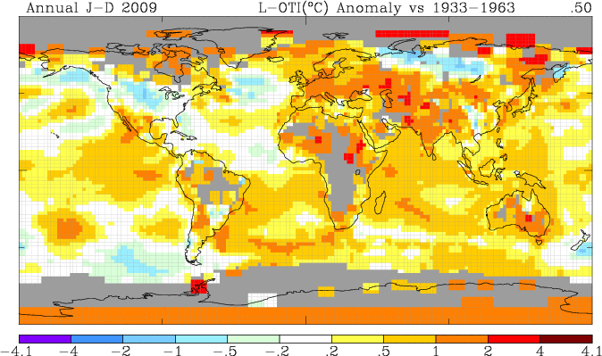
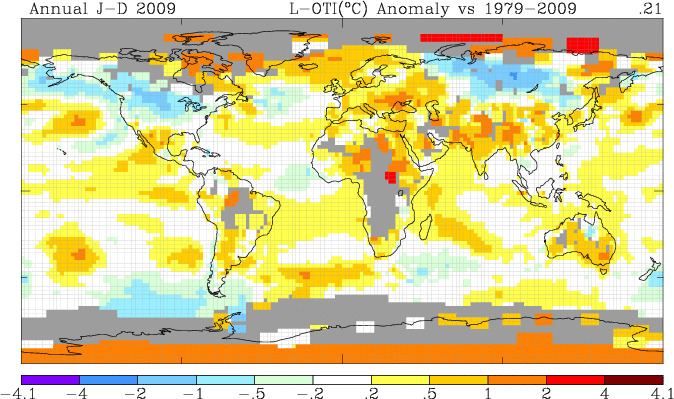
The 1933 to 1963 baseline for the surface temperature anomaly map was chosen for two major reasons. First, that period includes the peak of the last warm period before the present one. Second, that period was before most of the UHI warming took place for the arctic stations studied, making them show up on the map as red or orange grid-squares. The Arctic and Antarctic stations are highlighted. If you choose the modern warm period, 1979 to 2009, the baseline period includes much of the UHI warming, and the anomalies are much less pronounced.
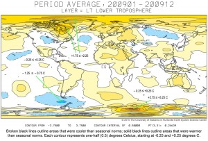
The satellite temperature map shows the arctic warming
Yes, it sure does. The reason is that the bottom of the AMO cycle was just prior to the beginning of the satellite measurements (1979). The arctic has been warming since then. If the satellites had been first launched in 1940 it would be a different picture. In 2050 it will be a different picture. These cycles are 70 years long, the biblical “three-score and ten”. Our main problems with studying climate are that we don’t live long enough to remember more than part of one cycle, and the satellite era has only been 31 years.
The selection criteria for “Urban” versus “Isolated”
“Urban” – Next to or in a town or research station with growth, or change in population over time, or change in heat generated over time.
“Isolated” – A location with no significant population or heat generator changes over time, a stable unchanging environment. An isolated location is one that never had more than one or two buildings, and with always the same size staff, and no adjacent town.
Remember, in the Arctic, in the winter, the environment around all these locations is very cold, bleak, desolate, and unpopulated. A steam-heated town or research station will stand out in the infrared like a bonfire in a desert.
The averaging of station data
The stations discussed all have data over different time periods, and have average temperatures that are different. Some have gaps in the data. How can these be averaged without distortion?
The data was downloaded from GISS as text files. These were dropped into Excel spreadsheets, and converted into column-delimited files. The monthly data was discarded, as the annual average has already been computed by GISS and is the rightmost column. Data gaps in GISS files are marked by the entries 999.9. These cells were cleared.
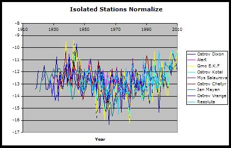
After putting all the stations into one spreadsheet with the total year span in the leftmost column, and each station with its own column, aligned with the correct years, each station column was averaged using the SUM of the column divided by the COUNT of the cells in each column with data. Then the average of all the columns was computed. This number is then the average of all the temperatures in all the stations over the whole time period. Call that the “table” average.
The next step was to “normalize” the data for each station by subtracting the “table” average from each column average. This results in a normalization factor for each column. That normalization factor was then subtracted from each value in that column. The normalization factor will be different for each station.
The rest is the data for all the stations now plot right over each other, in a narrow range, and now can be averaged across the rows in the same manner as the columns were averaged, using SUM divided by the COUNT for each row. Those adjacent years with many stations reporting data get a somewhat smoother plot than those years that have only one or two stations with data, but there is no distortion in the average from some stations being much warmer or cooler than the others.
The R2 question
R-squared value definition:
The R-squared value, also known as the coefficient of determination, is an indicator that ranges in value from 0 to 1 and reveals how closely the estimated values for the trendline correspond to your actual data. A trendline is most reliable when its R-squared value is at or near 1.
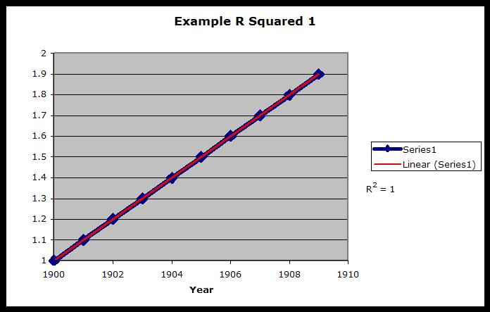
The above definition is cut and pasted unedited from the Excel Help files. What it means is that if the data and the trend-line coincide, as above, (if the data plotted is a straight line and the trend is coincident) then the R2 value would be 1.
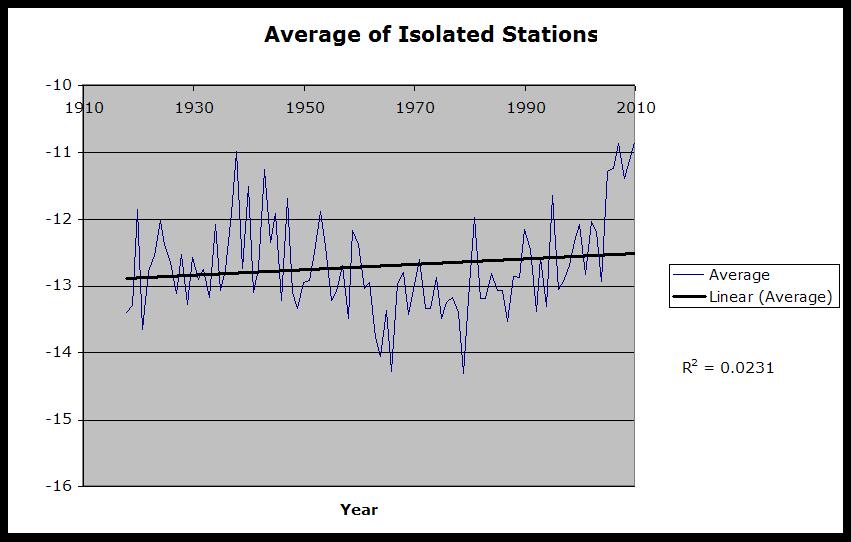
Our very noisy data, with the AMO sine-wave-like curve superimposed, has a trend line with an extremely low R2 value, because it has a very low correspondence to the data. The trend has very little statistical significance, thus little or no warming is indicated.





Ed, good work on these posts. One would have to think that in the arctic local UHI effects would cause a larger anomaly than warmer locations.
OT, I got a 502 Error when I tried to visit WUWT and Climate Audit tonight, has anybody heard anything?
[…] then he normalized the plots and generated an average. He explains how here, scroll down to “The averaging of station data”. The resulting plot with a linear […]
Arctic Sea Ice growth: 1.000 Manhattans per day.
Shortest thaw season on record.
http://stevengoddard.wordpress.com/2010/09/26/1000-manhattans-per-day/