Guest writer Ed Caryl recently looked at 9 “rural” stations scattered over the Arctic: from Alaska, to Canada, to Northern Europe western Russia and Siberia, and found Arctic temperatures follow the AMO, and not CO2. Read here A Light In Siberia. It’s important to note that the 9 stations were selected because they appeared to be NOT influenced by man-made heat sources.
First, here’s the AMO going back more than 150+ years. The cycles are clear to see.

Atlantic Multidecadal Oscillation (AMO). Source: http://www.appinsys.com/globalwarming/SixtyYearCycle.htm

North Pole, 17 March 1959. Image from NAVSOURCE
The AMO shows warm periods centering at about 1880, 1940 and 2005, i.e., 60 year cycle. We recall seeing photos of submarines surfacing at the North Pole back in the 1950s, see photo left, meaning it was relatively balmy back then too, as the AMO chart suggests.
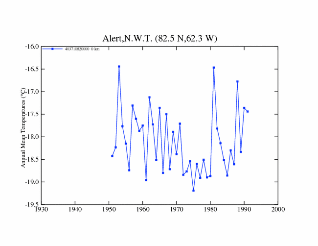
Well how do the temperature curves of Ed’s 9 untainted Arctic stations match up with the AMO? The following are the GISS graphs of these 9 stations, each shown individually. Take a look at each of them:


What happens from 1940 – 1980, a time when CO2 was increasing? What happens after 1980? How do these charts match up with the above AMO chart? Fit pretty well? It seems so.
Some of the temperature records shown above are shorter and some are longer. But they all show that temperatures between 1940 and 1980 were dropping. Remember that the Arctic is called the canary in the coal mine. When the globe cools or warms, you really see it in the Arctic, so they say.
Next Ed Caryl plotted each of the above graphs on a single chart. Ed calls these “rural” stations isolated because they are not impacted by man-made heat sources like asphalt, light bulbs, etc:

Plot of the 9 "rural" (isolated) stations.
And then he normalized the plots and generated an average. He explains how here, scroll down to “The averaging of station data”. The resulting plot with a linear trend line is shown as follows:

Average of the "rural" stations
Sure some hot-shot statisticians out there are going to say you can’t do this, or that, or whatever blah blah blah…but that’s just nitpicking. Attention to tiny detail is a later thing.
Ed’s method suffices for now to generate a good general picture. If the math hotshots out there want to do it with micrometers, no one is stopping them. I doubt the general picture is going to change that much, though.
If you look at the 9 individual plots above and imagine how a composite of all 9 would look like, it would look like Ed’s chart – common sense.
Doesn’t the shape of above curve look eerily similar to the shape of the AMO from 1920 to today? Ed thought so too, and so he superimposed the average of the 9 isolated stations and the AMO:

Gee, do you think Arctic temperatures correlate better with CO2?
Of course this is only a preliminary analysis that examined only 9 isolated stations scattered over the entire Arctic perimeter. But I suspect that if all stations were thrown in, except the crappy ones equipped with light bulbs and of that sort, you’d end up with similar results.
Could the AMO possibly drive climate? Well, the latest paper authored by Phil Jones and others seem to be hinting at this. Read my post from yesterday https://notrickszone.com/2010/09/24/der-spiegel-the-oceans-influence-greater-than-thought/.
Obvious conclusion: Trace gas Co2 drives the Arctic climate about as much as a sea breeze drives a loaded freight train.


Verity Jones and Tony Brown found the same pattern in stations scattered all over the world.
http://diggingintheclay.wordpress.com/2010/09/01/in-search-of-cooling-trends/
There is little doubt it is real. The next task is figure out what drives it.
Indeed common sense.
“Trace gas Co2 drives the Arctic climate about as much as a sea breeze drives a loaded freight train”.
Don’t you love it?
All ocean space is capable to drive the climate, and the graphic AMO-and-Isolated-Stations indicate close correlation with the naval activities during the two World Wars, which is investigated in two books, available at:
__WWI http://www.arctic-heats-up.com/
__WWII http://climate-ocean.com/ in German: http://www.seatraining.de/
and more recent papers at: http://www.oceanclimate.de/
Ed, I had a previous post where various of my meanderings led me to a sailing blog mentioning a visit to Prins Christiansund weather station in Greenland – the weather station operators were quoted as believing Arctic warming is cyclical.
http://diggingintheclay.wordpress.com/2010/06/26/they-believe-it-is-cyclical/
A bit more digging readily found other information including a great analysis by Alan Cheetham at Appinsys who has also linked warmong in Greenland to that AMO
How many times do we hear, MM e of CO2 = AGW = less Arctic sea ice, polar bears in trouble……….. blah, blah.
Well the above article pretty much kicks the CO2 malarkey football, into the streets outside the stadium.
Thank you Ed and PG.
Please look at my objection to Ed Caryl’s categorization of Resolute Bay as “rural” and Eureka as “urban”, posted in that thread, I think he has them backwards.
You use Resolute in this article. Note as well that its temperature grap seems much more sharply going upward after 1990 than most in Caryl’s analysis. (Of course the shorter the time span the more risky it is to try to determine a trend, due to the wide variation in the data – often more than the total of decades of a perceived trend, and the higher possibility of a regional trend which probably is a shorter cycle than of a whole huge area like the Arctic.
PS: Interesting that the Arctic was warmer in the 1950s, as that was well into the claimed trend of global cooling from the 1930s to circa 1980.
[…] Cyclical warming and cooling periods show up in many individual data sets (for example here and here) with the possible influence of the PDO and AMO. This being the case, more than 60 years of data […]
Your USS Skate photo is not from March 17, 1959. The actual photos from the North Pole can be found at http://www.science20.com/chatter_box/arctic_ice_october_2010
These are from the Commander’s (James Calvert) book “Surface at the Pole”.
On March 17, 1959 the sun had not yet risen from the 6 months of winter night (the Vernal Equinox was March 21). The photo you’re using is best listed as date and location unknown. We just know it’s not from the North Pole. Judging by Commander Calvert’s book – it can’t be anywhere near the North Pole – he said they never saw open water until 4 days *after* they broke the surface at the pole; and that was a two-foot diameter hole. By that time they were only 100 miles from the New Siberian Islands. So it had to be sometime afterwards that the photo was taken.