In my last post I summarized the results of Ed Caryl’s analyses of stations far up in the Arctic, where temperature trends appear to follow the 60-year AMO cycle, and do not correlate at all with CO2.
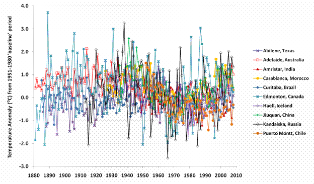
Now I’ve been made aware that temperatures following the AMO are not exclusive to the Arctic. Blogsite digging in the clay has plotted temperatures from other cities located about the globe and came up with the same AMO sine wave trend, see below:
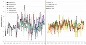
And what follows are more plots from Iceland, Norway and Russia on the left, and from USA on the right (Sorry about the poor quality. Better quality graphics can be seen at diggingintheclay here). Again the AMO wave appears there as well. Moreover, the 1930s and 40s in USA even look a bit warmer than today’s temps.
So poor little trace-gas CO2 just doesn’t get no respect, no matter where it goes. Every corner of the globe is ignoring this pip-squeak, climate-driver wannabe. CO2 is fading from the picture.
If the temperature has followed the AMO sine trend over the last 150 years, then why do we keep seeing hockey blades (nowadays without the stick-part) showing temperatures straight-lining up over the last 100 years or so?
Probably because GISS and others have changed historical data to make them fit their ideologized models – as unbelievable as it may sound. Steve Goddard’s site here explains how GISS has precisely done this with US temperatures by going back and flattening the graph.
The above comparator is from: Steve Goddard’s site. His post is short, but a very worthwhile read.
Before 2000, GISS showed a warmer 1930s and cooler current period. The AMO wave is clear to see. But today, after having fiddled with the data, GISS now shows a cooler 1930s, a warmer present day and a somewhat straighter line that tries to cloak the AMO effect.
Now you really know why they call it “man-made global warming”.


I’ve been looking at long temperature records in an attempt to tease out the driver behind the ocean cycles and land temperatures. ( I’ll ignore any snide comments from the “intelligencia”) the Central England record is one of the longest. The only problem is that they spoiled it with an “UWI adjustment” since 1978, to produce a hockey blade, of course. I guess the thinking is, “If CO2 won’t do it, we’ll fudge the figures.”
Hi Ed
I am one of the authors of the ‘cooling trends’ post P Gosselin
grefers to here.I maintain a record of long temperature instrumental records on my web site here. In addition there are a variety of articles by myself and others exploring some of the detail behind the headline temperatures shown.
http://climatereason.com/LittleIceAgeThermometers/
I am currently working on a CET article-with particular emphasis on the 1698 to 1730 period when it was as if the LIA was sudddenly turned off and temperatures recovered to something approaching modern levels.
If you would like to contact me direct my address is within the site. By the way I have also been working with someone else who has come up with an interesting Electro magnetic rationale behind the driver. I could let you have a couple of his items if you are interwsted.
Tonyb
Joe D’Aleo’s graph of PDO+AMO vs USHCNv2 just about knocked me out of the chair when I saw it:
http://www.appinsys.com/GlobalWarming/PDO_AMO_files/image008.gif
An r^2 of 0.85 doesn’t leave much room for CO2 based variance.