By Ed Caryl
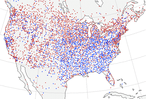
In the BEST paper Influence of Urban Heating on the Global Temperature Land Average Using Rural Sites Identified from MODIS Classifications. Red dots are warming trend sites and blue are cooling trend sites. This article will show that Dr. Richard Muller did not go far enough in looking at that influence, and failed to account for winter temperatures as one moves further north.
Figure 1. This is Figure 4 from the BEST paper.
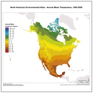
Figure 2. This is the Annual Mean temperature in North America. Source
Most of the temperature measuring sites examined by Dr. Richard Muller et al are in the U. S. In the paper cited above, they determined that 33% of the sites were cooling, and found a Gaussian distribution (Figure 3 below) in the heating and cooling that they blamed on measurement error. This seems odd, because the cooling sites shown on the map above do not have a random distribution, as they would if the Gaussian distribution was due to random error. Many are concentrated in the southeast quadrant of the U. S. It is very obvious that the red dot concentration around urban areas is due to Urban Heat Island (UHI) effect. But what is causing the blue, cooling effect in the southeast? Figure 2 is another map, the annual mean temperature in North America from 1950 to 2000. Note that the cooling area in Figure 1 is the warm area in Figure 2. Dr. Muller offered no explanation for the cooling in Figure 1.
Figure 3. From the BEST paper cited above showing the Gaussian trend distribution.
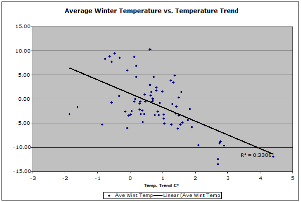
This author downloaded data from 71 sites with long, continuous, records (at least 1930 to 2000) scattered across the U.S. and Canada, concentrating on the cooling region and the areas north and west of it. Each location was (if possible) examined at Anthony Watts’ SurfaceStations.org web site, for metadata, especially the distance from the thermometer to the closest heated building. The populations of the surrounding areas were obtained from Wikipedia. The December, January, and February (winter) temperatures were downloaded from GISS, and the temperature trends from 1934 to 2000 were calculated for each site, as well as the average winter temperatures. Figure 4 is a plot of the average winter temperature versus the winter temperature trend for 71 locations.
Figure 4. This is the average winter temperature for 71 sites versus the warming or cooling trend over the period from 1934 to 2000. The average winter temperature was calculated over the period from 1930 to 1980.
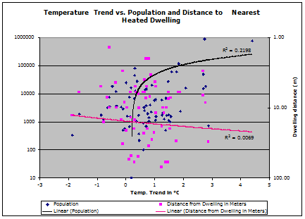
The warming trend is obvious for locations with cold winters. The extreme example is Edmonton, Alberta, Canada, with 4.4 degrees C warming, with an average winter temperature of –11.9° C. The warming is, of course due to UHI. Edmonton grew from about 80,000 people in 1931 to 666,000 in 2001. The cold winter temperatures exaggerate the UHI effect. Figure 5 is a plot of warming versus current population.
Figure 5. This is a combined plot of the winter temperature trend (1934 to 2000) versus population (blue) and the distance from the thermometer to the nearest heated building, usually a residence (pink).
It seemed clear to this author before this study was begun, that a heated building close to the thermometer might skew the readings in a warm direction, and that this could be detected with a large sample. Figure 5 shows this is not generally true. The large surrounding population makes a large warming effect. This is exaggerated in the winter due to the difference between inside and outside temperatures causing more heat lost to the outside. This is not noticeable for single structures close by. The numbers were tortured until they confessed; there is little warming due to one farmer’s house 3 meters away, but several thousand homes in the immediate area produces a “heat bubble” that makes a difference. Heat going up chimneys far outweighs heat escaping from walls.
There are exceptions, of course. Figure 6 shows one notable one.
Figure 6. This is the weather station at Grand Forks, North Dakota. It is located at the NOAA/NWS Eastern North Dakota Weather Forecast Office. The Cotton Region Shelter (CRS) is located about 3 meters in front of the vent on the office heating/cooling plant. The Photo is from SurfaceStations.org.
The winter temperature trend at the Grand Forks NWS office is 2.9° C warming, about 1.5° C above what the population alone would account for. Another exception is the site at Albert Lea, Minnesota. (Figure 7.) The winter warming at Albert Lea is about 2.5°C over what the population would cause.
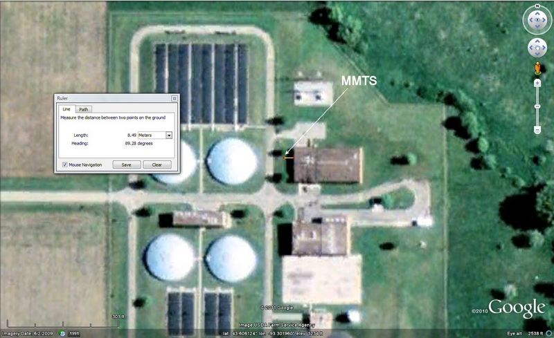
Figure 7. This is the water treatment plant at Albert Lea, MN. Buildings, water tanks, and waste-treatment ponds surround the MMTS. The Photo is from SurfaceStations.org.
These exceptions, and other locations like them, along with cities with large and growing populations, account for the red dots in figure one. The blue dots represent what the climate is really doing… cooling. The measured cooling does not extend into the cooler north and west because UHI warms these areas more than the south. UHI is exaggerated by the colder winters.
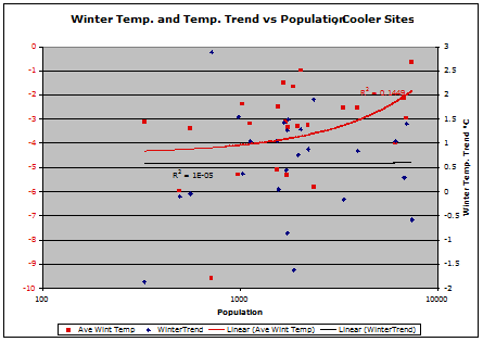
Is UHI a problem with rural sites with smaller populations, under 10,000? From the site collection, 50 sites with populations below 10,000 were sorted. These were in turn sorted into two groups by winter average temperatures. Figure 8 is the cooler group, Figure 9 the warmer.
Figure 8. These are plots of Winter Temperature and Temperature Trend versus Population at 25 sites with winter temperatures between 0°C and –10°C.
Figure 9. These are plots of Winter Temperature and Temperature Trend versus population at 25 sites with winter temperatures between 0°C and 10 °C.
Both Figures 8 and 9 show no change in temperature trend from 1934 to 2000 due to population. The average winter warming in both groups from 1934 to 2000 is about 0.5°C. But, there is significant winter temperature difference in both groups due to population. For locations with populations over 1000, winters are warmer, not getting warmer, but warmer all along. Why? These are all small towns and villages. They have been growing slowly, if at all, since the thermometers were installed. Population growth has been paced by improvements in heating system and insulation efficiency. But size is important. The absolute temperature in the winter is also important. BEST (and GISS) should recognize the need to reduce their rural population limit to 1000. Just looking for lights in the vicinity by satellite isn’t good enough. They must actually research the population and the location metadata. For locations with winters with average temperatures below freezing, special care should be taken to avoid close-by heat sources. It may be handy to locate a MMTS at the local water treatment plant, but it isn’t a good idea when measuring temperature.
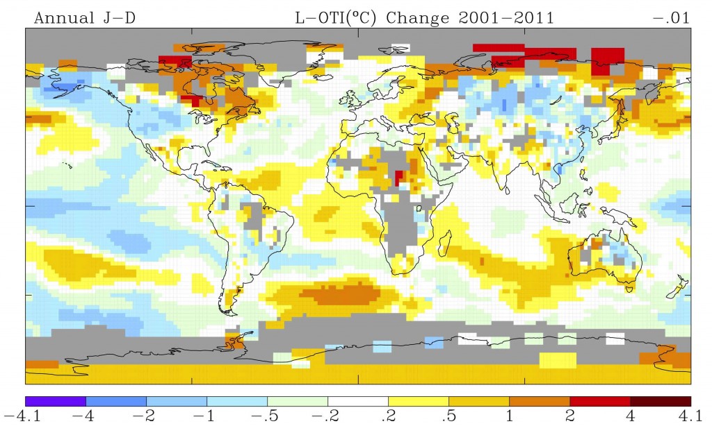
What happened in the last decade? For a global view, GISS has a trend mapping application on their site. This was set to map the trend from 2001 to the end of 2011. Figure 10 shows the result.
Figure 10. The GISS map of annual (January to December) temperature trend (change) from 2001 to 2011. The –0.01 in the top right corner is the global trend figure, 0.01°C cooling. Source.
In Figure 10, the red grids showing 2°C to 4°C warming represent about 10 measuring sites, most on the Siberian Arctic coast. Those are warming because the wind is moving the ice away from the Siberian coast. Compare Figure 10 with Figure 1. Many red dots in figure 1 fall in the cooling area in Figure 10 above, the opposite of what the BEST paper shows. Those sites may have been warming over the period BEST used, but they are cooling now.
Note that in Figure 10, the continents appear to be cooling, with only land stations on the Arctic coast showing warming. The Pacific Ocean and the North Atlantic are mostly cooling. They will cool further as the continents continue cooling. We are now ten years into the next cycle in the regular 60 to 70 year warming and cooling cycles, and at the
end of a 200 year cycle that the earth has been experiencing since the Dalton Minimum (1790 to 1830). If the sun is indeed going into another Grand Minimum, similar to the Dalton or Maunder Minimums, and it looks like it will be most like the latter, the cooling may be very deep, and last for 40 or 50 years.
The USDA just released a plant hardiness zone map, moving the growing season northward by about one zone compared to the previous map. They may want to rethink that move. Last winter in southern New Mexico and west Texas the cold killed many Mexican palms trees, and other tropical plants, that had survived up to 100 years of previous winters. Thermometers may be made to lie, but plants can’t be fooled.
Conclusion
In the BEST paper, Dr. Muller failed to notice the change in UHI effect in northern stations, and thus missed the fact that cooling is really taking place in the continental U. S. as for myself, I wonder how cold it will be before Berkeley Earth discovers the cooling.







“The USDA just released a plant hardiness zone map, moving the growing season northward by about one zone compared to the previous map. They may want to rethink that move.”
I saw a report about that, I think on BBC. Farmers who take that as their guide will be wiped out, IMHO.