What follows is a modestly abbreviated version in English. The first part is the brief solar activity report, and the second part is about IPCC model failure.
==========================================
The Sun in September 2014. Attention: X-Flares!
(Translated/edited by P Gosselin)The sun in September was considerably more active than in the previous months. The sunspot number was 87.6, which was 89% of what is typical in the 70th month into a cycle. The current solar cycle 24 (SC 24) began in December 2008. Figure 1 shows the current cycle compared to the mean of SC 1-23, and solar cycle no. 1:
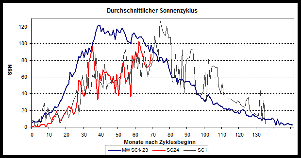
Fig. 1: The current SC 24 is shown in red, the mean of the previous 23 cycles is depicted by the blue curve, and the current cycle SC 24 strongly resembles SC 1, which is shown by the black curve.
The current cycle resembles SC 1, and should it continue to behave like SC 1, a trailing off of activity cannot be anticipated anytime soon. Indications, however, do point to a longer than normal cycle. Japanese researcher Hiroko Miyahara and his team examined this in 2013 (Influence of the Schwabe/Hale solar cycles on climate change during the Maunder Minimum). They were able to show that the length of the solar cycle correlates with solar activity. “The mean length of the Schwabe cycle during the Maunder Minimum was approx. 14 years, and during the Medieval Warm Period the average cycle length was only about 9 years.”
The sun today is relatively active, though slightly below normal. On September 10 there was an X 1.6 – flare, a a high category explosion on the sun. Flare are designated as follows: C for common, M for medium, and X for strong. See the following image, Figure 2:
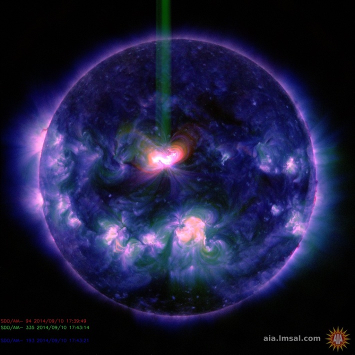
Figure. 2: X-flare on 10 September 2014. Source: solarham.net.
With such powerful explosions, material gets ejected from the sun, what is known as a Coronal Mass Ejection (CME). When such plasma strikes the earth’s atmosphere, it leads to polar lights and other effects. The strength of X 1.6 was too weak to have any massive impact on the earth’s atmosphere and magnetic field.
Models fail to project temperature
Now let’s take a detailed look at the warming scenarios of the earth’s surface temperature, this time taking local particularities into account:
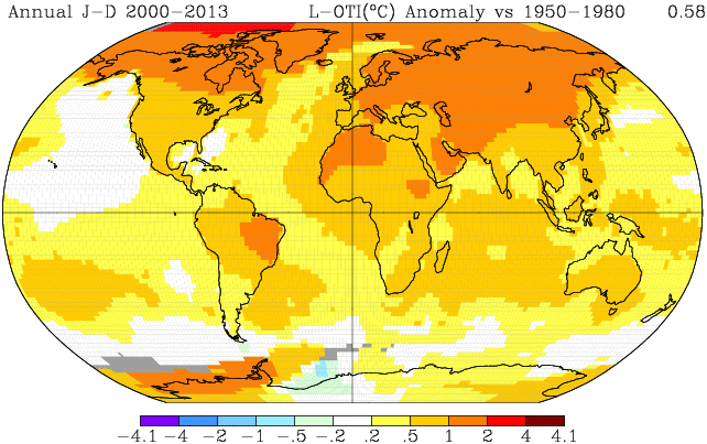
Fig. 3: The mean surface temperature since 2000 compared to the period of 1950-1980, Source: GISS
Most of the warming took place in the northern extra-tropics at latitudes between 25°N and 90°N. This is consistent with the expectations one would have with the effects of greenhouse gases. However, let’s take a look at the temperature series of the northern hemisphere extra-tropic region. Here we also see a “pause” since about the year 2000.
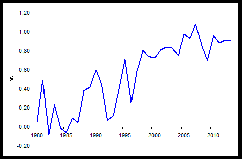
Figure. 4: The temperature curve of the northern extra-tropics as to GISS.
Indeed the trend from 1983 to 2013 differs significantly (0.33 +/- 0.06 °C/decade) from the 2000 to 2013 period (0.09 +/- 0.14°C/decade), which is no longer a significant warming. This hefty deceleration has occurred even though greenhouse gas emissions continued to rise linearly unabated. We reported multiple times on what the reasons could be for thi.
How do models handle the problem of the asymmetry in warming that we observe between both hemispheres? A recent paper from 2013 by 4 authors of the universities of Berkeley and Washington led by Andrew R. Friedman examined the difference between the northern hemisphere (NH) and the southern hemisphere (SH), named ITA, and summarized what the newest models anticipated for temperature:
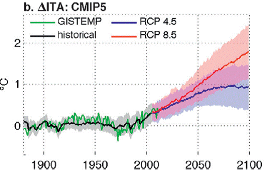
Fig. 5: The temperature difference between the NH and SH determined with the CMIP5 models. Source: Figure 2 of the just mentioned paper.
The text of the paper describes: With today’s emissions scenario (close to the IPCC scenario named RCP8.5) there is a highly linear rise of 0.17°K/decade (Point 3, “future projections“ of the aforementioned paper).
But let’s do a reality check and compare it to the actual surface observations since 1900:
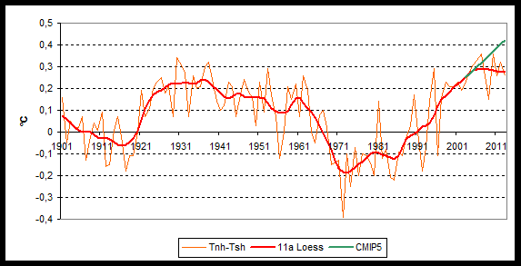
Fig. 6: ITA as GISS since 1900, (Data: GISS), Model (thick green curve).
The 1982-2013 period is indeed at 0.165+/-0.04°C/decade, but it has become significantly less. The 1998-2013 period shows a trend of only 0.055+/-0.067°C/decade – not rising significantly – and is barely 30% of what was registered since 1982. No one here can claim that the trend is “highly linear”.
The cause? One cause is offered up by the 2013 paper: The drop in the late 1960s was not replicated by the models and was likely caused by internal variability, very likely by the AMOC (see Fig. 8b of the paper), the authors maintain.
Also the steep rise after 1915 would be due to variability 1915 … and at least for a part of the rise beginning in 1985 – as we have often maintained at this blog.
So it remains: Reproducing internal variability has not been adequately possible by models up to now. The dependency of temperatures on the forcing by greenhouse gases is stronger in models than what it is in reality. The models overblow the anthropogenic impact and thus yield exaggerated prognoses for the future.




The models are indeed a sick joke when it comes to climate forecasting. But they have been ‘useful’, albeit inanimate, ‘idiots’ in supporting the intimidation which has been such a feature of climate alarm campaigning during recent decades.
Pardon my ignorance but I assumed all the models used by the IPCC etc. use a positive function based on the CO2 level to forecast (sorry to project) the temperature, and negative factor for volcanic activity, clouds etc. to make the output look something like the past. Needless to say, this is why their forecasts (oops, projections) are so divorced from what happens. They can only match reality afterwards.
This probably explains the attraction of Global Warming for Economists, who (if you remember a past PM) are very good at giving you 3 reasons why they went wrong.
If the Sun went quiet 5 times in the last 1,000 years and the Earth cooled, and when it was most active the Earth warmed, is seen as a mere coincidence by those believers in the IPCC. No, I don’t know the mechanism but I know that until they allow for the Sun’s behaviour their projections will be wrong.
The typical warmist Green believer in Germany does not know about the MWP. He believes that all of the medieval was a dark cold mess; confusing it with the dark ages and the Little Ice Age. I talked to some. They know little about the AGW theory, little about solar panels or electric cars, and nothing about history.
But they present themselves as perfect know-it-alls.
So it remains: Reproducing internal variability has not been adequately possible by models up to now. The dependency of temperatures on the forcing by greenhouse gases is stronger in models than what it is in reality. The models overblow the anthropogenic impact and thus yield exaggerated prognoses for the future –
So they work well, then ? Oh you forgot ! They produce pretty pictures.
[…] https://notrickszone.com/2014/10/10/ipcc-models-fail-abominably-in-projections-of-northern-and-southe… […]