By Ed Caryl
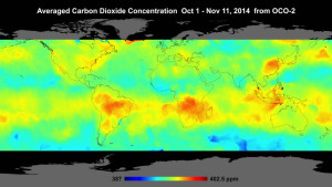
On 1 July 2014, NASA launched OCO-2, the second attempt at orbiting a global carbon dioxide observatory. In December, the first global map was released.
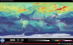
Compare this map with a frame from a previously released video showing a model of what the CO2 distribution was thought to be for roughly the same time period in 2006, the 1st of November.
Note the differences. There is much more CO2 coming from the tropical rainforests than the model predicts, and there is a sink, where CO2 is taken up, over Russia that the model does not have.
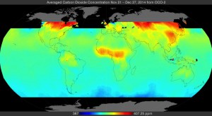
Since January, there has been no public disclosure of any further maps from OCO-2 on the OCO-2 website, except for a slide (their figure 5, shown below) from a webinar presentation that took place in February. This covers the period from late November to late December.
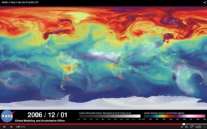
Compare this with a corresponding frame from the model video.
The reality measured by OCO-2 hardly resembles the model. The map released by NASA also seems to cut off CO2 sinks in the North Atlantic and Pacific. This may be excused by the sun angle in the Northern Hemisphere in December. NASA is surely learning a lot from OCO-2, but the findings may not be “politically correct”. We must await further data releases.





Oh please. You’re comparing a graph from 2014 to one from 2006. Is there some reason the carbon fluxes should be exactly the same for each, and over just a single month?
No, there isn’t. Regional conditions and weather are going to be important?
And you’re talking about CO2 differences of only a few ppmv, or about 1%. Frankly, it’s impressive ANY model can simulate CO2 so well. And that 1% has no effect on calculating the global average temperature for the year 2100, which is determined by global energy balance, not short-term carbon flux noise over a single month.
“Frankly, it’s impressive ANY model can simulate CO2 so well”
I just wanted to comment that the consensus “scientists” will next get out their statistics and start writing papers to declare the models to be purr-fect and the deviations to be meaningless, but I see that Appell was faster.
The model overstates the flux from population centers in the Northern Hemisphere, and understates the flux from the tropical rainforests as well as the ocean sinks in the North Atlantic and Pacific. As the satellite measurement is a monthly average, weather and regional conditions will average out. If you look at their model, they don’t show much regional variation. It is all one big smear of red in winter in the NH, and that isn’t what happens. The model was written to impress, not to represent reality.
I wonder whether the CO2 is emanating from sun warmed oceans upwind of the tropical rainforests but accumulates over the land areas because the flow of air slows down over land.
It may even be the case that those higher CO2 levels help to cause the growth of tropical rain forests by providing the necessary plant food.
I discussed a similar point here:
http://www.newclimatemodel.com/evidence-that-oceans-not-man-control-co2-emissions/
You presented no data to back up that claim. To do so you’d have to present measured data on carbon fluxes for cities and regions, and a simulation RUN FOR THE SAME TIME PERIOD.
@Appell,
It seems to me that you are the one lacking the proof that the models do have any link with reality. From what I see here, I conclude that models do lack any skill at predicting local CO2 concentrations. Since models are not time initialized to reflect actual measurements, they should at least show the skill to reproduce the monthly/annual patterns. The ball is in your park, not otherwise.
I, too, was very impressed with ominous red and brown CO2 clouds swirling the modeled northern hemisphere. David is right, ANY model can be used, we know that the global energy balance is not influenced by models.
It is important that the models look the same as the measured data, and that the animation seamlessly switches from past measured data to future fantasy without the viewer noticing, otherwise it is not good enough propaganda for the state broadcasters or Hollywood. The all important suspension of disbelief is the cornerstone of modern Consensus Government Science(CGS; commonly misunderstood as Computer Generated Science).
@ Appell
Your comment does reveal a total lack of any theoretical understanding of the subject of carbondioxide measurements. There is no such thing visible in any graph in this item as a flux. What is depicted are CO2 concentrations, averaged over a period of time. And because of the averaging, it is justified to show diagrams from two different times for comparison. It is not carbon flux noise, the pattern of local differences in CO2 concentration is obvious. What can be seen from this comparison is that the localization of high and low CO2 concentrations in the models is quite different from the measured concentration. Sinks occur at places where the models expect sources, and vice versa. This indicates that the basic assumptions for the models are wrong. It is as simple as that.
Well said henkie, Pierre is too to allow Appell who clearly has no understanding to post here. However, it is an indication of the rubbish believed by alarmist and for the thinkers it does bring an element of mirth.
keep up the good work Pierre
“Frankly, it’s impressive ANY model can simulate CO2 so well”
Another thought about this statement by David. What does he mean by “simulate CO2 so well”? I think he is simply impressed by those swirling colors, they look so real; there are eddies and turbulences, as if one looks from a bridge down into a river.
He doesn’t know that it is a piece of cake to write a cellular automata simulation that will express the same patterns without any semblance to real physics – as he has never tried it.
We get an insight into the gullible mind of the non-technical layperson. Maybe the warmunist climate modelers – all amateurs at best in Computer Science – have impressed themselves so much with their model runs of many colors that they managed to convince themselves that they’re competent in something.
Also, note to self: When creating my own product, make it colorful and visually impressive.
David,
I believe you are correct from the point of view of inter-annual variations in CO2 emissions. However, it is the terrestrial CO2 network that is the main source of our knowledge concerning year to year variations.
Keeling and others demonstrated with Mauna Loa CO2 data the intra-annual variations at least 50 years ago, including a lag of about 9 weeks between local emissions and global mixing on (at least) the hemispheric scale. Thus, for the global terrestrial network, CO2 observations are contaminated with local noise on timescales less than about 9 weeks.
Keeling and others showed for the Northern Hemisphere that the well-mixed minimum of emissions occurs near the autumn equinox and that the intra-annual minimum results mainly from seasonal effects, not variations in man-made CO2. From 1975-2014 the average CO2 increase per year at Mauna Loa Observatory was 1.7 ppm by volume. The average range between yearly minimum (May) and maximum (October) was about 6.7 ppmv, about 4 times greater.
The satellite observations should fill a gap in our knowledge by allowing us to focus on the signal of CO2 emissions before they have become well-mixed globally and therefore to identify the geographic locations of sources and sinks.
Note that the data in the two images is averaged over 5 weeks, giving twice the resolution (at least) of the terrestrial network.
Pierre is showing us two satellite images of CO2 emissions, the 1st centered about 21 October, the 2nd about 9 December. The average date is soon after the northern hemisphere minimum level of natural emissions and near the maximum in the southern hemisphere.
The satellite images presented on this blog should therefore reveal something about northern-hemisphere-man-made-emissions. However, around the time of minimum natural emissions, what do we see?
We see substantial CO2 emissions north of the 49th parallel in Canada, but not much in the US mid-west east of Chicago and not much in Western Europe compared to Siberia.
Intuitively, the industrial areas of the northern hemisphere should be conspicuous emitters in these images, but they are not. Since what we see is counter-intuitive, we need to think about why this is so. I don’t know the answer but the question seems interesting: Why are natural CO2 emissions so much more conspicuous than human emissions even at the time of the year when natural emissions are at or near the minimum? I have no notion of the answer or even whether or not the question is an important one.
The image of the southern hemisphere merely confirms what we know intuitively from previous analysis of the data. The images show that natural emissions are dominant near their annual peak levels, which we expect from the fact that only a small percentage of mankind live south of the Tropic of Capricorn (latitude 23.5 S). (Mauna Loa is near latitude 20 North.) In fact only a small percentage of mankind lives south of latitude 10 degrees North (about the latitude of the Panama Canal / Ho Chi Minh City.)
The terrestrial CO2 network is the main source of our knowledge concerning year to year variations. Keeling and others demonstrated with Mauna Loa CO2 data the solar connection with intra-annual variations at least 50 years ago, including a lag of about 9 weeks between local emissions and global mixing on (at least) the hemispheric scale. Thus, for the global terrestrial network, CO2 observations are contaminated with local noise on timescales less than about 9 weeks.
Keeling and others showed for the Northern Hemisphere that the well-mixed minimum of emissions occurs near the autumn equinox and that the intra-annual minimum results mainly from seasonal effects, not variations in man-made CO2. From 1975-2014 the average CO2 increase per year at Mauna Loa Observatory was 1.7 ppm by volume. The average range between yearly minimum (May) and maximum (October) was about 6.7 ppmv, about 4 times greater.
The satellite observations should fill a gap in our knowledge by allowing us to focus on the signal of CO2 emissions before they have become well-mixed globally and therefore to identify the geographic locations of sources and sinks.
Note that the data in the two images is averaged over 5 weeks, giving twice the resolution (at least) of the terrestrial network.
Pierre is showing us two satellite images of CO2 emissions, the 1st centered about 21 October, the 2nd about 9 December. The average date is soon after the northern hemisphere minimum level of natural emissions and near the maximum in the southern hemisphere.
The satellite images presented on this blog should therefore reveal something about northern-hemisphere-man-made-emissions. However, around the time of minimum natural emissions, what do we see?
We see substantial CO2 emissions north of the 49th parallel in Canada, but not much in the US mid-west east of Chicago and not much in Western Europe compared to Siberia.
Intuitively, the industrial areas of the northern hemisphere should be conspicuous emitters in these images, but they are not. Since what we see is counter-intuitive, we need to think about why this is so.
Why are natural CO2 emissions so much more conspicuous than human emissions even at the time of the year when natural emissions are at or near the minimum? I have no notion of the answer or even whether or not the question is an important one. But the question seems interesting.
The image of the southern hemisphere merely confirms what we know intuitively from previous analysis of the data. The images show that natural emissions are dominant near their annual peak levels, which we expect from the fact that only a small percentage of mankind live south of the Tropic of Capricorn (latitude 23.5 S). (Mauna Loa is near latitude 20 North.)
In fact only a small percentage of mankind lives south of latitude 10 degrees North (about the latitude of the Panama Canal / Ho Chi Minh City.)
The icing on the cake in one way is that aiui OCO-2 is calibrated to the terrestrial network…..
This one is set to run – the skillfulness of the models is beginning to look as may dad used to say like a case of the “monkey and the shavings”.
Look at the website, CARMA.ORG – it shows power plants, rated by emissions. There are two in the southeast of Australia. Observe the modelled “A year in the life of CO2” and watch that part of Australia… there are modelled plumes of CO2 from those power plants. Next, look at the one photo-output of OCO2 in that spot. No plumes. Similarly, look at Indonesia, to the NorthWest of Australia. Refer to Carma.org – the Kota Cilegon power plant is a big red one. In the model, there is a plume. In OCO2, there is no trace of Kota Cilegon, but WHOA! The entire region is fuming with CO2 (real CO2). Likely that is volcanic in origin. The oceans to the west of Australia show up in the OCO2 photo – this is likely Oceanic CO2 outgassing do to warmer water. On the east of Australia, the photo OCO2 shows real CO2, which is either from seamount volcanoes, warmer oceans, or both. What is clear is that the modelled CO2 isn’t very much like the detected CO2 from OCO2. Why the silence, from the OCO2 folks at NASA?
+1 henkie.
Concentration is not flux.
As an analogy, in biology ATP is widely produced and consumed in the cell/body. It’s importance is paramount to huge numbers of biochemical processes. Yet measuring its concentration by itself is an exercise in futility as far as making new discoveries is concerned.
Poor attempt to show a model is completely useless.
Lol, do you just like to see words you typed appear on the screen?
Which bit about the model not been able to reproduce known reality do you not really understand
“…What can be seen from this comparison is that the localization of high and low CO2 concentrations in the models is quite different from the measured concentration. Sinks occur at places where the models expect sources, and vice versa. This indicates that the basic assumptions for the models are wrong. It is as simple as that…”
I wonder about Appell. I sometimes think he makes his stupid remarks deliberately, just to try and sow doubt!
Either it’s deliberate or he is utterly stupid and incompetent
deliberately stupid !
I wonder if he realises just how much damage his stupidity does the alarmist agenda.
From his moronic posts, anyone can see just how brain-dead and rabid the average alarmista is, and just how incredibly stupid a person has to be to accept the “climate change™” farce/hoax/agenda.
Seriously, how many people on this Earth would want to be linked to some cretin like him ? !!!!!
Where are all the other months of readings? NASA appears very reluctant to release more up to date measurements. Last time I looked they were re-calibrating, again.
Trying to get their “al-gore-rithms” to adjust the raw data to their meme.
It is their aim in life… to FALSIFY and to CON !!
Appell is prime example, a liar and a conman.
I’ll give Appel credit; best would be to present model results of the same time periods and compare those with actual satellite measurements, say month-by-month for 2015.
But the lack of a follow-on image since Nov. 2014 of CO2 concentration distribution over the planet DOES beg the question, “Why the silence?”
Technical issues or spin issues?
As Pierre surmises, the output may not be “safe” to show to the unwashed. Such an act might run the real risk of derailing “Paris 2015”. And we all know what a disappointment that would be.
Meanwhile, science may be discovering more about the “Carbon Cycle” than its would-be gatekeepers thought possible. And some of the implications of said discoveries may necessitate a rearrangement of priorities (to put it mildly). And what a disappointment THAT would be.
Kurt in Switzerland
”Why the silence” indeed. Speaking of silence, not so long ago there was a similar picture release from Jaxa showing the same discrepancies between models and reality. It was very shortly in the picture and then vanished almost without a trace. Probably also an inconvenient truth that came to the surface.
Here we are at mid summer 2015 – the data from OCO2 must have accumulated (given its position in the “A train” orbit) into around 20 whole earth images but for over 6 months – tumbleweed / silence.
NASA’s data delivery system allows for gridding (i.e. mapping) of the data to occur actually on NASA’s prodigious computer assets in a manner than might be described as “automagic” – i.e. you invoke a (well documented) process and the required processed maps are delivered – in minutes
The silence regarding the OCO2 satellite’s direct observation of atmospheric CO2 can only be interpreted as full frontal and very deliberate obstruction
We don’t know who’s sanctioned this but you don’t need to think very hard about why – and the why is utterly and unequivocally well beyond disgraceful – shame on them, shame!
oco2 Data can be found here up to 03/06/2015,
ftp://oco2.gesdisc.eosdis.nasa.gov/data/s4pa/OCO2_DATA/
The question still remains …. it seems routine for earth observation teams to publish interim eye-candy to maintain general interest and keep PR simmering – and funders content that work is progressing, and worthwhile discoveries are being made consequent from investing $280 million USD. The paucity of output tells it’s own story.
Granted there is much tweaking of absolute values – but from a skim of the mission data user notes and caveats we are talking relative small %age amounts.
What is abundantly clear is (as others above have noted) that the distribution morphology and dynamics observed by OCO-2 are apparently quite at odds with the predicted behaviour from Gavin & Co’s “skillfull” models (let’s not quibble about a few absolute ppm here eh?)
ICYMI – It’s called validation .
ps
Alex B
any links / info on the subject of Jaxa would be useful…..