Thanks to German site wobleibtdieerderwärmung for providing what follows.
The slightly negative linear trend in global temperature measured by RSS satellite (TLT) continues despite the El-Nino-driven warm 2015.
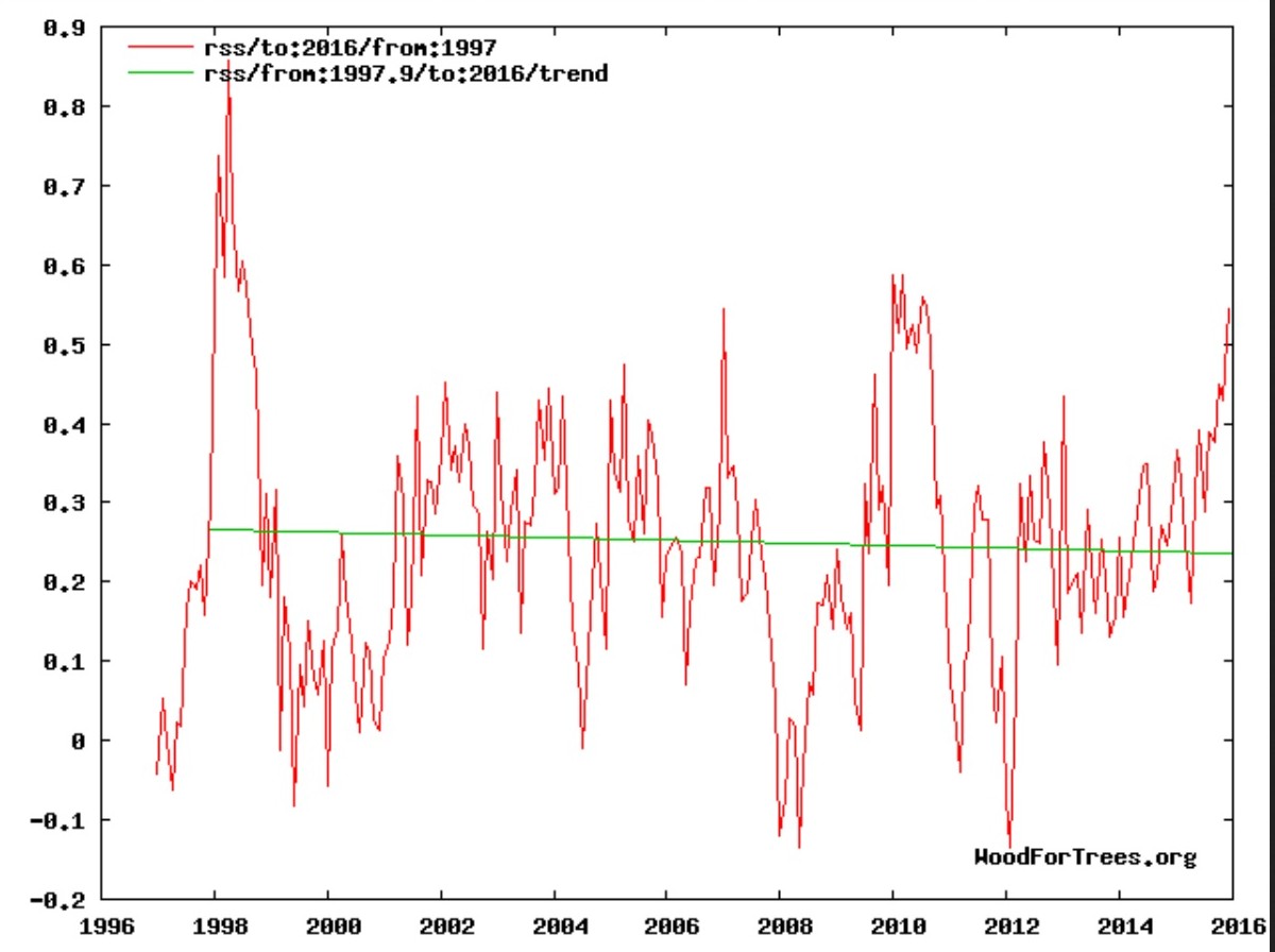
Source: www.woodfortrees.org trend
This flat trend has held since the end of 1997 and is closing in on two decades – catching a number of scientists by surprise.
The preliminary data from UAH and RSS shows that 2015 was the third warmest year since the measurements began in 1978, and thus did not set a new record. A reanalysis of the global 2m temperature from CFSv2 measured a positive deviation from the mean of 0.27 K, but put the year 2015 only in 6th place:
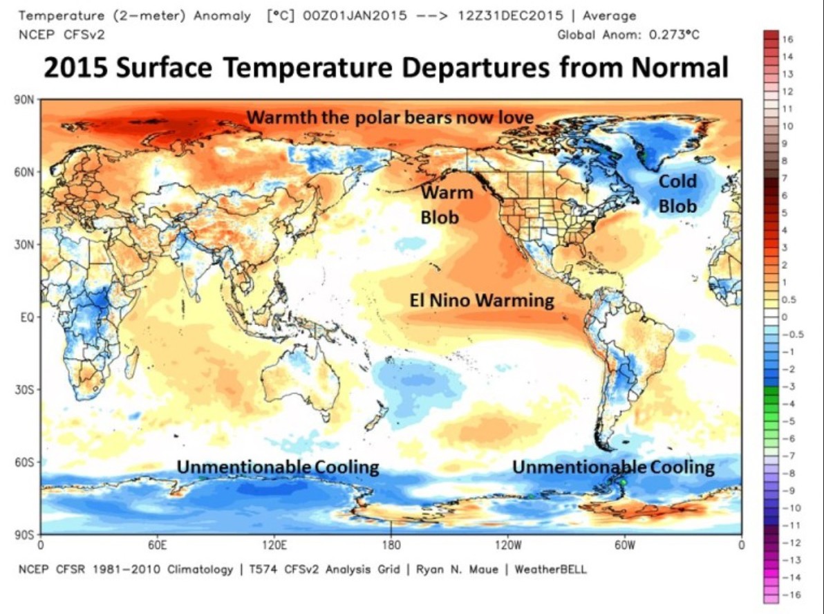
Note that the poles in the chart have been stretched out and so appear much larger in size than what they actually are. Source: What Causes El Nino Warmth?
This all means that more than half of the satellite measurement era has seen no warming whatsoever!
In Germany according to a DWD press release dated 30 December 2015, the mean temperature for 2015 was 9,9°C and so was the second warmest on record, tied with 2000 and 2007, despite the unusually warm November and December months, which were dominated by mild southerly winds.
Polar ice growth
A big surprise for many has been the ice growth measured in Greenland since 2014. Moreover the Greenland ice sheet has gown some 300 km³ since September 1, 2015 alone:
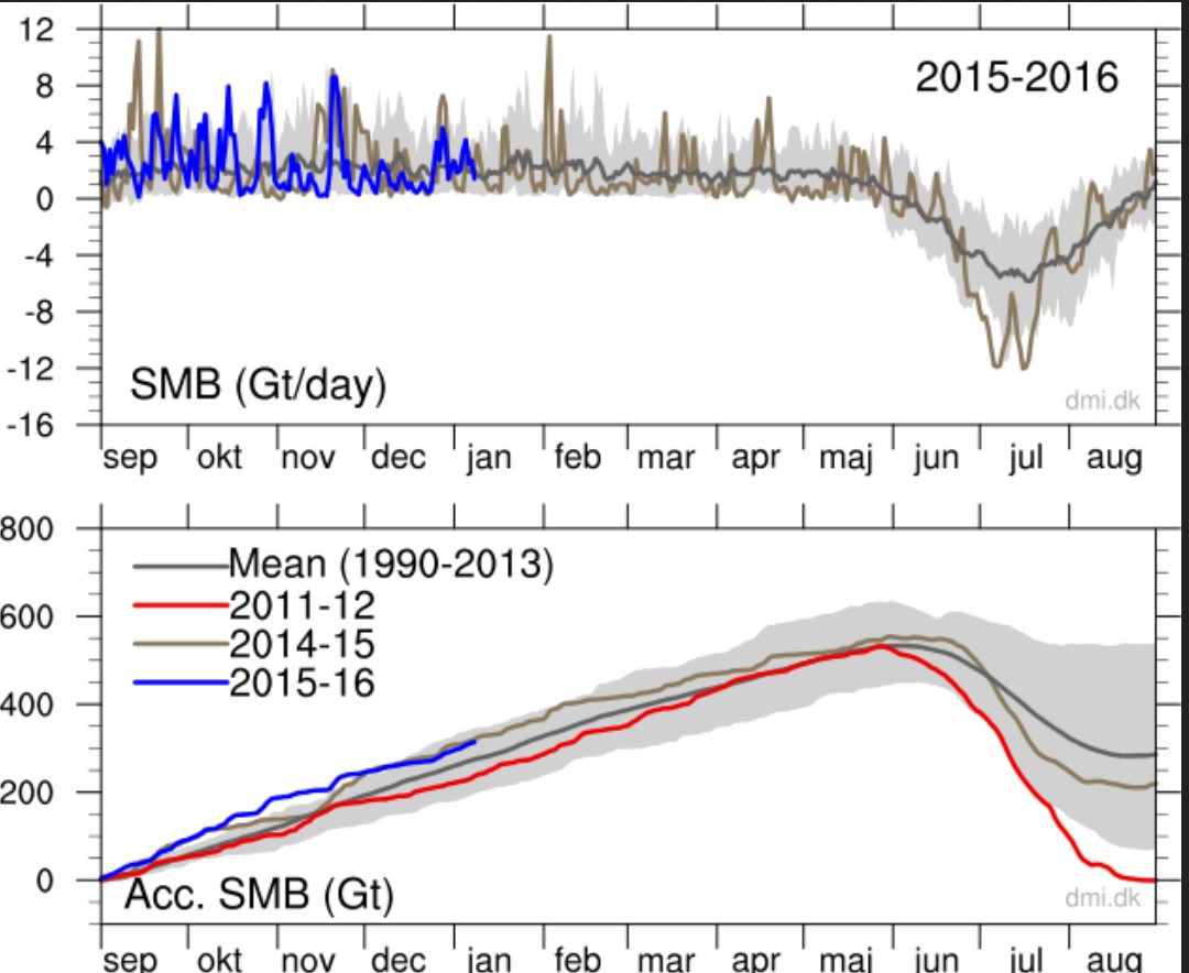
Top: The total daily contribution to the surface mass balance from the entire ice sheet (blue line, Gt/day). For comparison, the mean curve from the period 1990-2013 is shown (dark grey). The same calendar day in each of the 24 years (in the period 1990-2013) will have its own value. These differences from year to year are illustrated by the light grey band. For each calendar day, however, the lowest and highest values of the 24 years have been left out.” Source: www.dmi.dk/en/greenland-ice-mass-budget/.
It’s also worth taking a look at the surprising NASA-Study here!
The northern hemisphere in November 2015 saw a total of 36.25 million km² of snow cover. That’s about 2.3 million km² above the WMO 1981-2010 mean. It’s the 7th greatest extent since measurements began in 1966.
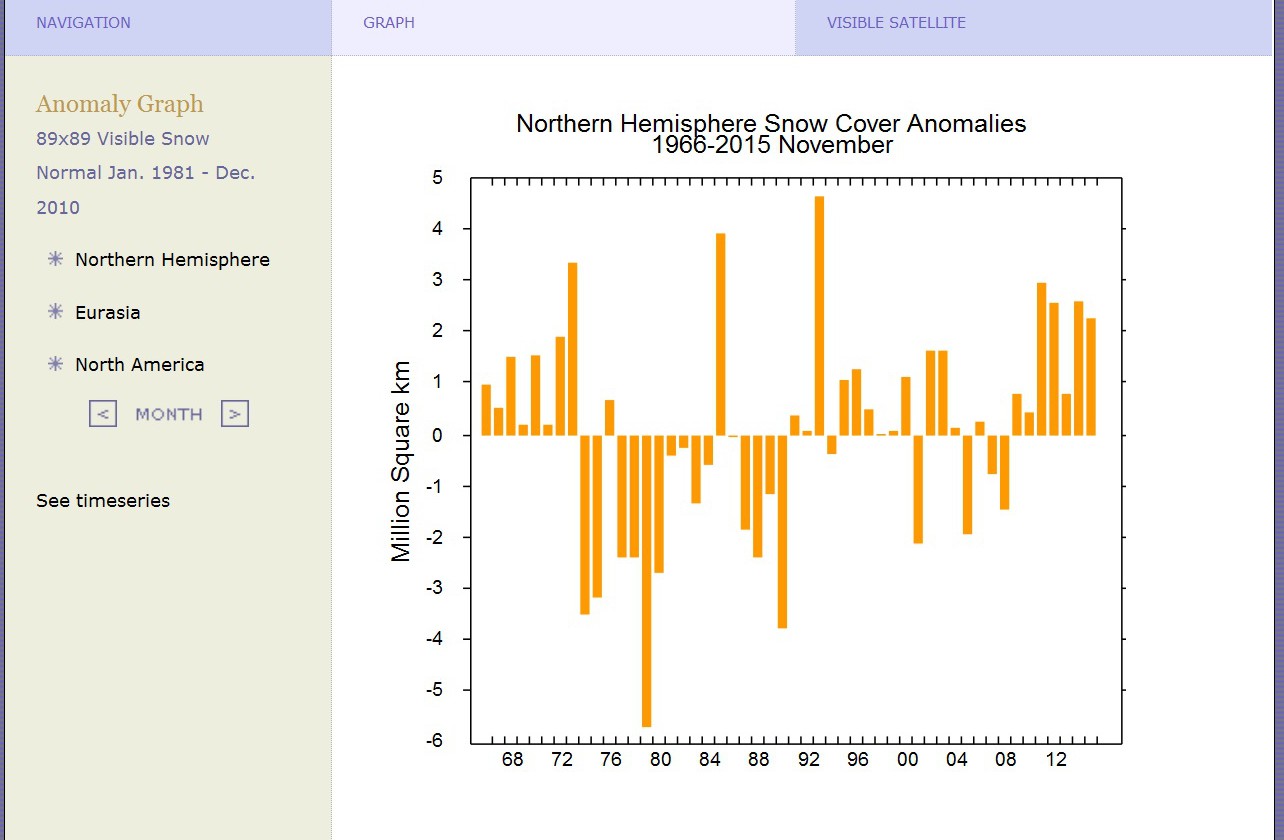
Northern hemispheric snow cover in November for the 2011 to 2015 five-year period set a new record since measurements began in 1966. The 40-year trend is strongly upwards. Source: http://climate.rutgers.edu/month=11.
In summary the global temperature, polar ice and snow cover trends show no warming taking place, but rather harbor strong signals of cooling.


Here is a Robinson projection with 250 km resolution, showing just the areas where there is actual data. When the El Niño subsides, the La Niña cooling will take over. http://data.giss.nasa.gov/cgi-bin/gistemp/nmaps.cgi?sat=4&sst=6&type=anoms&mean_gen=1212&year1=2015&year2=2015&base1=1981&base2=2010&radius=250&pol=rob
“Note that the poles in the chart have been stretched out and so appear much larger in size than what they actually are.”
Good point.
If you get the opening screen view of Google Earth aligned just so, Greenland and Brazil can both be viewed. The map projection in the NCEP chart is centered on the Equator (across the top or north end of that country) and, thus, Brazil looks like it is supposed to. Greenland is much distorted in shape and appears as large as Brazil.
Every child should have a globe or two. Few do.
[ NFL Wild Card Weekend: Seahawks and Vikings to square off in brutal cold ]
-18ºC / 255.15ºK predicted.
You come to a false conclusion, if you cherrypick the datasets and the starting dates or the months you look at.
Landbased sets will show an upward trend, as will satellite sets, if you do not start around the hot year 1998.
On snow cover, why not look at a relevant month, like june?
http://climate.rutgers.edu/snowcover/chart_anom.php?ui_set=1&ui_region=nhland&ui_month=6
(summer snow data shows, whether winter snow survives the year. it is not rather random, like winter data and it might actually be influenced by warming)
Rutgers says there’s less snow…
http://climate.rutgers.edu/snowcover/chart_anom.php?ui_set=1&ui_region=nhland&ui_month=6
Rutgers says there’s more snow…
http://nsidc.org/arcticseaicenews/files/2013/02/Figure41.png
Huh?!
“Rutgers says there’s less snow…
…
Rutgers says there’s more snow…”
No surprise. We know, that a warmer globe might cause more snowing.
But it also causes more melting.
So the relevant number is summer snow, not winter snow.
“We know, that a warmer globe might cause more snowing.” – sod
Like they used to “know” a warmer globe would cause less snow?
https://stevengoddard.wordpress.com/2011/07/26/chu-snow-is-a-thing-of-the-past-and-we-are-doomed/
And, no, AGW is not causing more snow in any case.
http://www.drroyspencer.com/2014/11/is-global-warming-causing-more-snowstorms/
“But it [a “warming globe”] also causes more melting.” – sod
Also, no.
With climate cooling (see here for USA), blame for the disappearance of snow can not be put on fictitious “warming.” As I’ve posted before, the “warming” is not due to an increase in actual heat, but to data tampering.
But how then can snow “melt” if it isn’t warming? E.g., it can sublimate on dry days when the temperature is below zero.
Also, the soot from increased development in China and India (a huge chunk of the Northern Hemisphere) causes melting to glaciers.
http://www.c3headlines.com/2011/05/black-carbon-soot-from-china-india-melting-himalaya-glaciers-not-co2-emissions-say-scientists.html
It can also cause snow to melt, because dirty snow absorbs more heat than clean snow.
Using disappearance of snow as a proxy for increased temperatures is just another desperate act of those who don’t have the actual temperature data on their side, unless of course it has been “adjusted.” See also here.
Sod, the physics of CAGW theory demands that the troposphere as a whole warms 20 percent more then the surface, and 30 percent more in the tropical troposphere.
Even if one makes a generous assumption that that the homogenized station reduced, poorly sited surface record is correct, the cause of the purported waming, per CAGW theory, cannot be CO2.
Sod are you disputing the satelite temps. Right, give us your temp for 2015, it derivation and confidence, please
sod 9. January 2016 at 10:35 PM | Permalink | Reply
“You come to a false conclusion, if you cherrypick the datasets”
Satellite dataset suffers from less violation of Shannon theorem and less manipulative butchery so it is by objective standards of a higher quality.
That is not cherrypicking; that is SELF-EVIDENT.
“Landbased sets will show an upward trend”
– agreed – at least when Gavin Schmidt has his fingers in the pot.
sod, I am surprised you didn’t suggest that the satellites were orbiting upside down.
Going through my Compact Oxford English Dictionary I was surprised to find you might have made it in those hallowed pages. Which definition do you prefer a piece of turf? or an unpleasant person? Or a problematic thing?
The trend calculation used on the two satellites does not do cherry picking. The start date is determined by the calculation, and the calculation is drive by a relevant question, namely “for how long has there been no increase in temperature?”
I note the use of the words ” third warmest year since the (satellite) measurements began in 1978″ in this article. This is of course quite different from “the xth warmest year since the AGWers started creating their own version of “global average temperature measurements” to scare the gullible”.
Summer snow is that an oxymoron
Sod blathers about “cherry picking the data?”
Yeah, because warmunistas would NEVER do to the data what the Muslims did to women in Cologne.
And they are doing it everywhere.
http://www.cfact.org/2015/02/19/record-keepers-cooked-global-temperature-books/
http://joannenova.com.au/2010/01/horrifying-examples-of-deliberate-tampering/
Showing data from 1998 is meant to illustrate the lack of warming, during that period, a fact grudgingly acknowledged by some warmists. Nothing more. But if sod wants to consider ALL the data, well, let’s do!
http://www.oxnotes.com/uploads/5/1/6/4/5164461/277908232.png
https://edmhdotme.files.wordpress.com/2014/09/screen-shot-2014-09-17-at-13-42-47.png
Instead of “Our children won’t know what snow is anymore,” what they should be saying is “Our children won’t know what truth is anymore.”
Okay, poor sod, but by picking June instead of any other month, aren’t you doing what you advocate should not be done, cherry picking?
Besides, in case you haven’t noticed, the Rutgers University snow-cover graphs indicate snow cover (the area extent of), not snow depth or snow volume.
Your objections are not only unreasonable, they are pathetic.
“Okay, poor sod, but by picking June instead of any other month, aren’t you doing what you advocate should not be done, cherry picking?”
yes, sort of.
we would need now a higher level of statistical analysis. Plotting trend lines via a look at the graph will not give the answer.
Can you spot the difference between the two graphs given above?
June:
http://climate.rutgers.edu/snowcover/chart_anom.php?ui_set=1&ui_region=nhland&ui_month=6
January:
http://nsidc.org/arcticseaicenews/files/2013/02/Figure41.png
Again, snow disappearance does not necessarily imply melting due to elevated global temperatures. There are other ways.
http://whyfiles.org/2011/why-does-snow-disappear/
https://lh3.googleusercontent.com/-VJBy0TrKUlY/VQhZixp_CvI/AAAAAAAAIo0/P3sXYFQ0kZE/s512/IMG_0560.jpg
Here is NH spring snow coverage…
https://suyts.files.wordpress.com/2015/06/image10.png
does not look like Global warming to me.
“does not look like Global warming to me.”
Looking at a single month and 5 years does not look like science to me. Instead i would call this a cherry pick and a TRICK, used on “notrickszone”.
Huffing and puffing as usual, desperate clueless sod who doesn’t even know how refutation of a crackpot theory works. You come up with counterevidence. This might not be it, but the UAH record since 1998 surely is.
Warmunism, as codified by the models, has been refuted by fulfilling Santers’ criterion for its refutation: No warming in more than 17 years.
sod 10. January 2016 at 1:13 PM | Permalink | Reply
“we would need now a higher level of statistical analysis. Plotting trend lines via a look at the graph will not give the answer.”
A higher level of statistical analysis, like Rahmstorff’s I-prove-anything Monte Carlo trickery?
Looks the same value as Ryan Maue at Weatherbell has derived from NCEP real time data
In case anyone is interested,
I have posted a whole heap of “which year was warmest” analysis (confirmed by Ken Gregory), starting at this address downwards.
http://wattsupwiththat.com/2016/01/08/ban-ki-moons-climate-finance-plan-despots-paying-off-third-world-debt-with-more-oppression/#comment-2116452
Its interesting to see where the northand south poles are in the ordered list.
UAH for the NoPol area has 2015 in 13th place and the SoPol in 35th place.
There is NO WARMING at either poles, despite Gavin butterknife smearing fabricated warming all over the Arctic.
Both actually show a cooling trend this century, unless you are stupid enough to thing a linear trend can be applied from 1979 (is that you sod?)
And sod, if you STILL haven’t figured out that 1998 is not a cherry-picked starting point, but a mathematically derived back-calculation, then you really do need to go back to junior high maths and start again.
And if you look at the 2001 IPCC reports, you will find this graph
https://i1.wp.com/realclimatescience.com/wp-content/uploads/2016/01/2016-01-04-17-05-54.png
As ANYONE can see, there was NO WARMING between 1980 and 2000
The ONLY warming in the last 37 years has been a step up in 2000-2001
1980-2000, No trend
2001-now, No trend.
The ONLY thing creating any trend at all in the last 37 years is that small step up at the culmination of the 1998 El Nino.
And that small step up of about 1/4C is the ONLY thing stopping the back calculation of ZERO TREND going back the full 37 years.
The slightly negative trend is caused by a cherry pick (start date 1998).
This graph shows the tiny dip, that the “trend” is based on:
http://www.moyhu.org.s3.amazonaws.com/2016/1/trend0.png
Ben Santers, warmunist scientist, said that if Earth does not warm for more than 17 year, the models have a problem.
That’s why this is not a cherry pick; it is the refutation of the climate models by the criteria the warmunists themselves have defined for a refutation.
Game, set, match. Warmunism is crackpot science.
This debunking of Sod is worth a repost as he hasn’t responded to Yonason
“We know, that a warmer globe might cause more snowing.” – sod
Like they used to “know” a warmer globe would cause less snow?
https://stevengoddard.wordpress.com/2011/07/26/chu-snow-is-a-thing-of-the-past-and-we-are-doomed/
And, no, AGW is not causing more snow in any case.
http://www.drroyspencer.com/2014/11/is-global-warming-causing-more-snowstorms/
“But it [a “warming globe”] also causes more melting.” – sod
Also, no.
With climate cooling (see here for USA), blame for the disappearance of snow can not be put on fictitious “warming.” As I’ve posted before, the “warming” is not due to an increase in actual heat, but to data tampering.
But how then can snow “melt” if it isn’t warming? E.g., it can sublimate on dry days when the temperature is below zero.
Also, the soot from increased development in China and India (a huge chunk of the Northern Hemisphere) causes melting to glaciers.
http://www.c3headlines.com/2011/05/black-carbon-soot-from-china-india-melting-himalaya-glaciers-not-co2-emissions-say-scientists.html
It can also cause snow to melt, because dirty snow absorbs more heat than clean snow.
Using disappearance of snow as a proxy for increased temperatures is just another desperate act of those who don’t have the actual temperature data on their side, unless of course it has been “adjusted.” See also here.
– See more at: https://notrickszone.com/2016/01/09/data-surprise-global-temperature-continues-stall-polar-ice-and-snow-cover-continue-surprising-growth/#sthash.kKvlblWS.dpuf
“As I’ve posted before, the “warming” is not due to an increase in actual heat, but to data tampering.”
Even the satellite data shows warming. So the “warming” and “melting” is real, and not “data tampering”.
And people speaking about “less” snow due to global warming are not speaking about the arctic in winter. Instead they are describing a most obvious effect (which is supported by real world data).
Both links in the article above do not actually say, what is claimed they say. Instead for example Roy Spencer says the opposite:
“but spring snowcover has decreased, due to spring tending to arrive earlier in a slightly warmer world.”
You might want to mark the phrase “warmer world”.
“And people speaking about “less” snow due to global warming are not speaking about the arctic in winter. Instead they are describing a most obvious effect (which is supported by real world data). ”
Warmunists are idiots trying to stir up panic over insignificant trends. This is the trend of NH sping snow cover, Mar-May. If we believe it which we shouldn’t as methods of counting have changed over time.
https://suyts.files.wordpress.com/2016/01/image1.png
More here
https://suyts.wordpress.com/2016/01/06/my-first-post-and-the-destruction-of-an-iconic-alarmist-meme/
“Even the satellite data shows warming.”
That is a LIE.
The satellites show COOLING at both poles in the last 10 or so years.
“The satellites show COOLING at both poles in the last 10 or so years.”
the satellites do not measure the poles. the melting is not caused by the last 10 years. You can not just ignore the increase before!
“the melting is not caused by the last 10 years. You can not just ignore the increase before!”
Warmunist theory expects continuously rising temperatures.
If natural variability is strong enough to reverse Global Warming, then why didn’t the models predict that?
Proof that the models are rigged and have no predictive skill.
You are WRONG.
Arctic sea ice has been gradually starting to climb in the past several years, since the AMO has peaked. As you say, you cannot just ignore this increase. But you do. !
It will be hilarious to watch you and your alarmist mates once as the Arctic sea ice level continues to climb over the next few years.
UAH, and RSS both have higher latitudes at both end of the globe as COOLING.
You say they don’t measure the poles.. well show me where all the surface temps are measured that give your mythical warming.
Here is UAH NoPol the last 10 years.
http://s19.postimg.org/sm42pougj/No_Pol2.jpg
As ANYONE can see, a distinct cooling, apart from the step up in 2010.
“Warmunist theory expects continuously rising temperatures.”
No, it does not.
“If natural variability is strong enough to reverse Global Warming, then why didn’t the models predict that?”
the models do predict that. you just have to look at single runs:
http://www.drroyspencer.com/wp-content/uploads/CMIP5-73-models-vs-obs-20N-20S-MT-5-yr-means1.png
“Arctic sea ice has been gradually starting to climb in the past several years, since the AMO has peaked. ”
you are looking at short time trends and you are making assumptions about the future.
Sob, you are WRONG again.
I am looking at the patterns of several different strands of data, and what they are doing.
If you don’t have the intelligence to see the relationship between the AMO and Arctic sea ice… you really should stop commenting, lest you make even more of a fool of yourself.
You must also realise that starting Arctic sea ice graphs in 1979 and thinking the trend would continue is probably the absolute height of ignorance. So I’m waiting for you to do that.
This is an old article, but it backs up the “soot from China causes ice melt” argument. https://notrickszone.com/2012/08/27/arctic-ice-loss-temperature-or-soot/#sthash.edkSvSur.dpbs
I have doubts about that “china soot” theory, it is based on a very simple correlation.
But you might still want to explain to the other sceptics here, that an AMO change might not help against the increasing coal use in China.
The best correlations are the simple ones.
WRONG again , sod.
The increasing coal use in China is in new high efficiency low pollution power stations and factories. They are closing their sooty old ones, and gradually cleaning up their act in that regard.
There will be a distinct decrease in soot in the Arctic, and the comparatively small effect will get even smaller. AMO has switched.
And Arctic sea ice is starting to increase.
https://rclutz.files.wordpress.com/2016/01/masie-day-2015365r.jpg
Please stick around as Arctic sea ice continues to increase, I want to watch you grovel.
” This is the trend of NH sping snow cover, Mar-May.”
Your source is using the same trick again: cherry picking a start point which is a low and adding a lot of irrelevant data at the bottom, which is even worse after the biggest changes have been cut away by losing the first few years of data.
bad.
So – using the start point of the satellite data series in 1979 would NOT be the same thing? If so – WHY not?
Of course we would love this data series back to the 800 AD so the MWP would be in it. But we haven’t.
The point is this : Warmunist Ben Santers has a few years ago stated that if reality doesn’t warm for 17 years or more, the models have a problem.
That’s why this is important. But, you probably do not even know about it – as you do not even know warmunist theory or the history of warmunism – yet you are a cult member.
I have noticed this many times. Leftists for instance do not know the history of socialism – invariably. When I tell them, some of them start to scream in my face. They cannot bear the history of their own ideology.
“So – using the start point of the satellite data series in 1979 would NOT be the same thing?”
Using the whole data set is supposed to be a good choice (typically the start will be be a “random” data point, which is generally a good idea.
But starting with more data has another advantage: The significancy of the trend will increase.
a perfect fit over 3 data points is much less significant than a less perfect fit over 100 data points.
You can also use a simple test for robustness of a trend. Will the trend change, when you add or remove 2 or 3 data points (years)?
“Using the whole data set is supposed to be a good choice”
Only if you have the intelligence and honesty to understand that starting in 1979 is a start from the low point of the AMO.
If you just use the period from 1979 to 2005ish as a piece of propaganda , without explaining the relationship to the AMO, them that is either a sign of BLATANT IGNORANCE or of massive INTELLECTUAL DISHONESTY.
You choose which one you think it is on your, and the alarmista’s, behalf. 😉
“perfect fit over 100 data points.”
yep
AMO vs flipped Arctic sea ice
http://s19.postimg.org/4crolmgmr/amo_vs_NHice.jpg
AMO vs real Reykjavik temperatures.
http://s19.postimg.org/5vfcwbc8j/amoreyk.jpg
btw, did you know that Iceland Met has reported that in Iceland, 2015 was the coldest year this century.
“btw, did you know that Iceland Met has reported that in Iceland, 2015 was the coldest year this century.”
By chance i could have guessed so, because i am reading this blog and it is always focused on the single cold spot on the globe.
So yes, i was always well informed about any time the temperature was low on Island or in the UK.
Poor Sod, the truth bites him again.
The poles are cooling.
AMO has switched, and will start cooling the Arctic more than the current cooling trend.
Only the El Nino is holding up temperatures in the topics and sub tropics, and when that dissipates, (its already starting to) the tropics and sub-tropics will also start to cool.
The alarmista desperations will be very funny to watch. 🙂
“Only the El Nino is holding up temperatures in the topics and sub tropics”
Sop one thing is “only el nino” and the other one is the all dominating AMO.
Can you even spot the problem in your own line of thought?
“Can you even spot the problem in your own line of thought?”
The only problem I see is that YOU have no idea about how or even where El Ninos and the AMO operate.
Your comment, as usual, highlights your ignorance.
Did you also know that UAH SoPol has 2015 has third COLDEST in the satellite record.. RSS has 60-70 south as 29th warmest (out of 37)
The world is starting to cool from the poles, and as the current El Nino continues to subside, the mid latitudes will also start to cool.
It will be hilarious to watch the antics of the warmista as they duck and weave, and then eventually crawl back into the crevasses they came from. 🙂
Careful! Next month UAH data will enter the realm of all-positive trends — all possible trends from whenever to now will be positive!
http://davidappell.blogspot.com/2016/01/ted-cruz-your-18-years-of-no-satellite.html
Can’t wait to see the excuses you’all make up then….
Idiocy obviously is a chronic and progressive disease for you. A few months of El Nino warming of course will push the trend to be temporarily positive. But the coming La Nina will change that by 2017.
“But the coming La Nina will change that by 2017.”
if you look at the graph posted by David, you will see that this is not very likely to happen.
http://davidappell.blogspot.de/2016/01/ted-cruz-your-18-years-of-no-satellite.html
The dip to a below zero trend is obviously a statistical artefact already. If you look at the 1998 data, you might notice that we might actually get some seriously high numbers. Even la nina will not brig the trend artefact back then.
My problem with RSS and UAH is, that they made so many changes, that i am not sure if the current setup would still produce the 1998 spike. so we will see interesting things either way.
graph posted by David..
ROFLMAO !! No-one is even going to bother looking at his tripe. !
“No-one is even going to bother looking at his tripe. !”+
Well, i can not help you, if you want to ignore the facts. David is just plotting basically all the trends with the different start months.
And it is obvious, that the “pause” is a statistical artefact (the tiny dip below zero).
http://davidappell.blogspot.de/2016/01/ted-cruz-your-18-years-of-no-satellite.html
If you are still looking at Appell’s tripe, no-one can help you.
You have truly fallen for the lowest form of propaganda mis-information available.
“Next month UAH data will enter the realm of all-positive trends”
sceptics will just become sceptic of the UAH numbers and switch to RSS.