We keep hearing various stories about sea level rise. Some alarmists even claim that it’s accelerating and coastal locations could be drowning in water by the end of the century, if not sooner. So I decided to make quick check of the data myself.
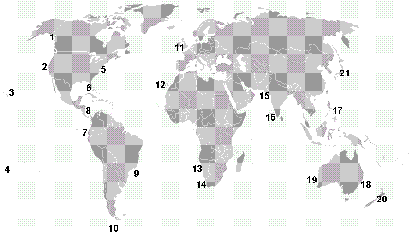
I took a sampling of 21 randomly selected locations scattered all over the globe and checked their respective sea level trends (not satellite data) to see what is happening. The following map shows the locations:
As you can see, the points are scattered all over the globe. The idea is to take a random representative sampling – much like a quality engineer who takes a random sampling of raw material from a bulk tanker truck arriving at a factory.
What follows is the corresponding list of the locations with the sea level trends measured by the NOAA.
Location – rate in mm per 100 years – observed most recent rate trend
1. Ketchikan, Alaska (-19 mm/100 yr) – steady drop
2. San Francisco, CA. (+201 mm/100) – slowing down
3. Honolulu, Hawaii (+150 mm/100) – slowing down
4. Kwajalein, Marshall Is. (+143 mm/100) – speeding up
5. Piladelphia, PA (+280 mm/100) – steady rise
6. St. Petersburg, FL (+236 mm/100) – slowing down
7. La Libertad, Ecuador (-122 mm/100) – steady drop
8. Cristobal, Panama (+141 mm/100) – slowing down (last 10 years)
9. Cananeia, Brazil (+420 mm/100) – speeding up
10. Argentine Is, Antarctica (+172 mm/100) – slowing down
11. Newlyn, UK (+171 mm/100) – steady rise
12. Tenerife Spain (+153 mm/100) – steady drop
13. Walvis Bay, Namibia (+33 mm/100) – steady drop
14. Simons Bay, S Africa (+159 mm/100) – speeding up
15. Karachi, Pakistan (+48 mm/100) – steady drop
16. Cochin India (+137 mm/100) – steady rise
17. Legaspi, Philippines (+522 mm/100) – slowing down
18. Sydney Australia (+59 mm/100) – slowing down
19. Fremantle, Australia (+148 mm/100) – slowing down
20. Wellington, New Zealand (+241 mm/100) – slowing down
21. Hosojima, Japan (-53 mm/100) – steady drop
For example San Francisco sea level is rising at a rate 201 mm per 100 years and the latest trend shows that sea level rise is slowing down.
Here are the results
– Steady drop: 6
– The rise is slowing down: 9
– Speeding up: 3
– Rising steadily: 3
Do you see any red flags? The average of the 21 NOAA measured trends is 147 mm/100 years (6 inches). This is a far cry below the IPCC projected 22 inches for the next 100 years.
Most of the sampled locations are dropping or the sea level rise is slowing down. Only at 6 locations is the rise steady or speeding up. The Marshall Islands show a speeding up, but Pago Pago, American Samoa shows a decline.
Clearly this random sampling of locations shows no signs of any accelerating disaster. To the contrary, it indicates that sea level rise is most likely slowing down.
This is a preliminary check only, and of course much more data would need to be crunched to make a final conclusion. But from the preliminary check, we can safely say that anyone who claims that SLR is accelerating is probably just a charlatan who is trying to get more funding.
Concerning satellite data, someone really ought to check the calibration of the satellites.


How come Walvis Bay and Tenerife both show numerical rises (+33 and +153mm respectively) but your narrative for both of these is ‘steady drop’ ? (Shurely Shome mistake)
Tenerife since 1960 appears to be dropping slightly. But I guess one could argue that it’s closer to being flat.
Walvis Bay has been declining since about 1980. Indeed both datasets are rather fragmented and so I wouldn’t draw any conclusions from them alone.
Numerically only 3 stations (Ketchikan, La Libertad and Hosojima) are observing a drop in sea level, but your narratives have 6 stations observing a steady drop. How are you arriving at the narratives in the ‘observed most recent rate trend’ field ?
Some cautions:
Gaps in a record of several years often means the tide Gage changed locations, so a trend line across the gaps doesn’t mean much.
Tide gages in northern Europe, including the UK, are still rebounding from the ice load 15 thousand years ago. Add about 50 mm/century to those in the UK. More to those in Scandanavia. In the Mediterranean, the trend is the other way, because the plate “teeter-totters”.
Tide gages in tectonically active zones like Japan, Ecuador, New Zealand, the US west coast, and Alaska, should be taken with several large grains of salt. These are edges of moving plates that can move up and down, as well as sideways.
But Pierre, IPCC was getting their data and extrapolation from Brazil locations that say, “speeding up” and “alarmingly fast rise” in sea level 🙂
Shouldn’t this post be retitled to ‘A random selection of NOAA data shows slowing SLR’? I did ask a couple of days ago how the narratives were arrived at, but answer comes there none. Hmmm would I be correct in assuming that ‘observed most recent rate trend’ means is the line going up or down in P Gosselin’s opinion ?
It was arrived at by looking at the data – a practice that appears to be completely foreign in your camp. Your time would be better spent if you asked Rahmstorf at the PIK how they reached their conclusions of accelerating SLR. (Hint: North Carolina)