By Ed Caryl
Because pilots need to know the local weather conditions, most temperature-measuring sites are at airports worldwide. Airports, in turn, tend to be where the airport users are, near cities. As cities grow, so do the airports. As the airports and cities grow, the number of aircraft and aircraft operations grow. As operations (take-offs and landings) grow, more kerosene (Jet fuel, JP-1 and JP-4) is burned. It is widely recognized that large airports near large cities are in urban-heat-islands (UHI), but is it the local population or the amount of fuel burned that causes the UHI? And what is the error in temperature measurements?
Twenty airports in the central United States were found with long, continuous, temperature records. They ranged in size from the small airport at North Platte, Nebraska, to the Minneapolis-St. Paul International airport. The local populations ranged from 24,000 to 3.2 million. When counting aircraft operations, only multi-engine jet and turbine engine operations were used, commercial and military. General aviation aircraft operations were ignored. A Cessna 172, after all, burns about as much fuel on take-off as a Boeing 727 auxiliary power unit uses while sitting at the gate, that is, in comparison, not much.
The 20 airports were: Albuquerque NM, Bismarck ND, Cheyenne WY, Duluth MN, Eau Claire WI, Eppley Field (Omaha, NE), Lincoln NE, Memphis TN, Minneapolis MN, North Platt NE, 0klahoma City OK, Peoria IL, Pueblo CO, Salt Lake City UT, Sioux City IA, Springfield IL, St Louis MO, Topeka KS, Urbana IL, and Wichita KS.
The temperature trend used in Figure 1 is the linear trend over the 66-years from 1934 to 2000, inclusive, to include both the hottest year in the previous cycle to the hottest years in the current cycle. Temperatures are from the GIStemp web site here. The default (raw) annual data was used for each location.

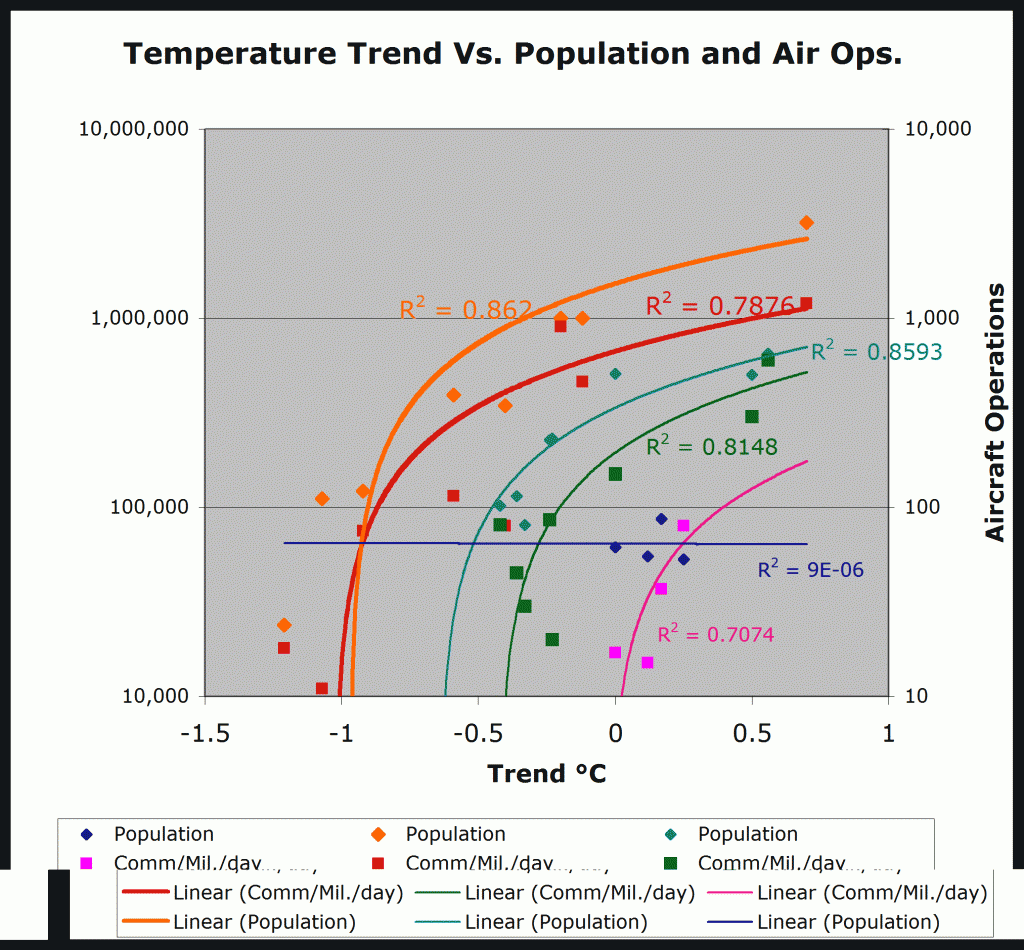
Figure 1. This is a plot of the Temperature Trend for 20 U. S. airports versus local population and number of daily jet aircraft operations. The vertical scales are both logarithmic, thus the linear trends are seen as log curves.
The twenty airports in this plot sort themselves into three groups. The first group of eight seems the least contaminated by local heat sources, and plot along linear trends with R2 values of 0.862 for population and 0.7876 for operations. It makes sense that the population and aircraft operations should track closely, because the percentage of people that fly should be somewhat the same everywhere.
The second group of eight is smaller cities with fewer flights, and seems slightly more contaminated by local heat sources. Some sources were identified, and proved to be airport facilities like Instrument Landing System (ILS) equipment and runway approach lighting. The same rough ratio of people and flights holds, though the number of operations warms the environment slightly more than the people.
At the remaining four airports, the UHI from population completely breaks down, and only air operations have any significance. These four were examined closely. All had local heat sources within 50 meters of the temperature sensors. At three, what appear to be ILS buildings are close by, at the fourth; a generator building was the culprit (Figure 2).
Figure 2. This is the site at Cheyenne, Wyoming airport. The generator building is downhill about 40 meters from the temperature sensor A (heat rises). The image is from Google here.
It is clear from Figure 1 that in the absence of population and burned jet fuel, the temperature trend in the mid-U. S., from 1934 to 2000, has been cooling by about one degree C. It is also clear that the UHI affect in the vicinity of large cities and their airports, is about 1.5°C. Yes, fossil fuel use leads to warming, especially at airports. But if those are the only places being measured, it is like a blind-man describing an elephant touching only the trunk.

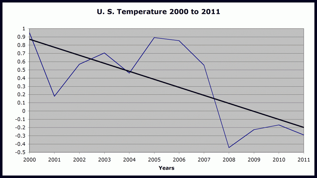
Figure 3. This is the cooling trend at 56 rural sites in the U. S. since 2000.
Since 2000, the U. S. has cooled one further degree, for a total since 1934, of 2.5°C. It is time for Messieurs Jones, Hansen, and Mann to switch back to global cooling.
For another illustration of UHI at an airport read: https://notrickszone.com/2011/01/21/giss-providence-in-urban-temperature-adjustment/
_____________________________________________________
Ciampino airport photo from: Paolo Mezzasalma, http://wattsupwiththat.com/2009/03/28/when-in-rome-dont-do-as-the-romans-do/


One should add that temperature measurements at Airports are designed to err to the warm side, as their main purpose is to ensure aircraft safety. The amount of fuel needed goes up with higher temperature and the measurements are used to determine how much fuel should be put into the tank, so they try never to measure too low.
Thanks, Ed, I didn’t know that there has already been such a remarkable cooling in the rural US stations.