By Ed Caryl
Yesterday, I resumed some temperature analysis I had been doing and found an amazing improvement in the GISS website for station data.
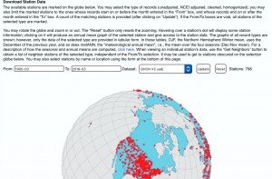
Instead of the tiny map with no station locations marked on it, I found a nice rotatable and zoomable globe with dots marking the station locations. There is also now a time window selector, making it much easier to find long and/or recent temperature records.
Figure 1: Screen grab of the station data selector screen on the GISS website here.
In this screen, there is also a selector for the data set. The selections are: GHCN V3 unadjusted, GHCN V3 adjusted, GHCN V3 adjusted and cleaned, and GHCN V3 adjusted, cleaned, and homogenized.
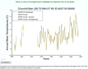
When a station is selected, these selections will be the downloaded data. But, all these are visible, and highlightable, on the graph for each station. When you hover the cursor over a station dot, the station name, the station number, the latitude and longitude, the station altitude, and the record beginning and end dates.
Here is a typical graph, this one for Churchill, Manitoba, Canada.
Figure 2: Temperature chart for Churchill. As you hover the cursor over the legend, the corresponding data is highlighted.
At the bottom of this page are the links to the images and data. These have also been improved with more selections.
These improvements have made it much easier to explore the temperature data available and the homogenization adjustments that have been applied. Keep in mind that these data, even the unadjusted data, have been somewhat manipulated by GHCN and NCDC.


@Ed Caryl
RE – Improvements.
LOL – now you can find tampered data a lot more efficiently. (lies told more smoothly and convincingly than ever thought possible)
Of course, if you want real raw data (at least until the fraudsters get their paws on it)….
Compare the curve in FIG 2. with the one of temp data from CYYQ (Churchill Airport) showing that it was flat from 1980 to 2000, after which it fell a few degrees, and has remained below that 20 year benchmark ever since.
https://www.wolframalpha.com/input/?i=temperature,+Churchill,+Manitoba,+Canada.
(use drop-down menu for time range desired, and select “all” instead of “current week”)
I don’t know from what alternative universe the GISS get their data, but it’s not one most inhabitants of this one are familiar with.
Damn, it looks like Russia has more stations than Canada. WTF?
It seems that the Canadian government cannot afford any thermometers. Or they just don’t want to know !!
Maybe ALL their temperatures come from models.
I checked the official Canadian data: http://climate.weather.gc.ca/climateData/monthlydata_e.html?timeframe=3&Prov=MB&StationID=3871&mlyRange=1943-01-01%7C2007-11-01&Year=1943&Month=1&Day=1
and found that there is little difference between them and GISS. I can’t see the Wolfram-Alpha data you see. Are you a “pro” member? I have noticed in the past that their data is wildly different from the official stuff.
“Are you a “pro” member?” – Ed Caryl
Not a “pro” member. Sometimes they allow me to look at stuff, but after I’ve done that they tell me I have to pay them to keep using it. I ignore them for a few months, and when I go back they let me use it for a while again. I’ll try to take a screen shot with a program my son sent me. If it works, I’ll post it.
A few years ago John Ray posted something on it, and included a screen shot of Greenland. See here:
” I have noticed in the past that their data is wildly different from the official stuff.”
I was afraid that might be the case. By “wildly different,” do you mean it’s random, or can you discern any bias?
Oops, accidently posted before done.
John Ray’s post on Greenland is here:
http://antigreen.blogspot.com/2009/09/melting-greenland-you-would-be-hard-put.html
If I got the location right, it’s about a third up on the West Coast. Not exactly “central Greenland, as Wolfram labels it.”
But if Wolfram is posting official data from airports, I see no reason to mistrust it. And if anything, I would guess it would be on the high side, being near the Tarmac and jet exhaust, etc.
There are no stations in “central greenland”. All are on the coast, and none have data that is even close to that in John Ray’s post. They are all nearly opposite in shape, upside down.
Here is my experience of Wolfram-Alpha: https://notrickszone.com/2014/07/05/weather-dtata-institutes-destroying-orginal-raw-data/#sthash.i3qQmBPx.dpbs
Thanks.
I couldn’t find the usual reference to an airport as a source (as I did on the screen shot I posted), but on closer examination of their page I found this:
I doubt theny make it up from whole cloth, though it woud be nice to see what method(s) they use to compile the data.
It’s probably not a standardized method, so using that data would introduce extra uncertainties. Still, it’s possibly better than the climate hucksters’ artificially enhanced pseudo-data, if for no other reason than it hasn’t been consciously altered (it’s relatively human bias free).
(gotta go away for a week or two, so won’t be responding to anything for a while. Pls don’t interpret as impolite)
OK, here is (hopefully) a screen shot of the Wolfram Alpha page in question
http://puu.sh/opEJZ/a17f462a68.png
Ed: Canada has been in the “climate nest” for decades. Former PM Harper sat on the scientists only to the extent that his gov didn’t use the data and diatribe to direct policy. The new PM Trudeau is a devotee to the cause and the hiatus in influence from what is now Environment and Climate Change Canada will prevail. It is too bad that govs don’t take a wait and see approach, as that seems fitting given the serious problems with the models and data records.
In the picture of the globe above, we see the famous GRID sod talked about; where you spread thermometers over the globe in an equidistant grid to have the same data quality everywhere… wait. What you say? That’s no grid? Hello? I think the line is broken. Well anyway. And so, the high quality GISS Global Average Temperature is produced by NASA, world famous for their satellites, which they don’t use here.
Basically nothing along the whole western coast of South America through Bolivia and Brazil.. heck only a couple of pockets where there are any. Argentina seems be reasonable, but what is the quality of their climate stations?
Huge tracts of emptiness through many parts of Africa
Indonesia is pretty sparse as well.
Anyone pretending that the “global” temperature calculation is in any way “global”, is massively FOOLING THEMSELVES.
And that “coverage” percentage graph is just a JOKE.
“Anyone pretending that the “global” temperature calculation is in any way “global”, is massively FOOLING THEMSELVES.”
I am sorry. i am one of those fools.
And it is easy to spot, that those missing thermometers in Bolivia and central africa are completely messing up the surface data.
GISS does not show any similarities with UAH data at all. Just look at the graphs!
http://www.woodfortrees.org/plot/uah/plot/gistemp/from:1979
“I am sorry. i am one of those fools.”
We kind of knew that.
The latest GISS bares no resemblance to reality at all. Getting worse and worse each iteration.
http://data.giss.nasa.gov/gistemp/graphs_v3/Fig.A.gif
Oh, it’s “gridded” all right. But they use a special AlGoreIthm with special transforms that don’t show the warmth detected, but the warmth “we know” is there. (the following is just for illustration purposes)
http://rlv.zcache.com/punk_warped_retro_checkerboard_in_black_and_white_tile-r0fbff3b12a3c4a3bb4e26635822fcaa9_agtk1_8byvr_512.jpg
“In the picture of the globe above, we see the famous GRID sod talked about; where you spread thermometers over the globe in an equidistant grid to have the same data quality everywhere… wait.”
Just because you struggle with the most basic math does not mean that everybody else does.
To stay with the human body example: guess what, you measure temperature at one place of the body and use it for the all of it. INSANE!
And it is done a million times each day, and *shock* it works!
Because the thing we want to know are anomalies. and these depend on thermometers with a long history. and anomalies can be easily calculated for the centre of each grid cell by forming a weighted average *SHOCK* from the thermometers nearby.
I know it is evil pseudo science. so i hope the sun spots, which are the real reasons for all changes of global temperature, do always appear at the right place!
“To stay with the human body example: guess what, you measure temperature at one place of the body and use it for the all of it.”
Genius Is irrepressible. You could measure temperature at one place and use the anomaly for the whole planet! Now you just have to find the Earth’s anus and have a go at it.
“find the Earth’s anus”
I strong suggest starting at SkS, then other climate alarmist sites, then the far-left/green politicians.
The human body is a bad example. It has this fluid called “blood” that transfers the temperature throughout. It isn’t perfect. Your toes are usually a lot cooler than your head.
Dirk, don’t get cocky. Just because it doesn’t show a grid doesn’t mean it’s not there. You know that sod is still looking for it. There must be a grid somewhere in there! It’s the mathematically correct method and they would not just make up the temperatures, would they? sod will find the missing grid sooner or later and you’ll be sorry.